CSS - Scroll Snap: scroll-snap-type과 scroll-snap-align
CSS Scroll Snap은 스크롤을 특정 위치에 고정할 수 있게 해주는 기능입니다.
사용자가 페이지를 스크롤할 때 중요한 요소를 더 쉽게 볼 수 있도록 도와주며,
특히 갤러리, 슬라이더, 카루셀 등에서 유용하게 사용됩니다.
자세히 알아보겠습니다.
scroll-snap-type
scroll-snap-type 속성은 스크롤 컨테이너에서 스냅 동작을 정의합니다.
이 속성은 스냅이 발생할 축과 스냅 강도를 설정할 수 있습니다.
scroll-snap-type은 두 가지 값을 가질 수 있습니다.
축 (Axis)
- none: 스냅 동작을 사용하지 않음
- x: 수평 축에서 스냅 동작 활성화
- y: 수직 축에서 스냅 동작 활성화
- block: 글 방향을 기준으로 스냅 동작 활성화 (보통 수직)
- inline: 글 방향의 수평 축에서 스냅 동작 활성화 (보통 수평)
- both: 수평과 수직 축 모두에서 스냅 동작 활성화
스냅 강도 (Snap Strictness):
- mandatory: 스크롤이 스냅 포인트에서 반드시 멈춤
- proximity: 스냅 포인트 근처에서 스크롤이 멈추도록 유도
예시
/* 수평 스냅이 강제되는 스크롤 컨테이너 */
.scroll-container {
  scroll-snap-type: x mandatory;
}
scroll-snap-align
scroll-snap-align 속성은 개별 스냅 포인트에서 요소가 어떻게 정렬될지를 정의합니다.
이 속성은 요소가 스크롤 컨테이너에서 스냅될 위치를 설정합니다.
scroll-snap-align은 세 가지 값을 가질 수 있습니다.
- start: 요소의 시작 부분이 스냅 포인트에 정렬
- end: 요소의 끝 부분이 스냅 포인트에 정렬
- center: 요소의 중앙이 스냅 포인트에 정렬
여러 값을 조합해서 사용할 수도 있다.
예시
/* 시작 부분이 스냅 포인트에 정렬되는 요소 */
.snap-item {
  scroll-snap-align: start;
}

/* 중앙이 스냅 포인트에 정렬되는 요소 */
.snap-item-center {
  scroll-snap-align: center;
}
적용 예시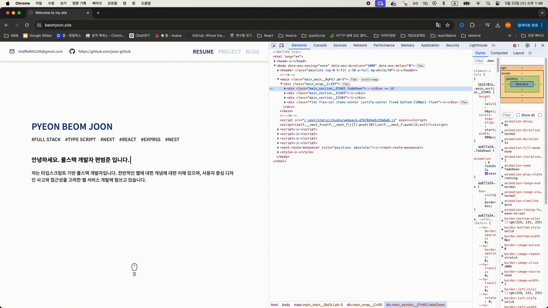
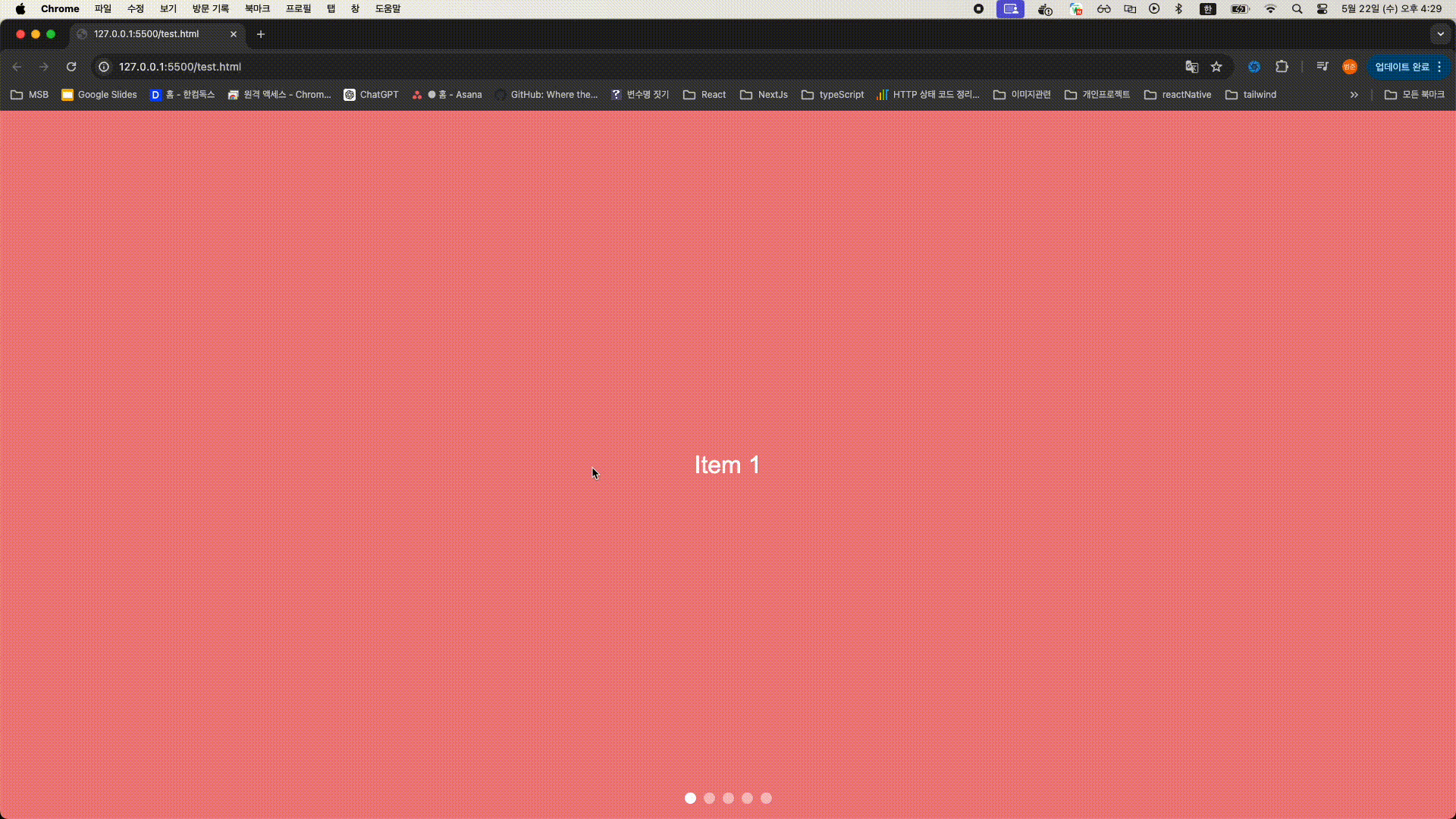
예시 구현 코드
<!DOCTYPE html>
<html lang="en">
<head>
  <meta charset="UTF-8">
  <meta name="viewport" content="width=device-width, initial-scale=1.0">
  <style>
    body {
      margin: 0;
      font-family: Arial, sans-serif;
      overflow: hidden;
    }
    .swiper-container {
      display: flex;
      overflow-x: scroll;
      scroll-snap-type: x mandatory;
      width: 100vw;
      height: 100vh;
      -ms-overflow-style: none;
      scrollbar-width: none;
    }
    .swiper-container::-webkit-scrollbar {
      display: none;
    }
    .swiper-item {
      flex: none;
      scroll-snap-align: start;
      width: 100vw;
      height: 100vh;
      display: flex;
      align-items: center;
      justify-content: center;
      font-size: 2em;
      color: white;
      user-select: none;
    }
    .swiper-item:nth-child(odd) {
      background-color: lightcoral;
    }
    .swiper-item:nth-child(even) {
      background-color: lightblue;
    }
    .navigation {
      position: absolute;
      bottom: 20px;
      width: 100%;
      display: flex;
      justify-content: center;
      gap: 10px;
    }
    .nav-dot {
      width: 15px;
      height: 15px;
      background-color: rgba(255, 255, 255, 0.5);
      border-radius: 50%;
      cursor: pointer;
    }
    .nav-dot.active {
      background-color: rgba(255, 255, 255, 1);
    }
  </style>
</head>
<body>
  <div class="swiper-container" id="swiperContainer">
    <div class="swiper-item">Item 1</div>
    <div class="swiper-item">Item 2</div>
    <div class="swiper-item">Item 3</div>
    <div class="swiper-item">Item 4</div>
    <div class="swiper-item">Item 5</div>
  </div>
  <div class="navigation" id="navigation">
    <div class="nav-dot" onclick="scrollToItem(0)"></div>
    <div class="nav-dot" onclick="scrollToItem(1)"></div>
    <div class="nav-dot" onclick="scrollToItem(2)"></div>
    <div class="nav-dot" onclick="scrollToItem(3)"></div>
    <div class="nav-dot" onclick="scrollToItem(4)"></div>
  </div>

  <script>
    const container = document.getElementById('swiperContainer');
    const navDots = document.querySelectorAll('.nav-dot');

    function scrollToItem(index) {
      container.scrollTo({
        left: container.clientWidth * index,
        behavior: 'smooth'
      });
      updateNavDots(index);
    }

    function updateNavDots(activeIndex) {
      navDots.forEach((dot, index) => {
        if (index === activeIndex) {
          dot.classList.add('active');
        } else {
          dot.classList.remove('active');
        }
      });
    }

    container.addEventListener('scroll', () => {
      const index = Math.round(container.scrollLeft / container.clientWidth);
      updateNavDots(index);
    });

    updateNavDots(0);
  </script>
</body>
</html>


``
