
Styled-Components
Styled-components는 CSS-in-JS 라이브러리중 많은 인기를 얻고있는 라이브러리이다.
CSS-in-JS란,
JavaScript를 사용하여 구성 요소의 Style을 지정하는 Styling 기술이다.
Inline Style과는 다르게, <style>요소로 DOM에 첨부된다.
또한, Javascript를 사용함으로써 선언적이고, 유지보수가 가능한 방식으로 style을 설명할 수 있다.
대표적으로는,
- emotion
- Styled-components
- JSS
등이 있다.
ex)
ThemeProvider
Theme설정을 위한 Component로, Context API를 통해 모든 Styled-components에 Theme를 삽입할 수 있다.
import styled, { ThemeProvider } from 'styled-components'

const Box = styled.div`
  color: ${props => props.theme.color};
`

render(
  <ThemeProvider theme={{ color: 'mediumseagreen' }}>
    <Box>I'm mediumseagreen!</Box>
  </ThemeProvider>
)
createGlobalStyle
Global한 style을 설정 할 수 있는 특수한 Styled-components를 생성하는 함수이다.
import { createGlobalStyle } from 'styled-components'

const GlobalStyle = createGlobalStyle`
  body {
    color: ${props => (props.whiteColor ? 'white' : 'black')};
  }
`

// later in your app

<React.Fragment>
  <GlobalStyle whiteColor />
  <Navigation />
</React.Fragment>
자식을 가지지 않는 Styled-component를 return하며,
Components 중 맨 위에 배치하면 render될 때 Global Style이 삽입된다.
또한, 위 코드에서 GlobalStyle도 역시 Styled-components이므로 ThemeProvider가 있다면 접근이 가능하다.
import { createGlobalStyle, ThemeProvider } from 'styled-components'

const GlobalStyle = createGlobalStyle`
  body {
    color: ${props => (props.whiteColor ? 'white' : 'black')};
    font-family: ${props => props.theme.fontFamily};
  }
`

// later in your app

<ThemeProvider theme={{ fontFamily: 'Helvetica Neue' }}>
  <React.Fragment>
    <Navigation />
    <GlobalStyle whiteColor />
  </React.Fragment>
</ThemeProvider>
.attrs
style이 지정된 Component에 props를 연결하는 method이다.
유일한 argument는 props에 병합될 객체이다.
import styled from 'styled-components'

const Input = styled.input.attrs(props => ({
  type: 'text',
  size: props.small ? 5 : undefined,
}))`
  border-radius: 3px;
  border: 1px solid palevioletred;
  display: block;
  margin: 0 0 1em;
  padding: ${props => props.padding};

  ::placeholder {
    color: palevioletred;
  }
`

render(
  <>
    <Input small placeholder="Small" />
    <Input placeholder="Normal" />
    <Input padding="2em" placeholder="Padded" />
  </>
)
백틱 속에 있는 style들과는 별개로, attrs에서 연결한 type, size가 추가로 props로 병합되게 된다.

as
모든 style을 유지하면서, 최종적으로 render되는 항목의 변경만을 위한 경우 사용하는 polymorphic(여러형태) prop이다.
import styled from "styled-components";

const Component = styled.div`
  color: red;
`;

render(
  <Component
    as="button"
    onClick={() => alert('It works!')}
  >
    Hello World!
  </Component>
)div로 Styled-component를 만들었지만, button으로 변경 하기위해 as="button"이 inline으로 추가되었다.
Extending Styles
styled() constructor를 사용하면 다른 style을 상속받으면서, 새로운 component를 만들수 있다.
import styled from "styled-components";

const Button = styled.button`
  color: palevioletred;
  font-size: 1em;
  margin: 1em;
  padding: 0.25em 1em;
  border: 2px solid palevioletred;
  border-radius: 3px;
`;

const TomatoButton = styled(Button)`
  color: tomato;
  border-color: tomato;
`;

render(
  <div>
    <Button>Normal Button</Button>
    <TomatoButton>Tomato Button</TomatoButton>
  </div>
);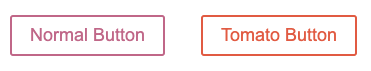
Button의 style을 그대로 상속받은 후, TomatoButton은 2가지의 추가 style이 적용되었다.

혼자 앞서 나가는 흥수좌