1. 비지도 학습 K-Means 도매업 고객 군집 분석
1) 문제정의
- 도매업(clients of a wholesale distributor) 데이터 셋을 활용한 군집 분석
#라이브러리임포트
import pandas as pd
import matplotlib.pyplot as plt
2) 데이터 준비하기
uci_path = 'https://archive.ics.uci.edu/ml/machine-learning-databases/\
00292/Wholesale%20customers%20data.csv'

df = pd.read_csv(uci_path, header=0)
df.head(150)- wholesale customers 데이터 셋 가져오기
- clients of a wholesale distributor: 각 품목에 대한 연간 지출
- 출처: https://archive.ics.uci.edu/ml/datasets/wholesale+customers

- Channel, Region이 범주형 데이터인 것처럼 보인다.
3) 데이터 확인하기
df.info()
- 모든 자료가 숫자형(정수형)으로 작성되어 있는 것을 알 수 있다.
df['Channel'].unique()
# df.Channel.unique() 도 가능- 데이터셋이 제공되는 출처 사이트에 '7) CHANNEL: customers’ Channel - Horeca (Hotel/Restaurant/Café) or Retail channel (Nominal)'로 표기되어 있다.
- 결과값: array([2, 1])
df['Region'].unique()
# df.Channel.unique() 도 가능- 데이터셋이 제공되는 출처 사이트에 '8) REGION: customers’ Region – Lisnon, Oporto or Other (Nominal)'라고 표기되어 있다.
- 실제로 결과값도 'array([3, 1, 2])'와 같이 3개의 범주라는 것을 확인할 수 있다.
4) 데이터 전처리
- 군집분석은 지도학습과 달리 정답지인 y값이 없기 때문에 X에만 데이터를 담은 후 데이터의 범위를 줄여준다.(정규화, 스케일링)
X = df.iloc[:,:]
X.shape- iloc[:,:]는 [rows:columns]를 말하며, 모든 행과 모든 열의 데이터를 가져온다.
- 결과값: (440, 8)로서 8개의 feature를 가진 440개 데이터가 담겼다.
X.head()
- 모든 데이터가 X에 담긴 것을 확인
# 데이터 정규화 -> 스케일링(차원 축소)
from sklearn import preprocessing
X = preprocessing.StandardScaler().fit(X).transform(X)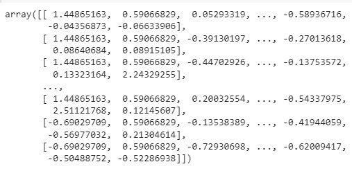
- 정규화 후 X를 출력해보면 df에서 array 형태로 바뀌면서 정규화된 것을 확인
5) K-Means 군집 모델 설정
from sklearn import cluster
kmeans = cluster.KMeans(n_clusters=5, random_state = 7) #5개의 군집으로 만들어줘- 5개의 군집으로 만들도록 설정하고 데이터를 분리한 최초 기준이 고정되도록 random_state를 7로 설정한다.
kmeans.fit(X)- 위와 같이 X값만 학습시키면 'KMeans(n_clusters=5, random_state=7)'로 학습되었다는 결과가 출력된다.
kmeans.labels_- 결과를 위와 같이 출력해보면, 0부터 4까지 총 5개의 클러스터로 군집된 것을 확인 가능
- labels뒤에 언더스코어를 쓰는 이유는 사용자가 지정한 변수가 아닌 기본으로 제공해주는 속성값이라는 의미
cluster_label = kmeans.labels_
cluster_label- 다시 새로운 변수에 담아준다.
6) 클러스터 데이터 시각화
df['Cluster'] = cluster_label
df.head()
- 군집된 데이터를 df에 새로운 컬럼명 Cluster을 설정하여 담아준다.
- 마지막 열에 새로운 컬럼이 추가된 것을 확인 가능
df['Cluster'].unique()- 결과값: array([3, 1, 0, 2, 4], dtype=int32)
- 참고. 군집하는 것은 쉬우나 잘 군집되었는지 검증하는 것이 어려움
# 채널과 지역의 연관관계(색 별 구분)
df.plot(kind='scatter', x='Channel', y='Region', c='Cluster',
cmap='Set1', figsize=(10,10))- 군집된 클러스터들을 시각화하여 분석해봐야 한다.

- 0번 클러스터는 2번 채널만 가고 지역은 1, 2, 3 모두 감
- 1번 클러스터는 1번 채널만 가고 지역은 1, 2번만 감
- 2번 클러스터는 1번 채널만 가고 3번 지역만 감
# 우유와 델리의 연관관계(색 별 구분)
df.plot(kind='scatter', x='Milk', y='Delicassen', c='Cluster',
cmap='Set1', figsize=(10,10))- 두 품목간 연관이 없다(우상향이 아니기 때문)

# 식료품와 신선식품의 연관관계(색 별 구분)
df.plot(kind='scatter', x='Grocery', y='Fresh', c='Cluster',

cmap='Set1', figsize=(10,10))
- 두 품목간 연관이 없다(우상향이 아니기 때문)
# 식료품과 종이형 세제의 연관관계(색 별 구분)
df.plot(kind='scatter', x='Grocery', y='Detergents_Paper', c='Cluster',
cmap='Set1', figsize=(10,10))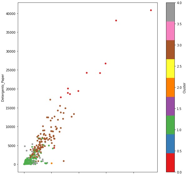
- 우상향의 차트를 그린 것을 보아 두 품목간 연관이 있다.
# 냉동식품과 종이형 세제의 연관관계(색 별 구분)
df.plot(kind='scatter', x='Frozen', y='Detergents_Paper', c='Cluster',
cmap='Set1', figsize=(10,10))- 두 품목간 연관이 없다(우상향이 아니기 때문)
# 특정 cluster만 추출해서 시각화
mask = (df['Cluster']==0) | (df['Cluster']==3) # '|' = 또는
ndf=df[mask]
ndf.Cluster.unique()- 결과값: array([3, 0], dtype=int32)
# 클러스터 0과 3의 냉동식품과 종이형 세제의 연관관계(색 별 구분)
ndf.plot(kind='scatter', x='Frozen', y='Detergents_Paper', c='Cluster',
cmap='Set1', figsize=(10,10))
- 두 품목 간 연관이 없다.
# 특정 cluster만 제외하고 시각화
mask = (df['Cluster']==0) | (df['Cluster']==3)
ndf = df[~mask] # '~' = except 의미
ndf.Cluster.unique()- 결과값: array([1, 0, 2], dtype=int32)
# 클러스터 1,2,4의 동식품과 종이형 세제의 연관관계(색 별 구분)
ndf.plot(kind='scatter', x='Frozen', y='Detergents_Paper', c='Cluster',
cmap='Set1', figsize=(10,10))
# 데이터프레임을 사용해 df['Cluster'] 따라서 색으로 구분된 산점도 행렬
pd.plotting.scatter_matrix(df, c=df['Cluster'], figsize =(20,20), marker='o',
                          hist_kwds={'bins':20}, s=60, alpha=0.8)
plt.tight_layout()
- 산점도를 먼저 그려보고 관련있는 요소들을 그룹핑해본다.
- 우상향하는 차트는 연관성이 있는 요소라고 볼 수 있다.
import numpy as np
plt.imshow([np.unique(df['Cluster'])])
plt.show()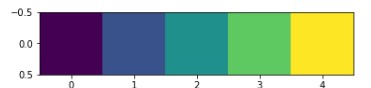
- 클러스터별 포함 데이터 수를 아래와 같이 확인할 수 있다.
len(df[df['Cluster']==0])- 결과값: 11
len(df[df['Cluster']==1])- 결과값: 211
len(df[df['Cluster']==2])- 결과값: 1
len(df[df['Cluster']==3])- 결과값: 125
len(df[df['Cluster']==4])- 결과값: 92
2. 비지도학습 DBSCAN 고등학교 진학률 데이터를 활용한 중학교 군집 분석
1) 문제 정의
- 고등학교 진학률 데이터를 활용한 중학교 DBSCAN 군집분석 및 지도 시각화
#라이브러리 임포트
import pandas as pd
import folium
2) 데이터 준비하기
df = pd.read_excel('/content/2016_middle_shcool_graduates_report.xlsx', index_col=0,
                   header = 0, engine ='openpyxl')
df.head()- unnamed가 excel에 없는데 index 순서를 컬럼으로 가져오는 경우 'index_col = 0'로 숨겨진 인덱스를 가져오지 않게 처리
- header는 첫번째 행에 있다고 알려줌
- engine ='openpyxl'로 읽히지 않는 엑셀을 읽어오게 만들 수 있음
- 참고. csv파일형식에는 일반 excel 형식에서 보이지 않는 정보를 읽어올 수 있다.

3) 데이터 확인하기
df.info()
df['코드'].unique()- 결과값: array([3, 5, 9])
df['주야'].unique()- 결과값: array(['주간'], dtype=object)
df['지역'].unique()- 결과값:
array(['성북구', '종로구', '강남구', '서초구', '송파구', '강동구', '양천구', '강서구', '금천구',
'구로구', '영등포구', '동대문구', '중랑구', '동작구', '관악구', '노원구', '도봉구', '마포구',
'은평구', '서대문구', '광진구', '성동구', '강북구', '중구', '용산구'], dtype=object)
len(df['지역'].unique())- 결과값: 25
df['유형'].unique()-
결과값: array(['국립', '공립', '사립'], dtype=object)
-
상기 모든 컬럼들이 범주형이라는 것을 알 수 있다.
# 중학교 위치 지도 시각화
mschool_map = folium.Map(location=[37.55, 126.98], tiles='Stamen Terrain', zoom_start=12)

# 중학교 위치 정보를 CircleMarker로 표시 -> popup은 학교명 /필요한 컬럼: 위도, 경도, 학교명
for name, lat, lng in zip(df.학교명, df.위도, df.경도):
  folium.CircleMarker([lat, lng], #위도 경도
                      radius=5, #반지름
                      color='brown', #둘레 색상
                      fill=True,
                      fill_color='coral', #원 안 색상
                      fill_opacity=0.7, #투명도
                      popup='<pre>'+ name +'</pre>').add_to(mschool_map)
mschool_map
- 동일한 학교명이 다른 지역에 복수로 존재해 좌표 오류가 있다 -> 수작업으로 보정 필요
4) 데이터 전처리
from sklearn import preprocessing
label_encoder = preprocessing.LabelEncoder()

l_location = label_encoder.fit_transform(df['지역']) # unique에 맞게 인코딩(25개 -> 0 ~ 24)
l_code = label_encoder.fit_transform(df['코드']) # 3,5,9 -> 0,1,2 로 변경해줌(범위조절)
l_type = label_encoder.fit_transform(df['유형']) # unique에 맞게 인코딩(3개 -> 0 ~ 2)
l_day = label_encoder.fit_transform(df['주야']) # 주간 -> 0

# df 새로운 컬럼으로 추가
df['l_location'] = l_location
df['l_code'] = l_code
df['l_type'] = l_type
df['l_day'] = l_day

df.head()- 범주형 데이터 -> Dtype: object -> 인코딩 -> 라벨링(숫자만 부여)
- 유형, 지역, 주야, 코드는 feature의 특성은 있을 것이다. but 학교명은 모두 unique하기 때문에 feature는 아님
- 참고. 분류 통한 예측모델이 필요할 때 원핫인코딩

columns_list = [9,10,11,13]
X = df.iloc[:, columns_list] # [rows_index, columns_index], : = 모든 rows를 의미- 클러스터링에 사용할 속성을 선택하여 X에 담기 -> 과학고, 외고국제고, 예고체고, 자사고
X = preprocessing.StandardScaler().fit(X).transform(X)- X를 모두 정규화 시켜줌
5) DBSCAN 군집 모델 설정
# DBSCAN 모델 설정
from sklearn import cluster
dbm = cluster.DBSCAN(eps = 0.3, min_samples=5) - 한 데이터 포인트에서 eps 거리 안에 데이터가 min_sample 개수 만큼 포함되어 있으면 클러스터로 포함
- eps 핵심 포인트를 중심으로 측정되는 유클리디언 거리값
- min_samples: 핵심 포인트를 중심점으로 간주하는 주변 지역의 표본 수, 한 군집에 속해야 하는 최소한의 수
6) 모델 학습하기
dbm.fit(X)7) 모델 예측(군집) 확인하기
import numpy as np
np.unique(dbm.labels_)- 결과값: array([-1, 0, 1, 2, 3, 4])
- '-1'은 noise이자 outlier임
cluster_label = dbm.labels_
df['Cluster'] = cluster_label

df.head() 
- 아웃라이어가 많은 것처럼 보임
- 예측결과를 기존 데이터프레임에 추가
df['Cluster'].value_counts()- 클러스터 결과 확인
- 각 클러스터의 데이터 건 수 확인 가능
- 결과값:
-1 218
0 159
1 12
3 11
2 10
4 5
# 클러스터 1에 속하는 데이터만 보려면
df[df['Cluster']==1]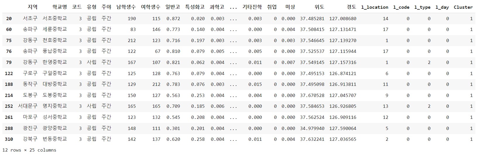
#클러스터 값을 기준(key)으로 그룹하고, 그룹별로 내용(value) 출력(5개 출력)

group_cols = [0,1,3] + columns_list
#지역, 학교명, 유형, + cols

grouped = df.groupby('Cluster')
grouped['Cluster'].value_counts()- 그룹바이를 하면 key와 value가 생김
- key는 groupby한 기준인 cluster이고 그 기준으로 묶인 데이터프레임이 value이다.
for index, group in grouped: #key: -1,0,1,2,3,4/ value: 각 클러스터에 속한 df들
  print(' *  Cluster: ', index)
  print(' * len: ', len(group))
  print(group.iloc[:,group_cols].head())
- 어떠한 클러스트에도 속하지 못한 outlier가 218건
- eps가 작아질수록 -1에 해당하는 데이터 수가 많아진다.
8) 클러스터링 결과 지도 시각화
# 중학교 위치 지도 시각화
cluster_map = folium.Map(location=[37.55, 126.98], tiles='Stamen Terrain', zoom_start=12)
colors =  {-1: 'gray', 0:'coral', 1:'blue', 2:'green', 3:'red', 4:'purple', 5:'orange'}
# 중학교 위치 정보를 CircleMarker로 표시 -> popup은 학교명 /필요한 컬럼: 위도, 경도, 학교명
for name, lat, lng , clus in zip(df.학교명, df.위도, df.경도, df.Cluster):
  folium.CircleMarker([lat, lng], #위도 경도
                      radius=5, #반지름
                      color=colors[clus], #둘레 색상
                      fill=True,
                      fill_color=colors[clus], #원 안 색상
                      fill_opacity=0.7, #투명도
                      popup='<pre>'+ name +'</pre>').add_to(cluster_map)
cluster_map