Detail페이지를 만들 예정인데 react router dom 패키지를 이용할 것이다.
npm install react-router-dom@6사용법은 공식 사이트를 참고하자 패키지를 사용할 때의 주의점은 패키지의 버전에 따라 사용법이 바뀌는 경우가 자주 있으므로 만약 에러가 난다면 해당 패키지의 공식 사이트에서 사용법을 찾아보자
https://reactrouter.com/docs/en/v6/getting-started/installation
먼저 Detail.js를 만들어두고
import React from "react";

function Detail() {
  return <div>Detail</div>;
}

export default Detail;
App.js에서 패키지와 Detail.js를 import한 뒤 패키지의 사용법에 따라
...
import { BrowserRouter as Router, Routes, Route, Link } from "react-router-dom";

function App() {
  return (
    <div className="App">
      <Router>
        <Header />
        <Routes>
          <Route path="/detail" element={<Detail />} />
          <Route path="/" element={<Home />} />
        </Routes>
      </Router>
    </div>
  );
}

export default App;
path가 /detail이면 Detail을 보여주고 /이면 Home을 보여주도록 하자
지금은 /경로에 있어서 Home을 보여주고 있지만
경로 뒤에 /detail을 붙여주면
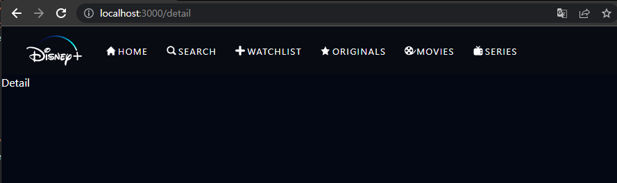
Detail.js에 작성한 내용이 나타난다. Header는 Routes의 밖에 있으니 그대로 나타난다.
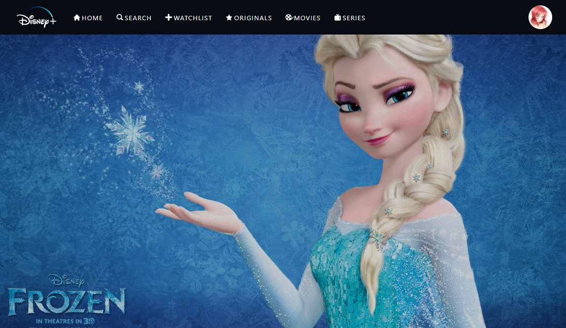
가장 먼저 Detail에 배경화면을 깔아두자
function Detail() {
  return (
    <Container>
      <Background>
        <img src="https://cdn.wallpapersafari.com/79/81/sCDgJ1.jpg" />
      </Background>
    </Container>
  );
}

export default Detail;
원하는 이미지를 styled패키지를 이용해 넣고
const Container = styled.div`
  min-height: calc(100vh - 70px);
  padding: 0 calc(3.5vw + 5px);
  position: relative;
`;
Container div는 이전과 같이 위 여백과 옆 패딩을 주고 포지션을 relative로 설정.
const Background = styled.div`
  position: fixed;
  top: 0;
  left: 0;
  bottom: 0;
  right: 0;
  z-index: -1;
  opacity: 0.8;

  img {
    width: 100%;
    height: 100%;
    object-fit: cover;
  }
`;
Background div는 위치를 고정시키고 화면에 꽉차도록 한 뒤 헤더보다 뒤에 있도록 z-index를 -1로 주고 위에 버튼 등 여러 요소가 위치할 예정이므로 opacity를 좀 줘서 배경의 느낌을 더 낸다.
배경이 완성되었으니 타이틀을 넣자
    ...
      <ImageTitle>
        <img src="https://pngimg.com/uploads/frozen/frozen_PNG57.png" />
      </ImageTitle>
    </Container>
    ...
const ImageTitle = styled.div``;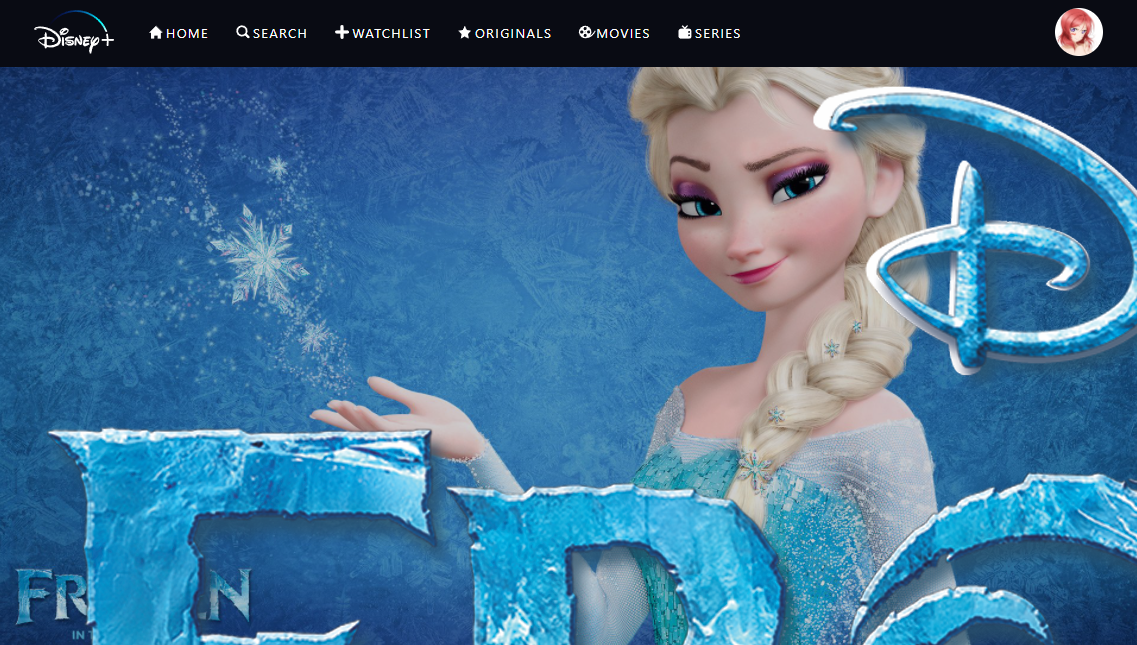
타이틀이 좀 크다.. 스타일을 줘서 조정해보면
const ImageTitle = styled.div`
  height: 30vh;
  width: 35vw;
  min-height: 170px;
  min-width: 200px;

  img {
    width: 100%;
    height: 100%;
    object-fit: contain;
  }
`;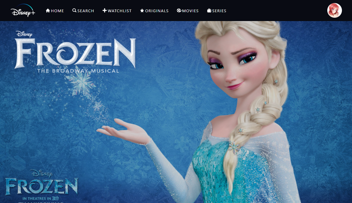
적절한 크기로 나타난다 이미지는 좀 더 어울리는걸로 교체해줬다.
이미지의 크기를 조절할 때에는 부모요소 div의 크기를 먼저 잡아준 다음 img태그에 100%를 넣어주는게 편하다.
이제 버튼들을 만들건데 기본 코드부터 미리 작성해두자
...
      </ImageTitle>
      <Controls>
        <PlayButton></PlayButton>
        <TrailerButton></TrailerButton>
        <AddButton></AddButton>
        <GroupWatchButton></GroupWatchButton>
      </Controls>
    </Container>
    ...
const Controls = styled.div``;

const PlayButton = styled.button``;

const TrailerButton = styled.button``;

const AddButton = styled.button``;

const GroupWatchButton = styled.button``;
PlayButton과 TrailerButton부터 작성해보면
        <PlayButton>
          <img src="/images/play-icon-black.png" />
          <span>PLAY</span>
        </PlayButton>
        <TrailerButton>
          <img src="/images/play-icon-white.png" />
          <span>Trailer</span>
        </TrailerButton>
        ...
const Controls = styled.div`
  display: flex;
`;

const PlayButton = styled.button`
  border-radius: 4px;
  font-size: 15px;
  padding: 0px 24px;
  margin-right: 22px;
  display: flex;
  align-items: center;
  height: 56px;
  background: rgb(249, 249, 249);
  border: none;
  letter-spacing: 1.8px;
  cursor: pointer;

  &:hover {
    background: rgb(198, 198, 198);
  }
`;

const TrailerButton = styled(PlayButton)`
  background: rgb(0, 0, 0, 0.3);
  border: 1px solid rgb(249, 249, 249);
  color: rgb(249, 249, 249);
  text-transform: uppercase;
`;
TrailerButton은 styled.div 대신 PlayButton을 줘서 공통된 스타일을 그대로 활용하도록 했다. 다 작성하고 보면 멋진 버튼 2개가 완성되었다.
이제 AddButton을 만들어보자
	  ...
        </TrailerButton>
        <AddButton>
          <span>+</span>
        </AddButton>
        <GroupWatchButton></GroupWatchButton>
      </Controls>
      ...
const Controls = styled.div`
  ...
  align-items: center;
`;
...
const AddButton = styled.button`
  margin-right: 16px;
  width: 44px;
  height: 44px;
  display: flex;
  align-items: center;
  justify-content: center;
  border-radius: 50%;
  border: 2px solid white;
  background-color: rgba(0, 0, 0, 0.6);
  cursor: pointer;

  span {
    font-size: 30px;
    color: white;
  }
`;
AddButton도 멋지게 잘 나왔다.
GroupButton도 만들어보면
        </AddButton>
        <GroupWatchButton>
          <img src="/images/group-icon.png" />
        </GroupWatchButton>
      </Controls>
      ...
const GroupWatchButton = styled(AddButton)`
  background: rgba(0, 0, 0);
`;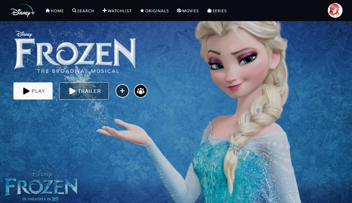
GroupButton도 AddButton의 디자인을 계승하고 이미지를 채워준 뒤 배경색만 바꿔주었다.
이제 마지막으로 텍스트로 이루어진 부분을 만들자
...
      </Controls>
      <SubTitle>2013 American computer-animated musical fantasy film</SubTitle>
      <Description>
        Frozen is a 2013 American computer-animated musical fantasy film
        produced by Walt Disney Animation Studios and released by Walt Disney
        Pictures.[5] The 53rd Disney animated feature film, it is inspired by
        Hans Christian Andersen's fairy tale "The Snow Queen". The film depicts
        a princess who sets off on a journey alongside an iceman, his reindeer,
        and a snowman to find her estranged sister, whose icy powers have
        inadvertently trapped their kingdom in eternal winter.
      </Description>
    </Container>
텍스트는 아무거나 넣고
const SubTitle = styled.div`
  color: rgb(249, 249, 249);
  font-size: 18px;
  min-height: 20px;
  margin-top: 26px;
`;

const Description = styled.div`
  width: 50vw;
  line-height: 1.4;
  font-size: 14px;
  margin-top: 16px;
  color: rgb(249, 249, 249);
`;
스타일을 적용해주면
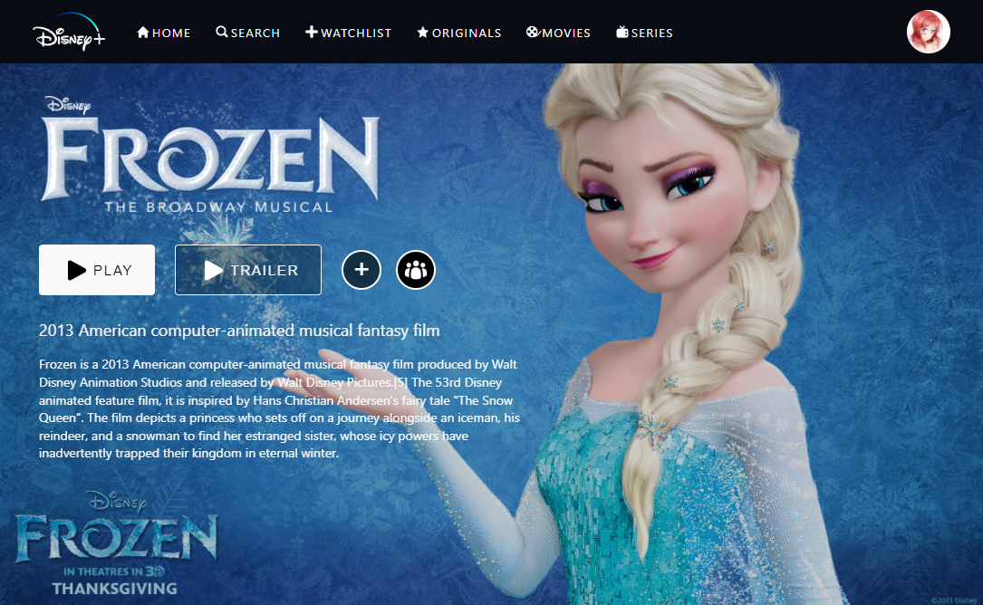
Detail페이지가 완성되었다.
다음 포스팅에선 Login 컴포넌트를 만들 예정이다.