모달을 띄우는 조건을 지정하여준다.
adminPage.js
const adminPage=()=>{

//어드민페이지 로그인 창 모달 기본값이 true로 필수 로그인
const [onModal, setOnModal] = useState(true);
//배경화면 블러를 관리함
const [onBlur, setOnBlur] = useState(true);
const closeModal = () => {
     setOnModal(false);
     setOnBlur(false);
}

return (
<AdminLoginModal open={onModal} close={closeModal}/>
<div className={onBlur ? "blur" : "holebody"}>
  ...(내용)...
</div>
)
}
모달이 띄워지면 배경화면은 blur가 되게 만들었다.
css
동일하게 가지만 filter에 blur를 넣어준다.
.holebody{
    display: flex;
    flex-direction: column;
    justify-content: center;
    align-items: center;
    width: 100%;
    height: 100vh;
    position: fixed;
}
.blur {
    filter: blur(5px);
    display: flex;
    flex-direction: column;
    justify-content: center;
    align-items: center;
    width: 100%;
    height: 100vh;
    position: fixed;
}
AdminLoginModal.js
AdminLoginModal 는 adminPage.js 에서 선언되어 open 과 close값이 넘어온다. 이 값을 이용하여 삼항연산자을 걸어준다.
{open ? '참일때 실행되는 CSS' : '거짓일 때 실행되는 CSS'}
const AdminLoginModal = (props) => {
const {open, close} = props;
return(
<div className={open ? 'blockBackground' : 'normalBackground'}>
<div className={open ? 'openModal modal' : 'modal'}>
{open && <div className="form">
<header>
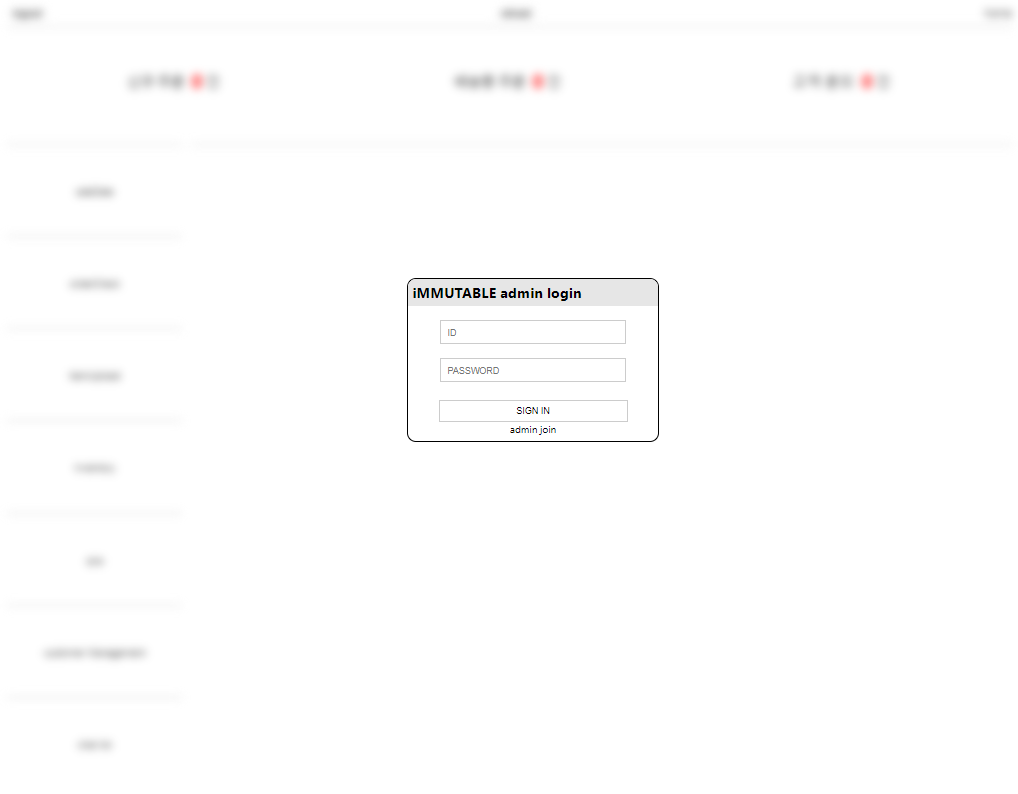
<div className="header-title">iMMUTABLE admin login</div>
</header>
<div className="main">
<input type="text" placeholder="ID" value ={inputId} onChange={onChangeId}/>
<input type="password" placeholder="PASSWORD" value ={inputPw} onChange={onChangePw}/>
<button onClick={onClickLogin}>SIGN IN</button>
<Link to="/AdminSignup">admin join</Link>
</div>
</div>
}
</div>
</div>
)
}css
모달은 숨겨진 상태로 시작하며 background도 아무것도 없는 상태로 시작한다
모달이 실행되어질 때 background를 absolute로 지정하여 맨 위로 오게하고 크기를 vw vh 로 설정하여 화면 전체를 덮어준다.
그 위에 openModal을 띄워준다.
   .normalBackground{

    }
    .blockBackground{
    position: absolute;
    top: 0;
    left: 0;
    width: 100vw;
    height: 100vh;
    z-index: 100;
    }
    .modal {
        display: none;  // 숨겨진 상태로 시작
        position: fixed;
        width: 280px;
        height: 180px;
        top: 35%;  // 화면 전체를 덮도록 위치
        bottom: 0;
        left: 40%;
        z-index: 99; // 다른 모달 보다 위에 위치하도록 함
        background-color: white;
        border-radius: 10px;
 }

    .openModal {
        display: flex; // 모달이 보이도록 함
        align-items: center;
        /* 팝업이 열릴때 스르륵 열리는 효과 */
        animation: modal-bg-show 0.8s;
    }
결과

Be {Nice} Be {Kind}