optional, required
form 형식에 optional input과 required input 칸을 만들어보았다.
<!DOCTYPE html>
<html lang="en">
<head>
<meta charset="UTF-8">
<meta name="viewport" content="width=device-width, initial-scale=1.0">
<title>The Gata Times</title>
<style>
body{
height: 1000vh;
margin:50px;
}
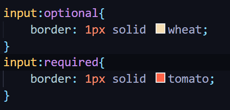
input:optional{
border: 1px solid wheat;
}
input:required{
border: 1px solid tomato;
}
</style>
</head>
<body>
<div>
<form>
<input type="text" placeholder="username"/>
<input type="password" required placeholder="password"/>
</form>
</div>
</body>
</html>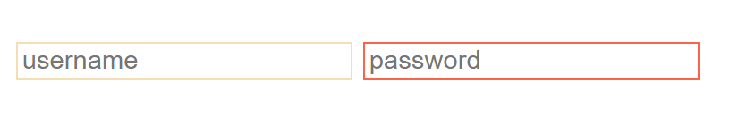
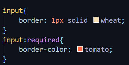
border: 1px solid부분이 겹치므로 다음과 같이 축약할 수 있다.
input:required는 class 추가 없이 form에서 required 필드를 보여줄 때 많이 사용한다.
Attribute selector
*= is 'contains'
~= is 'exactly'
*= "hello" 라고 하면 ㅁㄴㅇㄹㄴㅇㄹhelloㅁㄴㅇㄹㄴㅇㄹ 라고 줘도 선택되고,
~= "hello" 라고 하면 앞뒤에 공백이 있는 상태에서 hello 인 경우만 선택된다.
예시
- type이 password인 input들의 배경색을 thistle로 해준다.
- placeholder에 "name"이라는 단어를 포함한 모든 input의 배경색을 yellow로 해준다.
<!DOCTYPE html>
<html lang="en">
<head>
    <meta charset="UTF-8">
    <meta name="viewport" content="width=device-width, initial-scale=1.0">
    <title>The Gata Times</title>
    <style>
        input[type="password"]{
            background-color: thistle;
        }
        input[placeholder~="name"]{
            background-color: yellow;
        }
    </style>
</head>
<body>
    <div>
        <form>
            <input type="text" placeholder="User name"/>
            <input type="password" required placeholder="Password"/>
            <input type="text" placeholder="First name">
            <input type="text" placeholder="Last name">
        </form>
    </div>
</body>
</html>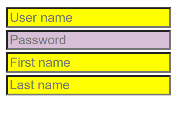
전체 코드
<!DOCTYPE html>
<html lang="en">
<head>
    <meta charset="UTF-8">
    <meta name="viewport" content="width=device-width, initial-scale=1.0">
    <title>The Gata Times</title>
    <style>
        body{
            height: 1000vh;
            margin:50px;
        }

        input{
            border: 1px solid wheat;
        }
        input:required{
            border-color: tomato;
        }
        input[type="password"]{
            background-color: thistle;
        }
        input[placeholder~="name"]{
            background-color: yellow;
        }
    </style>
</head>
<body>
    <div>
        <form>
            <input type="text" placeholder="User name"/>
            <input type="password" required placeholder="Password"/>
            <input type="text" placeholder="First name">
            <input type="text" placeholder="Last name">
        </form>
    </div>
</body>
</html>

개발은 즐거워🪇