States
개발자 도구에서 가장 중요한 selector는 states이다.
- active
- hover
- focus
- focus-within
- vistied
1. active
- 해당 요소를 마우스로 클릭할 때 효과를 적용할 수 있다.
- 클릭을 놓으면 원래로 다시 돌아간다.

클릭하지 않은 상태

클릭한 상태
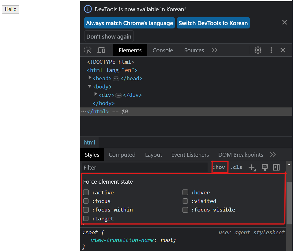
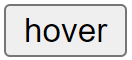
2. hover
- 마우스가 해당 요소 위를 지나갈 때 (클릭X) 효과를 적용할 수 있다.
마우스를 올려놓지 않은 상태
마우스를 올려놓은 상태(클릭X)
3. focus
-
마우스나 키보드로 선택했을 때 효과를 적용할 수 있다.

마우스로 input칸을 클릭하거나 tab으로 이동했을 때 효과

-
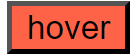
focus와 hover을 연결할 수 있다.
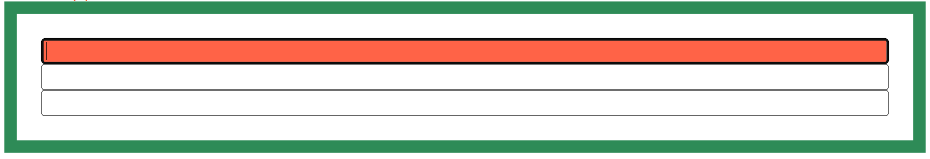
form이 hover가 된 상태에서 input이 focus이면 효과가 적용되도록 해보자.
마우스나 tab으로 input을 클릭하면 (input이 focused가 되어) 배경이 red로 지정된다. 마우스가 올려져만 있고 클릭된 상태가 아니면 red 배경이 적용 되지 않아 황토색(burlywood색) input 3개만 보여진다.
코드
<!DOCTYPE html>
<html lang="en">
<head>
    <style>
        form:hover input{
                    background-color: burlywood;
                }
        form:hover input:focus{
                    background-color: red;
           		}
    </style>
</head>
<body>
    <form>
      <input type="text" name="" id="" />
      <input type="text" name="" id="" />
      <input type="text" name="" id="" />
    </form>
</body>
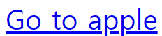
4. visited
- visited는 링크에만 적용이 된다.
- 방문한 사이트일 경우에 효과를 적용할 수 있다.
예시
방문하지 않고 마우스도 올려놓지 않은 초기의 상태
사이트 방문 후 tomato색으로 변한 상태

💡링크에 hover와 focus를 적용할 수도 있다.
'Go to apple' 위를 마우스가 지나 갈 때 teal색으로 변한 상태

'Go to apple' 위에서 마우스 클릭을 유지할 때 hotpink색으로 변한 상태

<!DOCTYPE html>
<html lang="en">
<head>
    <style>
      a:visited{
            color: tomato;
        }
        a:hover{
            color: teal;
        }
        a:focus{
            color: hotpink;
        }
</head>
<body>
    <a href="https://apple.com">Go to apple</a>
</body>
5. focus-within
- focus-within은 자신의 자식 요소들 중 하나가 focused 되었을 때 부모 요소에게 효과를 적용한다.
예시
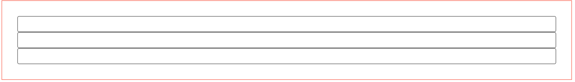
form의 자식들인 input을 클릭하여 input이 focused 되었다. focus-within가 발동되어 border-color와 width가 각각 seagreen과 10px로 적용된다.
<!DOCTYPE html>
<html lang="en">
<head>
    <style>
        form:focus-within{
            border-color: seagreen;
            border-width: 10px;
        }
    </style>
</head>
<body>
    <form>
        <input type="text" name="" id="" />
        <input type="text" name="" id="" />
        <input type="text" name="" id="" />
    </form>
</body>
전체 코드
<!DOCTYPE html>
<html lang="en">
<head>
    <meta charset="UTF-8">
    <meta name="viewport" content="width=device-width, initial-scale=1.0">
    <title>Document</title>
    <style>
        #button1:active{
            background-color: tomato;
        }
        #button2:hover{
            background-color: tomato;
        }
        input:focus{
            background-color: tomato;
        }
        a:visited{
            color: tomato;
        }
        a:hover{
            color: teal;
        }
        a:focus{
            color: hotpink;
        }
        form{
            border: 1px solid salmon;
            display: flex;
            flex-direction: column;
            padding: 20px;

            /*
            - form 형식에 3개의 input을 만든 후
            - form에 border를 준다.
            - form의 display를 flex로 만든다.
            - form에 padding(border에서 안쪽으로 공간을 만들어줌)을 넣는다.*/
        }
        form:focus-within{
            border-color: seagreen;
            border-width: 10px;
        }
        form:hover input{
            background-color: burlywood;
        }
        form:hover input:focus{
            background-color: red;
        }
    </style>
</head>
<body>
    <div><button id="button1">active</button></div>
    <div><button id="button2">hover</button></div>
    <div><input type="text"/><input type="text"/></div>
    <div><a href="https://apple.com">Go to apple</a></div>
    <div>
        <form>
            <input type="text" name="" id="" />
            <input type="text" name="" id="" />
            <input type="text" name="" id="" />
        </form>
    </div>
</body>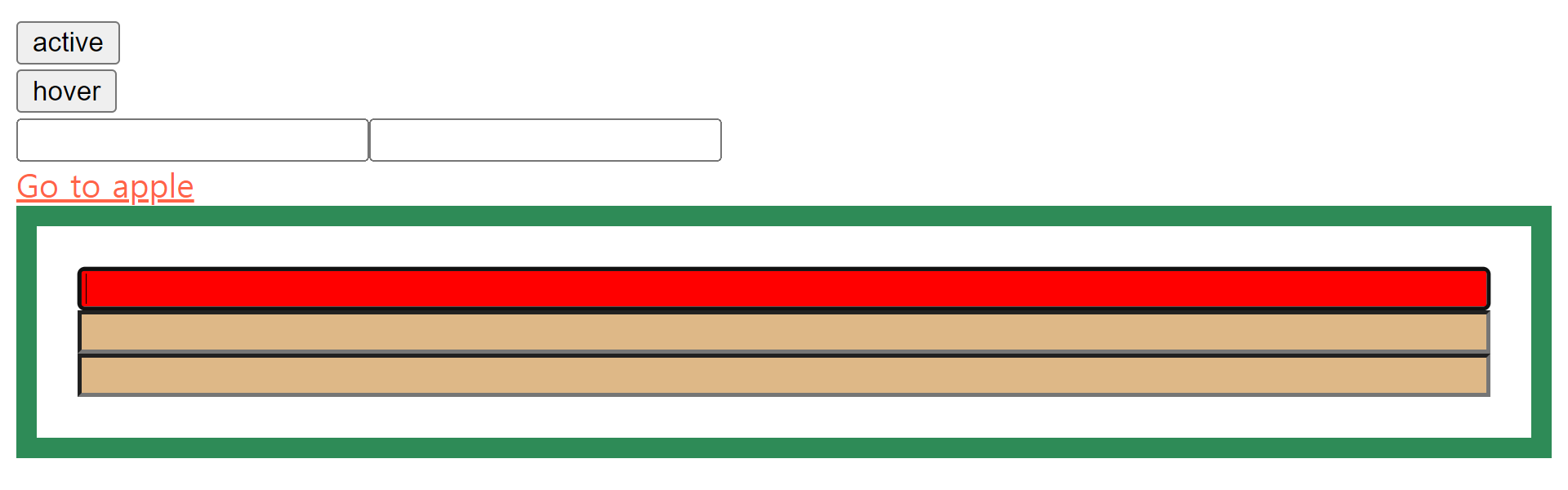

개발은 즐거워🪇