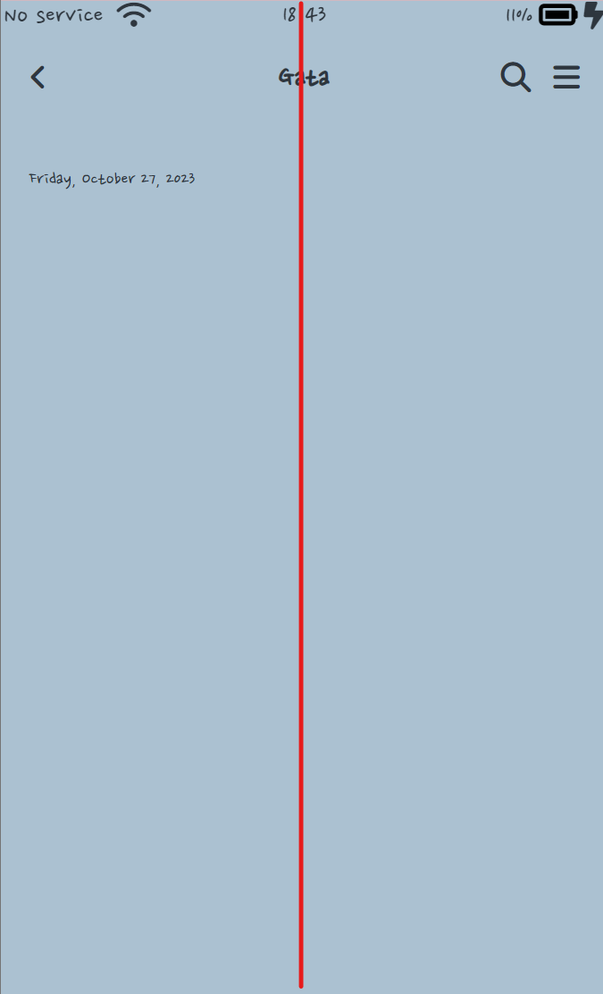
alt-header를 정 가운데로 맞추기
<body id="chat-screen">
  <header>
          <div class="alt-header">
              <div class="alt-header__column">
                  <a href="more.html">
                      <i class="fa-solid fa-angle-left fa-xl"></i>
                  </a>
              </div>
              <div class="alt-header__column">
                  <h1 class="alt-header__title">Gata</h1>
              </div>
              <div class="alt-header__column">
                  <span><i class="fa-solid fa-magnifying-glass fa-xl"></i></span>
                  <span><i class="fa-solid fa-bars fa-xl"></i></span>
              </div>
          </div>
      </header>
  </body>
.alt-header__column {
width: 33%;
}
.alt-header__column:last-child {
display: flex;
justify-content: flex-end;
}
.alt-header__column:nth-child(2) {
text-align: center;
}column이 3개니까 width를 33%으로 맞춘다.
alt-header를 상단에 고정하기
#chat-screen {
    background-color: #abc1d1;
    height: 11000vh;  /* 채팅창을 스크롤할 수 있도록 높이를 높게 준다.*/

}

#chat-screen .alt-header {
    position: fixed;
    width: 100%;
    box-sizing: border-box;
}
z-index
z-index는 여러개의 div가 겹칠 때 div의 layer 순서를 결정할 수 있다.
더 큰 z-index 값을 가진 요소가 작은 값의 요소 위를 덮는다.
default: 0
position이 fixed나 absolute 일 때 이용한다.
예제
<div class="dashed-box">
  Dashed box
  <span class="gold-box">Gold box</span>
  <span class="green-box">Green box</span>
</div>
.dashed-box {
position: relative;
z-index: 1;
border: dashed;
height: 8em;
margin-bottom: 1em;
margin-top: 2em;
}
.gold-box {
position: absolute;
z-index: 3; /* put .gold-box above .green-box and .dashed-box */
background: gold;
width: 80%;
left: 60px;
top: 3em;
}
.green-box {
position: absolute;
z-index: 2; /* put .green-box above .dashed-box */
background: lightgreen;
width: 20%;
left: 65%;
top: -25px;
height: 7em;
opacity: 0.9;
}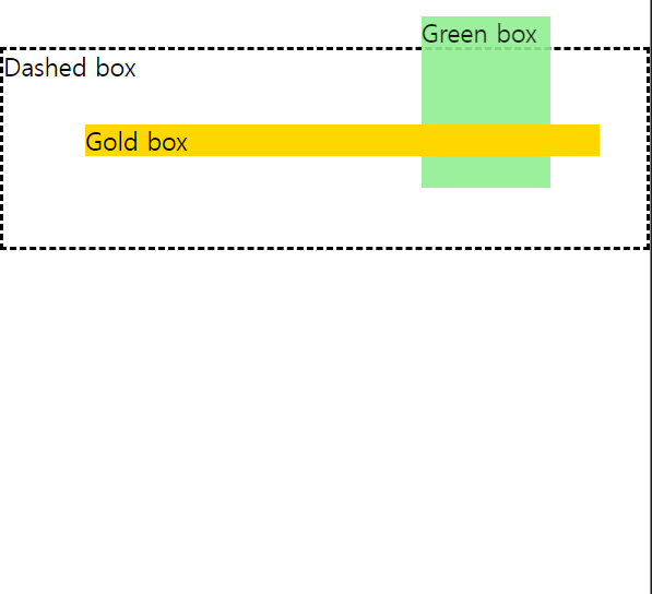
z-index
Dashed box: 1
green-box: 2
gold-box: 3가장 작은 수의 z-index가 가장 아래에 깔린다.
mdn 참고자료

개발은 즐거워🪇