전체 코드
<div class="chat__timestamp">
  Friday, October 27, 2023
</div>
.chat__timestamp {
color: white;
background-color: #92a4b2;
padding: 7px 15px;
border-radius: 25px;
font-size: 18px;
}.main-chat {
margin-top: 120px;
display: flex;
flex-direction: column;
align-items: center;
}.main-chat에서 display, flex-direction, align-items를 한 줄씩 주석 처리해서 각각의 존재 이유에 대해 알아보자.
1) span은 inline
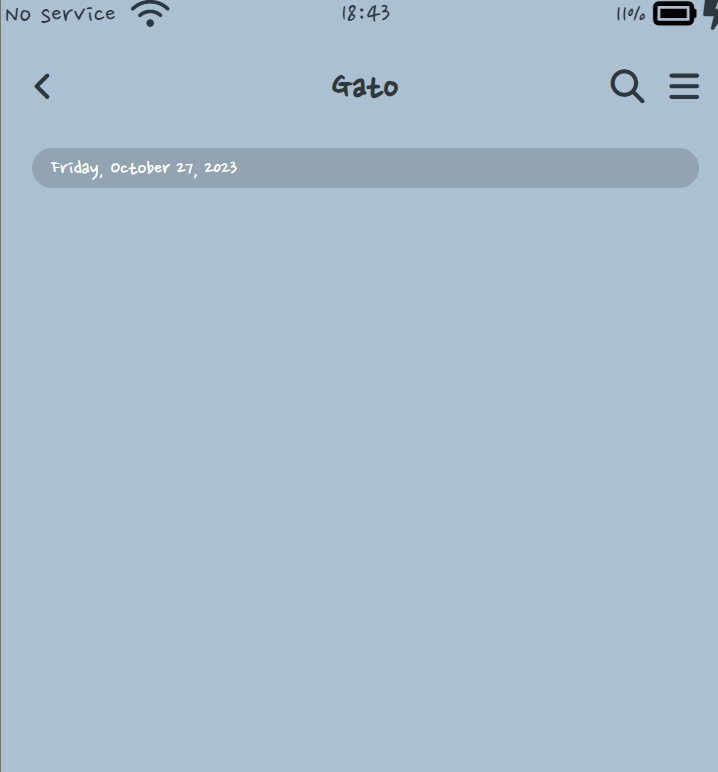
일단, margin-top 한 줄은 기본 값으로 깔아주고 아무 코드도 적지 않았을 때의 모습이다. span (Friday, October 27, 2023)은 inline이기 때문에 다른 요소들과 함께 있으려는 속성이 있다. inline은 width/height, margin 등 css 속성이 먹히지 않기 때문에 css 효과를 주려면 block으로 바꿔줘야 한다.
.main-chat {
margin-top: 120px;
}
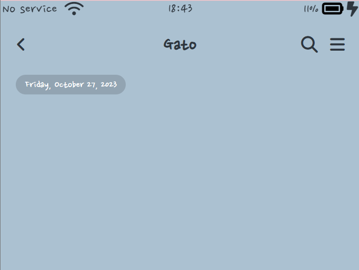
2) display: flex;
.main-chat {
margin-top: 120px;
display: flex;
}display: flex;를 하면 content의 width 만큼 가로가 줄어들게 된다.
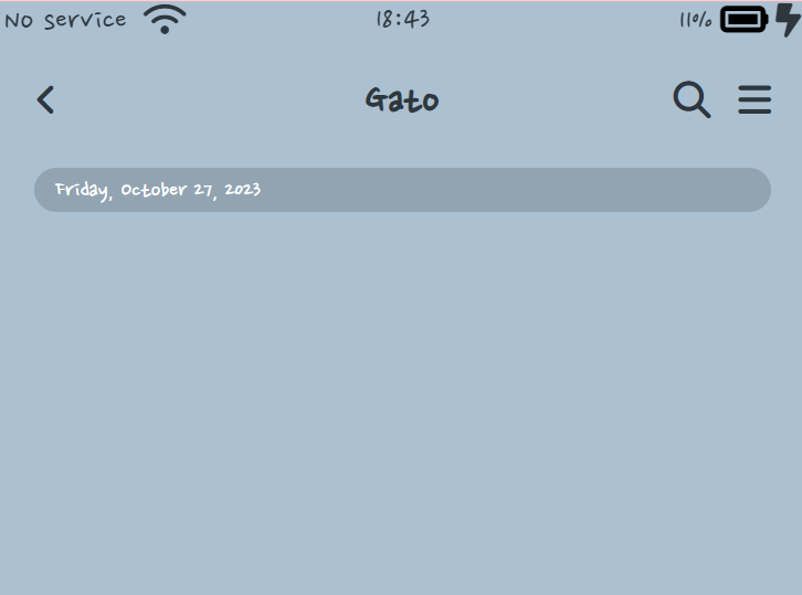
3) flex-direction: column;
.main-chat {
margin-top: 120px;
display: flex;
flex-direction: column;
} flex-direction: column;를 해서 세로로 요소들이 배열 되게 한다.
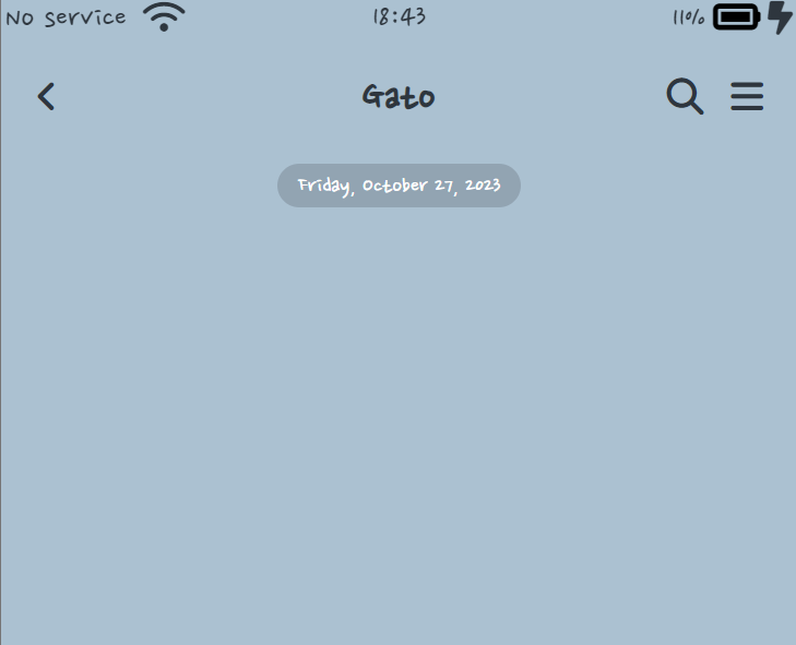
4) align-items: center;
.main-chat {
	margin-top: 120px;
    display: flex;
    flex-direction: column;
    align-items: center;
}timestamp를 중앙 정렬하기 위해 align-items: center;를 사용한다.

개발은 즐거워🪇