
1. line plot
- 기간(x)에 따른 변화(y)를 보는 경우가 많음
- y값이 숫자형인 경우만 가능!
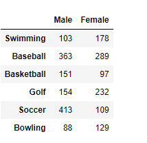
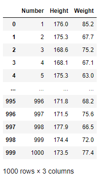
DataFrame 정보

df.plot(kind="line")
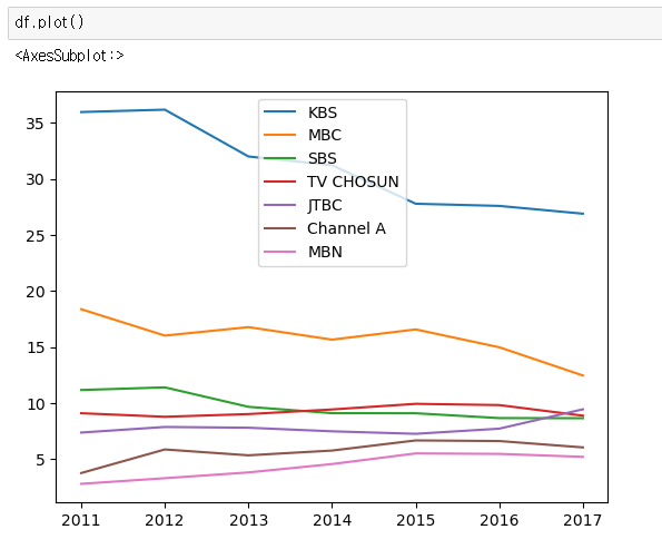
kind="line" 이 디폴트라 생략 가능
df.plot(y=[col1, col2])
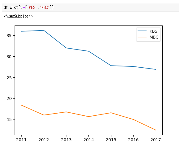
특정 컬럼만 그리고 싶으면 y값을 리스트로 넘기면 된다.
df[[col1, col2]].plot()

위와 동일한 결과
df[col1].plot()
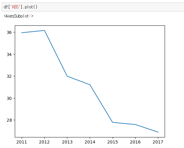
Series 도 plot() 모듈 사용가능
2. bar plot
- 카테고리 비교를 위해 사용
DataFrame 정보
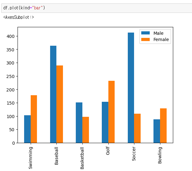
df.plot(kind="bar")
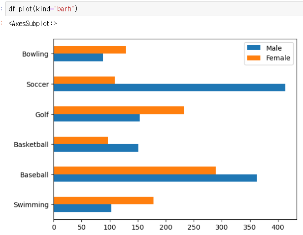
df.plot(kind="barh")
- 가로로 눕힌 bar plot
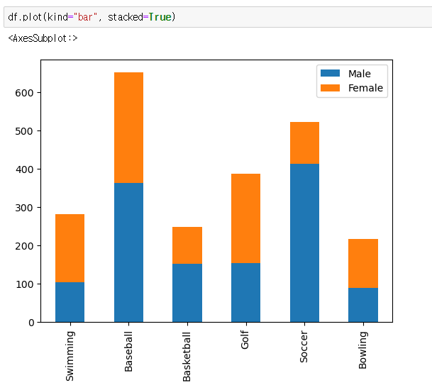
df.plot(kind="bar", stacked=True)
- 누적 막대 그래프
df[col1].plot(kind='bar')
- 원하는 col만 그래프로 시각화

3. pie plot
- 절대적인 수치보다 비율을 보고싶은 경우
DataFrame 정보
df.plot(kind="pie")
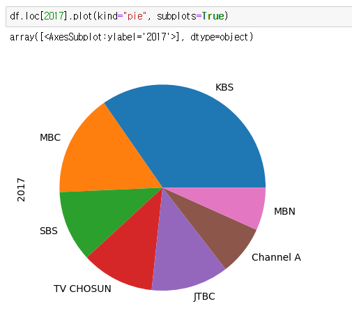
- loc[2017]을 안하면 에러 발생
4. histogram
- 값의 분포를 알고 싶은 경우
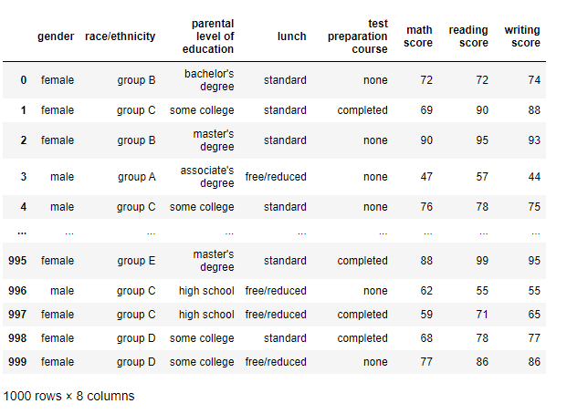
DataFrame 정보
df.plot(kind="hist", bins={구간개수})

5. box plot
- 데이터의 통계정보를 시각적으로 보여주는 데 효과적
- 최댓값, 최솟값, 중앙값(Q2), 25%지점(Q1), 75%지점(Q3), 이상점을 확인할수 있다.
DataFrame 정보
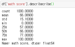
이 값들을 보기좋게 시각화한것이 boxplot.
df.plot(kind="box")

df.plot(kind='box', y='math score')도 같음
6. scatter plot
- 상관관계를 확인하기 적합한 그래프
DataFrame 정보
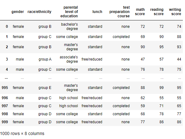
df.plot(kind="scatter", x={x값}, y={y값})
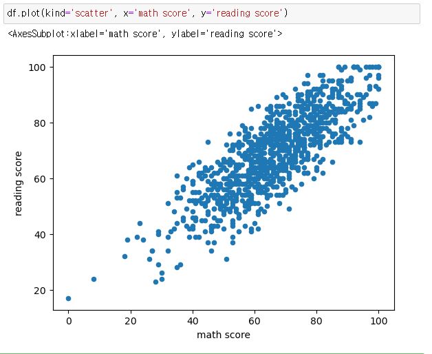
다른 그래프들하곤 다르게 x, y 값을 설정해줘야 한다.

데이터 분석으로 세상을 읽어보쟈 빠샤