<!DOCTYPE html>
<html lang="en">
<head>
<meta charset="UTF-8">
<meta http-equiv="X-UA-Compatible" content="IE=edge">
<meta name="viewport" content="width=device-width, initial-scale=1.0">
<title>Document</title>
<link rel="stylesheet" type="text/css" href="printpage.css" />
</head>
<body>
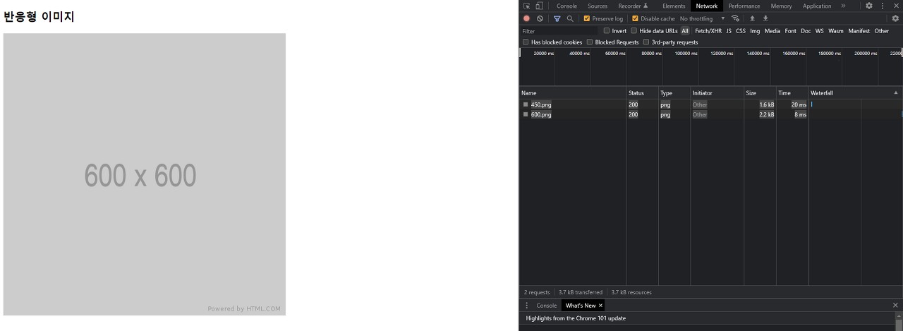
<h2>반응형 이미지</h2>
<img src="/images/600.png"
srcset="images/300.png 300w, images/450.png 450w, images/600.png 600w"
sizes="(min-width : 600px) 600px, (min-width : 450px) 450px, 300px"
alt="responsive images"/>
</body>
</html>(min-width : 600px) 600px => 보다 큰 값을 가진 사람들에게 600px로 이미지를 고정하여라
(min-width : 450px) 450px => 450px보다 크고 600px 보다 작으면 450px로 이미지를 고정하여라
▶️ 가로길이가 600px 이상 커져도 600px 사이즈의 이미지로 고정이 된다.
자라나라 나무나무