비선형 회귀 분석
1. 비선형 데이터 표현
# nonlinear logistic regression.py

import numpy as np
import matplotlib.pyplot as plt
from math import *

# 1. Training Data
# load the training data file ('data-nonlinear.txt')
data = np.genfromtxt("drive/My Drive/.../data-nonlinear.txt", delimiter=',')

# each row (xi,yi,li) of the data consists of a 2-dimensional point (x,y) with its label l
# x,y∈R
pointX = data[:, 0]
pointY = data[:, 1]
# l∈{0,1}
label  = data[:, 2]

pointX0 = pointX[label == 0]
pointY0 = pointY[label == 0]

pointX1 = pointX[label == 1]
pointY1 = pointY[label == 1]

# plot the training data points (x,y) with their labels l in colors
# (blue for label 0 and red for label 1)
print('1. Plot the training data')
plt.figure(figsize=(8, 8))
plt.scatter(pointX0, pointY0, color='blue')
plt.scatter(pointX1, pointY1, color='red')
plt.show()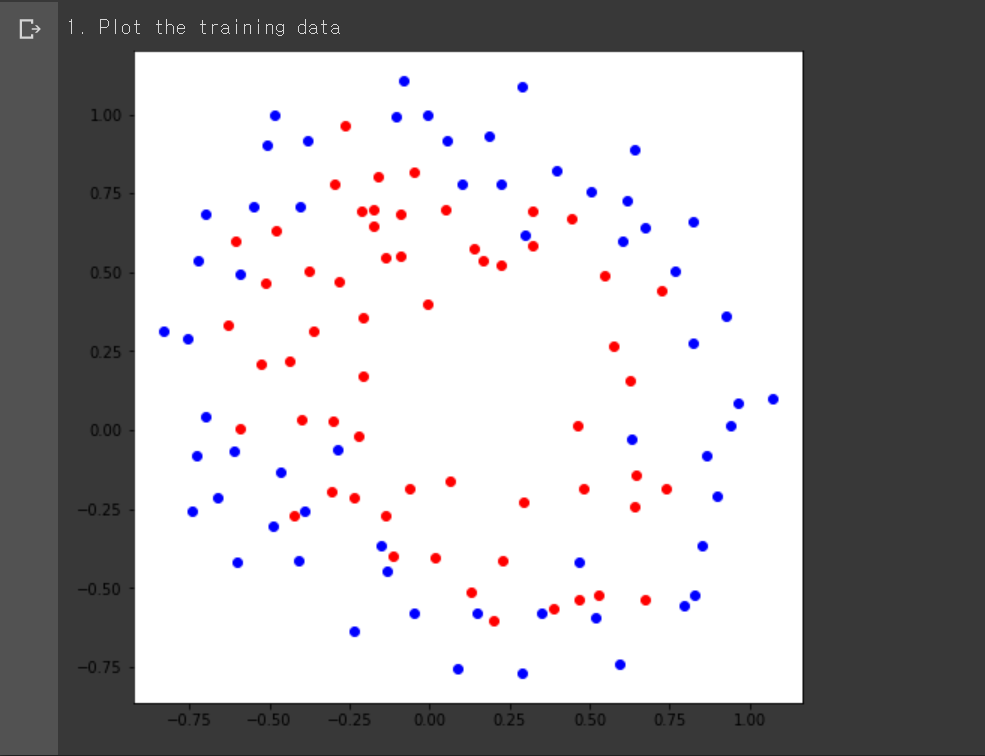
비선형 학습 데이터를 txt 파일로부터 불러와서 2차원에 표현한 그림이다. 비선형 데이터는 데이터를 하나의 선으로 구분할 수 없는 데이터로서, 위와 같은 그림에서 직선 하나로 빨간색 점과 파란색 점을 구분할 수 없는 경우를 말한다.
데이터는 각 행마다 을 가지고 있으며 각각 x좌표, y좌표, 해당 좌표의 레이블을 의미한다. 와 는 실수에 속하고 레이블은 에 속한다.
2. 논리 회귀 모델 정의
# nonlinear logistic regression.py
# 2. Logistic regression
# z=g(x,y;θ), where g is a high dimensional function and θ∈Rk
def sigmoid(z):
return 1 / (1 + np.exp(-z))
# 2. Logistic regression
# the dimension k of θ can be 16, but it can be less than that.
# you can choose k for the best performance
# k = 9
def g(x, y, theta):
return theta[0] + theta[1] * x * x + theta[2] * x + theta[3] * y * y + theta[4] * y \
+ theta[5] * sin(theta[6] * x) + theta[7] * cos(theta[8] * x)
# 2. Logistic regression
def dg_dtheta_k(x, y, k, theta):
if(k == 0):
return 1
elif(k == 1):
return x * x
elif(k == 2):
return x
elif(k == 3):
return y * y
elif(k == 4):
return y
elif(k == 5):
return sin(theta[6] * x)
elif(k == 6):
return theta[6] * theta[5] * cos(theta[6] * x)
elif(k == 7):
return cos(theta[8] * x)
elif(k == 8):
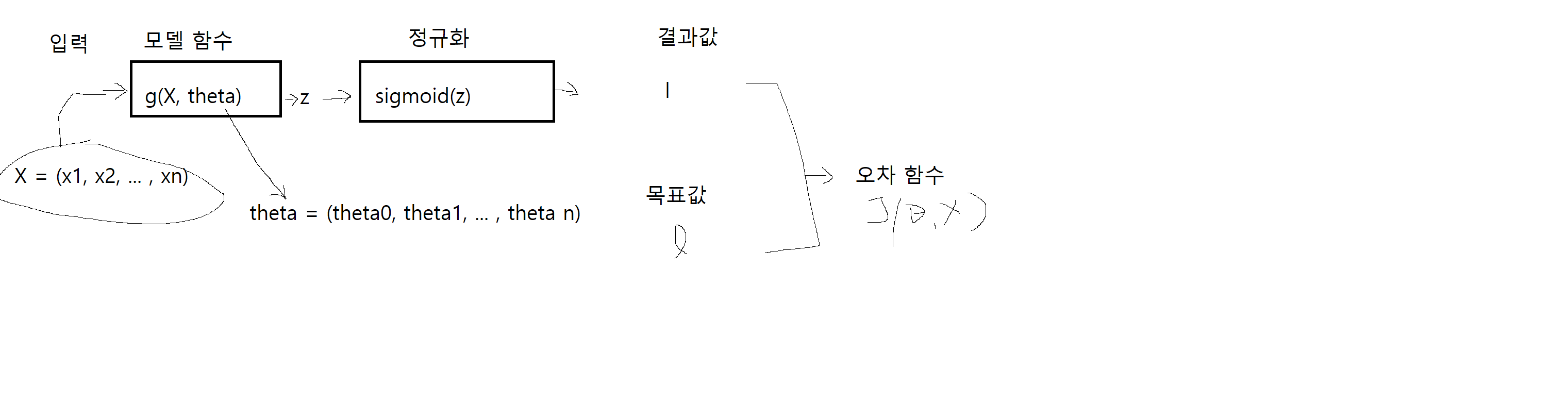
return -theta[7] * theta[8] * sin(theta[8] * x)여기는 실제로 데이터를 레이블로 분류하는 모델 함수를 설계하는 단계다. 이 함수를 잘 설계해야 데이터를 잘 분류할 수 있다. sigmoid 함수는 그저 모델 함수의 결과값을 정규화하는 역할을 할 뿐이다. 따라서 주어진 데이터를 잘 표현하는 방정식의 일반형을 선택하는 것이 중요하다.
where
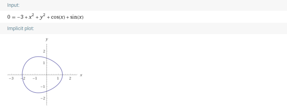
이번엔 타원 방정식에 삼각 함수를 섞은 형태를 모델 함수로 설정했다. 뭔가 타원 방정식만으론 주어진 데이터를 분류하기가 어려워보여서 타원 방정식에 삼각함수를 추가해 원 둘레에 굴곡을 줬다. 구체적인 일반형 식은 위와 같고, 위 그림은 모델 파라미터를 임의로 설정한 모델 함수를 Wolfram Alpha를 통해 대강 표현한 것이다.
3. 오차 함수 정의
# nonlinear logistic regression.py

# 3. Objective Function
def J(data, theta):
  sumation = 0
  for i in data:
    if(int(i[2]) == 0):
      sumation += -log(1 - sigmoid(g(i[0], i[1], theta)))
    elif(int(i[2]) == 1):
      sumation += -log(sigmoid(g(i[0], i[1], theta)))
  return (1 / len(data)) * sumation

# 3. Derivative of Objective Function
def dJ_dtheta_k(data, theta, k):
  sumation = 0
  for i in data:
    sumation += (sigmoid(g(i[0], i[1], theta)) - int(i[2])) * dg_dtheta_k(i[0], i[1], k, theta)
  return (1 / len(data)) * sumation
4. 경사하강법으로 모델 학습
# nonlinear logistic regression.py
def get_training_accuracy(data, theta):
correct = 0
for i in data:
if(g(i[0], i[1], theta) >= 0 and i[2] == 1 or g(i[0], i[1], theta) < 0 and i[2] == 0):
correct += 1
return correct / len(data)
# determine whether theta is converged
def is_converged(theta, next_theta):
for i in range(len(theta)):
if(not isclose(theta[i], next_theta[i])):
return False
return True
# 4. Gradient Descent
# you should choose a learning rate α in such a way that the convergence is achieved
learning_rate = 0.1
# you can use any initial conditions θk for all k
theta = np.array([-10, 0, 10, 2, 2, 2, 2, 2, 3], float)
# i-th training error J(θk), and training accuracy
J_i = [J(data, theta)]
training_accuracy = [get_training_accuracy(data, theta)]
# 5. Training
while True:
#for i in range(10000):
# find optimal parameters θ using the training data
next_theta = np.empty(9, float)
for k in range(len(theta)):
next_theta[k] = theta[k] - learning_rate * dJ_dtheta_k(data, theta, k)
# break the loop if parameters are converged
if(is_converged(theta, next_theta)):
break
# save the J(θk) at every iteration of gradient descent
J_i.append(J(data, theta))
training_accuracy.append(get_training_accuracy(data, theta))
# update the theta
theta = next_theta
print('Gradient Descent Step:', len(J_i))
print('Theta:', theta)x = range(len(J_i))
# 3. Plot the training error [3pt]
# plot the training error J(θk) at every iteration of gradient descent
# until convergence (in blue color)
print('3. Plot the training error [3pt]')
plt.figure(figsize=(8, 8))
plt.plot(x, J_i, color='blue')
plt.show()
# 4. Plot the training accuracy [3pt]
# plot the training accuracy at every iteration of gradient descent
# until convergence (in red color)
print('4. Plot the training accuracy [3pt]')
plt.figure(figsize=(8, 8))
plt.plot(x, training_accuracy, color='red')
plt.show()
# 5. Write down the final training accuracy [5pt]
# present the final training accuracy in number (%) at convergence
print('5. Write down the final training accuracy [5pt]')
print('The final training accuracy:', training_accuracy[-1] * 100, '%\n')
# 6. Plot the optimal classifier superimposed on the training data [5pt]
# plot the boundary of the optimal classifier at convergence (in green color)
# the boundary of the classifier is defined by {(x,y)∣σ(g(x,y;θ))=0.5}={(x,y)∣g(x,y;θ)=0}
print('6. Plot the optimal classifier superimposed on the training data [5pt]')
y,x=np.ogrid[-1.5:1.5:100j,-1.5:1.5:100j]
plt.figure(figsize=(8, 8))
equation = theta[0] + theta[1] * x * x + theta[2] * x + theta[3] * y * y + theta[4] * y \
+ theta[5] * np.sin(theta[6] * x) + theta[7] * np.cos(theta[8] * x)
plt.contour(x.ravel(),y.ravel(),equation, [0], colors='green')
# plot the training data points (x,y) with their labels l in colors superimposed on the illustration of the classifier
# (blue for label 0 and red for label 1)
plt.scatter(pointX0, pointY0, color='blue')
plt.scatter(pointX1, pointY1, color='red')
plt.show()
이유와 방법을 알려주는 메모장 겸 블로그 (Frontend, AI, 경제, 책)