
1. Flex Panel Gallery
- css flex 속성을 이용하여 요소 배치 및 동작
- 화면 클릭 시 해당 구역이 커지거나 작아지는 애니메이션 동작 처리
2. 전체 코드
<!DOCTYPE html>
<html lang="en">
<head>
<meta charset="UTF-8">
<title>Flex Panels 💪</title>
<link href='https://fonts.googleapis.com/css?family=Amatic+SC' rel='stylesheet' type='text/css'>
</head>
<body>
<style>
html {
box-sizing: border-box;
background: #ffc600;
font-family: 'helvetica neue';
font-size: 20px;
font-weight: 200;
}
body {
margin: 0;
}
*,
*:before,
*:after {
box-sizing: inherit;
}
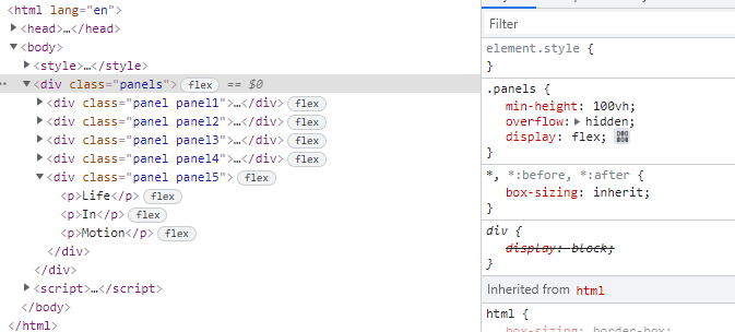
.panels {
min-height: 100vh;
overflow: hidden;
display: flex;
}
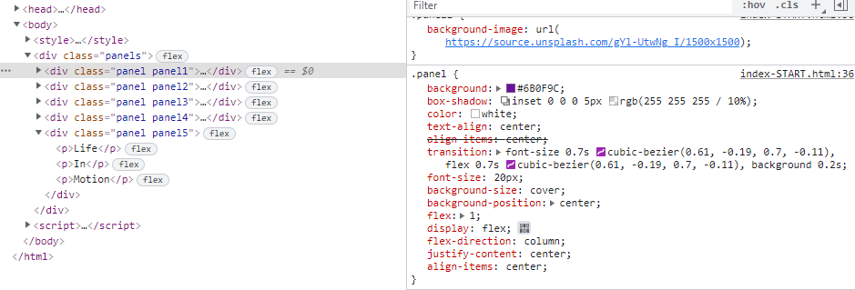
.panel {
background: #6B0F9C;
box-shadow: inset 0 0 0 5px rgba(255, 255, 255, 0.1);
color: white;
text-align: center;
align-items: center;
/* Safari transitionend event.propertyName === flex */
/* Chrome + FF transitionend event.propertyName === flex-grow */
transition:
font-size 0.7s cubic-bezier(0.61, -0.19, 0.7, -0.11),
flex 0.7s cubic-bezier(0.61, -0.19, 0.7, -0.11),
background 0.2s;
font-size: 20px;
background-size: cover;
background-position: center;
flex: 1;
display: flex;
flex-direction: column;
justify-content: center;
align-items: center;
}
.panel1 {
background-image: url(https://source.unsplash.com/gYl-UtwNg_I/1500x1500);
}
.panel2 {
background-image: url(https://source.unsplash.com/rFKUFzjPYiQ/1500x1500);
}
.panel3 {
background-image: url(https://images.unsplash.com/photo-1465188162913-8fb5709d6d57?ixlib=rb-0.3.5&q=80&fm=jpg&crop=faces&cs=tinysrgb&w=1500&h=1500&fit=crop&s=967e8a713a4e395260793fc8c802901d);
}
.panel4 {
background-image: url(https://source.unsplash.com/ITjiVXcwVng/1500x1500);
}
.panel5 {
background-image: url(https://source.unsplash.com/3MNzGlQM7qs/1500x1500);
}
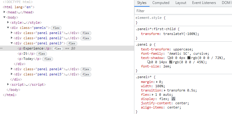
/* Flex Children */
.panel>* {
margin: 0;
width: 100%;
transition: transform 0.5s;
flex: 1 0 auto;
display: flex;
justify-content: center;
align-items: center;
}
.panel>*:first-child {
transform: translateY(-100%);
}
.panel.open-active>*:first-child {
transform: translateY(0);
}
.panel>*:last-child {
transform: translateY(100%);
}
.panel.open-active>*:last-child {
transform: translateY(0);
}
.panel p {
text-transform: uppercase;
font-family: 'Amatic SC', cursive;
text-shadow: 0 0 4px rgba(0, 0, 0, 0.72), 0 0 14px rgba(0, 0, 0, 0.45);
font-size: 2em;
}
.panel p:nth-child(2) {
font-size: 4em;
}
.panel.open {
flex: 5;
font-size: 40px;
}
</style>
<div class="panels">
<div class="panel panel1">
<p>Hey</p>
<p>Let's</p>
<p>Dance</p>
</div>
<div class="panel panel2">
<p>Give</p>
<p>Take</p>
<p>Receive</p>
</div>
<div class="panel panel3">
<p>Experience</p>
<p>It</p>
<p>Today</p>
</div>
<div class="panel panel4">
<p>Give</p>
<p>All</p>
<p>You can</p>
</div>
<div class="panel panel5">
<p>Life</p>
<p>In</p>
<p>Motion</p>
</div>
</div>
<script>
const panels = document.querySelectorAll('.panel');
function toggleOpen() {
this.classList.toggle('open');
}
function toggleActive(e) {
console.log(e.propertyName)
if(e.propertyName.includes('flex')){
this.classList.toggle('open-active')
}
}
panels.forEach(panel => panel.addEventListener('click',toggleOpen));
panels.forEach(panel => panel.addEventListener('transitionend',toggleActive));
</script>
</body>
</html>3. 동작 순서
- panel 요소에서
addEventListner로 click 감지 및 toggleOpen 함수 호출- toggleOpen 함수에서 해당 panel(this)의 classList.togggle 상태 변경
- panel 요소에서
addEventListner로 transitionend 감지 및 toggleActive 함수 호출
transitionend: transition 완료 감지- toggleActive 함수에서 해당 panel(this)의 classList.togggle 상태 변경
4. HTML, CSS
flex
- https://css-tricks.com/snippets/css/a-guide-to-flexbox/ 참조
flex: 하나의 플렉스 아이템이 자신의 컨테이너가 차지하는 공간에 맞추기 위해 크기를 키우거나 줄이는 방법을 설정하는 속성
display: flex: 해당 div에 flex를 적용함을 의미
flex: 1: 1 속성으로 자식 요소의 크기 확장함flex-direction: column: flex요소 진열방향을 종열로 변경justify-content: center: space-between 속성으로 자식 요소를 일정한 간격으로 정렬align-items: center: center 속성으로 자식 요소를 교차축의 중앙에 정렬

선택자
>자식 결합자
: 첫 번째 요소의 바로 아래 자식인 노드를 선택*전체 선택자
: 문서 내의 모든 요소.panel>* { margin: 0; width: 100%; transition: transform 0.5s; flex: 1 0 auto; display: flex; justify-content: center; align-items: center; }==> panel 요소 아래 모든 노드
5. JAVASCRIPT
Element.classList.toggle
toggle: 전등 스위치를 껐다 켰다 하는 행위 처럼, 0과 1이 반복되는 행위를 의미- 기존 값이 0이었다면 1로 바뀌고 기존 값이 1이었다면, 0으로 바뀜
- add()와 remove() 메서드가 합쳐진 개념
    function toggleOpen() {
      this.classList.toggle('open');
    }
    function toggleActive(e) {
      console.log(e.propertyName)
      if(e.propertyName.includes('flex')){
        this.classList.toggle('open-active')
      }
    }

프로그래머를 꿈꾸는 코더