Chapter1. Component Driven Development
Chapter2. CDD 개발 도구
Chapter3. useRef
1.후기
멍청인가?
2.새롭게 알게 된 것
<Chapter1. Component Driven Development>
1.CDD
부품 단위로 UI 컴포넌트를 만들어 나가는 개발(상향식 개발)
2.CSS-in-JS
자바스크립트 코드에서 CSS를 작성하는 방식
1) 구조화된 CSS의 필요성
-프로젝트의 규모나 복잡도가 점점 커지고 함께 작업해야 할 팀원 수도 많아짐
-다양한 디바이스들의 등장으로 더 복잡해진 CSS
2) 발전
CSS-in-CSS -> CSS 전처리기 등장(SASS) -> 다른 방법론 등장(ex.BEM) -> 컴포넌트 기반의 방식 등장(ex.Styled-Component)
-특징, 장단점

CSS-in-CSS: 상태에 맞는 스타일을 전부 미리 만들어두기 때문에, 상태가 변하면 만들어둔 스타일을 바로 적용 가능(적용 빠름)
CSS-in-JS: 상태가 변경되면 자바스크립트의 CSS 코드를 읽어와 파싱하는 단계부터 시작(적용 느림), class 명이 빌드 시 유니크한 해시값으로 변경되기 때문에 별도의 명명 규칙이 필요하지 않음.
CSS-in-JS를 사용하면 class 명이 빌드 시 유니크한 해시값으로 변경되기 때문에 별도의 명명 규칙이 필요하지 않습니다.
-SASS

-BEM
요소.
Block, Element, Modifier로 구분하여 클래스 작성
block: 전체를 감싸고 있는 블럭 요소
element: 블럭이 포함하고 있는 한 조각
modifier: 블럭 또는 요소의 속성(블록이나 엘리먼트의 외관이나 상태를 변화가능하게 하는 부분)
작성법.
Element는 두 개의 언더바, Modifier는 두 개의 대쉬로 구분
.block{}
.block__element{}
.block--modifier{}
.block__element--modifier{}
예시.
.header__navigation--navi-text {
	color: red;
}
<Chapter2. CDD 개발 도구>
1.Styled Components
CSS in JS 라는 개념이 대두되면서 나온 라이브러리. React로 HTML, JS는 한 파일이 되었지만 CSS는 그렇지 못했다는 점에서 출발한 개념.

1) Styled Components 설치하기
-터미널
# with npm
$ npm install --save styled-components

# with yarn
$ yarn add styled-components
-package.json
{
  "resolutions": {
    "styled-components": "^5"
  }
}
-CSS를 적용하고 싶은 파일
import styled from "styled-components"2) Styled Components 문법
-컴포넌트 만들기
컴포는트이므로 이름의 첫 글자 대문자로 설정
템플릿 리터럴(``) 사용
// 형식(컴포넌트 밖에서 선언)
const 컴포넌트이름 = styled.태그종류`
	CSS속성1: 속성값;
	CSS속성2: 속성값;
`;

//예시
const BlueButton = styled.button`
	background-color: blue;
	color: white;
`;
-컴포넌트를 재활용해서 새로운 컴포넌트 만들기(태그 종류 작성 안함)
// 형식
const 새로운 컴포넌트이름 = styled(재사용할 컴포넌트)`
	추가할 CSS속성1: 속성값;
	추가할 CSS속성2: 속성값;
`;

//예시
const BlueButton = styled.button`
	background-color: blue;
	color: white;
`;

const NewBlueButton = styled(BlueButton)`
	padding: 10px;
	margin-top: 10px;
`;

// NewBlueButton 결과
const NewBlueButton = styled.button`
	background-color: blue;
	color: white;
	padding: 10px;
	margin-top: 10px;
`;
-적용하기
원래 태그 대신 스타일 컴포넌트를 사용
// 스타일 컴포넌트 적용
function 적용할컴포넌트() {
	return(
    	<스타일컴포넌트이름>생략</스타일컴포넌트이름>
    )
}

// 예시
function App() {
	return(
    	<Bluebutton>버튼입니다</BlueButton>
    )
}
-Props 활용하기
// <Props로 조건부 렌더링하기>
// <button skyblue> -> 배경색 blue
// <button> -> 배경색 red
const Button = style.button`
	backgroud:${(props) => props.skyblue?"blue":"red"}
`;

// <Props 값으로 렌더링하기>
// 예시1. 삼항연산자 활용
// <button color = "orange"> -> 배경색 orange
// <button> -> 배경색 red
const Button = style.button`
	backgroud:${(props) => props.color?props.color:"red"}
`;
// 예시2. OR 연산자 활용
// <button color = "orange"> -> 배경색 orange
// <button> -> 배경색 red
const Button = style.button`
	backgroud:${(props) => props.color || "red"}
`;
-전역 스타일 설정하기
// 새 파일
import { createGlobalStyle } from "styled-components";

const 전역컴포넌트이름 = createGlobalStyle`
	태그종류 {
		CSS속성1: 속성값;
		CSS속성2: 속성값;
	}
`;

export default 전역컴포넌트이름;

// 최상위 컴포넌트 파일
import styled from "styled-components";
import 전역컴포넌트이름 from "경로";

function 최상위컴포는트() {
	return (
		<>
			<전역컴포넌트이름 />
			... 생략 ...
		</>
	);
}
-hover 이벤트 주기
&:hover{} 사용
// 배경색 blue -> hover시 배경색 red
const BlueButton = styled.button`
	background-color: blue;
	color: white;
	&:hover {
		background-color: red;
	}
`;
2.Storybook
1) 정의
React에서 CDD를 하기 위한 도구. 각각의 컴포넌트들을 따로 볼 수 있게 구성해 주어 한 번에 하나의 컴포넌트에서 작업할 수 있음.
2) 장점
-컴포넌트를 문서화
-자동으로 컴포넌트를 시각화하여 시뮬레이션할 수 있는 다양한 테스트 상태를 확인 가능
-버그 사전 방지
-테스트 및 개발 속도 향상
-애플리케이션을 의존성을 걱정하지 않고 빌드할 수 있음
3) 사용 이유
-Storybook은 기본적으로 독립적인 개발 환경에서 실행되므로 개발자는 애플리케이션의 다양한 상황에 구애받지 않고 UI 컴포넌트를 집중적으로 개발할 수 있음
-회사의 내부 개발자들을 위해 문서화를 하여 회사의 UI 라이브러리로써 사용
-외부 공개용 디자인 시스템을 개발하기 위한 기본 플랫폼으로 사용
4) 주요 기능
-UI 컴포넌트들을 카탈로그화하기
-컴포넌트 변화를 Stories로 저장하기
-핫 모듈 재 로딩과 같은 개발 툴 경험을 제공하기
-리액트를 포함한 다양한 뷰 레이어 지원하기
3) 설치
-React App 프로젝트 파일에서 명령어 입력
npx storybook init/.storybook 폴더, /src/stories 폴더 생성됨
/.storybook 폴더 -> Storybook 관련 설정 파일
/src/stories 폴더 -> Storybook 예시 파일
-storybook 실행
npx run storybooklocalhost:6006으로 접근하여 Storybook을 실행시킴
4) 사용법(Title.js 예시)
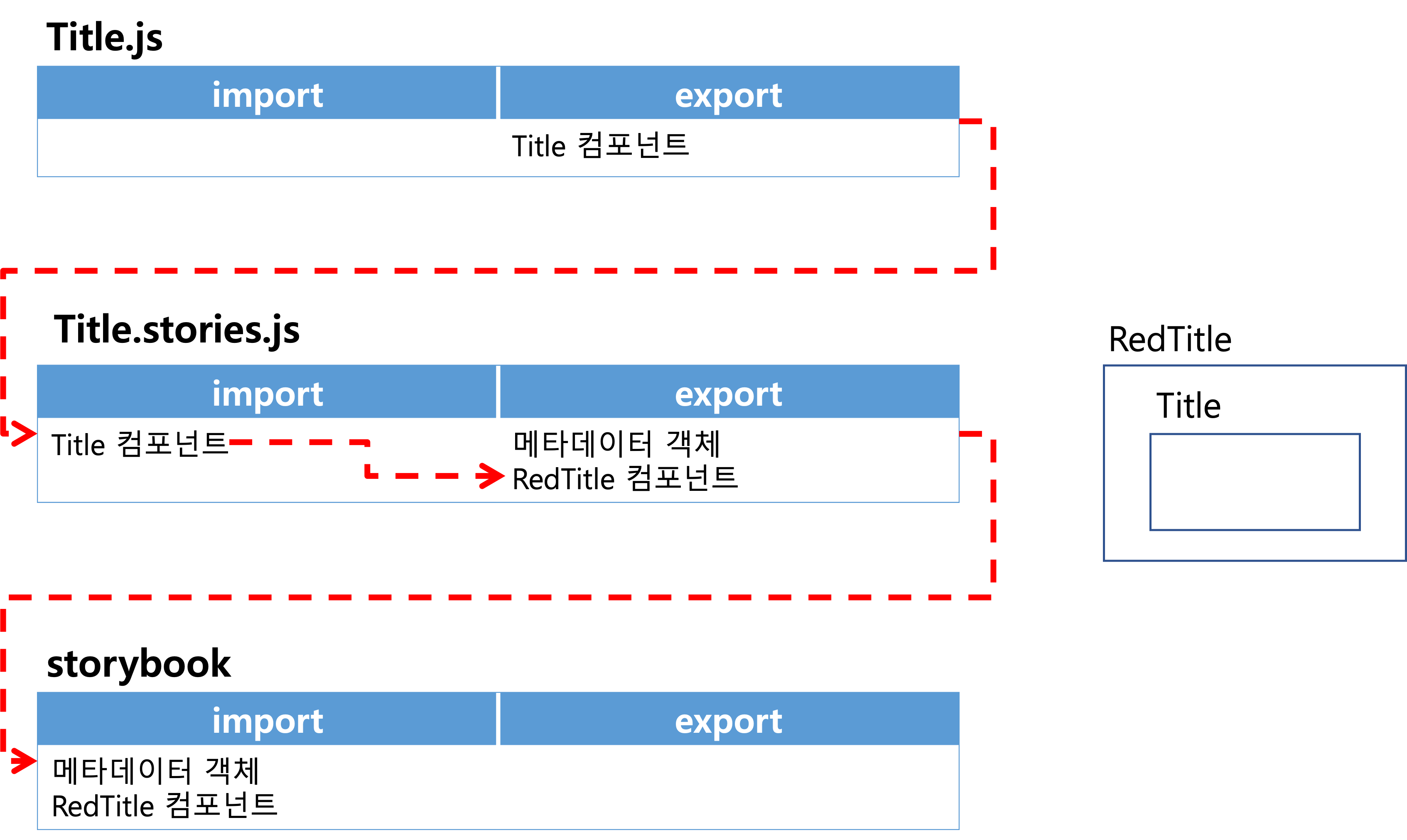
-src 폴더 안에 Title.js 파일 생성 후 Title 컴포넌트 작성
import React from "react";

const Title = ({title, textColor}) => (
<h1 style={{color: textColor}}>{title}</h1>
);

export default Title;
-src 폴더 안에 Title.stories.js 파일 생성
// 경우1. 전달 인자를 storybook에서 작성
import Title from "./Title";
export default {
title: "Practice/Title", // 카테고리화
component: Title, // 사용할 컴포넌트
argTypes: { // 해당 컴포넌트의 전달 인자 타입
title: { control: "text" },
textColor: {control: "text"}
}
}
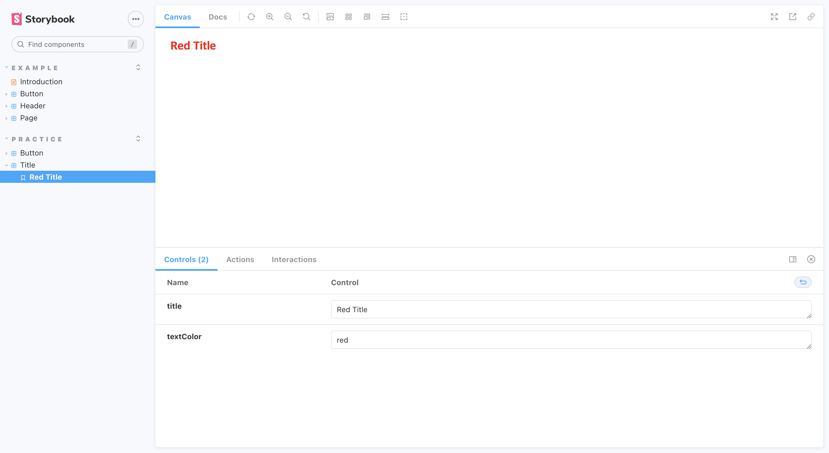
export const RedTitle = (args) => <Title {...args} />
// 경우2. 전달 인자를 js에서 작성
import Title from "./Title";

export default {
    title: "Practice/Title", // 카테고리화
    component: Title, // 사용할 컴포넌트
    argTypes: { // 해당 컴포넌트의 전달 인자 타입
        title: { control: "text" },
        textColor: {control: "text"}
    }
}

export const RedTitle = (args) => <Title {...args} />

RedTitle.args= {
    title: "Red Title",
    textColor: "red"
}
// 경우3. Template 사용
import Title from "./Title";

export default {
    title: "Practice/Title", // 카테고리화
    component: Title, // 사용할 컴포넌트
    argTypes: { // 해당 컴포넌트의 전달 인자 타입
        title: { control: "text" },
        textColor: {control: "text"}
    }
}

const Template = (args) => <Title {...args} />

// 컴포넌트.bind({}) -> 함수의 복사본을 만드는 표준 JavaScript의 한 기법
export const RedTitle = Template.bind({});
export const OrangeTitle = Template.bind({});
export const YellowTitle = Template.bind({});
export const GreenTitle = Template.bind({});
export const BlueTitle = Template.bind({});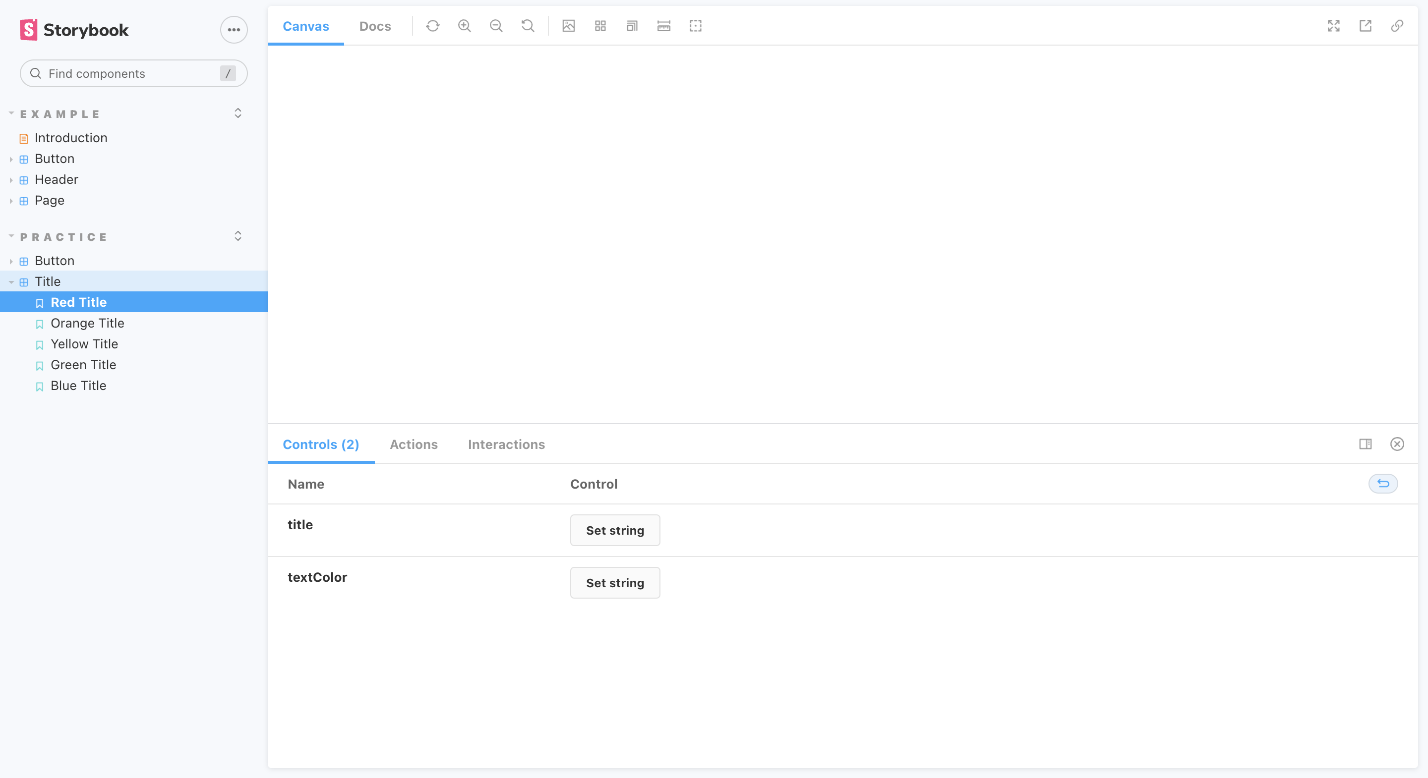
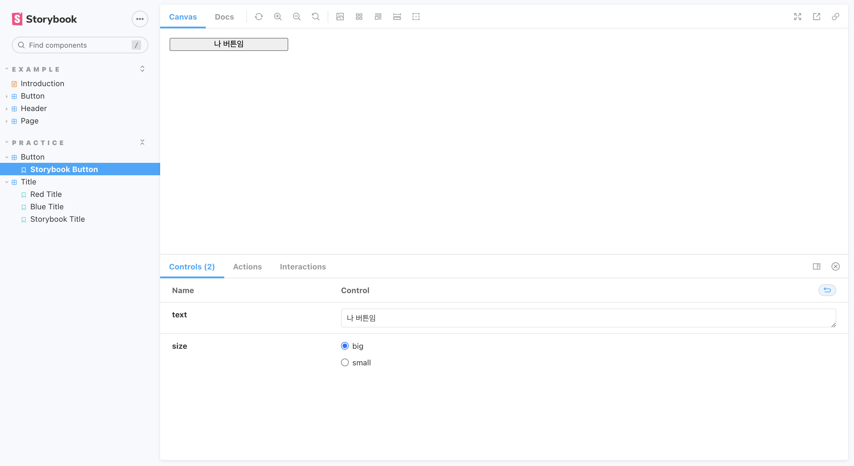
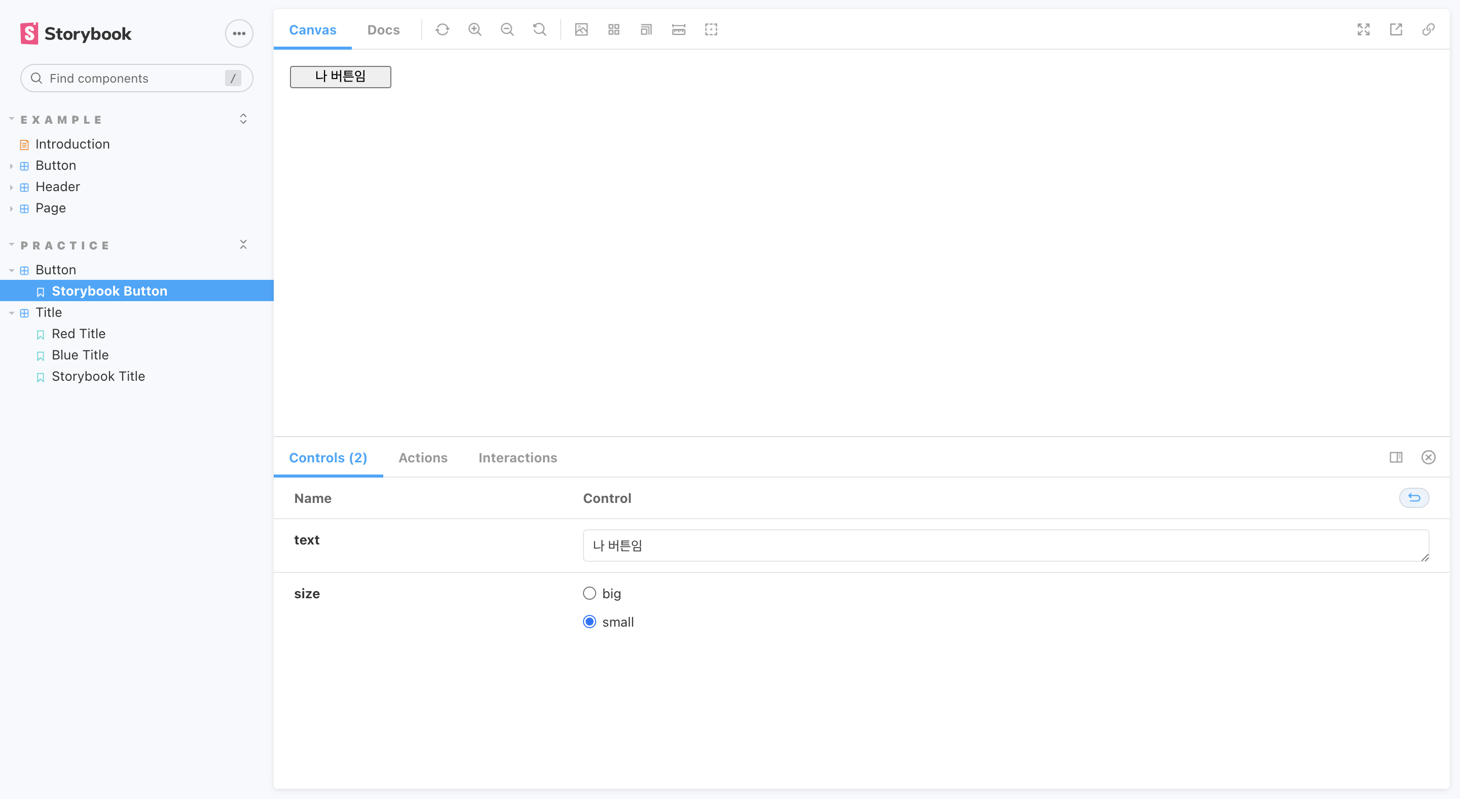
5) 메타데이터의 radio type
전달 인자: { control: { type:'radio', options : ['옵션1', '옵션2'] }}
// <Button.js>
import React from 'react';
import styled from 'styled-components';

const StyledButton = styled.button`
  width: ${(props) => (props.size === 'big' ? '200px' : '100px')};
`;

const Button = ({ size, text }) => (
  <StyledButton size={size}>
    {text}
  </StyledButton>
);

export default Button;

// <Button.stories.js>
import Button from "./Button";

export default {
    title: "Practice/Button",
    component: Button,
    argTypes: {
        size: { control: { type:'radio', options : ['big', 'small'] }},
        text: { control: 'text'}
    }
};

export const StorybookButton = (args) => (
    <Button {...args}></Button>
)

StorybookButton.args = {
  text: '나 버튼임',
};
<Chapter3. useRef>
1.useRef 역할
DOM 노드, 엘리먼트, React 컴포넌트 주소값을 참조
2.useRef를 사용해야 하는 경우
일반적으로, state가 변해도 re-rendering을 원치 않을 경우에 사용.
-focus
-text selection
-media playback
-애니메이션 적용
-d3.js, greensock 등 DOM 기반 라이브러리 활용
위의 상황 제외한 대부분의 경우는 기본 React 문법을 벗어나거나 React의 선언형 프로그래밍 원칙과 배치되기 때문에, 남용 금지.
3.특징
useRef를 통해 DOM을 직접 조작시 리렌더링이 되지 않음.
ref 주소값은 컴포넌트가 re-render 되더라도 바뀌지 않음.
4.작성법
-useRef import하기
-주소값을 담을 변수 선언
const 변수이름 = useRef(초기값);
-참조하고자 하는 태그에 속성 추가
ref = {변수이름}
-변수이름.current로 해당 태그 참조 가능
import React, { useRef } from "react";

function TextInputWithFocusButton() {
  const inputEl = useRef(null);
  const onButtonClick = () => {
    console.log(inputEl.current) // <input ref={inputEl} type="text" />
    inputEl.current.focus();
  };
  return (
    <>
      <input ref={inputEl} type="text" />
      <button onClick={onButtonClick}>Focus the input</button>
    </>);
}
<기타>
1.상하좌우로 꽉 참
position: fixed;
top: 0
bottom: 0
left: 0;
right: 0;
2. event 함수
✅<input onKeyUp={addTags} />
✅<input onKeyUp={(e) => addTags(e)} />
❌<input onKeyUp={addTags()} />  // 함수가 아닌 결과값 할당
❌<input onKeyUp={addTags(e)} /> // 함수가 아닌 결과값 할당
❌<input onKeyUp={() => addTags()} /> // event 객체를 받는 매개변수가 없어 이벤트 실행 시 event 객체를 넘겨주지 못함(e.target, e.target.value 등 사용 불가(e가 undefined))
3.&연산자
현재 태그/클래스
4.상태 변경 조건
상태 변경 함수가 호출되어야 함 + 참조자료형이라면 주솟값 바뀌어야 함
5.onKeyUp
-에러 메세지
Warning: You provided a value prop to a form field without an onChange handler. This will render a read-only field. If the field should be mutable use defaultValue. Otherwise, set either onChange or readOnly.
⚠️onKeyUp + value -> value 읽기 전용
✅onKeyUp + defaultValue -> defaultValue 변경 가능
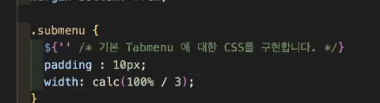
6.n등분으로 너비 설정