The how-it-works section is a component that is built in order to guide users step-by-step on how to use the service provided on the website. The main focus for this section will be to create a z-pattern which will display content in a zig-zag format.
On the HTML, we need to create a main container to fill up all the content for this section. Inside this container, there will be a lot of repeating code that will be displayed as a z-pattern structure.
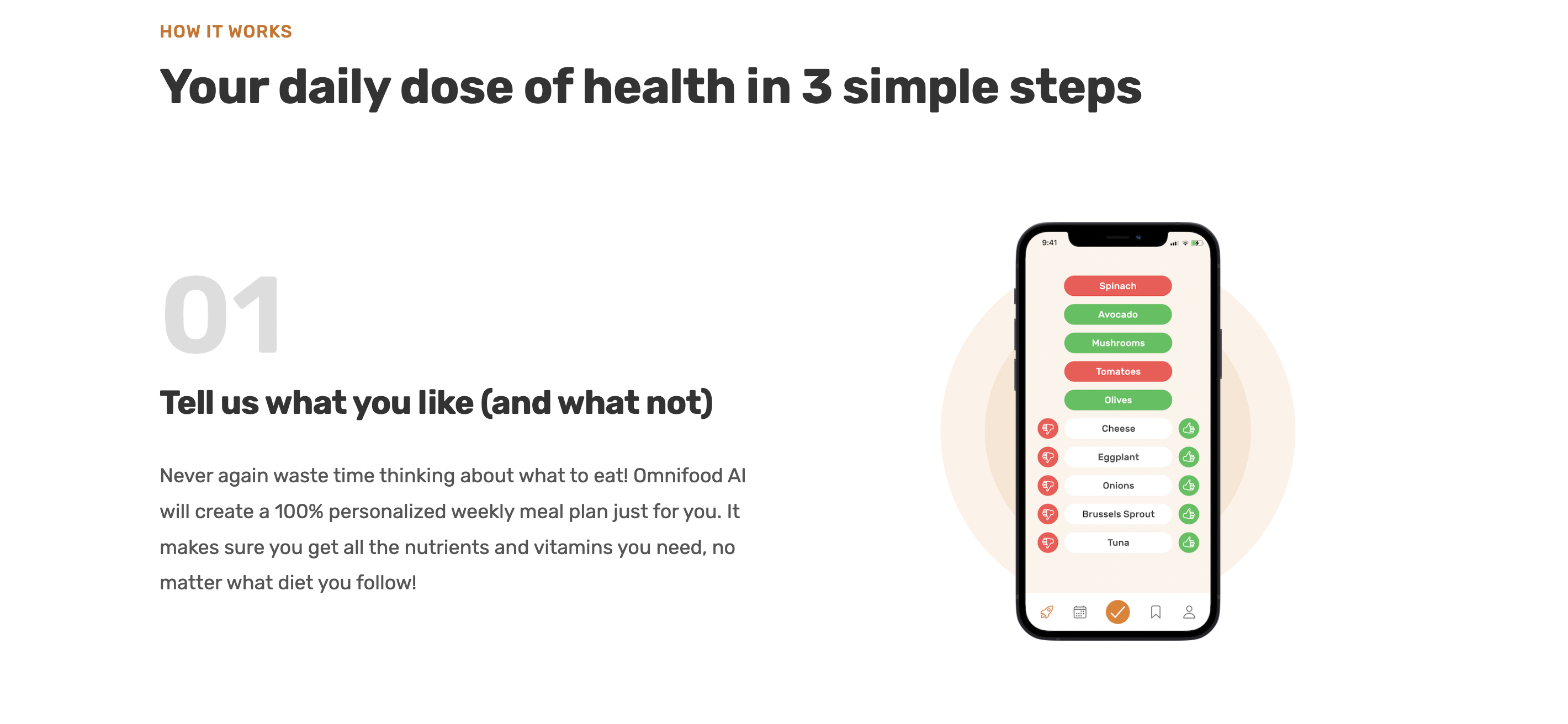
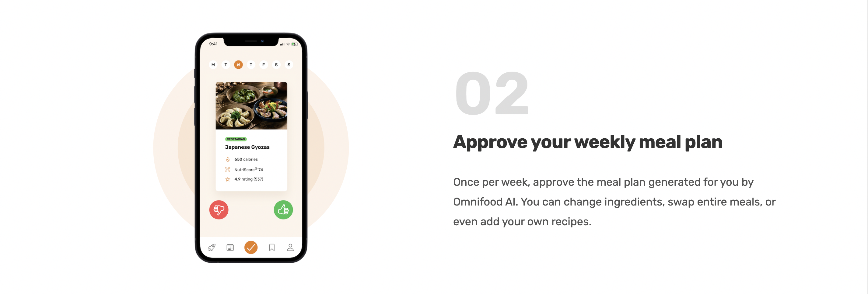
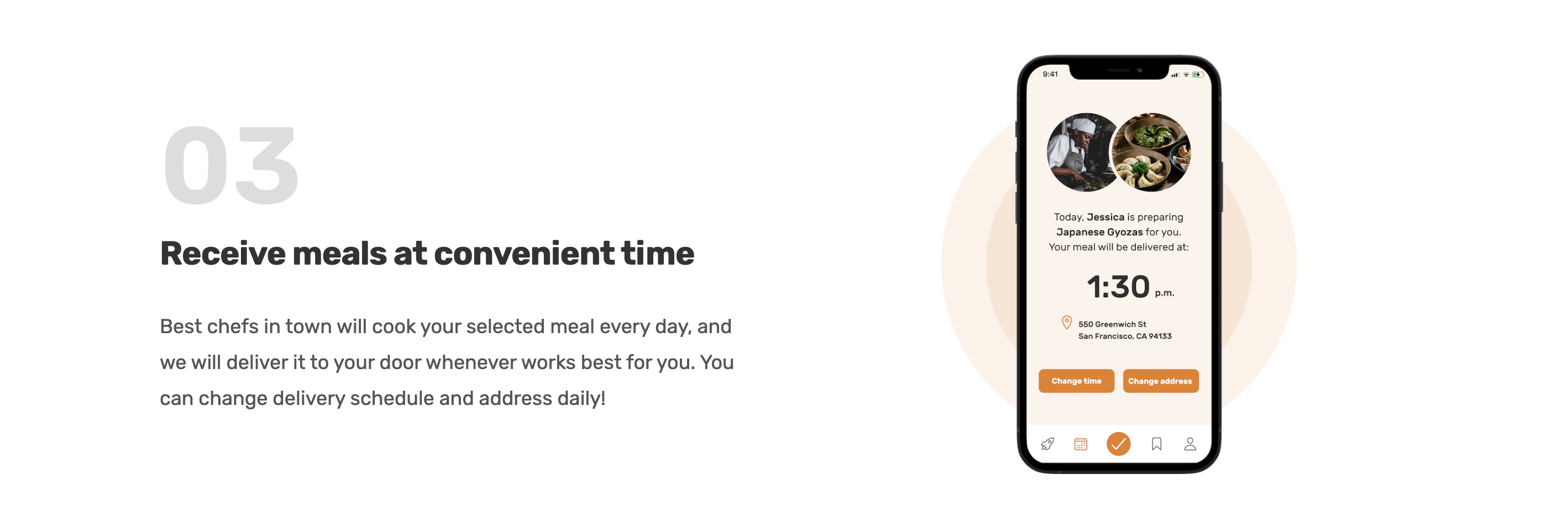
<div class="container grid grid--2-cols grid--center-v">
          <!-- STEP 01 -->
          <div class="step-text-box">
            <p class="step-number">01</p>
            <h3 class="heading-tertiary">
              Tell us what you like (and what not)
            </h3>
            <p class="step-description">
              Never again waste time thinking about what to eat! Omnifood AI
              will create a 100% personalized weekly meal plan just for you. It
              makes sure you get all the nutrients and vitamins you need, no
              matter what diet you follow!
            </p>
          </div>
          <div class="step-img-box">
            <img
              src="img/app/app-screen-1.png"
              class="step-img"
              alt="iPhone app preferences selection screen"
            />
          </div>
          <!-- STEP 02 -->
          <div class="step-img-box">
            <img
              src="img/app/app-screen-2.png"
              class="step-img"
              alt="iPhone app meal approving plan screen"
            />
          </div>
          <div class="step-text-box">
            <p class="step-number">02</p>
            <h3 class="heading-tertiary">Approve your weekly meal plan</h3>
            <p class="step-description">
              Once per week, approve the meal plan generated for you by Omnifood
              AI. You can change ingredients, swap entire meals, or even add
              your own recipes.
            </p>
          </div>
          <!-- STEP 03 -->
          <div class="step-text-box">
            <p class="step-number">03</p>
            <h3 class="heading-tertiary">Receive meals at convenient time</h3>
            <p class="step-description">
              Best chefs in town will cook your selected meal every day, and we
              will deliver it to your door whenever works best for you. You can
              change delivery schedule and address daily!
            </p>
          </div>
          <div class="step-img-box">
            <img
              src="img/app/app-screen-3.png"
              class="step-img"
              alt="iPhone app delivery screen"
            />
          </div>
        </div>
On CSS, we need to style all the spaces, fonts, and images to naturally fit the screen along with the overal webpage.
The most interesting part of this section is that the z-index property was used to display images in order. This z-index property is used by many developers to add images in stacks so that the webpage looks more interesting for users. This also naturally hides awkward leftover space between contents.
/***************************/
/* HOW-IT-WORKS SECTION */
/***************************/
.section-how {
  padding: 9.6rem 0;
}
.step-number {
  font-size: 9.8rem;
  font-weight: 600;
  color: #ddd;
  margin-bottom: 1.2rem;
}
.step-description {
  font-size: 1.8rem;
  line-height: 1.8;
}
.step-img-box {
  position: relative;
  display: flex;
  align-items: center;
  justify-content: center;
}
.step-img-box::before,
.step-img-box::after {
  content: "";
  display: block;
  border-radius: 50%;
  position: absolute;
  top: 50%;
  left: 50%;
  transform: translate(-50%, -50%);
}
.step-img-box::before {
  width: 60%;
  padding-bottom: 60%;
  background-color: #fdf2e9;
  z-index: -2;
}
.step-img-box::after {
  width: 45%;
  padding-bottom: 45%;
  background-color: #fae5d3;
  z-index: -1;
}
.step-img {
  width: 35%;
}