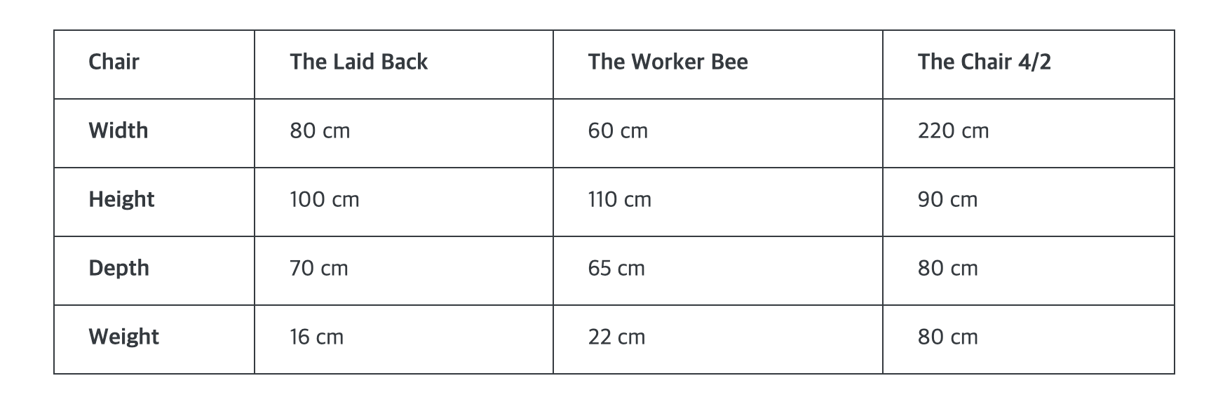
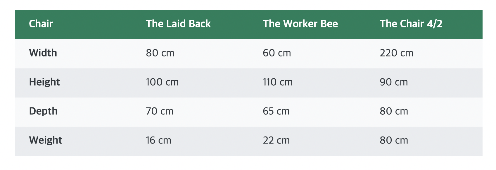
Although the table component is not used as commonly as other components, it is still important to know how to make one. There may be times when you might need to build a table for various purposes. For my own learning purposes, I attempted to clone-code an example of a table that can be seen on a web page.
As always, I followed the common process of creating html elements first. This time, however, I applied a special type of element that is used specifically for creating tables. After creating a simple table element, we can use the thead element to define the heading and the tbody element to define the body. Inside each of these elements, we can then add the tr tag to write text in table format. Again, inside each of these tr tags, we can use either the th or the td tags to add content. The 'th' tag makes the text weight bold without the use of the font-weight property in css while the 'td' text does not get any effect.
    <table>
      <thead>
        <tr>
          <th>Chair</th>
          <th>The Laid Back</th>
          <th>The Worker Bee</th>
          <th>The Chair 4/2</th>
        </tr>
      </thead>
      <tbody>
        <tr>
          <th>Width</th>
          <td>80 cm</td>
          <td>60 cm</td>
          <td>220 cm</td>
        </tr>
        <tr>
          <th>Height</th>
          <td>100 cm</td>
          <td>110 cm</td>
          <td>90 cm</td>
        </tr>
        <tr>
          <th>Depth</th>
          <td>70 cm</td>
          <td>65 cm</td>
          <td>80 cm</td>
        </tr>
        <tr>
          <th>Weight</th>
          <td>16 cm</td>
          <td>22 cm</td>
          <td>80 cm</td>
        </tr>
      </tbody>
    </table>

After adding all the content, I moved on to stylize my table so that it does not look so boring. Under the body property, I applied the flex property and set all the content to be positioned in the center horizontally. Additionally, I applied a border around the entire table.
      body {
        font-family: "Inter", sans-serif;
        color: #343a40;
        line-height: 1;
        display: flex;
        justify-content: center;
      }
      table {
        width: 800px;
        margin-top: 100px;
        font-size: 18px;
        border: 1px solid #343a40;
        border-collapse: collapse;
      }
For the td and th contents, I aligned everything to be positioned on the left in a linear order. Similarly, I added a border around all the contents. By the end, I also gave some padding to give some space for all the contents.
      td,
      th {
        /* border: 1px solid #343a40; */
        padding: 16px 24px;
        text-align: left;
      }

Since I was not going to use borders for my end product, I applied a special property called border-collapse and set it to collapse so that I can combine the all the borders into a single border.
border-collapse: collapse;

Lastly, I added colors to the table to finish this exercise. I gave a background-color for the table heading and I also used the nth-child property to specifically add colors on either the odd or even row for the body of the table. With this, I was able to complete my table 😀.
      thead th {
        background-color: #087f5b;
        color: #fff;
        width: 25%;
      }
      tbody tr:nth-child(odd) {
        background-color: #f8f9fa;
      }
      tbody tr:nth-child(even) {
        background-color: #e9ecef;
      }

Reference Code
<!DOCTYPE html>
<html lang="en">
  <head>
    <meta charset="UTF-8" />
    <meta http-equiv="X-UA-Compatible" content="IE=edge" />
    <meta name="viewport" content="width=device-width, initial-scale=1.0" />
    <link
      href="https://fonts.googleapis.com/css2?family=Roboto:wght@400;500;600;700&display=swap"
      rel="stylesheet"
    />
    <title>Table Component</title>
    <style>
      * {
        margin: 0;
        padding: 0;
        box-sizing: border-box;
      }
      body {
        font-family: "Inter", sans-serif;
        color: #343a40;
        line-height: 1;
        display: flex;
        justify-content: center;
      }
      table {
        width: 800px;
        margin-top: 100px;
        font-size: 18px;
        /* border: 1px solid #343a40; */
        border-collapse: collapse;
      }
      td,
      th {
        /* border: 1px solid #343a40; */
        padding: 16px 24px;
        text-align: left;
      }
      thead th {
        background-color: #087f5b;
        color: #fff;
        width: 25%;
      }
      tbody tr:nth-child(odd) {
        background-color: #f8f9fa;
      }
      tbody tr:nth-child(even) {
        background-color: #e9ecef;
      }
    </style>
  </head>
  <body>
    <table>
      <thead>
        <tr>
          <th>Chair</th>
          <th>The Laid Back</th>
          <th>The Worker Bee</th>
          <th>The Chair 4/2</th>
        </tr>
      </thead>
      <tbody>
        <tr>
          <th>Width</th>
          <td>80 cm</td>
          <td>60 cm</td>
          <td>220 cm</td>
        </tr>
        <tr>
          <th>Height</th>
          <td>100 cm</td>
          <td>110 cm</td>
          <td>90 cm</td>
        </tr>
        <tr>
          <th>Depth</th>
          <td>70 cm</td>
          <td>65 cm</td>
          <td>80 cm</td>
        </tr>
        <tr>
          <th>Weight</th>
          <td>16 cm</td>
          <td>22 cm</td>
          <td>80 cm</td>
        </tr>
      </tbody>
    </table>
  </body>
</html>
