A carousel in UI Design allow multiple pieces of content to occupy a single component. Today, almost everyone uses handheld devices such as a smartphone or a tablet pc to scroll past various content. As such, knowing how to create a carousel in a web page can be very advantageous as it offers good navigation for users to access contents.
Carousels possesses the following traits:
- appears toward the top of the main page.
- displays more than one piece of content in the same place (one at a time).
- shows indication that there is more than one piece of featured content within the carousel (ex. arrow navigation).
- contains imaages and some form of text on the side.
- includes important information such as the organization's brand or mission.
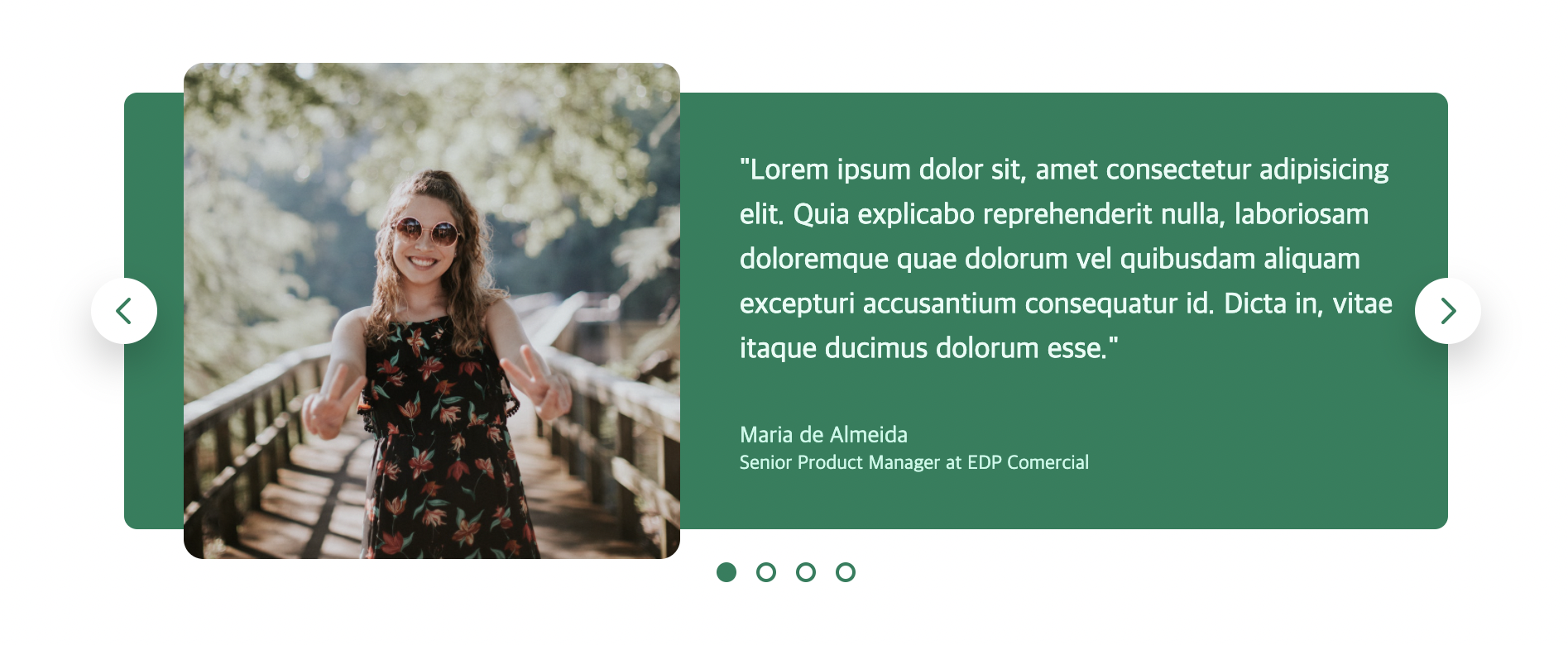
Using the fundamentals of HTML and CSS, I attempted to create a practice carousel component which is taught in one of my udemy courses. As always, it is important to start with the smallest elements and gradually build up to the entire component itself.
First I added all the text and image needed on the HTML section. Then I added colors and background-colors needed by creating a separate css section on the html page. The arrow shaped icons were used from 'opencolors' which is free on the internet.
Now that I have all the content, I just had to adjust the sizing to my preferences. For the whole component, I applied flexbox to structure all the elements by aligning them both vertically and horizontally to the center.
.carousel {
        width: 800px;
        margin: 100px auto;
        background-color: #087f5b;
        padding: 32px 32px 32px 86px;
        border-radius: 8px;
        position: relative;
        display: flex;
        align-items: center;
        gap: 86px;
      }
Additionally, the buttons were adjusted so that they may look natural with the overall content. I added border-radius the make the shape round, changed the color of the icon, and added a bit of shadow to its surroundings using box-shadow. For this part, I used the transform property where I was able to adjust the position of the button with greater detail. I also used absolute positioning for the buttons so that I can freely position them anywhere on the entire component.
.btn {
        background-color: #fff;
        border: none;
        height: 40px;
        width: 40px;
        border-radius: 50%;
        position: absolute;
        box-shadow: 0 12px 24px rgba(0, 0, 0, 0.2);
        cursor: pointer;
        display: flex;
        align-items: center;
        justify-content: center;
      }
      .btn--left {
        /* In relation to PARENT ELEMENT */
        left: 0;
        top: 50%;
        /* In relation to ELEMENT ITSELF */
        transform: translate(-50%, -50%);
      }
      .btn--right {
        right: 0;
        top: 50%;
        transform: translate(50%, -50%);
      }
      .btn-icon {
        height: 24px;
        width: 24px;
        stroke: #087f5b;
      }
Finally, I needed to create dots that represented the current order of the content displayed on the page when the arrow buttons were clicked. The process was similar as before.
// HTML <div class="dots"> <button class="dot dot--fill"> </button> <button class="dot"> </button> <button class="dot"> </button> <button class="dot"> </button> </div>// CSS .dots { position: absolute; left: 50%; bottom: 0; transform: translate(-50%, 32px); display: flex; gap: 12px; } .dot { height: 12px; width: 12px; background-color: #fff; border: 2px solid #087f5b; border-radius: 50%; cursor: pointer; } .dot--fill { background-color: #087f5b; }
Reference Code
<!DOCTYPE html> <html lang="en"> <head> <meta charset="UTF-8" /> <meta http-equiv="X-UA-Compatible" content="IE=edge" /> <meta name="viewport" content="width=device-width, initial-scale=1.0" /> <link href="https://fonts.googleapis.com/css2?family=Roboto:wght@400;500;600;700&display=swap" rel="stylesheet" /> <title>Carousel Component</title> <style> * { margin: 0; padding: 0; box-sizing: border-box; } body { font-family: "Inter", sans-serif; color: #343a40; line-height: 1; } .carousel { width: 800px; margin: 100px auto; background-color: #087f5b; padding: 32px 32px 32px 86px; border-radius: 8px; position: relative; display: flex; align-items: center; gap: 86px; } img { height: 200px; border-radius: 8px; transform: scale(1.5); box-shadow: 0 12px 24px rgba(0, 0, 0, 0, 0.25); } .testimonial-text { font-size: 18px; font-weight: 500; line-height: 1.5; margin-bottom: 32px; color: #e6fcf5; } .testimonial-author { font-size: 14px; margin-bottom: 4px; color: #c3fae8; } .testimonial-job { font-size: 12px; color: #c3fae8; } .btn { background-color: #fff; border: none; height: 40px; width: 40px; border-radius: 50%; position: absolute; box-shadow: 0 12px 24px rgba(0, 0, 0, 0.2); cursor: pointer; display: flex; align-items: center; justify-content: center; } .btn--left { /* In relation to PARENT ELEMENT */ left: 0; top: 50%; /* In relation to ELEMENT ITSELF */ transform: translate(-50%, -50%); } .btn--right { right: 0; top: 50%; transform: translate(50%, -50%); } .btn-icon { height: 24px; width: 24px; stroke: #087f5b; } .dots { position: absolute; left: 50%; bottom: 0; transform: translate(-50%, 32px); display: flex; gap: 12px; } .dot { height: 12px; width: 12px; background-color: #fff; border: 2px solid #087f5b; border-radius: 50%; cursor: pointer; } .dot--fill { background-color: #087f5b; } </style> </head> <body> <div class="carousel"> <img src="maria.jpg" alt="Maria de Almeida" /> <blockquote class="testimonial"> <p class="testimonial-text"> "Lorem ipsum dolor sit, amet consectetur adipisicing elit. Quia explicabo reprehenderit nulla, laboriosam doloremque quae dolorum vel quibusdam aliquam excepturi accusantium consequatur id. Dicta in, vitae itaque ducimus dolorum esse." </p> <p class="testimonial-author">Maria de Almeida</p> <p class="testimonial-job">Senior Product Manager at EDP Comercial</p> </blockquote> <button class="btn btn--left"> <svg xmlns="http://www.w3.org/2000/svg" class="btn-icon" fill="none" viewBox="0 0 24 24" stroke="currentColor" <path stroke-linecap="round" stroke-linejoin="round" stroke-width="2" d="M15 19l-7-7 7-7" /> </svg> </button> <button class="btn btn--right"> <svg xmlns="http://www.w3.org/2000/svg" class="btn-icon" fill="none" viewBox="0 0 24 24" stroke="currentColor" <path stroke-linecap="round" stroke-linejoin="round" stroke-width="2" d="M9 5l7 7-7 7" /> </svg> </button> <div class="dots"> <button class="dot dot--fill"> </button> <button class="dot"> </button> <button class="dot"> </button> <button class="dot"> </button> </div> </div> </body> </html>

Thanks for your sharing. It is useful for me because I am developing minecraftle game