Conflicts Between Selectors
In HTML and CSS, we can use various kinds of selectors to efficiently add CSS properties onto HTML contents. But, if we make all the selectors to select the same element, what would happen? Long story short, all the rules would be applied. However, not all of the properties would be displayed on the content. This is where we can suspect that there is priority between the selectors we use for the same element. The id(#) selector would have the highest priority in CSS. Then, the class(.) would come after while the standard element(p, div, li, etc.) has the lowest priority. Remembering this rule helps us to choose selectors in various situation.
// Example Text
<p id="text" class="text">
  This is a text
</p>
// 1st Priority #text { font-size: 20px; }// 2nd Priority .text { font-size: 18px; }// 3rd Priority p { font-size: 22px; }
How Inheritance Work
We can apply 'prioritized selector' concept in inheritance. As the term speaks for itself, inheritance is simply the process of passing down CSS properties from the parent element to the child element. However, because of selectors, not all properties get inherited. Inheritance most include text properties(font-family, font-style, color, etc) and not the shape(border, padding, margin, content).
body {
  color: blue;
  font-size: 14px;
  font-family: sans-serif;
  border-top: 10px solid blue; // does not get inherited
}
h1 { color: green; // overwritten font-size: 32px; // overwritten text-transform: uppercase; }
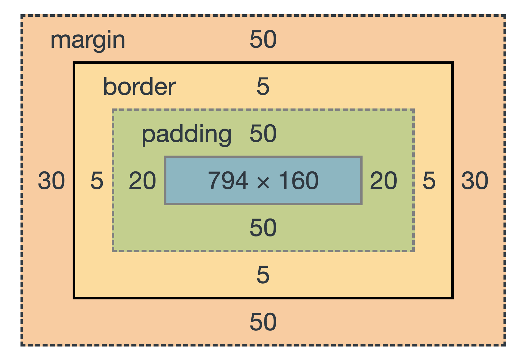
CSS Box Model
The Box Model is the most crucial concept in CSS for stylizing contents. We use the box model to create spacing within and between contents to make them look clean and nice on the browser. The five pieces that make up the box model are content, border, padding, margin, and fill area.
The content, as the name states, contains text, images, videos, and anything that can be visually displayed on the browser.
The border is a line around the content element. In the code, however, the border itself is still inside of the element.
The padding is an invisible space around the content. This too, is also inside of the content element.
The margin is the space outside of the element and between other content elements.
the fill area is a space that gets filled with background color or background image within the padding space.
Types of Boxes
Within the box model, there are two distinct types of boxes for each every element. The element can either be inside an inline box or a block-level box. Inline boxes are positioned side-by-side with another element in a single line. On the other hand, block-level boxes completely occupies the entire line for themselves and cannot stay side-by-side with another element. Additionally, there is also a box with a mix of both inline and block properties known as inline-block box. As the name states, the box share the two previous box properties at the same time. It displays as an inline on the outside, but acts as a block on the inside.
Inline Elements:
- Occupies only the space necessary for its content.
- Causes no line-breaks after or before the element.
- Box model applies in a different way: heights and widths do not apply.
- Paddings and margins are applied only horizontally (left and right)
- Elements: a, img, strong, em, button, etc.
Block-Level Elements:
- Elements are formatted visually as blocks.
- Elements occupy 100% of parent element's width, no matter the content.
- Elements are stacked vertically by default, one after another.
- The Box Model is applied normally.
- Elements: body, main, header, footer, section, nav, aside, div, h1-h6, p, ul, ol, li, etc.
Inline-Block Elements:
- Looks like inline from the outside, behaves like block-level on the inside.
- Occupies only content's space (inline).
- Causes no line-breaks (inline).
- Box-model is applied (block).
Absolute Positioning
Normally in the browser, all the elements are positioned in a certain states. Most of the time, the elements are set in a position known as the normal flow where elements are simply laid out according to their order in the HTML code. On the other hand, we can set the position of an element to absolute positioning where the element functions outside to that of the normal flow. We can set all these positions using CSS.
Normal Flow
- Default positioning.
- Element is "in flow".
- Elements are simply laid out according to their order in the HTML code.
Absolute Positioning
- Element is removed from the normal flow: "out of flow".
- No impact on surrounding elemments, might overlap them.
- We use top, bottom, left, or right to offset the element from its relatively positioned container.
Through the child-parent relationship within elements, we can create absolute positioning on any box. However, we only use absolute positioning for creating minor properties such as buttons because using it too much could lead to complex problems.
// normal flow
position: relative
// absolute positioning position: absolute
Pseudo-Elements
A pseudo-elment is a type of selector that lets you style a specific part of the selected element. This selector is unique as you do not need to create an element in order to select it from CSS. When using this selector, you can either change a CSS property of a specific element or add a completely new content entirely without the use of HTML.
// changing the first letter of every 'p' element.
p::first-letter {
  color: blue;
  font-family: sans-serif;
// changing the first line of every 'p' element. p::first-line { color: blue; font-family: sans-serif; }
3개의 댓글

CSS theories are about CSS rules. If you're just getting into CSS, or want to know more about CSS, the best place to start is a theory. Here you check this the house and building wash company and get more new things for gutter repairs. A lot of people tell me that they don't understand all the rules and whatnot when it comes to CSS, but really, if you can follow along with these theories there's no reason why you can't apply them in your own projects!

Really interesting read! I totally agree — web design plays such a critical role in how users perceive and interact with a site. Whether it’s calm and minimal or bold and energetic, design really does set the tone for user botoes experience.
Here you check this and get more new things for gutter repairs.