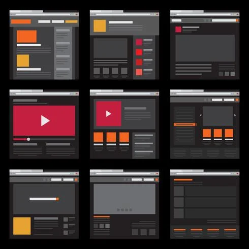
What are Layouts?
If you are trying to build a website using HTML and CSS, it is very crucial to know how to build layouts in webpages. Layout is the format in which text, images, and other content is placed and arranged on a webpage. Having a good layout gives the webpage a visual structure into which we place our content. We create layouts by arranging page elements into this visual structure instead of simply having them placed one after another.
Layout Types
When we enter a certain website in our browser, we first see the webpage as a whole structure. This overall structure is what is known as a page layout. Additionally, if we look closely at each component within the webpage, we see that all these components are made up of even smaller components within them. These smaller components are what is known as component layout. For front-end web developers, it is very important to understand how to build both page and component layouts.
3 Ways of Building Layouts
Currently, there are three known ways to building layouts with CSS. The first method is by using floats which is an old way of building layouts of all sizes, using the float CSS property. Although still used in some circumstances, it is not recommended. The second method is a new method called flexbox where we can lay out elements in a 1-dimensional row. This method is good for building component layouts. The final method is also a new method called CSS grid where we can lay out elments in a 2-dimensional grid. This method is good for building page layouts and complex components.

In our previous article 'Getting Started with CSS Grid,' we had a look at the basics of using CSS grid. Here you check this concrete layers waikato and get more new steps for concrete.Today, I'd like to demonstrate you how to use CSS grid to build website layouts or specifically the container of a website layout. It's all about nesting grids and the properties display: grid and justify-content: space-between . Let's get hands on!