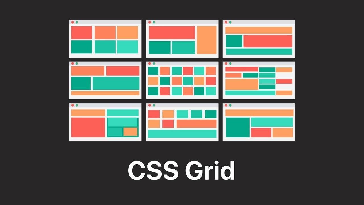
What is CSS Grid?
CSS Grid is a CSS property for building 2-dimensional layouts in webpages. The main purpose of CSS grid is that a container element can be divided into rows and columns which in turn can be filled with its child elements. CSS grid is very similar to flexbox where we are able to write less nested HMTL and easer-to-read CSS. However, it is important to not think that we can replace flexbox with CSS grid. Rather, the two properties work very well together and usage can vary depending on the situation. When we deal with 1D layout, we use flexbox. When we deal with 2D layout, we use CSS grid.
In order to activate CSS Grid, we use the display property and set its value to grid. This gives us control over setting rows and columns within a single parent container. For CSS Grid, the parent container is called a grid container while its child elements are called grid items. We use the grid-template-columns property for columns while we use the gird-template-rows property for rows. Unlike flexbox, we can also set gaps for rows and columns individually using the properties, column-gap and row-gap.
// activating CSS Grid property
display: grid;
// setting rows and columns grid-template-columns: 150px 150px; grid-template-rows: 100px 100px;// creating gaps between grid-item column-gap: 10px; row-gap: 40px;
Sizing Columns and Rows
One of the most useful features in CSS Grid is that we can flexibly size columns and rows within a container. For this feature, we use the fr unit instead of the px unit. Items that are set to the 'fr' unit divides the remaining space within their parent container according to their size and fills the whole space freely. Without specifying the width manually, this feature creates a width automatically. If there is an ambiguous space left within the container, we may use the auto keyword to fill the remaining container.
We can also use the repeat() method to size items with the 'fr' unit. All we need to do is fill in the size and the number of times we want to repeat the size.
// 'fr' unit
grid-template-columns: 1fr 1fr 1fr 1fr;
grid-template-rows: 1fr 1fr;
// 'fr' unit shortcut grid-template-columns: repeat(3, 1fr); grid-template-rows: repeat(2, 1fr);// automatically adjusting size: auto grid-template-columns: 1fr 1fr 1fr auto; grid-template-rows: 1fr auto;
Placing and Spanning Grid Items
Placing Grids
With CSS Grid, we are able to move grid items within a container from one location to another without the use of HTML elements. For this to work, we first need to look at the grid numbers on the container and how they are related to all the other elements within.
By using the '/' keyword along with the designated grid numbers, we can place items anywhere on the container. Additonaly, we use the properties grid-column and grid-row to be able to move items onto specific grid numbers.
grid-column: 2 / 3;
grid-row: 1 / 2;
Spanning Grids
To stretch the item in order to make it larger or longer, we simply write the grid number larger. This method is known as spanning.
grid-column: 2 / 4;
grid-row: 1 / 4;
In case we become too lazy to count grid numbers, we can literally use the span keyword to count the items as boxes.
grid-column: 2 / span 3;
grid-row: 1 / span 4;
The grid numbers are not limited to positive numbers. We can also use negative numbers to span grid items. For example, starting from 1 and ending with -1 would span a grid item all the way to the end.
grid-column: 1 / -1;
grid-row: 1 / -1;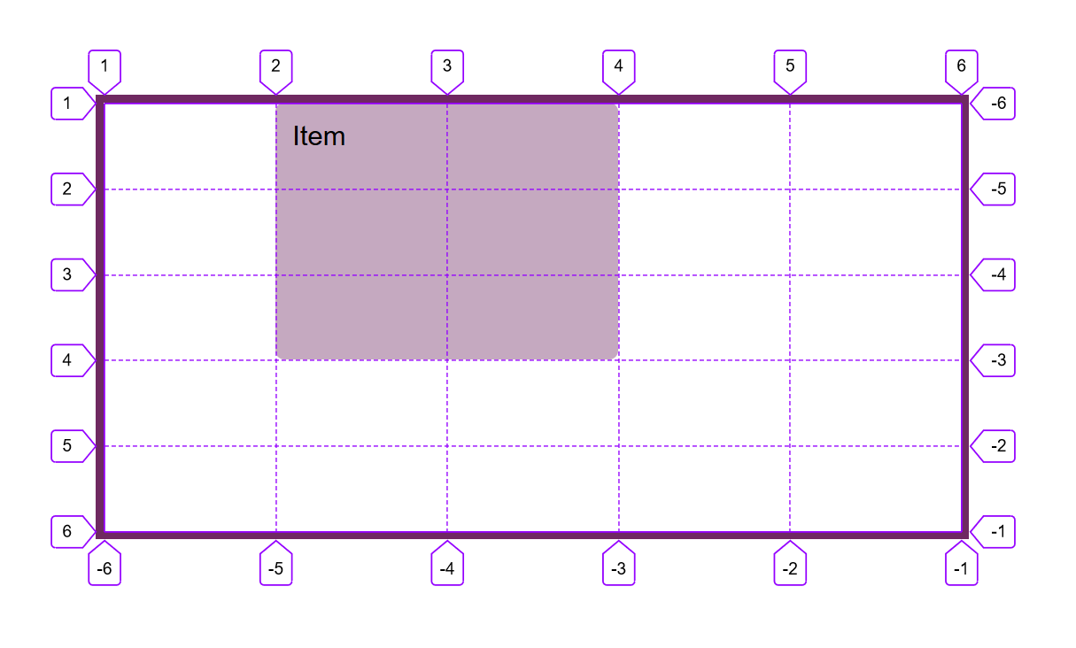
Aligning Grid Items
Unlike flexbox, we can align both the tracks and individual grid items within a parent container.
Aligning the tracks as a single group positions the entire grid items together to another location.
// aligning tracks within a container
align-content: center; // vertical alignment
justify-content: center; // horizontal alignment
As mentioned before, we can also align grid items individually. Just like flexbox, aligning items causes them to stretch automatically. This means that, unless there is a set size, the items only take just the required amount of space needed.
// aligning items within a cell
align-items: center;
align-items: start;
align-items: end;
justify-items: center;
justify-items: start;
justify-items: end;
We may also overlap our initial alignment by using the align-self and justify-self property.
align-self: end;
justify-self: end;
List of Useful CSS Grid Properties
Grid Container
// To establish the grid row and column tracks.
// One length unit for each track.
// Any unit can be used, new 'fr' fills unused space.
grid-template-rows: <track size>*;
grid-template-columns: <track size>*;
// To create empty space between tracks. row-gap: <length>; column-gap: <length>; gap: <length>;// To align items inside rows / columns (horizontally / vertically). justify-items: <stretch | center | start | end>; align-items: <stretch | center | start | end>;// To align entire grid inside grid container. // Only applies if container is larger than the grid. justify-content: <start | end | center>; align-content: <start | end | center>;
Grid Items
// To place a grid item into a specific cell, based on line numbers.
// Span keyword can be used to span an item across more cells.
grid-column: <start line>, <end line> | span <number>;
grid-row: <start line>, <end line> | span <number>;
// To overwrite justify-items / align-items for single items. justify-self: <stretch | center | start | end>; align-self: <stretch | center | start | end>;

CSS grid is the new kid on the block and every web designer worth their salt should know about it. I prefer to get stump removal and learn more new things about removal companies. This article is going to cover some of the most popular aspects of CSS grids and see how we can use this to build up some super cool layouts.