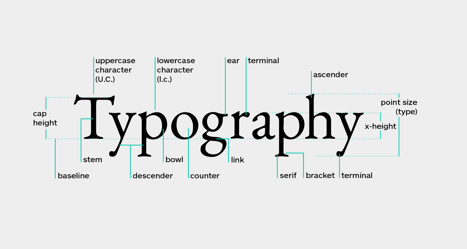
Typefaces
According to the standard definition, typography is the art and technique of arranging type to make written language legible, readable and appealing when displayed (src. Wikipedia). Choosing a font for text may take some time of thinking because even a slight change in text can change the atmosphere of the website as a whole.
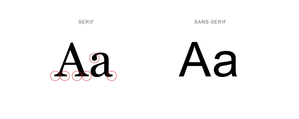
For most webpages, developers either use the classic serif typeface which has pointed edges or the modern sans-serif typeface. For beginners, however, it is recommended to use the sans-serif typeface because it is much easier to implement. Additionally, it is perfectly fine to use just one typeface for the entire webpage. Too much typefaces may create confusion for the users. As one becomes more experienced with web design, it is encouraged to experiment with various typefaces to see which fits the best on a website. Vast majority of typefaces can be found on the internet such as 'google fonts' and 'font squirrel'.
Sizes and Weights
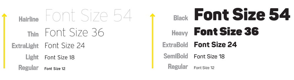
For good text design, it is very important to choose the right size and weight. Instead of just choosing any font that comes to mind, limiting choices may make the process much easier. For normal text, a font size between 16px and 32px is recommended. For long text (like a blog post), a font size of 20px or higher is recommended. For headlines, choosing the font size upto 50px or higher with a boldness of 600 or higher is recommened. All this may vary depending on the personality of the website. Lastly, for any text, don't use a font weight under 400.
Reading Experience
We always need to put much effort about how our website is viewed on the user's standpoint. As mentioned before, even minor changes can affect the overall atmosphere of the website. If we stretch the structure of the text too long, the user may lose interest quickly from reading the text further.
It is recommended to use less than 75 characters per text line within a text block. Additionally, normal-sized text uses a line height between 1.5 and 2 while big text go below 1.5. The rule of thumb is that the smaller or longer the text, the larger the line height needs to be.
Other Tips:
- Make sure to use letter-spacing (especially in headlines) if text look unnatural.
- For short titles, try using all caps with extra letter-spacing.
- If unnecessary, do not justify text.
- Don't center long text blocks. Small blocks are fine.
Web design is all about typography. In fact, it could be argued that a website's typography determines whether or not your visitors will take action on the site. I prefer to get https://plumberswestauckland.co.nz/ and learn more new steps for services. Typography is an art form and can be learned. There are some great resources online to help make your type design better. The best option is to work with a designer that knows how to use typography to make something visually appealing to read and engage visitors.