
Flex?
flex는 레이아웃을 만들 수 있는 다양한 방법 중 하나!
'남는 공간을 어떻게 차지할 것인가?'라고 이해하면 된다.
쉽게 말해 공간의 배치라고 할 수 있다.
flexbox는 flex container와 flex item으로 구성된다.
flex container는 flex item들을 감싸는 역할이고 flex item은 각각의 요소들이다.
👉 전체가 container, 각각의 요소가 item이라고 볼 수 있다.
Flex 적용하기!
<div class="container">flexbox</div>✔ display : flex; 적용하기
body {
  display: flex;
}
flex 레이아웃을 적용하기 위해선 display 속성을 flex로 값을 지정해 주어야 한다.
✔ 배치 방향 설정하기(flex-direction)
	flex-direction: row;
	flex-direction: column;
	flex-direction: row-reverse;
flex-direction: column-reverse;- row : 왼쪽 -> 오른쪽
- column : 위 -> 아래
- row-reverse : 오른쪽 -> 왼쪽
- column-reverse : 아래 -> 위
아이템들을 어떤 축으로 배열할 것인지 설정하는 속성이다.
row가 기본값이며 reverse가 붙으면 역순으로 바뀌게 된다.
✔ 줄넘김 설정하기(flex-wrap)
	flex-wrap: nowrap;
	flex-wrap: wrap;
flex-wrap: wrap-reverse;- nowrap : 줄바꿈 X
- wrap : 줄바꿈 O
- wrap-reverse : 역순으로 줄바꿈
창을 늘리거나 줄일때 컨텐츠 내용이 넘치는 경우가 있는데, 이럴때 줄바꿈을 설정할 수 있는 기능이다.
nowrap이 기본값이다.
✔ 수평축 방향 정렬하기(justify-content)
	justify-content: flex-start;
	justify-content: flex-end;
	justify-content: center;
	justify-content: space-between;
	justify-content: space-around;
justify-content: space-evenly;- flex-start : 가로배치일 경우 왼쪽, 세로배치일 경우 위로 정렬함
- flex-end : 가로배치일 경우 오른쪽, 세로배치일 경우 아래로 정렬함
- center : 가운데 정렬
- space-between : 아이템들 사이에 균일한 간격을 줌
- space-around : 아이템의 둘레에 균일한 간격을 줌
- space-evenly : 아이템들의 양 끝에 균일한 간격을 줌
flex의 item들을 수평축 방향으로 어떻게 정렬할지에 대한 기능들이다.
flex-start가 기본값이다.
✔ 수직축 방향 정렬하기(align-items)
	align-items: stretch;
	align-items: flex-start;
	align-items: flex-end;
	align-items: center;
align-items: baseline;- stretch : 수직축으로 늘어남
- flex-start : 가로배치일 경우 왼쪽, 세로배치일 경우 위로 정렬함
- flex-end : 가로배치일 경우 오른쪽, 세로배치일 경우 아래로 정렬함
- center : 가운데 정렬
- baseline : 아이템들 베이스라인 기준으로 정렬함
flex의 item들을 수직축 방향으로 어떻게 정렬할지에 대한 기능들이다.
stretch가 기본값이다.
MISSION
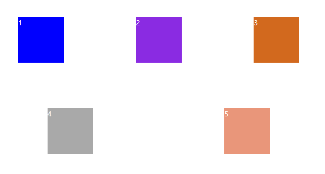
html
<!DOCTYPE html>
<html lang="en">
<head>
    <meta charset="UTF-8">
    <meta http-equiv="X-UA-Compatible" content="IE=edge">
    <meta name="viewport" content="width=device-width, initial-scale=1.0">
    <title>flexbox</title>
    <link rel="stylesheet" href="../css/day12.css">
</head>
<body>
    <div class="box1">1</div>
    <div class="box2">2</div>
    <div class="box3">3</div>
    <div class="box4">4</div>
    <div class="box5">5</div>
</html>
css
body {
  display: flex;
  justify-content: space-around;
  flex-wrap: wrap;
  color: #fff;
}

div {
  width: 100px;
  height: 100px;
  margin: 50px;
}

.box1 {
  background-color: blue;
}

.box2 {
  background-color: blueviolet;
}

.box3 {
  background-color: chocolate;
}

.box4 {
  background-color: darkgrey;
}

.box5 {
  background-color: darksalmon;
}

I want be a developer🙂