Kaggle Titanic 데이터 분석
https://www.kaggle.com/c/titanic/data 의 데이터를 사용
먼저, 데이터 분석에 필요한 기본 라이브러리부터 준비했다.
import pandas as pd
import numpy as np
import seaborn as sns
import matplotlib.pyplot as plt
import missingno as msno
#한글 폰트 설정, 축이나 라벨에 표시되는 -기호 깨짐 방지
plt.rc('font', family='Malgun Gothic')
plt.rc('axes', unicode_minus=False)

train = pd.read_csv("train.csv")
test = pd.read_csv("test.csv")
submission = pd.read_csv("gender_submission.csv")
Data 분석에 앞서 데이터 프레임을 확인하기 위해 header를 확인했다.
train.head()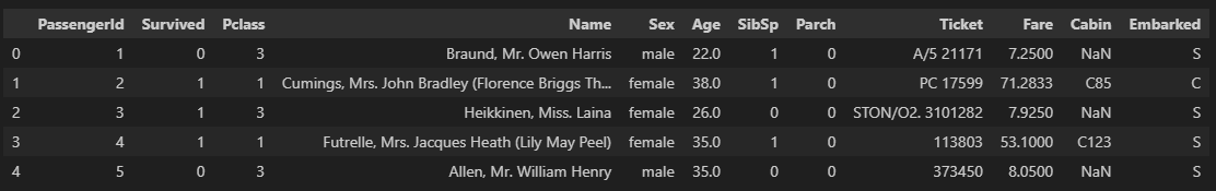
Survived - 생존유무(값) (0 = 사망, 1 = 생존)
Name - 탑승객 이름
Pclass - 티켓 클래스 (1 = 1st, 2 = 2nd, 3 = 3rd)
Sex - 성별
Age - 나이
SibSp - 함께 탑승한 형제자매, 배우자 수 총합
Parch - 함께 탑승한 부모, 자녀 수 총합
Embarked - 탑승 항구
Fare - 탑승 요금
Ticket - 티켓
Cabin - 객실
이라는것을 알 수 있다.
해당 데이터의 결측값을 알아보면
train.isnull().sum()
test.isnull().sum()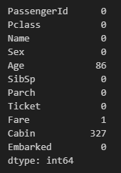
Age, Fare, Cabin에 결측값이 존재한다.
이를 missingno를 통해서 시각화해 보면 어디에 얼만큼 결측치가 존재하는지 확인하기 쉽다.
msno.matrix(train)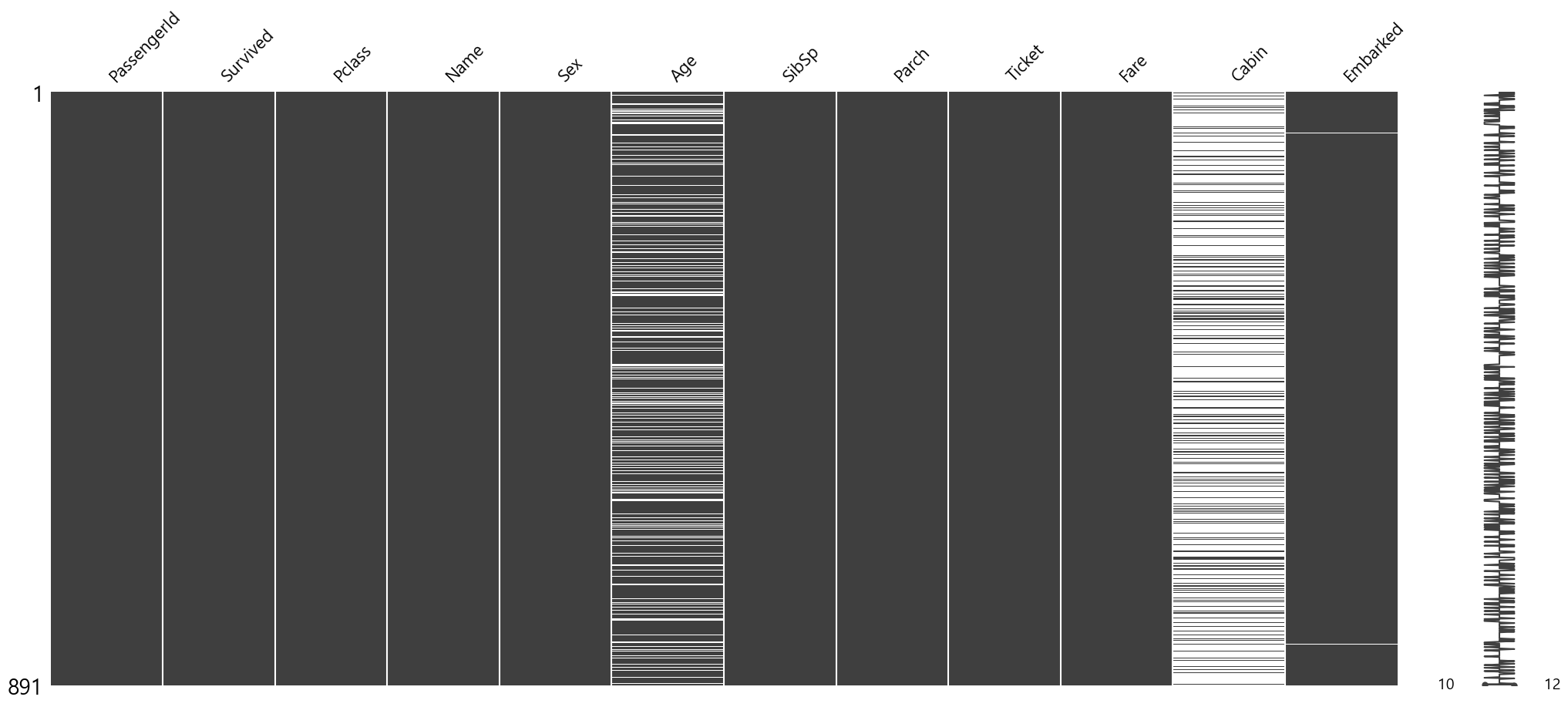
Titanic호의 생존비율을 어떻게 될까?
labels = ['사망','생존']
train['Survived'].value_counts().plot.pie(
    explode = [0, 0.05],
    shadow = True,
    autopct='%1.1f%%',
    labels=labels,
    legend = True)
plt.title("생존비율")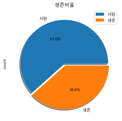
그렇다면 생존 비율에 영향을 미치는 요인에는 뭐가 있을까?
직관적으로 데이터를 봤을때 Pclass(Fare), Sex, Age, Sibsp, Parch의 영향을 받는다고 보인다.
Pclass는 탑승 클래스로 승객이 타고 있던 위치와 관련이 있을것으로 보인다.
train[['Pclass', 'Survived']].groupby('Pclass').mean()
fig, axes = plt.subplots(1, 2)
axes[0].set_title("클래스별 탑승수 \n", size=15)
sns.countplot(data=train, x='Pclass', ax=axes[0])
axes[1].set_title("클래스별 생존/사망 수 \n", size=15)
sns.countplot(x="Pclass", hue="Survived", data=train, ax=axes[1])
axes[1].legend(labels = ['사망', '생존'])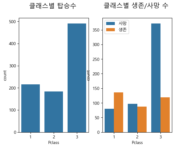
확연히 클래스별 생존률이 차이가 난다는것을 알 수 있다.
실제로 클래스 별 이동통로, 흡연실 등 생활공간, 숙소 위치를 확인하면 갑판위쪽으로 높은 등급이 위치한다. (설계도 : https://www.encyclopedia-titanica.org/titanic-deckplans/)
두 번째로, 성별에 따라 생존율을 확인해보자.
위에 시각화 자료에 y축 라벨이 있는게 짜증나서 지웠다.
#성별에 따른 생존비율 확인
fig, axes = plt.subplots(1, 2, figsize=(12, 6))
# 첫 번째 그래프: 탑승자 성비
axes[0].set_title("탑승자 성비 \n", size=15)
sns.countplot(x="Sex", data=train, ax=axes[0])
axes[0].set_ylabel("")  # y축 라벨 제거
# 두 번째 그래프: 성별에 따른 생존율
axes[1].set_title("성별에 따른 생존율 \n", size=15)
sns.countplot(x="Sex", hue="Survived", data=train, ax=axes[1])
axes[1].set_ylabel("")
# 범례 설정
axes[1].legend(labels=['사망', '생존'], loc='upper right')
여성이 남성에 비해 훨씬 생존률이 높은것으로 보임. (74.2%, 18.9%)
재난 상황에 아이와 여성부터 대피하기 때문일수도..?
다음은 SibSp(함께 탑승한 형제자매, 배우자 수 총합) , Parch(함께 탑승한 부모, 자녀 수 총합)이다.
fig, axes = plt.subplots(2, 2, figsize=(12, 12))
axes[0][0].set_title("SibSp별 탑승자 수", size=15)
sns.countplot(x="SibSp", data=train, ax=axes[0][0], palette="Set2")
axes[0][1].set_title("Parch별 탑승자 수", size=15)
sns.countplot(x="Parch", data=train, ax=axes[0][1], palette="Set2")

axes[1][0].set_title("SibSp별 생존 여부", size=15)
sns.countplot(x="SibSp", hue="Survived", data=train, ax=axes[1][0], palette="Set2")
axes[1][0].legend(loc='upper right')
axes[1][1].set_title("Parch별 생존 여부", size=15)
sns.countplot(x="Parch", hue="Survived", data=train, ax=axes[1][1], palette="Set2")
axes[1][1].legend(loc='upper right')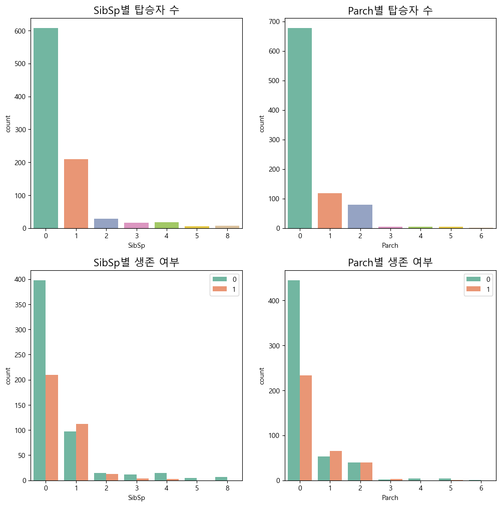
으로 나타낼수 있는데 SibSp, Parch가 0일때와 그렇지 않을때를 비교하는게 더 바람직 해보인다.
따라서 코드를 다음과 같이 수정하면
# SibSp와 Parch를 0 또는 1로 변환
train['SibSp_binary'] = train['SibSp'].apply(lambda x: 0 if x == 0 else 1)
train['Parch_binary'] = train['Parch'].apply(lambda x: 0 if x == 0 else 1)

# 시각화
fig, axes = plt.subplots(2, 2, figsize=(12, 12))

# SibSp 탑승자 수
axes[0][0].set_title("SibSp 별 탑승자 수", size=15)
sns.countplot(x="SibSp_binary", data=train, ax=axes[0][0], palette="Set2")
axes[0][0].set_xticklabels(['0', '1+'])
axes[0][0].set_xlabel("SibSp")

# Parch  탑승자 수
axes[0][1].set_title("Parch 별 탑승자 수", size=15)
sns.countplot(x="Parch_binary", data=train, ax=axes[0][1], palette="Set2")
axes[0][1].set_xticklabels(['0', '1+'])
axes[0][1].set_xlabel("Parch")

# SibSp  생존 여부
axes[1][0].set_title("SibSp 별 생존 여부", size=15)
sns.countplot(x="SibSp_binary", hue="Survived", data=train, ax=axes[1][0], palette="Set2")
axes[1][0].legend(labels=['사망', '생존'], loc='upper right')
axes[1][0].set_xticklabels(['0', '1+'])
axes[1][0].set_xlabel("SibSp")

# Parch  생존 여부
axes[1][1].set_title("Parch 별 생존 여부", size=15)
sns.countplot(x="Parch_binary", hue="Survived", data=train, ax=axes[1][1], palette="Set2")
axes[1][1].legend(labels=['사망', '생존'], loc='upper right')
axes[1][1].set_xticklabels(['0', '1+'])
axes[1][1].set_xlabel("Parch")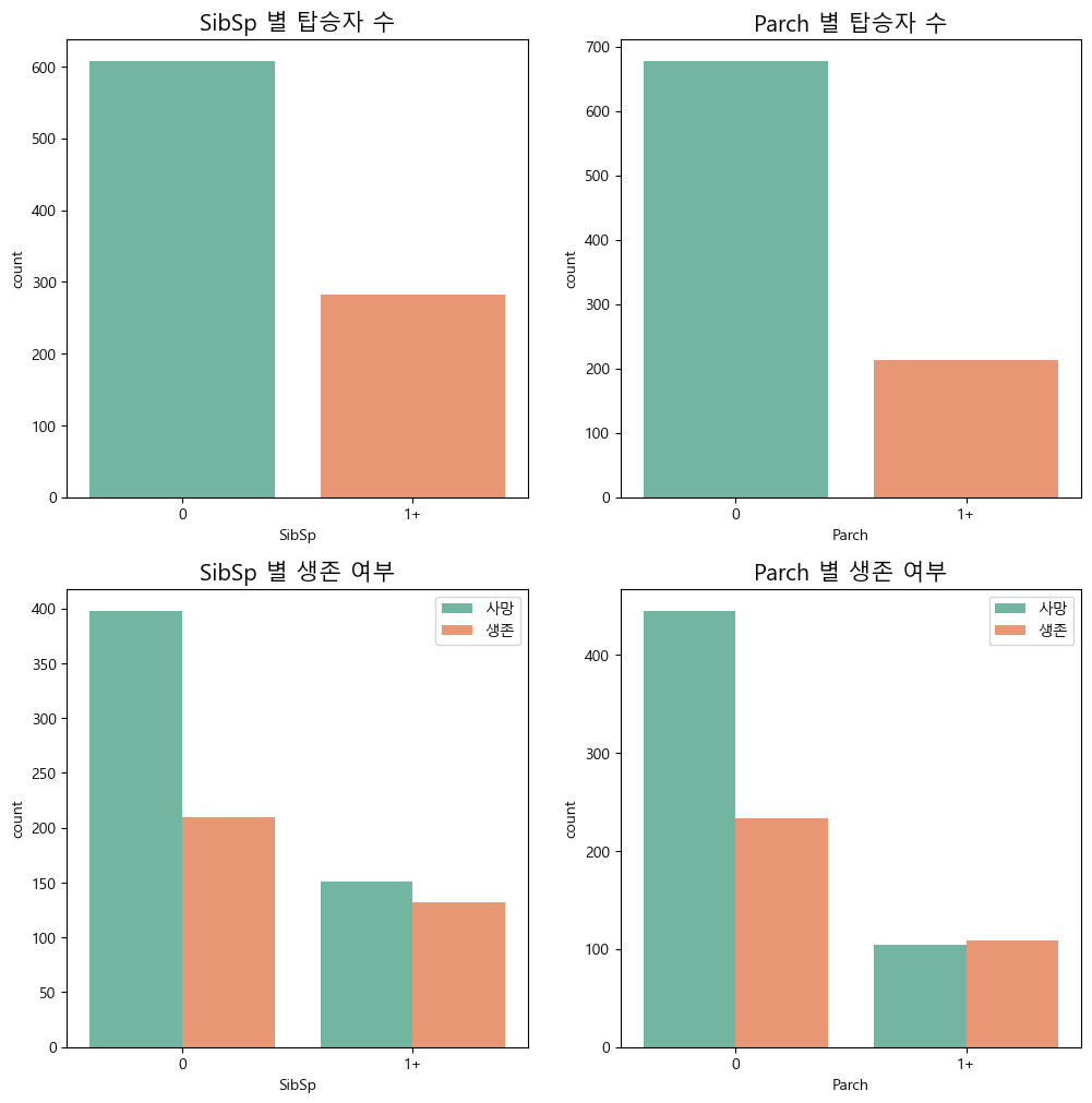
로 표현할 수 있다. 함께 탑승한 형제자매, 배우자, 함께 탑승한 부모, 자녀가 없으면 사망률이 더 높다고 보여진다.
탑승 금액이 높을수록 사망률이 적은것으로 티켓 클래스별 생존의 의미 확인하기 위해 Fare을 비교해보면
fig, ax = plt.subplots(figsize=(10,6))

# 분포 확인
sns.kdeplot(train[train['Survived']==1]['Fare'], ax=ax)
sns.kdeplot(train[train['Survived']==0]['Fare'], ax=ax)

# 축 범위
ax.set(xlim=(0, train['Fare'].max()))
ax.legend(['생존', '사망'])
빨간색이 사망, 파란색이 생존비율이다. 지불 비용이 높을수록 생존율이 높다고 보여지며 이는 클래스별 생존율은 유의미 하다고 보여진다.
정리하면, titanic의 생존율에는 성별, 나이, 탑승클래스, 같이 탑승한 사람의 수가 영향을 미친다고 볼 수 있다.