1. R의 시각화 도구
주요 패키지
graphics, lattice, ggplot2, ggmap
graphics패키지는 일반적인 시각화 도구 제공. barplot(), dotchart(), pie(), boxplot(), hist(), plot()함수
고급 시각화
lattice 패키지: 서로 상관있는 확률적 반응변수의 시각화에 사용. 특정 변수가 갖는
범주(domain)별로 독립된 패널을 격자(lattice)처럼 배치하여 여러 개의 변수에 대한 범주를
세부적으로 시각화해주는 도구
ggplot2 패키지
기하학적 객체들(점, 선, 막대 등)에 미적 특성(색상, 모양, 크기)을 적용하여
시각화는 방법을 제공. 그래프와 사용자 간의 상호작용(interaction)기능을 제공하기 때문에
시각화 과정에서 코드의 재사용성이 뛰어나고, 데이터 분석을 위한 시각화에 적합
ggmap
지도를 기반으로 위치, 영역, 시간과 공간에 따른 차이와 변화에 대한 것을 다루는
공간시각화에 적합.
2. 격자형 기법 시각화
2.1 히스토그램
histogram()함수를 이용하여 데이터 시각화
histogram(~gcsescore, data = Chem97)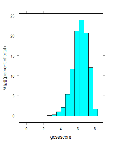
score 변수를 조건변수로 지정하여 데이터 시각화
histogram(~gcsescore | score, data = Chem97)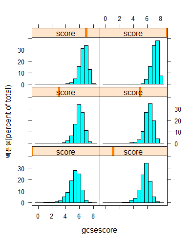
2.2 밀도 그래프
densityplot()함수를 사용하여 밀도 그래프 그리기
densityplot(~gcsescore | factor(score), data = Chem97,
 groups = gender, plot.Points = T,
 auto.ley = T)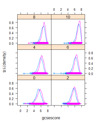
2.3 막대 그래프
barchart() 함수를 사용하여 막대 그래프 그리기
data(VADeaths)
VADeaths

str(VADeaths)
class(VADeaths)
mode(VADeaths)

dft <- as.data.frame.table(VADeaths)
str(dft)
dft
barchart(Var1 ~ Freq | Var2, data = dft, layout = c(4, 1))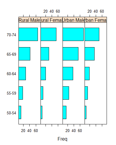
2.4 점 그래프
dotplot(Var1 ~ Freq, data = dft,
        groups = Var2, type = "o",
        auto.key = list(space = "right", points = T, lines = T))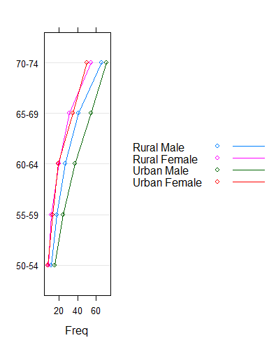
2.5 산점도 그래프
airquality 데이터 셋으로 산점도 그래프 그리기
library(datasets)
str(airquality)

xyplot(Ozone ~ Wind, data = airquality)

xyplot(Ozone ~ Wind | Month, data = airquality)

xyplot(Ozone ~ Wind | Month, data = airquality, layout = c(5, 1))

convert <- transform(airquality, Month = factor(Month))
str(convert)

xyplot(Ozone ~ Wind | Month, data = convert)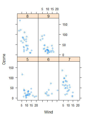
quakes 데이터 셋으로 산점도 그래프 그리기
head(quakes)
str(quakes)

xyplot(lat ~ long, data = quakes, pch = ".")

tplot <- xyplot(lat ~ long, data = quakes, pch = ".")
tplot <- update(tplot, main = "1964년 이후 태평양에서 발생한 지진 위치")
print(tplot)

range(quakes$depth)

quakes$depth2[quakes$depth >= 40 & quakes$depth <= 150] <- 1
quakes$depth2[quakes$depth >= 151 & quakes$depth <= 250] <- 2
quakes$depth2[quakes$depth >= 251 & quakes$depth <= 350] <- 3
quakes$depth2[quakes$depth >= 351 & quakes$depth <= 450] <- 4
quakes$depth2[quakes$depth >= 451 & quakes$depth <= 550] <- 5
quakes$depth2[quakes$depth >= 551 & quakes$depth <= 680] <- 6

convert <- transform(quakes, depth2 = factor(depth2))
xyplot(lat ~ long | depth2, data = convert)

xyplot(Ozone + Solar.R ~ Wind | factor(Month),
       data = airquality,
       col = c("blue", "red"),
       layout = c(5, 1))

numgroup <- equal.count(1:150, number = 4, overlap = 0)
numgroup

depthgroup <- equal.count(quakes$depth, number = 5, overlap = 0)
depthgroup

xyplot(lat ~ long | depthgroup, data = quakes,
       main = "Fiji Earthquakes(depthgroup)",
       ylab = "latitude", xlab = "longitude",
       pch = "@", col = "red")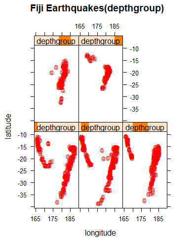
2.6 데이터 범주화
numgroup <- equal.count(1:150, number = 4, overlap = 0)
numgroup
depthgroup <- equal.count(quakes$depth, number = 5, overlap = 0)
depthgroup
xyplot(lat ~ long | depthgroup, data = quakes,
main = "Fiji Earthquakes(depthgroup)",
ylab = "latitude", xlab = "longitude",
pch = "@", col = "red")
magnitudegroup <- equal.count(quakes$mag, number = 2, overlap =0)
magnitudegroup
xyplot(lat ~ long | magnitudegroup, data = quakes,
main = "Fiji Earthquakes(magnitude)",
ylab = "latitude", xlab = "longitude",
pch = "@", col = "blue")
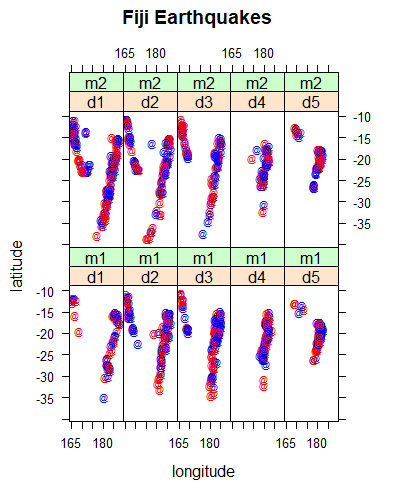
xyplot(lat ~ long | depthgroup * magnitudegroup, data = quakes,
main = "Fiji Earthquakes",
ylab = "latitude", xlab = "longitude",
pch = "@", col = c("red", "blue"))
quakes$depth3[quakes$depth >= 39.5 & quakes$depth <= 80.5] <- 'd1'
quakes$depth3[quakes$depth >= 79.5 & quakes$depth <= 186.5] <- 'd2'
quakes$depth3[quakes$depth >= 185.5 & quakes$depth <= 397.5] <- 'd3'
quakes$depth3[quakes$depth >= 396.5 & quakes$depth <= 562.5] <- 'd4'
quakes$depth3[quakes$depth >= 562.5 & quakes$depth <= 680.5] <- 'd5'
quakes$mag3[quakes$mag >= 3.95 & quakes$mag <= 4.65] <- 'm1'
quakes$mag3[quakes$mag >= 4.55 & quakes$mag <= 6.65] <- 'm2'
convert <- transform(quakes,
depth3 = factor(depth3),
mag3 = factor(mag3))
xyplot(lat ~ long | depth3 * mag3, data = convert,
main = "Fiji Earthquakes",
ylab = "latitude", xlab = "longitude",
pch = "@", col = c("red", "blue"))