🍎학습내용 주제
반응형 웹 및 블로그 만들기
2단 홈페이지 만들기.
body에 h1 태그로 메인 글을 작성해준다.<body> <div id="content"> <h1>Love</h1> </div>
max-width 700px 이하와 이상 2가지 배경화면을 가진다.
background: url(/love.jpg) no-repeat center center fixed;
background 속성값 안에는 다양한 값들은 한코드에 깔끔하게 정리할수있다.
width 700이상일때
width 700이하일때.

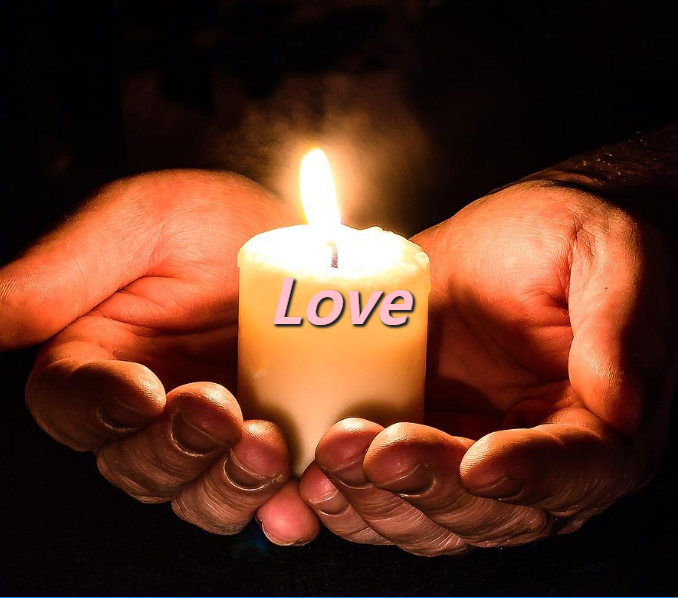
html{
    background: url(/love.jpg) no-repeat center center fixed;
    background-size: cover;
    font-family: "Open Sans"
}


@media (max-width:700px){
    html{
        background: url(/hands.jpg) no-repeat center center fixed;
        background-size: cover;
    }

    h1{
        font-size: 4rem;
    }
}
고양이 블로그 만들기

HTML code
<div class="post-title">
   <h2><a href="#">처음 고양이 키울 때 필요한 것!</a></h2>
</div>

CSS code

.post-title{
    padding-bottom: 10px;
    background-image:linear-gradient(45deg, #fff 30%, #ccc 30%, #ccc 50%,
    #fff 50%, #fff 80%, #ccc 80%, #ccc 100%);
    background-size: 6px 6px;
    margin-bottom: 1.5rem;
}
background-image를 활용하여 linear-gradient를 사용하여 45deg 기울기를주고
위코드를 활용하여 사선을 주어 메뉴하면을 꾸민다.
<div class="post-thumb">
   <p class="post-date"><span>2021</span><span>12/18</span></p>
   <img class="post-img" src="./images/cat1.jpg">
</div>

css
.post-date{
    position: absolute;
    left: 0;
    top: -10px;
    font-size: 1.5rem;
    letter-spacing: 0.1rem;
    font-family: 'Amatic SC', cursive;
    background: #93d8d0;
    width:80px;
    height:80px;
    text-align: center;
    color:#fff;
    border-radius:30% 60% 50% 70% / 50%;
}

.post-date span{
    font-size: 1.25rem;
    border-bottom: 2px rgba(255, 255, 255, .5) dotted;
    display: block;
    margin: 5px auto 0;
}

.post-date span:last-child{
    border-bottom: none;
}

.post-img{
    width:100%;
    height:260px;
    object-fit: cover;
    border-radius:40% 70% 50% 30% / 50%;
}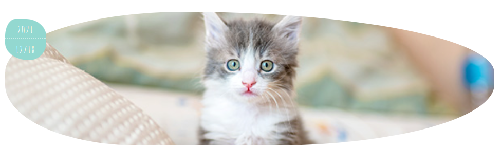
왼쪽 상단에 아이콘을 활용하여 년도와 일월을 작성한다.span을 2개를 사용하여 last-child런을 사용하여 마지막 border-bottom: none;을 사용하여 줄선을 제거했다.
고양이 이미지를 border-radius를 활용하여 원을 짤라서 꾸민다.
 <h3>
   고양이를 처음 기를 때 필수 아이템!
 </h3>
    <ul>
      <li>고양이 간식</li>
      <li>화장실, 화장실 모래</li>
      <li>식품</li>
     </ul>

 CSS
 article ul li:before{
    content: '';
    width:8px;
    height: 8px;
    background: #93d8d0;
    display:inline-block;
    margin: 0 8px 2px 0;
    border-radius: 50%;
}
boredr-radius = 50%을 사용하여 초록색 O을 만들어 줍니다
🙊 어려웠던 점 or 해결못한 것
background-image:linear-gradient(45deg, #fff 30%, #ccc 30%, #ccc 50%,
#fff 50%, #fff 80%, #ccc 80%, #ccc 100%);
이 코드가 어려웠다. 너무 길고 해석하는데 어려움이있었다.
🐣 해결방법 작성
위의 코드에 대해서 조금더 찾아보고 공부하려하고한다.🌝 학습 소감
블로그를 만들떄는 글이 많고 이것저것 신경써야할 부분들이 많았다. 마지막 까지 마무리를 잘해서 더 많은것을 배울수있도록 해야겠다.
비전공자의 프론트앤드 도전기