HTML&CSS 강의
postcss 예제
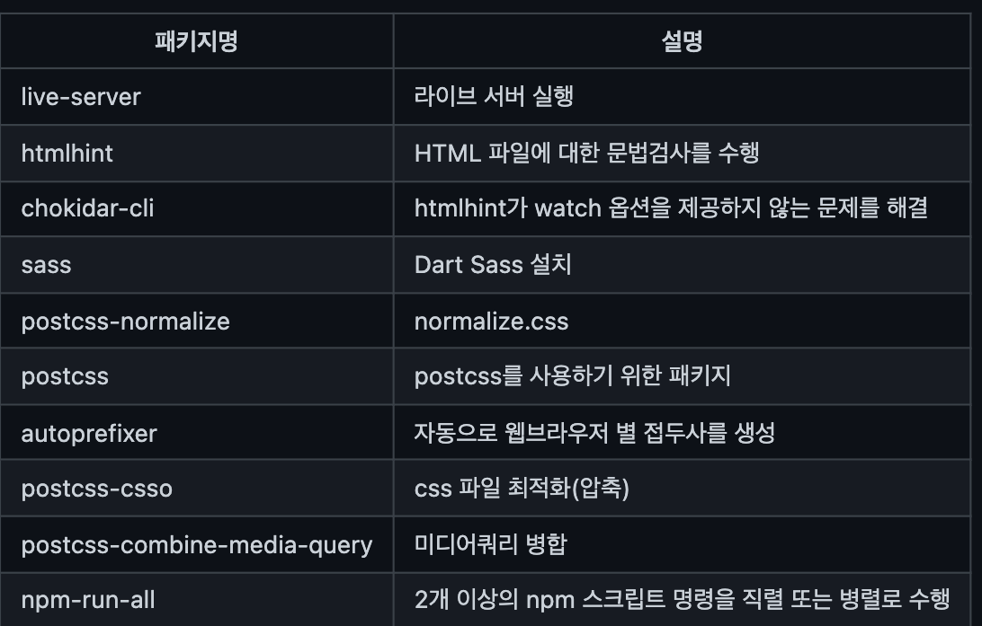
webpack은 liveserver보다 dev서버를 많이 사용(내장되어 있어서)
npm-run-all은 postcss가 직렬로 실행되어야 제대로 작동하기 때문에 이를 위해 패키지에 넣어 준다.
{
  "scripts": {
    "start": "run-p dev watch:**",
    "htmlhint": "htmlhint '**/*.html'",
    "watch:htmlhint": "SHELL=/bin/bash chokidar --initial --silent '**/*.html' -c 'npm run htmlhint'",
    "sass": "sass sass:css",
    "watch:sass": "npm run sass -- --watch",
    "dev": "live-server",
    "build:sass": "npm run sass -- --no-source-map",
    "build:postcss": "postcss css/style.css -o css/style.css",
    "build": "run-s build:sass build:postcss"
  },
  "devDependencies": {
    "autoprefixer": "^10.2.5",
    "chokidar-cli": "^2.1.0",
    "htmlhint": "^0.14.2",
    "live-server": "^1.2.1",
    "npm-run-all": "^4.1.5",
    "postcss": "^8.2.13",
    "postcss-cli": "^8.3.1",
    "postcss-combine-media-query": "^1.0.1",
    "postcss-csso": "^5.0.1",
    "postcss-normalize": "^10.0.0",
    "sass": "^1.32.8"
  }
}
htmlhint는 html문법검사로 .html확장자가 붙는 모든 파일 검사
start의 run-p에 있는 -p는 두 개의 명령을 병렬로 실행하여라 라는 뜻
build:sass는 sass를 빌드하되, source-map 없이 빌드하라는 뜻
build:postcss는 css파일을 갖고 postcss를 적용시키는 거
buildsass를 먼저 빌드 한 후에 postcss를 빌드하라 run-s의-s뜻은 직렬로 실행하라
  // 요소 박스의 가로 크기를 뷰포트 기준 100vw로 설정 -------------------------------------------- /
  @mixin boxSizeFull($width: 100vw){
    // width: 100vw로 인해 body 영역에 가로 스크롤바가 나타난다.
    // 이를 해결하기 위해 루트 요소인 html에 overflow-x: hidden;을 추가해야 한다.
    width: 100vw;
    position: relative;
    left: 50%;
    margin-left: -50vw;
    @content;
  }
margin-left: -50vw음수마진, vw트릭 (푸터 같이 전체 영역을 디자인 하기 위해)
모바일용, 데스크탑용 헤더만들기
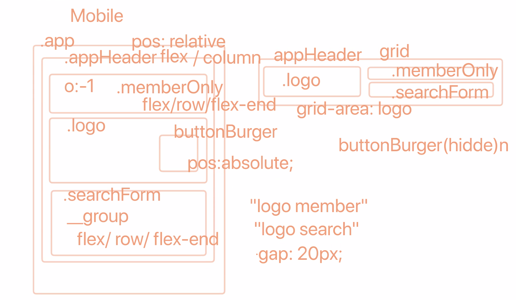
데스크탑용은 그리드로 만들기
fieldset 자체에 오류있어서 거기에 바로 클래스를 주지않고 그 안에 div태그에 스타일링을 함
a 태그에 inline속성과 padding: 8px을 주었을 때, 그 속성이 먹히지 않는 것은 아니고 inline속성이라 상자가 그만큼 안늘어나는 것 뿐임.
grid의 repeat속성은 지원 안되는 브라우저가 있음
_form.scss
@use './../utils' as *;

.formInput {
    &__input {
        appearance: none;
        display: block;
        padding: rem(8px) rem(16px);
        width: 100%;
        border: 1px solid $gray;
        background: $white;
        font-size: rem(14px);
    }
}
formInput의 경우 마크업에서 공통적으로 사용될 여지가 있는 component이기 때문에
_form.scss라는 파일에 넣어서 관리한다. input의 경우 자체 브라우저마다 다른 스타일을 가지고 있기 때문에 운영 체제 테마를 기반으로 플랫폼 기본 스타일을 사용하여 요소를 표시하기 위해apperance: none속성을 준다.
_button.scss
@use './../utils' as *;

.button {
    appearance: none;
    border: 0;
    border-radius: rem(4px);
    background: $black;
    color: $white;
    padding: rem(10px) rem(16px);
    font-size: rem(14px);

    &None {
        appearance: none;
        border: 0;
        padding: 0;
        background: transparent;
    }

    &--primary {
        background: $brown;
    }

    // 햄버거 버튼
    &--burger {
        position: relative;
        width: rem(48px);
        height: rem(48px);

        &BarTop ,&BarMiddle ,&BarBottom {
            position: absolute;
            background-color: $white;
            width: 100%;
            height: 20%;
            left: 0;
            border-radius: rem(10px);
        }

        &BarTop {
            top: 0;
        }

        &BarMiddle {
            // 바 모양의 반만큼 위로 끌어 올려주어야 딱 중간!
            top: 50%;
            transform: translateY(-50%);
        }

        &BarBottom {
            top: 100%;
            // 바 모양의 반만큼 위로 끌어 올려주어야 딱 중간!
            transform: translateY(-100%);
        }
    }

}
버튼도 마찬가지로 자체 브라우저의 속성을 제거하기 위해
appearance:none속성을 주고, 주의깊게 보아야할 것은 3개의 bar를 설정할 때, 포지션을 퍼센트로 위치설정 할 때, 퍼센트를 고려한 위치만큼transform: translateY속성으로 끌어 올려주어야 제대로 ui맞게 위치시킬수 있다는 것이다.
_header.scss
@use './../utils' as *;
@use './../components' as *;

.appHeader {
    @include mobile {
        position: relative;
        @include flexbox(column);
        background: $darkbrown;
        padding: 0 rem(20px);
    }
    @include desktop {
        @include boxSizeMax($paddingX: 20px);
        display: grid;
        grid-template-columns: repeat(2, 1fr);
        grid-template-rows: 50px 60px;
        grid-template-areas:
        "logo member"
        "logo search";

        align-items: center;
    }

    // 로고
    .logo{
        @include desktop {
            grid-area: logo;
        }

        &__link {
            $w: rem(204px);
            $h: rem(59px);
            display: block;
            width: $w;
            height: $h;
            @include bgRetina("webcafe-logo", "png", $w, $h);
        }
    }

    // 멤버링크
    .memberOnly {
        @include flexbox(row, flex-end);
        padding: rem(16px) 0;

        @include mobile {
            padding: rem(8px) 0;
            order: -1;
            color: $white;
            font-size: rem(14px);
        }

        @include desktop{
            grid-area: member;
        }

        .divider {
            margin: 0 rem(8px);
        }

        a {
            display: inline;
            padding: rem(8px) 0;
        }
    }

    .searchForm {

        @include desktop {
            grid-area: search;
        }

        &__group {
            @include flexbox(row, flex-start, center);
            @include mobile {
                padding: rem(16px) 0;
            }

            .formInput {
                flex-grow: 1;
            }

            .button--primary {
                margin-left: rem(8px);
            }
        }
    }

    // 메인메뉴 제어 버튼
    .button--burger {
        @include mobile {
            width: rem(36px);
            height: rem(36px);
            position: absolute;
            top: rem(48px);
            right: rem(20px);
            overflow: hidden;

            &BarTop, &BarMiddle, &BarBottom {
                transition: all 250ms;
            }
        }

        @include desktop {
            display:none;
        }
    }

    .is-active {
        .button--burgerBarTop {
            top: 50%;
            transform: translateY(-50%) rotate(45deg);
        }

        .button--burgerBarMiddle {
            // 아까 translateY를 높이때문에 땡겼으므로 같이 조절해야함!
            transform: translate(-100%, -50%);
        }

        .button--burgerBarBottom {
            top: 50%;
            transform: translateY(-50%) rotate(-45deg);
        }
    }
}
헤더에서는 mixin으로 설정해 둔 것들을 @include로 가져와 사용을 하며 그 사용법에 익숙해지고, desktop의 경우 헤더 부분을 그리드 속성을 사용해서 좀 더 쉬운 레이아웃 작업을 해보았다. (
grid-template-areas,grid-area를 사용)
여기선 마지막의 is-active클래스를 위한 css를 적용하기 위해 transform을 사용하면서 위치도 옮기면서 각도를 회전시켜주어야 제대로 화면상에 작동하며, middle바의 경우 x축만 바꾸는 것이 아닌_button.scss에서 위로 끌어올리기위해 y축을 설정해 두었던 것처럼transform: translate(-100%, -50%);같이 사용하여 설정해야 한다.