
permutaion importances
- 특정 노이즈 전후 성능 비교
boosting
- 베깅: 트리 독립적인가 아닌가?
- ada boost,gb -> xgb
XAI
모델 A -> 설명x
모델 B -> 설명O
설명 되는 모델 B를 픽할 것임
pdp
- 특성 a : 결과에 어떻게 영향?
shap
- 특성 a,b,c,d: 개별 샘플에 어떻게 영향?>summary plot
PDP(Partial dependence plots)
- 랜덤/부스팅/딥러닝 모델은 내부에서 정해지는 결정과정은 이해하기 어렵기 때문에 블랙박스 모델이라고도함
- 트리 모델 학습-특성 중요도로 특성확인할 수 있지만 트리에만 국한되는것임
- 퍼뮤테이션 임포턴스 : 학습 모델 종류와 상관없이 모델을 설명할 때 사용할 수 있는 모델 애그노스틱 방법임
복잡한 모델>이해하기 어렵지만 성능이 좋음
단순한 모델>이해가 쉬운데 성능이 부족
pdp는 특성값에 따라서 타겟값이 증가/감소하는 정보를 알 수가 있음
- 특성들을 선형적으로 변환 시켜보면서 타겟이 어떻게 변화(증감)하느지 시각화 하여 보는 방법
%%capture

# Ignore this warning: https://github.com/dmlc/xgboost/issues/4300
# xgboost/core.py:587: FutureWarning: Series.base is deprecated and will be removed in a future version
import warnings
warnings.filterwarnings(action='ignore', category=FutureWarning, module='xgboost')

import pandas as pd

# Kaggle 데이터세트에서 10% 샘플링된 데이터입니다.
## Source: https://www.kaggle.com/wordsforthewise/lending-club
## 10% of expired loans (loan_status: ['Fully Paid' and 'Charged Off'])
## grades A-D
## term ' 36 months'

df = pd.read_csv('https://ds-lecture-data.s3.ap-northeast-2.amazonaws.com/lending_club/lending_club_sampled.csv')
df['issue_d'] = pd.to_datetime(df['issue_d'], infer_datetime_format=True)

# issue_d로 정렬
df = df.set_index('issue_d').sort_index()

df['interest_rate'] = df['int_rate'].astype(float)
df['monthly_debts'] = df['annual_inc'] / 12 * df['dti'] / 100

# 152 특성 중 6특성만 사용
columns = ['annual_inc', # 연수입
           'fico_range_high', # 신용점수
           'funded_amnt', # 대출
           'title', # 대출 목적
           'monthly_debts', # 월간 부채
           'interest_rate'] # 이자율

df = df[columns]
df = df.dropna()

# 마지막 10,000 대출은 테스트셋
# 테스트셋 전 10,000 대출이 검증셋
# 나머지는 학습셋
test = df[-10000:]
val = df[-20000:-10000]
train = df[:-20000]df.columns, test.shape, val.shape, train.shape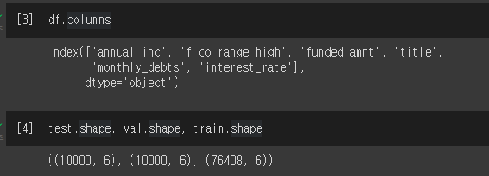
선형회귀로 알아보기
!pip install --upgrade category_encoders
from category_encoders import TargetEncoder
from sklearn.linear_model import LinearRegression
from sklearn.pipeline import make_pipeline
from sklearn.preprocessing import StandardScaler
linear = make_pipeline(
TargetEncoder(),
LinearRegression()
)
linear.fit(X_train, y_train)
print('R^2', linear.score(X_val, y_val))
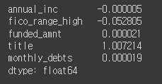
#R^2 0.1758506495816231 값이 작음
# 회귀계수 확인
coefficients = linear.named_steps['linearregression'].coef_
pd.Series(coefficients, features)
그래디언트 부스팅으로 학습진행
from category_encoders import OrdinalEncoder
from sklearn.metrics import r2_score
from xgboost import XGBRegressor

encoder = OrdinalEncoder()
X_train_encoded = encoder.fit_transform(X_train) # 학습데이터
X_val_encoded = encoder.transform(X_val) # 검증데이터

boosting = XGBRegressor(
    n_estimators=1000,
    objective='reg:squarederror', # default
    learning_rate=0.2,
    n_jobs=-1
)

eval_set = [(X_train_encoded, y_train),
            (X_val_encoded, y_val)]

boosting.fit(X_train_encoded, y_train,
          eval_set=eval_set,
          early_stopping_rounds=50
         )
y_pred = boosting.predict(X_val_encoded)
print('R^2', r2_score(y_val, y_pred))

#R^2 0.228134736099475 선형보다 성능 좋아짐
그래디언트 부스팅 결과를 해석하려면?
선형모델은 회귀계수를 이용해 변수와 타겟 관계를 해석할 수 있지만 트리모델은 할 수 없음
- 대신 부분의존그림을 사용하여 개별 특성과 타겟간의 관게를 볼 수 있음
PDP (1개의 특성 사용)
pip install PDPbox

# dpi(dots per inch) 수치를 조정해 이미지 화질을 조정 할 수 있습니다
import matplotlib.pyplot as plt
plt.rcParams['figure.dpi'] = 144

from pdpbox.pdp import pdp_isolate, pdp_plot

feature = 'annual_inc'

isolated = pdp_isolate(
    model=linear,
    dataset=X_val,
    model_features=X_val.columns,
    feature=feature,
    grid_type='percentile', # default='percentile', or 'equal'
    num_grid_points=10 # default=10
)
pdp_plot(isolated, feature_name=feature);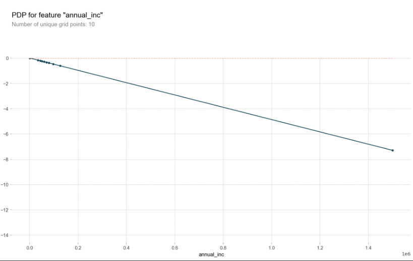
그래디언트 부스팅 모델에서 annual_inc PDP를 그려봄
isolated = pdp_isolate(
    model=boosting,
    dataset=X_val_encoded,
    model_features=X_val_encoded.columns,
    feature=feature
)
pdp_plot(isolated, feature_name=feature);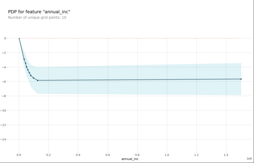
변화량부분에서 이자율이 급격하게 떨어진다.
pdp_plot(isolated, feature_name=feature)
plt.xlim((20000,150000));
pdp를 10개의 ice(individual conditional expectation)curves와 함께 그려봄
한 ice곡선은 하나의 관측치에 대해 관심 특성을 변화시킴에 따른 타겟값 변화 곡선이고 이 ice들의 평균이 pdp입니다.
pdp_plot(isolated
         , feature_name=feature
         , plot_lines=True # ICE plots
         , frac_to_plot=0.001 # or 10 (# 10000 val set * 0.001)
         , plot_pts_dist=True)

plt.xlim(20000,150000);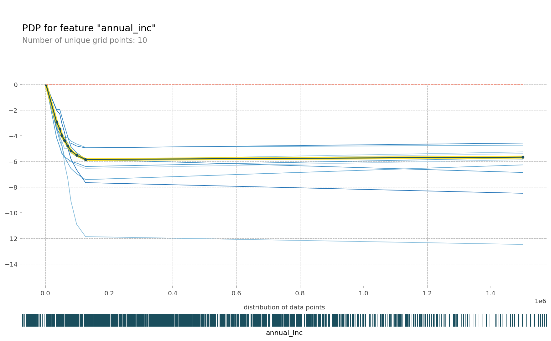
Ice curves->PDP를 표현하는 GIF
한특성에 대해 pdp를 그릴 경우 얼마나 많은 예측이 필요할까요?
데이터셋 사이즈에 grid points를 곱한 수 만큼 예측을 해야함
isolated = pdp_isolate(
    model=boosting,
    dataset=X_val_encoded,
    model_features=X_val.columns,
    feature=feature,
    # grid point를 크게 주면 겹치는 점이 생겨 Number of unique grid points는 grid point 보다 작을 수 있습니다.
    num_grid_points=100, # grid 포인트를 더 줄 수 있습니다. default = 10
)
print('예측수: ',len(X_val) * 100)
#예측수:  1000000

pdp_plot(isolated
         , feature_name=feature
         , plot_lines=True
         , frac_to_plot=0.01 # ICE curves는 100개
         , plot_pts_dist=True )

plt.xlim(20000,150000);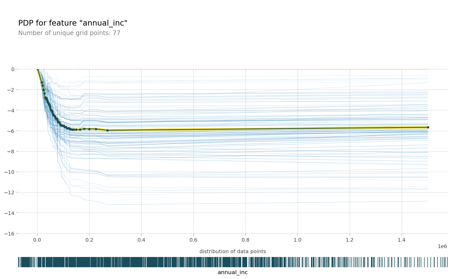
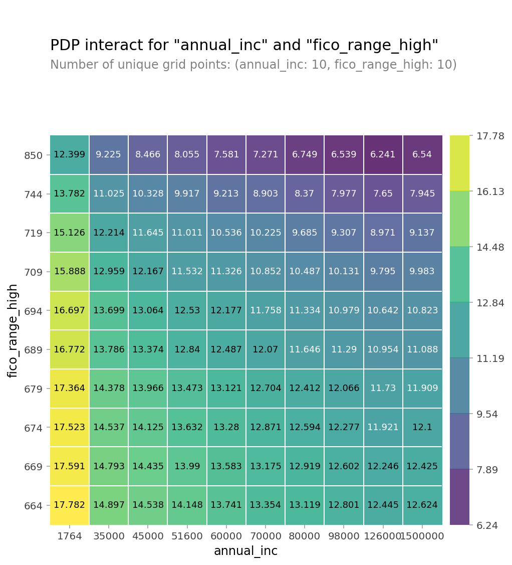
PDP (2개의 특성 사용)
- 두 특성간의 상호작용을 pdp를 통해 확인
from pdpbox.pdp import pdp_interact, pdp_interact_plot

features = ['annual_inc', 'fico_range_high']

interaction = pdp_interact(
    model=boosting,
    dataset=X_val_encoded,
    model_features=X_val.columns,
    features=features
)

pdp_interact_plot(interaction, plot_type='grid',
                  feature_names=features);
PDP에서 카테고리특성을 사용
카테고리 특성을 학습할 대 Ordinal Encoder, Target Encoder 같은 인코더를 사용하게됨
인코딩을 하게되면 학습 후 PDP를 그릴 때 인코딩된 값이 나오게 되어 카테고리특성의 실제 값을 확인하기 어려운 문제가 있습니다.
이번에는 pdp에 인코딩되기 전 카테고리값을 보여주기 위한 방법을 아아보겠습니다.
import seaborn as sns
from sklearn.ensemble import RandomForestClassifier
from sklearn.pipeline import make_pipeline

df = sns.load_dataset('titanic')
df['age'] = df['age'].fillna(df['age'].median())
df = df.drop(columns='deck') # NaN 77%
df = df.dropna()

target = 'survived'
features = df.columns.drop(['survived', 'alive'])

X = df[features]
y = df[target]

pipe = make_pipeline(
    OrdinalEncoder(),
    RandomForestClassifier(n_estimators=100, random_state=42, n_jobs=-1)
)
pipe.fit(X, y);

encoder = pipe.named_steps['ordinalencoder']
X_encoded = encoder.fit_transform(X)
rf = pipe.named_steps['randomforestclassifier']

import matplotlib.pyplot as plt
from pdpbox import pdp
feature = 'sex'
pdp_dist = pdp.pdp_isolate(model=rf, dataset=X_encoded, model_features=features, feature=feature)
pdp.pdp_plot(pdp_dist, feature); # 인코딩된 sex 값을 확인할 수 있습니다
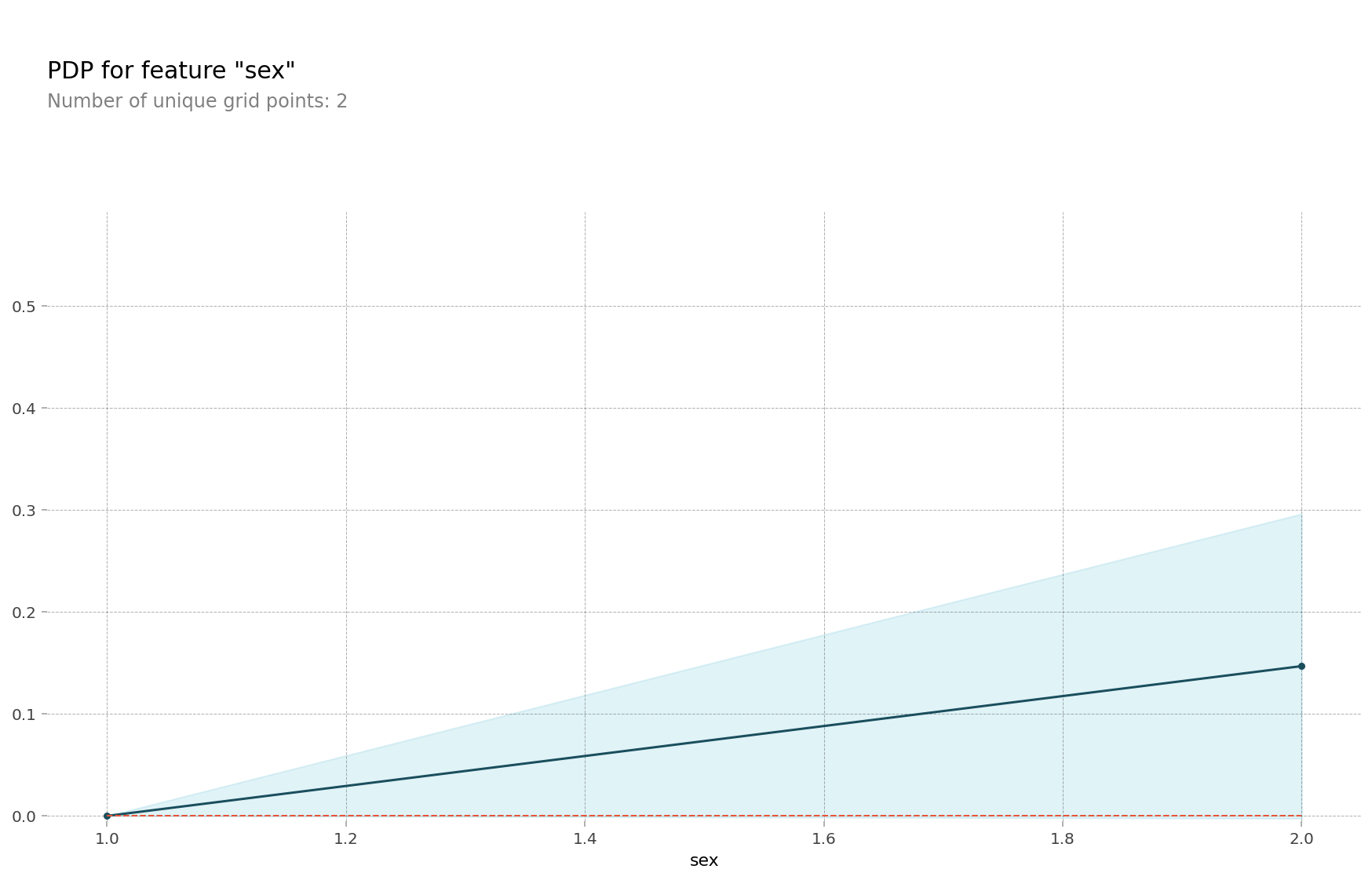
# encoder 맵핑을 확인합니다, {male:1, female:2} 로 인코딩 되어 있습니다
encoder.mapping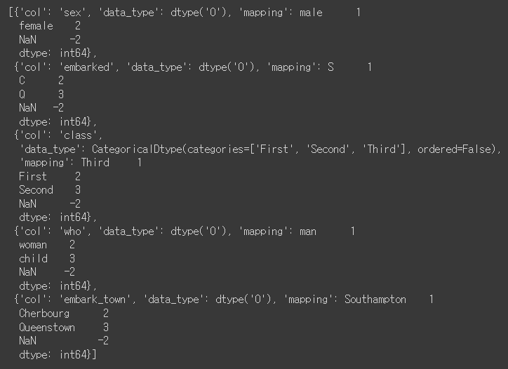
# 2D PDP
features = ['sex', 'age']

interaction = pdp_interact(
    model=rf,
    dataset=X_encoded,
    model_features=X_encoded.columns,
    features=features
)

pdp_interact_plot(interaction, plot_type='grid', feature_names=features);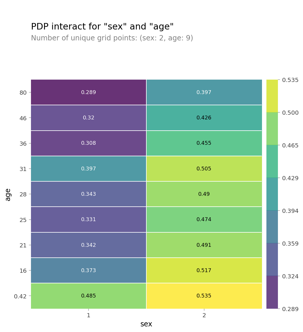
SHAP
샵라이브러리: 개별 예측 설명
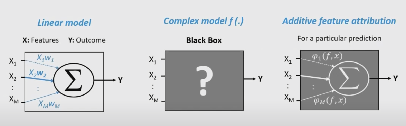
- 어던 머신러닝 모델이든지 단일 관측치로부터 특성들의 기여도(feature attribution)를 계산하기 위한 방법을 배울수 있음
- sharpley value는 원래 게임이론에서 나온 개념이지만 복잡한 머신러닝모델의 예측을 설명하기 위한 매우 유용한 방법을 제공함
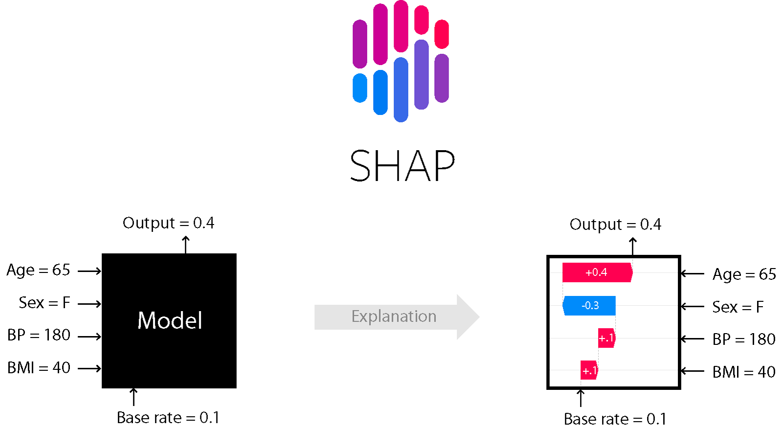
위에 이미지처럼 왼쪽 블랙박스 같은 모델을(뭐가 어떻게 영향주느지 알 수 없음) 오른쪽 처럼 어떤게 영향을 주는지 시각화 한 것이다.
회귀모델 예시를 사용해 진행
import numpy as np
import pandas as pd

# 킹카운티 주택가격 데이터셋을 사용
df = pd.read_csv('https://ds-lecture-data.s3.ap-northeast-2.amazonaws.com/kc_house_data/kc_house_data.csv')

# price, longitude, latitude 양 끝단 값 1% 제거합니다.

df = df[(df['price'] >= np.percentile(df['price'], 0.5)) &
        (df['price'] <= np.percentile(df['price'], 99.5)) &
        (df['long'] >= np.percentile(df['long'], 0.05)) &
        (df['long'] <= np.percentile(df['long'], 99.95)) &
        (df['lat'] >= np.percentile(df['lat'], 0.05)) &
        (df['lat'] < np.percentile(df['lat'], 99.95))]

# split train/test, 시계열이니까 2015-03-01 기준으로 나눕니다
df['date'] = pd.to_datetime(df['date'], infer_datetime_format=True)
cutoff = pd.to_datetime('2015-03-01')
train = df[df['date'] < cutoff]
test  = df[df['date'] >= cutoff]

train.shape, test.shape
#((16660, 21), (4691, 21))

train.columns
'''
Index(['id', 'date', 'price', 'bedrooms', 'bathrooms','sqft_living', 'sqft_lot', 'floors', 'waterfront', 'view', 'condition', 'grade',
'sqft_above', 'sqft_basement', 'yr_built', 'yr_renovated', 'zipcode', 'lat', 'long', 'sqft_living15', 'sqft_lot15'], dtype='object')
'''

#핏쳐, 타겟으로 데이터 분리
features = ['bedrooms', 'bathrooms', 'long', 'lat']
target = 'price'
X_train = train[features]
y_train = train[target]
X_test = test[features]
y_test = test[target]
from scipy.stats import randint, uniform
from sklearn.ensemble import RandomForestRegressor
from sklearn.model_selection import RandomizedSearchCV
param_distributions = {
'n_estimators': randint(50, 500),
'max_depth': [5, 10, 15, 20, None],
'max_features': uniform(0, 1),
}
search = RandomizedSearchCV(
RandomForestRegressor(random_state=2),
param_distributions=param_distributions,
n_iter=5,
cv=3,
scoring='neg_mean_absolute_error',
verbose=10,
return_train_score=True,
n_jobs=-1,
random_state=2
)
search.fit(X_train, y_train);
print('최적 하이퍼파라미터: ', search.best_params_)
print('CV MAE: ', -search.best_score_)
model = search.best_estimator_
회귀 모델 핏까지 완료했고 최적 파라미터 확인 했음
sharpley values
- 게임이론에 기초한건데 같은 팀 선수들(특성들)이 게임 목표(예측) 달성을 위해 각자 자신의 역할(기여)을 한다고 할때 게임 목표 달성 후 받은 포상을 어떻게 하면 그들의 기여도에 따라 공평하게 나누어 줄 수 있을것인가?라는 질문과 연관됨
- 위에 이미지를 보면 sharply value를 머신러닝의 특성 기여도 산정에 활용하는 것을 알 수 있음
- 특성의 갯수가 많아질 수록 필요한 계산량이 기하 급수적으로 늘어나기 때문에 sharp에서는 샘플링을 이용해 근사적으로 값을 구함
pip install shap
import shap
explainer = shap.TreeExplainer(model)
shap_values = explainer.shap_values(row)
shap.initjs()
shap.force_plot(
base_value=explainer.expected_value,
shap_values=shap_values,
features=row
```
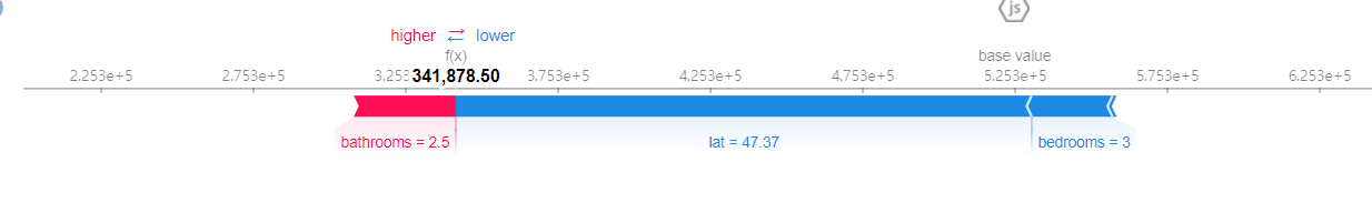
모델이 집값을 341,878.50으로 예측했는데 이는 lat=47.37, bedrooms=3 때문에 낮아지다가 bathrooms = 2.5 때문에 높아진 값으로 표를 확인하면 됨pdp와 sharp의 차이점
pdp와 특성 중요도와 차이를 가짐
shap은 데이터 샘플 하나에 대한 설명을 하는 것임
관측치 하나하나마다 특성의 영향도가 다르게 계산이 될 수 있음
