1. React Bootstrap
The most popular front-end framework Rebuilt for React.
install
npm install react-bootstrap bootstrapcss
import 'bootstrap/dist/css/bootstrap.min.css';
2. Material UI
Install
Default installation
Run one of the following commands to add Material UI to your project:
npm
npm install @mui/material @emotion/react @emotion/styledyarn
yarn add @mui/material @emotion/react @emotion/styledWith styled-components
Material UI uses Emotion as its default styling engine. If you want to use styled-components instead, run one of the following commands:
npm
npm install @mui/material @mui/styled-engine-sc styled-componentsyarn
yarn add @mui/material @mui/styled-engine-sc styled-componentsRoboto font
Material UI is designed to use the Roboto font by default. You may add it to your project with npm or yarn via Fontsource, or with the Google Fonts CDN.
npm
npm install @fontsource/robotoyarn
yarn add @fontsource/robotoThen you can import it in your entry point like this:
import '@fontsource/roboto/300.css';
import '@fontsource/roboto/400.css';
import '@fontsource/roboto/500.css';
import '@fontsource/roboto/700.css';
Google Web Fonts
To install the Roboto font in your project using the Google Web Fonts CDN, add the following code snippet inside your project's tag:
<link
  rel="stylesheet"
  href="https://fonts.googleapis.com/css?family=Roboto:300,400,500,700&display=swap"
/>
Icons
To use the font Icon component or the prebuilt SVG Material Icons (such as those found in the icon demos), you must first install the Material Icons font. You can do so with npm or yarn, or with the Google Web Fonts CDN.
npm
npm install @mui/icons-materialyarn
yarn add @mui/icons-materialGoogle Web Fonts
To install the Material Icons font in your project using the Google Web Fonts CDN, add the following code snippet inside your project's tag:
To use the font Icon component, you must first add the Material Icons font. Here are some instructions on how to do so. For instance, via Google Web Fonts:
<link
  rel="stylesheet"
  href="https://fonts.googleapis.com/icon?family=Material+Icons"
/>
Usage
import React from 'react';
import { Button } from '@material-ui/core';

function App() {
  return <Button color="primary">Hello World</Button>;
}
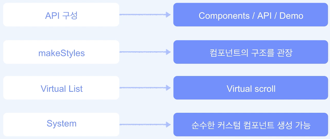
VirtualizedList (Virtual Scroll)
많은 컴포넌트들로 인해 동작에 문제가 생길 수 있을 것을 방지하고자 한정된 컴포넌트들만 받아오고 추가로 받아올 때 기존의 컴포넌트들과 바꿔치기하는 방식
import * as React from 'react';
import Box from '@mui/material/Box';
import ListItem from '@mui/material/ListItem';
import ListItemButton from '@mui/material/ListItemButton';
import ListItemText from '@mui/material/ListItemText';
import { FixedSizeList } from 'react-window';

function renderRow(props) {
  const { index, style } = props;

  return (
    <ListItem style={style} key={index} component="div" disablePadding>
      <ListItemButton>
        <ListItemText primary={`Item ${index + 1}`} />
      </ListItemButton>
    </ListItem>
  );
}

export default function VirtualizedList() {
  return (
    <Box
      sx={{ width: '100%', height: 400, maxWidth: 360, bgcolor: 'background.paper' }}
    >
      <FixedSizeList
        height={400}
        width={360}
        itemSize={46}
        itemCount={200}
        overscanCount={5}
      >
        {renderRow}
      </FixedSizeList>
    </Box>
  );
}
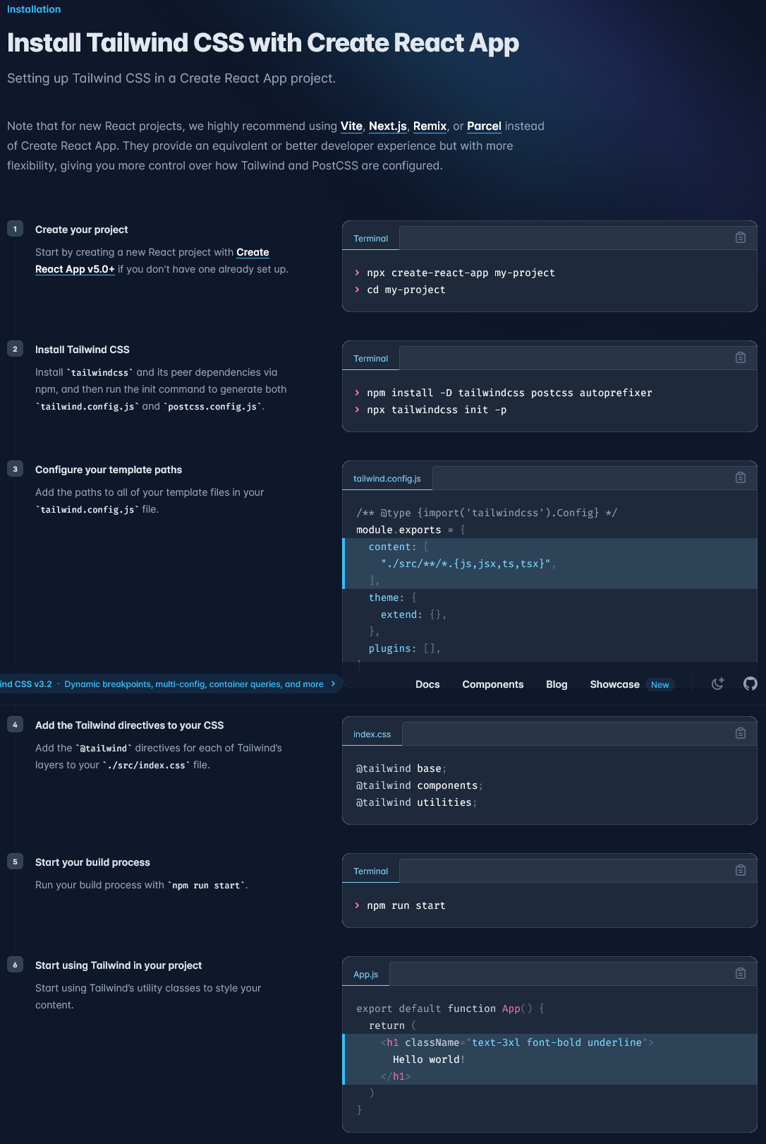
3. Tailwindcss
Rapidly build modern websites without ever leaving your HTML.