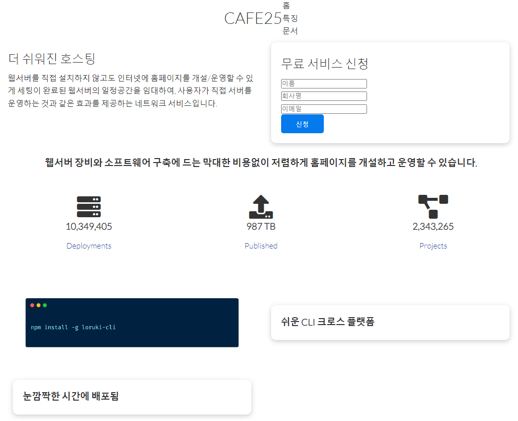
CAFE25
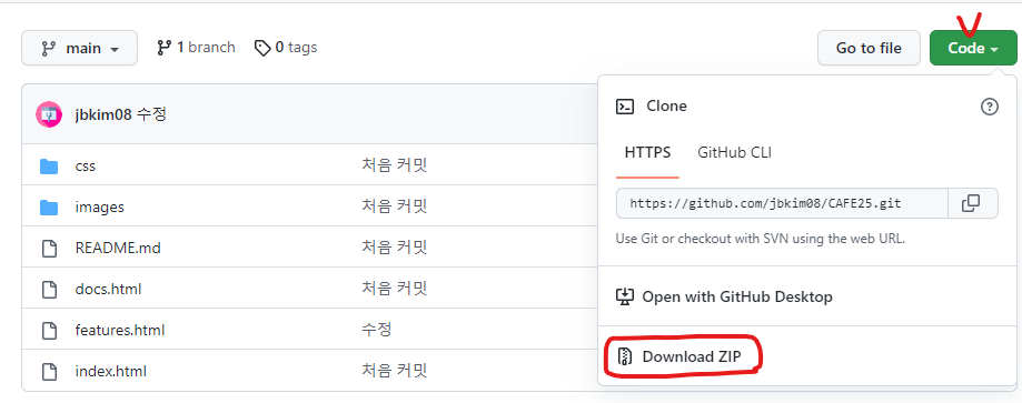
깃허브에서 파일 다운로드 받는법
자주 쓰는 색을 변수로 설정하는 방법 : --변수명
:root {
  --primary-color: #047aed;
  --secondary-color: #1c3fa8;
  --dark-color: #002240;
  --light-color: #f4f4f4;
  --success-color: #5cb85c;
  --error-color: #d9534f;
}
CSS적용 전 각 태그들의 기본 마진/패딩을 초기값 0으로 하고 박스모델 기준(px사이즈의 기준)을 보더-박스로 하는 방법. * {box-sizing: border-box; padding: 0; margin: 0;}
* {
box-sizing: border-box;
padding: 0;
margin: 0;
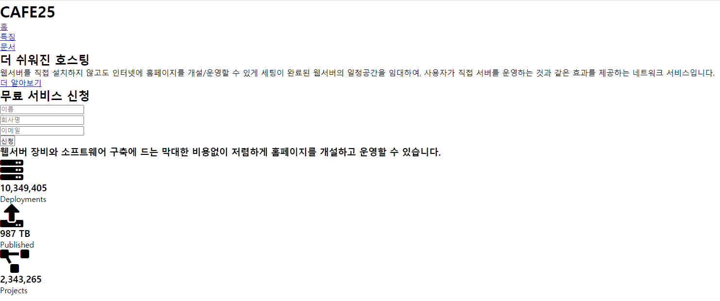
}기본화면
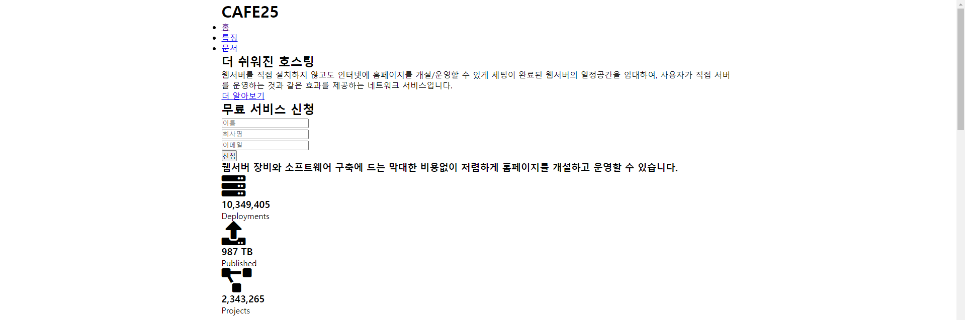
컨테이너 적용 후
.container {
max-width: 1100px;
margin: 0 auto;
overflow: auto;
padding: 0 40px;
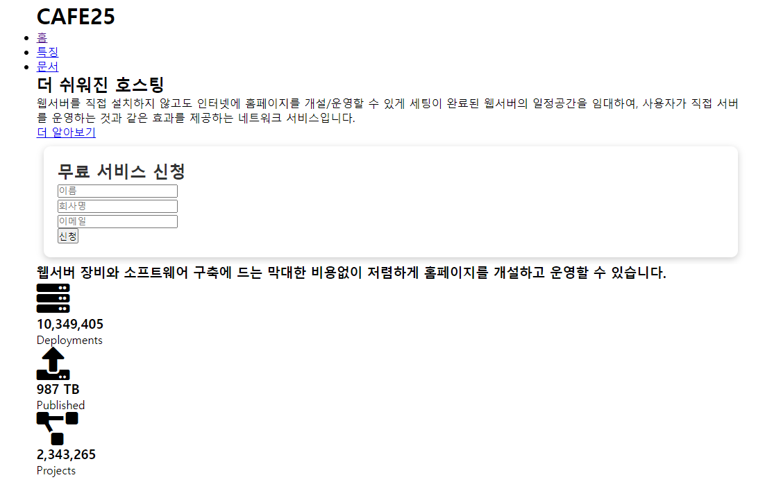
}카드 적용 후
.card {
  background-color: #fff;
  color: #333;
  border-radius: 10px;
  box-shadow: 0 3px 10px rgba(0, 0, 0, 0.2);
  padding: 20px;
  margin: 10px;
}
버튼 적용 후
.btn {
  display: inline-block;
  padding: 10px 30px;
  cursor: pointer;
  background: var(--primary-color);
  color: #fff;
  border: none;
  border-radius: 5px;
}
/* 투명 버튼 */
.btn-outline {
  background-color: transparent;
  border: 1px #fff solid;
}
/* 마우스를 올리면 약간 작아지게 */
.btn:hover {
  transform: scale(0.98);
}
글자색, 배경색 설정
백그라운드 색이 밝으면 글자색은 어둡게, 백그라운드색이 어두우면 글자색은 밝게
& 버튼 색과 글자색도 마찬가지
.bg-primary,
.btn-primary {
  background-color: var(--primary-color);
  color: #fff;
}

.bg-secondary,
.btn-secondary {
  background-color: var(--secondary-color);
  color: #fff;
}

.bg-dark,
.btn-dark {
  background-color: var(--dark-color);
  color: #fff;
}

.bg-light,
.btn-light {
  background-color: var(--light-color);
  color: #333;
}

/* 예) Footer */
.bg-primary a,
.btn-primary a,
.bg-secondary a,
.btn-secondary a,
.bg-dark a,
.btn-dark a {
  color: #fff;
}
글자색을 변수에 저장된 색으로 변경
/* 글자 색 */
.text-primary {
  color: var(--primary-color);
}

.text-secondary {
  color: var(--secondary-color);
}

.text-dark {
  color: var(--dark-color);
}

.text-light {
  color: var(--light-color);
}
글자 사이즈 변경
/* 글자 크기 */
.lead {
  font-size: 20px;
}

.sm {
  font-size: 1rem;
}

.md {
  font-size: 2rem;
}

.lg {
  font-size: 3rem;
}

.xl {
  font-size: 4rem;
}

/* 좌우 정렬 */
.text-center {
  text-align: center;
}
경고창
/* 경고창 */
.alert {
  background-color: var(--light-color);
  padding: 10px 20px;
  font-weight: bold;
  margin: 15px 0;
}

.alert i {
  margin-right: 10px;
}

.alert-success {
  background-color: var(--success-color);
  color: #fff;
}

.alert-error {
  background-color: var(--error-color);
  color: #fff;
}
그리드 적용
/* 그리드 (절반:절반) 정렬 */
.grid {
  display: grid;
  grid-template-columns: repeat(2, 1fr);
  gap: 20px;
  justify-content: center;
  align-items: center;
  height: 100%;
}

/* 그리드 3개 정렬 33.33% 씩 */
.grid-3 {
  grid-template-columns: repeat(3, 1fr);
}
플렉스 적용
/* 플랙스 가운데 정렬 */
.flex {
  display: flex;
  justify-content: center;
  align-items: center;
  height: 100%;
}
마진, 패딩 적용
/* 마진 */
.my-1 {
  margin: 1rem 0;
}

.my-2 {
  margin: 1.5rem 0;
}

.my-3 {
  margin: 2rem 0;
}

.my-4 {
  margin: 3rem 0;
}

.my-5 {
  margin: 4rem 0;
}

.m-1 {
  margin: 1rem;
}

.m-2 {
  margin: 1.5rem;
}

.m-3 {
  margin: 2rem;
}

.m-4 {
  margin: 3rem;
}

.m-5 {
  margin: 4rem;
}

/* 패딩 */
.py-1 {
  padding: 1rem 0;
}

.py-2 {
  padding: 1.5rem 0;
}

.py-3 {
  padding: 2rem 0;
}

.py-4 {
  padding: 3rem 0;
}

.py-5 {
  padding: 4rem 0;
}

.p-1 {
  padding: 1rem;
}

.p-2 {
  padding: 1.5rem;
}

.p-3 {
  padding: 2rem;
}

.p-4 {
  padding: 3rem;
}

.p-5 {
  padding: 4rem;
}
구글폰트 적용, 공통 적용 css
body {
  font-family: 'Lato', sans-serif;
  color: #333;
  line-height: 1.6;
}

ul {
  list-style-type: none; /* 리스트의 ● 을 없애줌 */
}

a {
  text-decoration: none; /* a태그의 파란색 밑줄 제거 */
  color: #333;
}
/* 글자 굵게, 마진 조금 더 */
h1,
h2 {
  font-weight: 300;
  line-height: 1.2;
  margin: 10px 0;
}

p {
  margin: 10px 0;
}
/* 이미지의 가로길이를 100% */
img {
  width: 100%;
}

code,
pre {
  background: #333;
  color: #fff;
  padding: 10px;
}

.hidden {
  visibility: hidden;
  height: 0;
}
여기까지 공통적으로 지정 해준 후, CSS 개별지정 시작하면됨.
navBar 메뉴 꾸미기
/* 네브바 메뉴 */
/* 상단 네브바 색상설정 */
.navbar {
background-color: var(--primary-color);
color: #fff;
height: 70px;
}
/* ul에 플렉스를 줘서 가로로 정렬되게 함 */
.navbar ul {
display: flex;
}
.navbar a {
color: #fff;
padding: 10px;
margin: 0 5px;
}
/* 네브바 a태그에 마우스를 올리면 밑줄이 생기도록 */
.navbar a:hover {
border-bottom: 2px #fff solid;
}
/* 로고버튼(CAFE)에 마우스 올리면 밑줄 안생기도록 */
.logo a:hover {
border-bottom: none;
}
.navbar .flex {
justify-content: space-between; /* 창을 가로로 늘려도 CAFE25와 홈/특징/문서가 양 끝단에 있도록 */
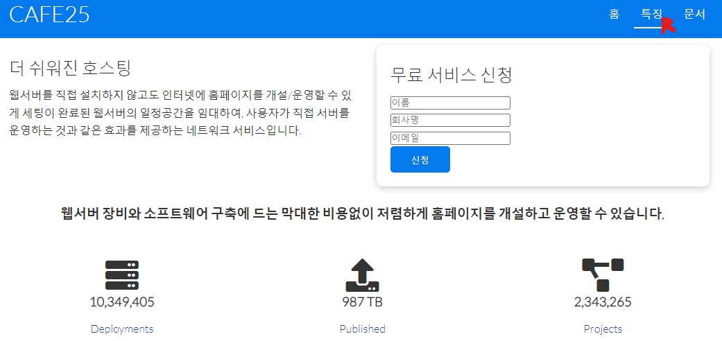
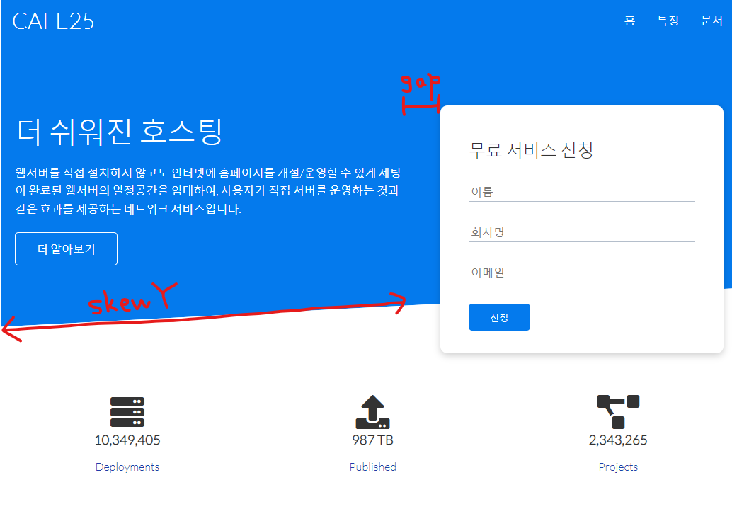
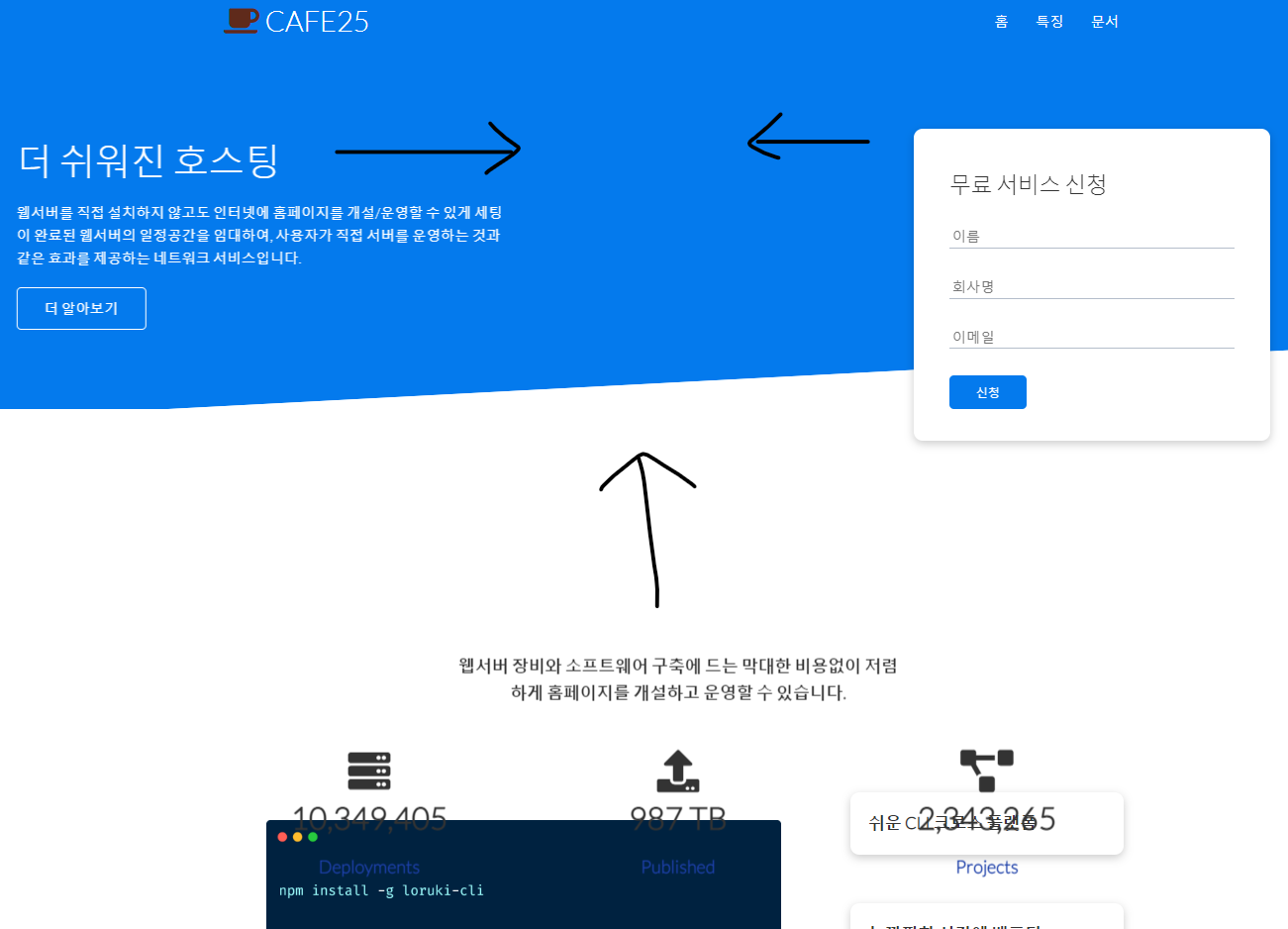
}쇼케이스 섹션 꾸미기
/* Showcase */
.showcase {
  height: 400px;
  background-color: var(--primary-color);
  color: #fff;
  position: relative;
}

.showcase h1 {
  font-size: 40px;
}

.showcase p {
  margin: 20px 0;
}
/* 그리드의 1:1 비율을 재조정 */
.showcase .grid {
  overflow: visible;
  grid-template-columns: 55% auto;
  gap: 30px;
}

.showcase-text {
  animation: slideInFromLeft 1s ease-in;
}

.showcase-form {
  position: relative;
  top: 60px;
  height: 350px;
  width: 400px;
  padding: 40px;
  z-index: 100;
  justify-self: flex-end;
  animation: slideInFromRight 1s ease-in;
}

.showcase-form .form-control {
  margin: 30px 0;
}

.showcase-form input[type='text'],
.showcase-form input[type='email'] {
  border: 0;
  border-bottom: 1px solid #b4becb;
  width: 100%;
  padding: 3px;
  font-size: 16px;
}

.showcase-form input:focus {
  outline: none;
}

.showcase::before,
.showcase::after {
  content: '';
  position: absolute;
  height: 100px;
  bottom: -70px;
  right: 0;
  left: 0;
  background: #fff;
  transform: skewY(-3deg);	/* 찌그러진 모양을 만듦 */
  -webkit-transform: skewY(-3deg); /* webkit-transform: 접속자의 컴퓨터 브라우저별 적용양식(벤더 프리픽스) */
  -moz-transform: skewY(-3deg);
  -ms-transform: skewY(-3deg);
}
벤더 프리픽스 : https://dolly77.tistory.com/9
자동변환 프로그램 : https://autoprefixer.github.io/
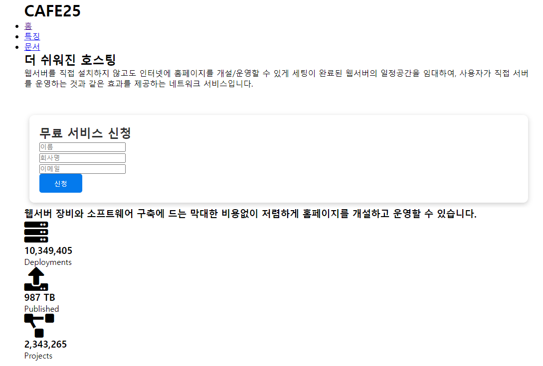
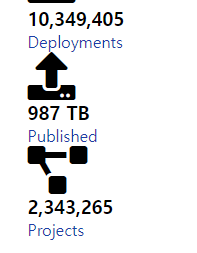
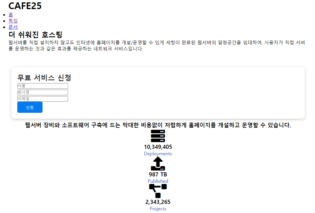
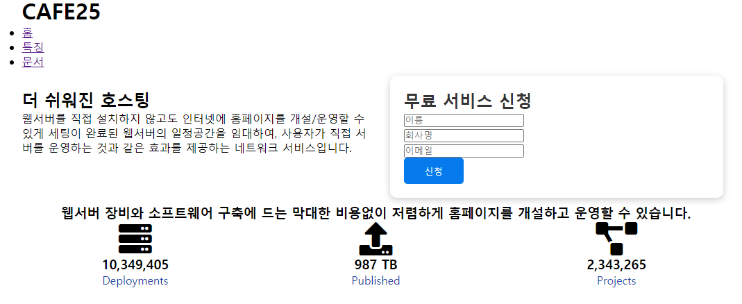
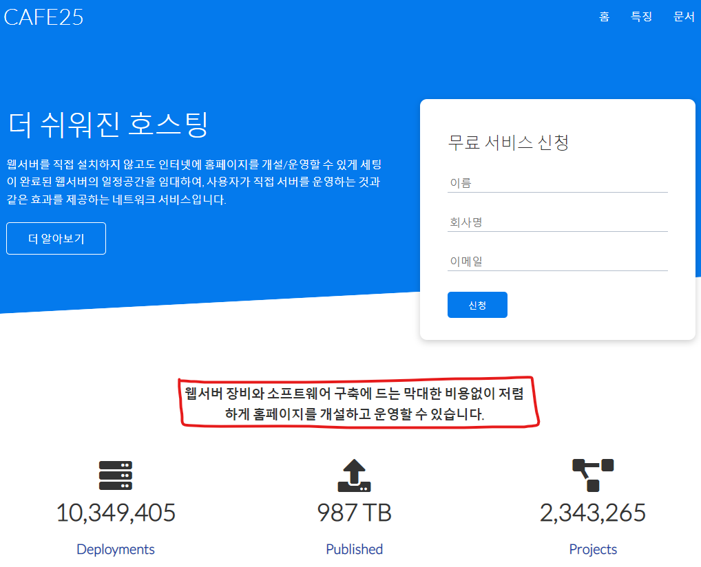
stats 섹션 꾸미기
가상요소에 가려져서 안보이던 글자 보이게
/* Stats */
.stats {
  padding-top: 100px;
  animation: slideInFromBottom 1s ease-in;
}

.stats-heading {
  max-width: 500px;	/* 글자가 너무 길면 읽기가 힘들어서 가로길이를 500px로, 그보다 길면 줄바꿈이 이루어지도록 함 */
  margin: auto;
}

.stats .grid h3 {
  font-size: 35px;
}

.stats .grid p {
  font-size: 20px;
  font-weight: bold;
}
Cli 섹션 꾸미기
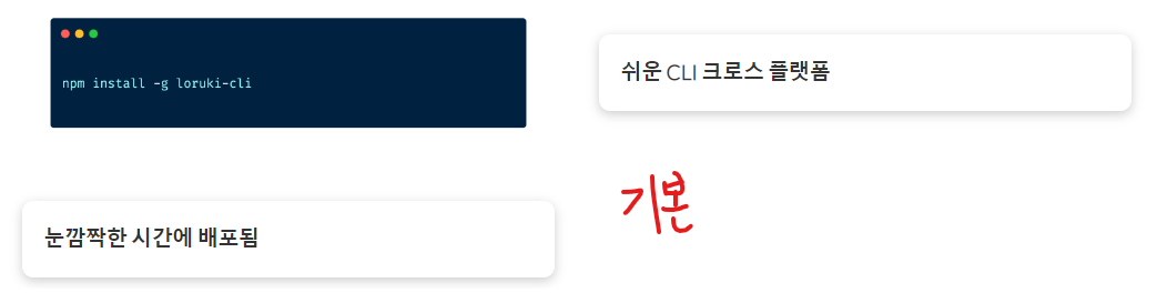
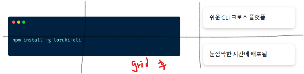
/* Cli */
/* 가로 3등분, 세로 2등분 */
.cli .grid {
  grid-template-columns: repeat(3, 1fr);
  grid-template-rows: repeat(2, 1fr);
}

.cli .grid > *:first-child {
  grid-column: 1 / span 2;
  grid-row: 1 / span 2;
}
cloud 섹션 꾸미기
cloud섹션의 글자와 그림의 비율을 4:3으로

/* Cloud */
.cloud .grid {
grid-template-columns: 4fr 3fr;
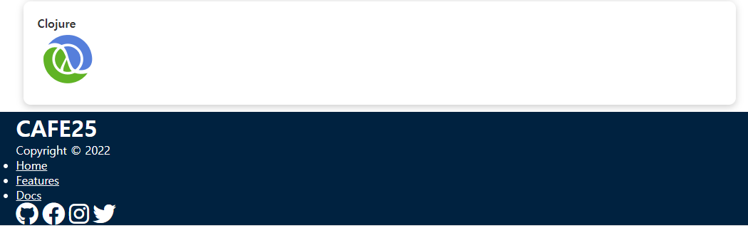
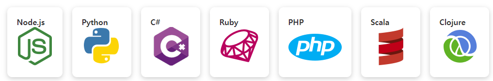
}Languages 섹션 꾸미기
화면이 작아지면 카드가 내려오도록 flex: wrap
변경전
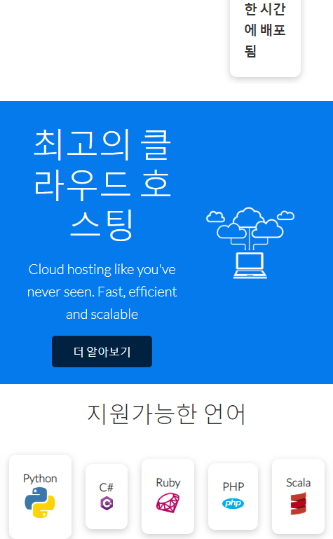
변경후
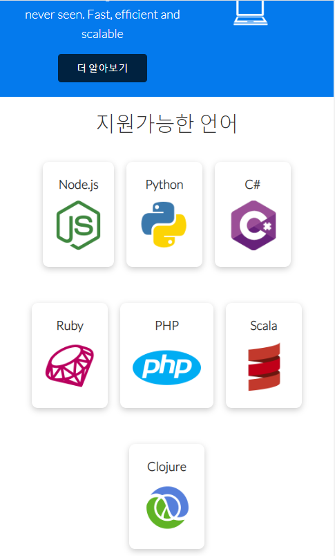
/* Languages */

.languages .flex {
  flex-wrap: wrap;
}
/* 마우스를 올리면 카드가 살짝 올라가는 transform */
.languages .card {
  text-align: center;
  margin: 18px 10px 40px;
  transition: transform 0.2s ease-in;
}

.languages .card h4 {
  font-size: 20px;
  margin-bottom: 10px;
}

.languages .card:hover {
  transform: translateY(-15px);
}
아이콘 넣는법
<link rel="stylesheet" href="https://cdnjs.cloudflare.com/ajax/libs/font-awesome/5.15.1/css/all.min.css" /> 링크를 를 index.html에 넣어줘야 구글에서 제공하는 아이콘을 사용할 수 있음. (폰트오썸 5버전 사용해야함)
font-awesome 링크 https://fontawesome.com/v5/icons
※ <h1 class="logo"><i style="color : rgb(95, 42, 27)" class="fas fa-coffee"></i> CAFE25</h1> 와 같이 style 태그를 통해 아이콘의 색상을 지정해줄수도 있음.
1. 사이트에서 태그 복사
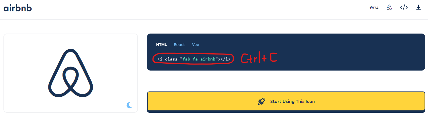
2. 아이콘을 넣고자 하는 태그에 붙여넣기
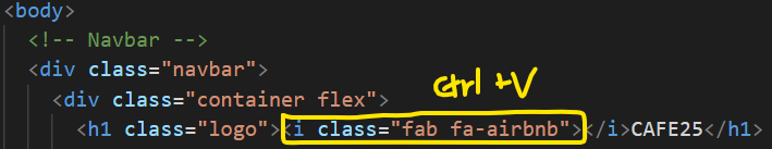
3. 결과물

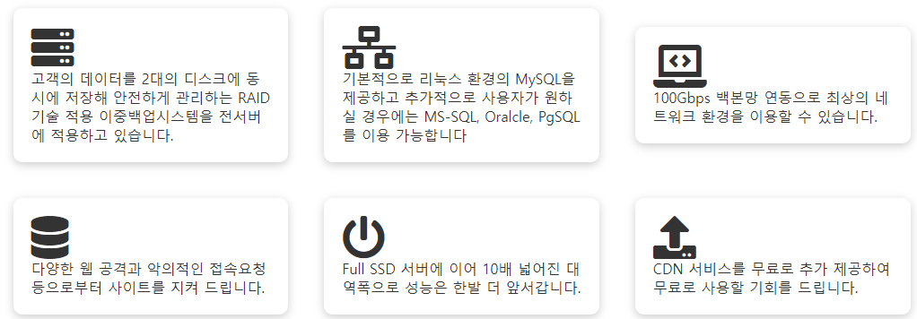
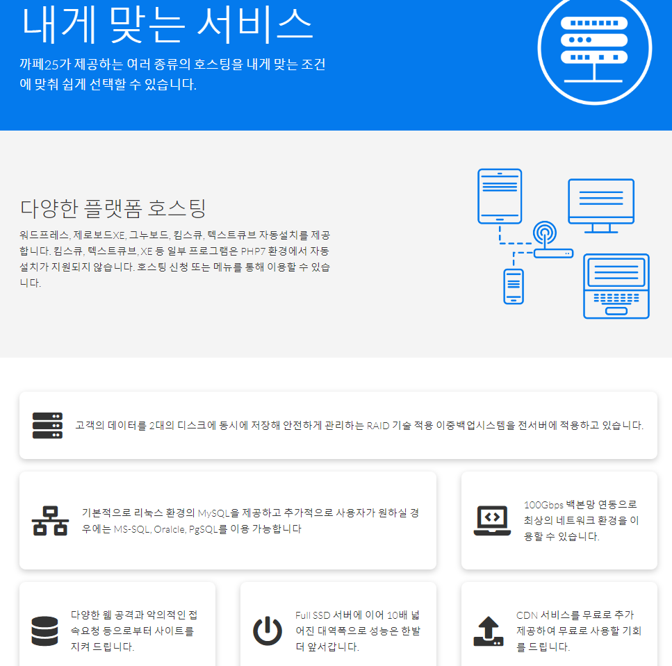
특징 페이지 꾸미기
/* 특징 페이지 */
.features-head img,
.docs-head img {
width: 200px; /* 사이즈 200px로 축소 */
justify-self: flex-end;
}
.features-sub-head img {
width: 300px;
justify-self: flex-end; /* 그리드로 절반씩 나눈 위치 내에서 맨 끝으로 이동 */
}
.features-main .card > i {
margin-right: 20px; /* 글자와 아이콘 간의 간격 */
}
.features-main .grid {
padding: 30px; /* 그리드 박스의 테두리에 공간 주기 */
}
.features-main .grid > *:first-child {
grid-column: 1 / span 3; /* 첫번째카드는 글자가 많으므로 3칸 */
}
.features-main .grid > *:nth-child(2) {
grid-column: 1 / span 2; /* 두번째카드는 2칸 */
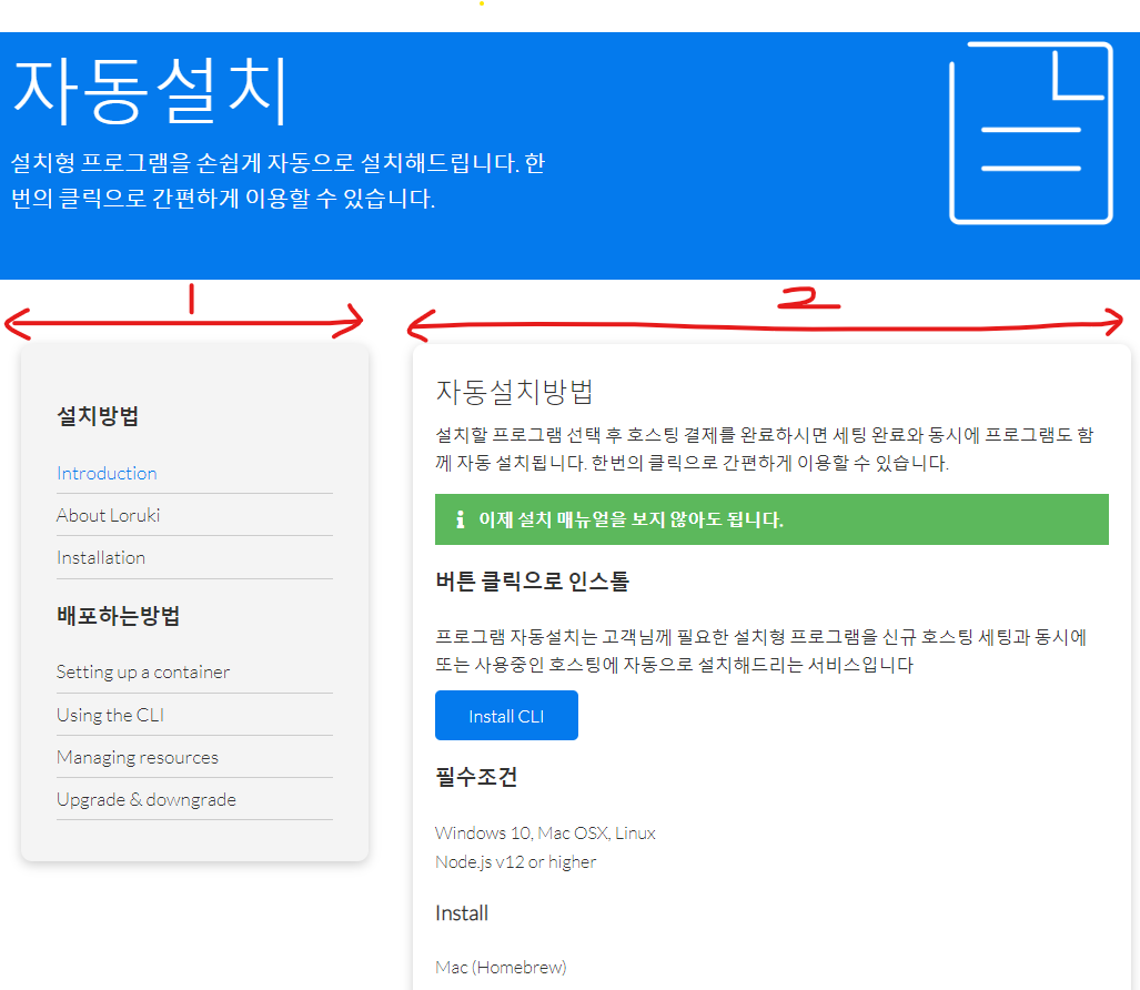
}문서 페이지 꾸미기
/* 문서 페이지 */
.docs-main h3 {
  margin: 20px 0;
}

.docs-main .grid {
  grid-template-columns: 1fr 2fr;   /* 1:2 비율 */
  align-items: flex-start;
}

.docs-main nav li {
  font-size: 17px;
  padding-bottom: 5px;
  margin-bottom: 5px;
  border-bottom: 1px #ccc solid;
}

.docs-main a:hover {
  font-weight: bold;   /* 마우스를 갖다대면 굵어지게 */
}
footer 공통
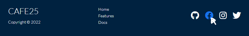
마우스를 갖다대면 각 아이콘마다 색깔이 바뀌게
/* Footer */
.footer .social a {
  margin: 0 10px;
}

.fa-github:hover {
  color: #000000;
}

.fa-facebook:hover {
  color: #1773ea;
}

.fa-instagram:hover {
  color: #b32e87;
}

.fa-twitter:hover {
  color: #1c9cea;
}
애니메이션
/* 애니메이션 */
/* 왼쪽에서 오른쪽으로 */
@keyframes slideInFromLeft {
  0% {
    transform: translateX(-100%);
  }

  100% {
    transform: translateX(0);
  }
}
/* 오른쪽에서 왼쪽으로 */
@keyframes slideInFromRight {
  0% {
    transform: translateX(100%);
  }

  100% {
    transform: translateX(0);
  }
}
/* 위에서 아래로 */
@keyframes slideInFromTop {
  0% {
    transform: translateY(-100%);
  }

  100% {
    transform: translateX(0);
  }
}
/* 아래에서 위로 */
@keyframes slideInFromBottom {
  0% {
    transform: translateY(100%);
  }

  100% {
    transform: translateX(0);
  }
}
탭아이콘 넣기

link:favicon + Enter
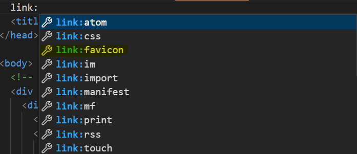
<link rel="shortcut icon" href="images/cafe.png" type="image/x-icon">
결과

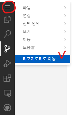
깃허브에 올리기, 수정, 배포하기
Repository name 설정
Description (optional) 설정
Public 선택
Add a README file : 설명하는 파일
Choose a license : None
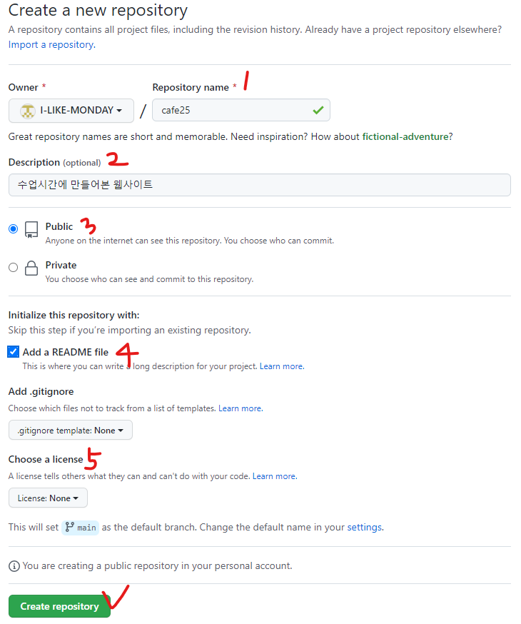
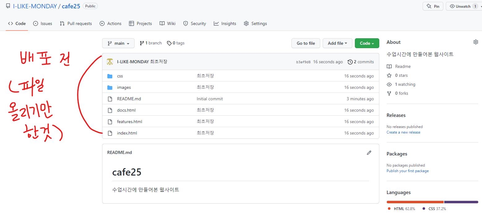
Create버튼 클릭 후 위와같이 repository 생성
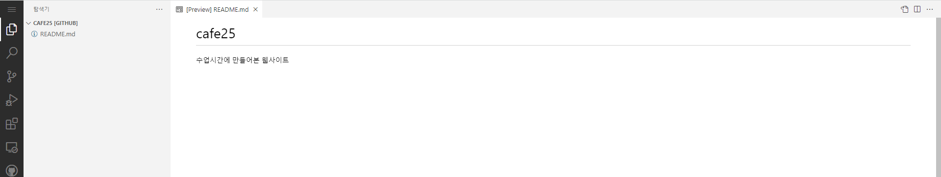
Create 후 키보드의 . 을 누르면 Edit 페이지로 들어갈 수 있다.
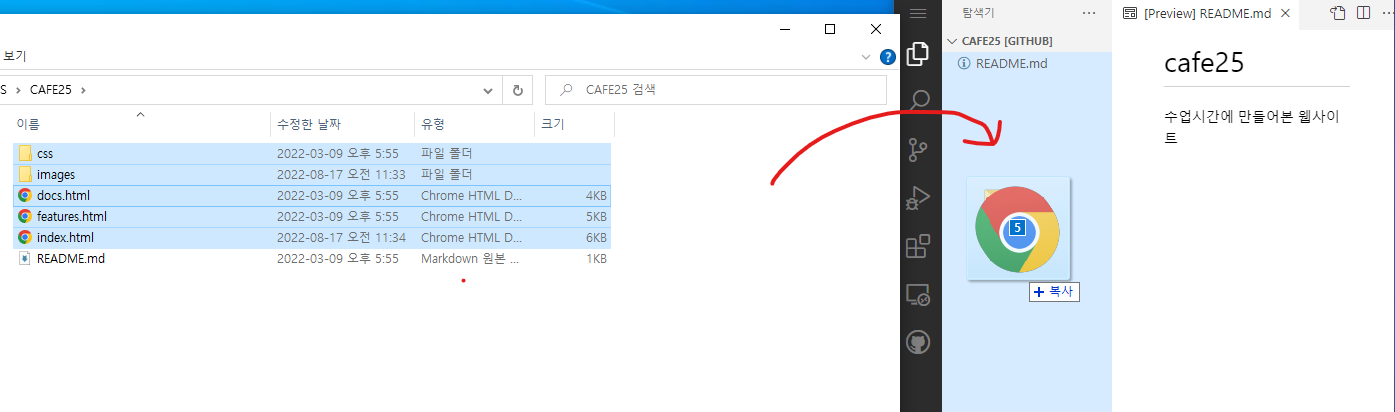
탐색기 탭에서 배포하고자 하는 파일들을 끌어다 놓는다.
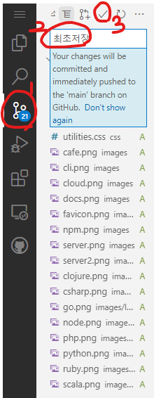
깃으로 저장 : 좌측 소스제어 탭에서 저장하고자하는 이름 작성 후 commit 버튼 클릭
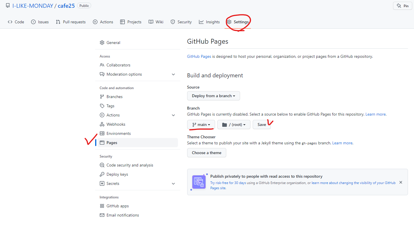
생성된 repository의 Setting탭 - Pages에서 위 이미지와 같이 설정 후 Save 클릭후 기다리면
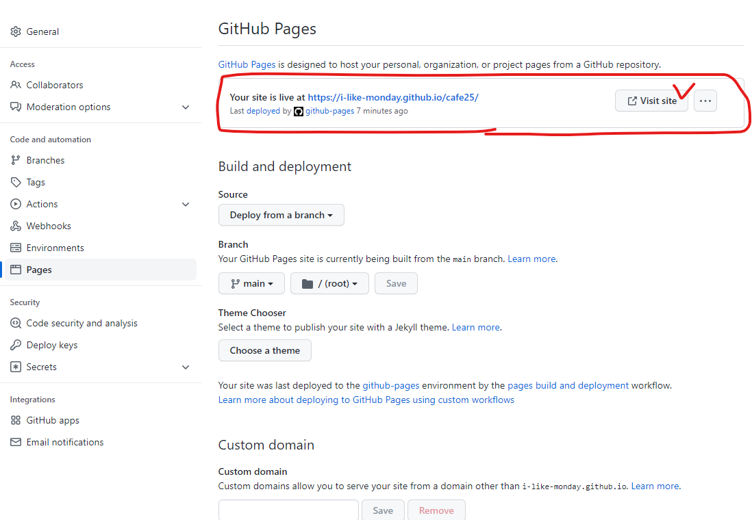
url주소가 생성된다.
???
????
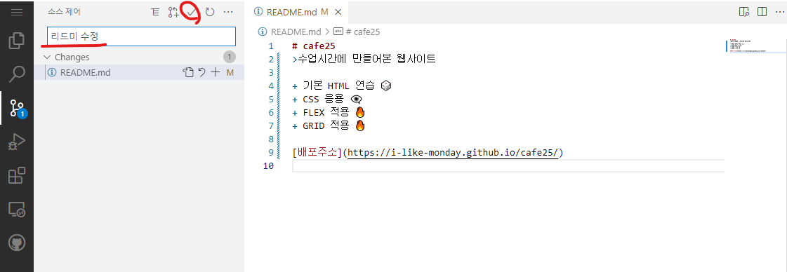
소스제어에 들어가서 벨로그와 같은 형식의 마크다운으로 설명파일 생성 가능
부트스트랩
부트스트랩은 반응형이며 모바일 우선인 웹프로젝트 개발을 위한 가장 인기있는 HTML, CSS, JS 프레임워크이다.
한글사이트(페이크) - 버전3, 현재는 잘 쓰지 않음
http://bootstrapk.com/
🎃공식사이트
https://getbootstrap.com/
🎃한글공식사이트
https://getbootstrap.kr/
- 바탕화면에 Bootstrap 폴더 생성 후 내부에 test폴더 생성후 Code로 열기
- test.html 파일 생성 후 링크걸어보기
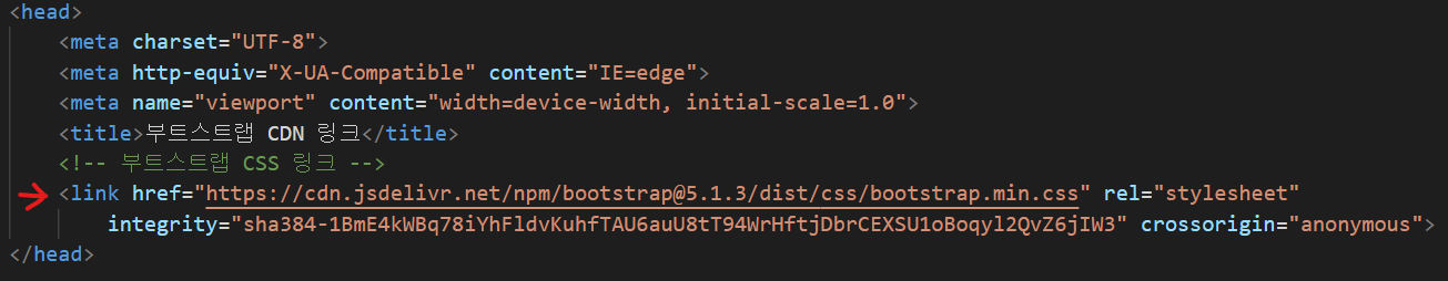
한글공식사이트 접속 후 시작하기 클릭(링크를 붙여넣는 방법과 다운로드하는 방법이 있음)
링크를 붙여넣는 방법
기본버튼과 btn 버튼의 차이점
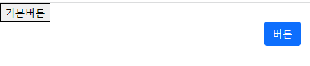
<button>기본버튼</button>
    <div class="container">
        <button class="btn btn-primary">버튼</button>
        <!-- btn danger -> 빨간색으로 변함 -->
</div><body>
<button>기본버튼</button>
<div class="container">
<button class="btn btn-primary">버튼</button>
<!-- btn danger -> 빨간색으로 변함 -->
</div>
<!-- 부트스트랩 JS 링크(위치 : <body>태그의 끝지점) -->
<script src="https://cdn.jsdelivr.net/npm/bootstrap@5.1.3/dist/js/bootstrap.bundle.min.js"
integrity="sha384-ka7Sk0Gln4gmtz2MlQnikT1wXgYsOg+OMhuP+IlRH9sENBO0LRn5q+8nbTov4+1p"
crossorigin="anonymous"></script>
</body>다운로드 방식
.
.
.
타이포그래피 사용법
https://getbootstrap.kr/docs/5.1/content/typography/
부트스트랩 테마색
참고 : https://getbootstrap.kr/docs/5.1/utilities/colors/
글자색 : <class="text-색이름">
   <!-- COLORS ON TEXT -->

    <p class="text-primary">This is a primary text</p>
    <p class="text-secondary">This is a secondary text</p>
    <p class="text-success">This is a success text</p>
    <p class="text-danger">This is a danger text</p>
    <p class="text-warning">This is a warning text</p>
    <p class="text-info">This is a info text</p>
    <p class="text-light">This is a light text</p>
    <p class="text-dark">This is a dark text</p>
    <p class="text-body">This is a body text</p>
    <p class="text-muted">This is a muted text</p>
    <p class="text-white">This is a white text</p>
백그라운드 색 : <class="bg-백그라운드색">
  <!-- COLORS ON BACKGROUND -->

    <p class="bg-primary text-light">This is a primary background</p>
    <p class="bg-secondary text-white">This is a secondary background</p>
    <p class="bg-success">This is a success background</p>
    <p class="bg-danger">This is a danger background</p>
    <p class="bg-warning">This is a warning background</p>
    <p class="bg-info">This is a info background</p>
    <p class="bg-light">This is a light background</p>
    <p class="bg-dark text-white-50">This is a dark background</p>
    <p class="bg-body">This is a body background</p>
    <p class="bg-white">This is a white background</p>
    <p class="bg-transparent">This is a transparent background</p>
🎃 <class="bg-백그라운드색 ^ text-글자색">으로 한번에 두가지 지정 가능
보더
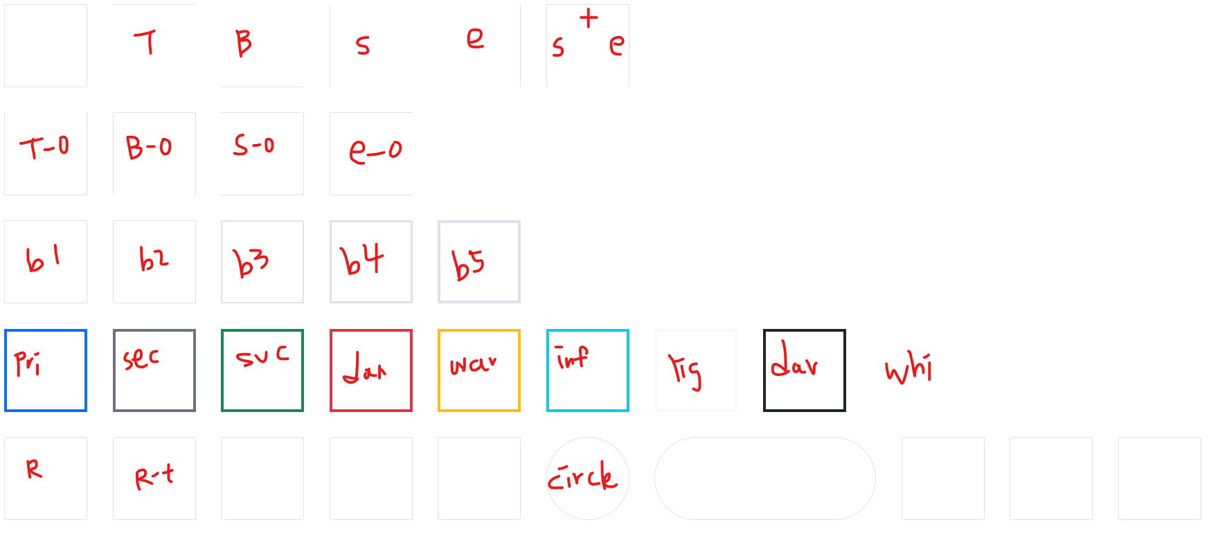
<!-- ADDING BORDERS -->

  <div class="border"></div>
  <div class="border-top"></div>
  <div class="border-bottom"></div>
  <div class="border-start"></div>
  <div class="border-end"></div>
  <div class="border-end border-start border-top"></div>

  <br>
  <!-- REMOVING BORDERS -->

  <div class="border border-top-0"></div>
  <div class="border border-bottom-0"></div>
  <div class="border border-start-0"></div>
  <div class="border border-end-0"></div>

  <br>
  <!-- BORDER WIDTH -->

  <div class="border border-1"></div>
  <div class="border border-2"></div>
  <div class="border border-3"></div>
  <div class="border border-4"></div>
  <div class="border border-5"></div>

  <br>
  <!-- BORDER COLORS -->

  <div class="border border-5 border-primary"></div>
  <div class="border border-5 border-secondary"></div>
  <div class="border border-5 border-success"></div>
  <div class="border border-5 border-danger"></div>
  <div class="border border-5 border-warning"></div>
  <div class="border border-5 border-info"></div>
  <div class="border border-5 border-light"></div>
  <div class="border border-5 border-dark"></div>
  <div class="border border-5 border-white"></div>

  <br>
  <!-- BORDER RADIUS -->

  <div class="border rounded"></div>
  <div class="border rounded-top"></div>
  <div class="border rounded-bottom"></div>
  <div class="border rounded-start"></div>
  <div class="border rounded-end"></div>

  <div class="border rounded-circle"></div>
  <div style="width: 400px;" class="border rounded-pill"></div>

  <!-- ROUNDED SIZES -->

  <div class="border rounded-1"></div>
  <div class="border rounded-2"></div>
  <div class="border rounded-3"></div>
  <div class="border rounded-0"></div>
  <script src="js/bootstrap.bundle.min.js"></script>
디스플레이
 <!-- DISPLAY PROPERTIES -->
 /* 디스플레이 속성 d-inline 인라인 d-block 블록 */
  <div class="border border-2 border-danger d-inline"></div>
// 인라인은 사이즈를 넣을 수 없음.
  <br>
  <div class="border border-2 border-danger d-inline-block"></div>
// 인라인 블록은 사이즈를 넣을 수 있음.
  <br>
  <span class="border border-2 border-warning d-block"></span>
// d-블록은 화면을 다 차지하는 것.

  <!-- DISPLAY GRID -->
// d-grid : 세로 1:1:1 비율로 박스 3개, 근데 border클래스는 4개라서 첫줄에 3개밖에 못들어감 -> 1행에 3개, 2행에 1개로 나뉘어짐
  <div class="d-grid" style="grid-template-columns: 1fr 1fr 1fr;">
    <div class="border"></div>
    <div class="border"></div>
    <div class="border"></div>
    <div class="border"></div>
  </div>

  <!-- DISPLAY FLEX -->
// 화면의 가로길이를 바꿔도 왼쪽에 붙어있게 설정
  <div class="d-flex">
    <div class="border"></div>
    <div class="border"></div>
    <div class="border"></div>
  </div>
캐러셀
참고 : https://getbootstrap.kr/docs/5.1/components/carousel/
-끝-