7강 키즈가오( 처음 - 02:20:36)
학습 내용
오늘은 강사님께서 제작하신 웹사이트를 만들어보았다.
index.html
style.css
animation.css
mobile.css
이렇게 네 가지를 먼저 만들어준다.
html
<!DOCTYPE html>
<html>
<head>

	<meta charset="utf-8">
	<meta name="description" content="우리쌀 점토로 만든 키즈가오 웹사이트 소개">
	<meta name="keyword" content="키즈가오, 점토, 장난감">
	<meta name="author" content="이정민">

	<meta name="viewport" content="width=device-width, initial-scale=1.0">

	<title>키즈가오</title>

	<link rel="stylesheet" type="text/css" href="css/style.css">
	<link rel="stylesheet" type="text/css" href="css/animation.css">
	<link rel="stylesheet" type="text/css" href="css/mobile.css">
</head>
<body>

</body>
</html>
모바일 버전도 고려해서 제작을 하기 때문에 viewport 부분의 설정을 해주지 않으면 모바일에서 웹사이트를 실행했을 때 화면 비율이 맞지 않게 된다.
initial-scale=1.0 확대 비율
css
/* Default Css */
html, body {
	margin: 0;
	padding: 0;
}

body {
	overflow-x: hidden;
}

h1, h2, h3, h4, h5, h6, p {
	margin: 0;
	padding: 0;
}

button {
	border: none;
	background-color: transparent;
}

.clearfix {
	clear: both;
}
-
overflow-x: hidden;
browser의 x축을 벗어나는 (browser 외곽에 있는) 영역에 있는 것 숨김. 가로 스크롤이 생기지 않도록 -
border: none;
button 태그는 기본적으로 테두리를 가지고 있기 때문에 없애준다. -
background-color: transparent;
회색 배경이 기본 -> 투명으로 바꿔준다.
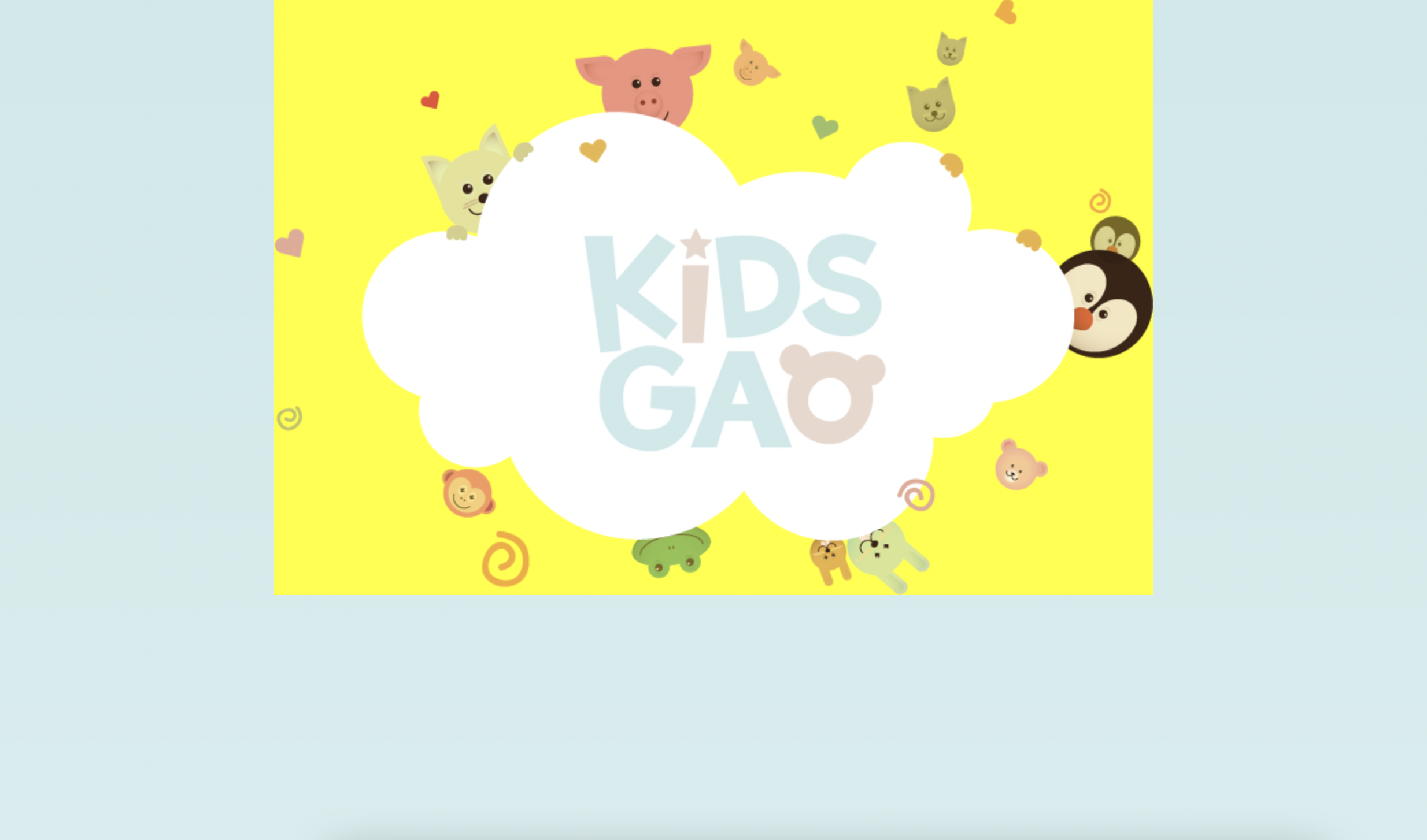
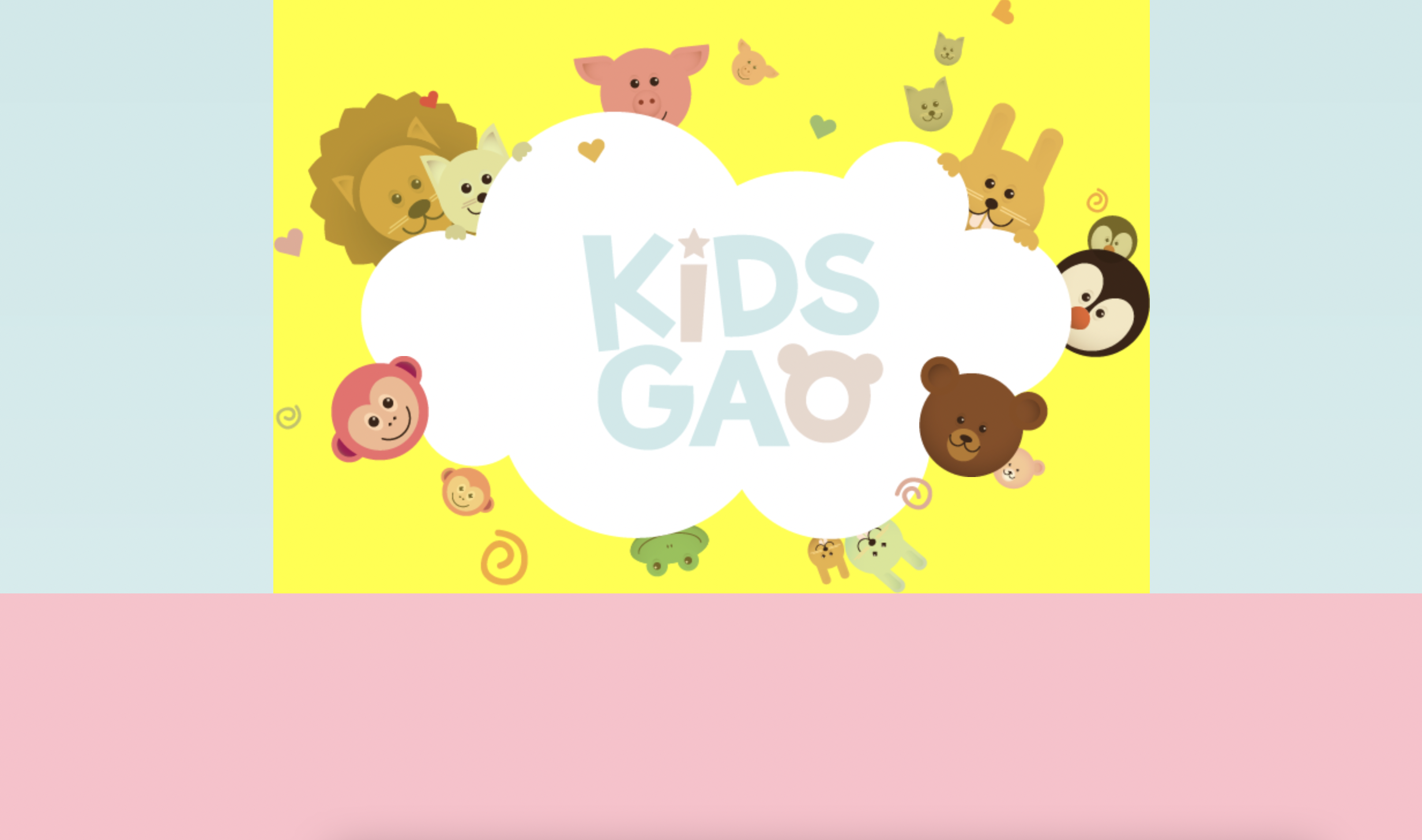
잠자리가 날아다니는 intro 부분 제작
첫번째 부분 : 움직이는 동물 네마리
두번째 부분 : 구름 & 잠자리
html
body에
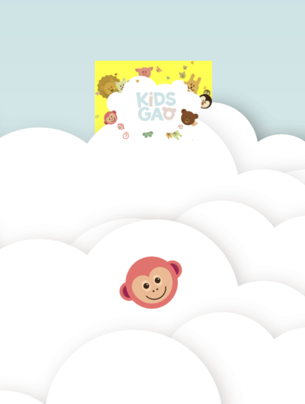
	<header id="intro">

		<div class="introWrap">
			<div class="logo"></div>
			<div class="lion"></div>
			<div class="rabbit"></div>
			<div class="bear"></div>
			<div class="monkey"></div>
		</div>

		<div class="cloudWrap">
			<div class="leftCloud"></div>
			<div class="rightCloud"></div>
			<div class="dragonfly"></div>
		</div>

	</header>
css
#intro {
	width: 100%;
	height: 1600px;
	background-image: url(../img/intro/intro_bg.png);
}- ../
css 폴더에서 나와서 img 파일로 가야할 때
첫 번째 서랍장에 대한 디자인 작업
css
#intro {
	width: 100%;
	height: 1600px;
	background-image: url(../img/intro/intro_bg.png);
}

#intro .introWrap {
	position: relative;

	width: 760px;
	height: 516px;
	background-color: yellow;

	left: 50%;
	margin-left: -380px;
}

#intro .introWrap .logo {
	position: absolute;

	width: 760px;
	height: 516px;
	background-image: url(../img/intro/logo.png);

	z-index: 100;
}-
introWrap을 position relative로 설정한 이유
1 중앙 정렬을 하기 위해서 (relative는 2차원, 3차원 다 가능)
2 부모가 기준점이 되어서 좌표 기준점 설정 가능
3 top을 사용하기 위해서 -
margin-left: -380px
380은 서랍장의 width 값의 절반 값
left: 50%;으로 하는 것은 3차원 영역에서만 가능
이렇게 해준 것과 함께 적용되면 이미지가 정중앙에 위치 -
position: absolute;
앞 동물, 뒷 동물 있으므로 z축 존재하기 때문 -
z-index: 100;
의미 x. 기준점을 만들어 주는 것
100보다 작으면 동물이 뒤에 배치
100보다 크면 앞에 배치
css
#intro .introWrap .lion {
	position: absolute;

	width: 161px;
	height: 161px;
	background-image: url(../img/intro/lion.png);

	margin: 80px 0 0 30px;
}

#intro .introWrap .rabbit {
	position: absolute;

	width: 105px;
	height: 129px;
	background-image: url(../img/intro/rabbit.png);

	margin: 90px 0 0 580px;
}

#intro .introWrap .bear {
	position: absolute;

	width: 112px;
	height: 105px;
	background-image: url(../img/intro/bear.png);

	margin: 310px 0 0 560px;

	z-index:  200;
}

#intro .introWrap .monkey {
	position: absolute;

	width: 85px;
	height: 93px;
	background-image: url(../img/intro/monkey.png);

	margin: 310px 0 0 50px;

	z-index: 200;
}-
position: absolute; 를 사용한 영역은 z-index가 0이라고 보면 된다. 0<100 이므로 사자는 뒤에 배치
-
width 값을 image의 크기보다 크게 주었을 때
공간을 메꾸는 속성 때문에 여러개의 image가 보이게 된다.
background-repeat으로 1개의 image만 보이게 할 수 있지만 공간은 그대로 차지하기 때문에 image의 크기에 맞게 공간을 설정하는 것이 좋다.
어려웠던 부분
로고의 마진을 설정할 때 기준값과 설정값에 대해서 어떻게 정해진 것인지 의문이 생겼었다. 마진이 아니어도 top, left, right, bottom을 활용해서 여백을 주는 것은 불가능한 것인지 궁금했다.
해결방법
강의를 들으면서 의문점을 가지고 있었지만 나중에 강사님께서 설명해주셔서 알게 되었다. absolute의 특징을 가지고 있는 자식의 부모가 relative 특징을 가지고 있다면 top left bottom right의 좌표 기준점이 부모를 기준으로 형성된다. 좌표 기준점이 달라지기 때문에 margin을 사용해야 문제가 없다. top과 left를 사용할 때 좌표 기준점을 부모로 잡고 싶다면 부모에게 position relative 적용하는 것이 유리하다. margin 값은 강사님께서 적절한 위치에 두기 위해 임의로 설정하신 크기 같다.
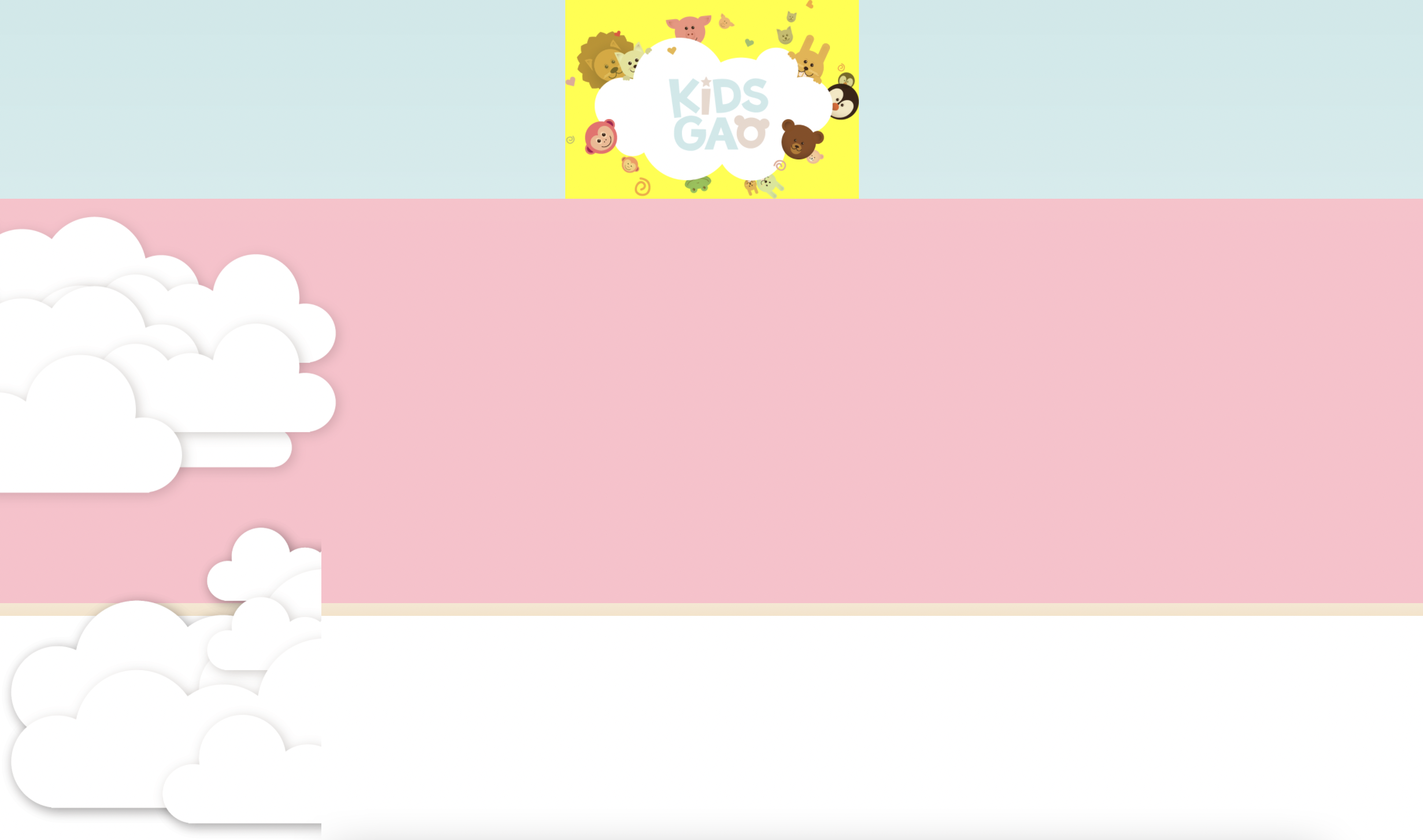
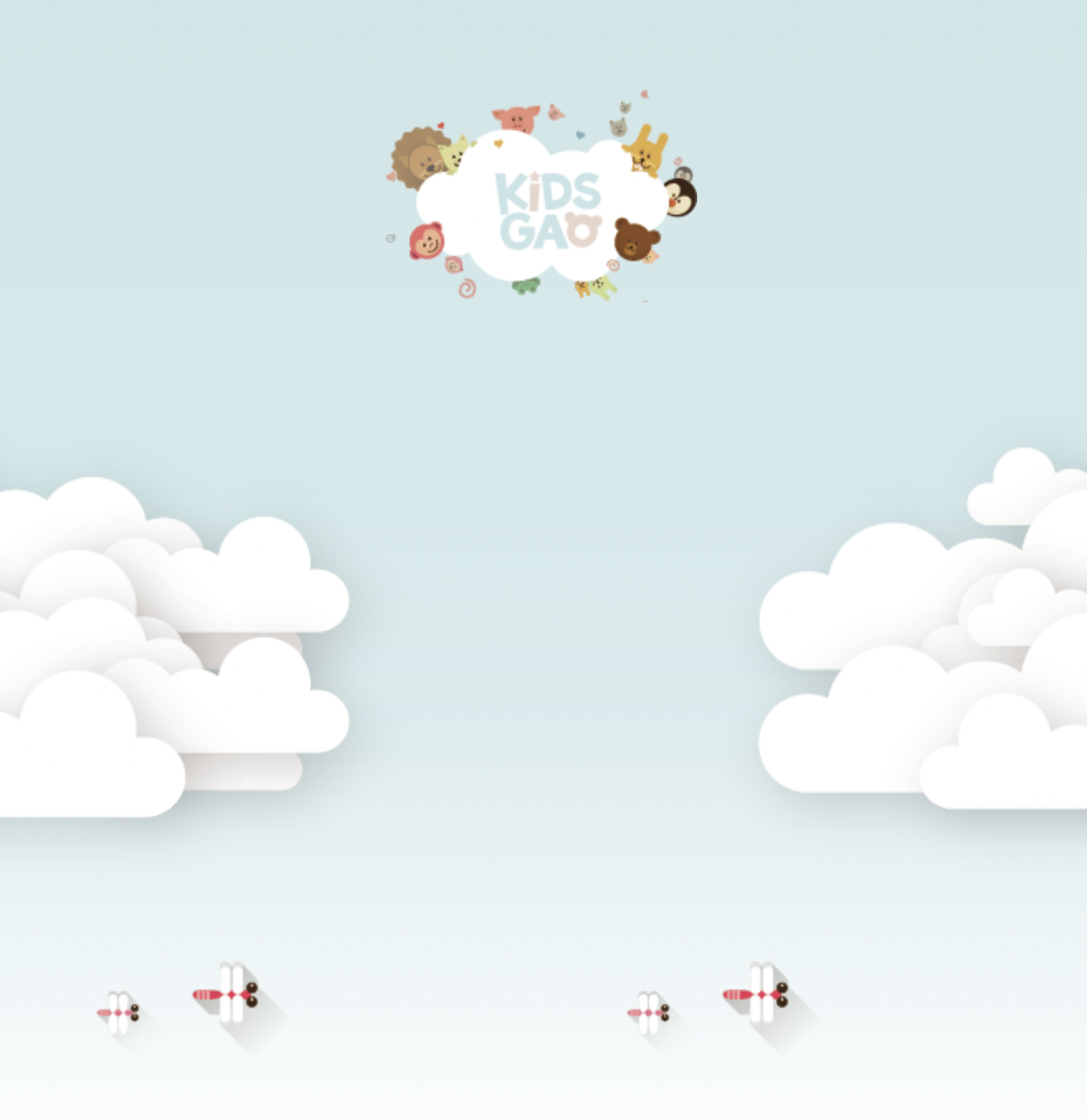
cloudWrap 배치 작업
css
#intro .cloudWrap {
	position: relative;

	width: 100%;
	height: 1050px;
	background-color: pink;
}
cloudWrap 부분이 분홍색 배경으로 나타난다.
css
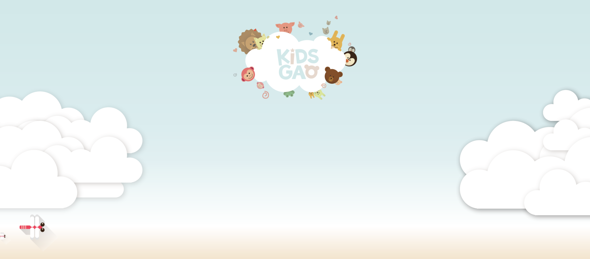
#intro .cloudWrap .leftCloud {
width: 934px;
height: 816px;
background-image: url(../img/intro/cloud1.png);
}
#intro .cloudWrap .rightCloud {
width: 843px;
height: 858px;
background-image: url(../img/intro/cloud2.png);
}
- 구름이 영역을 벗어나서 y축 정렬로 배치된다.
float을 사용해서 각각 left, right 설정을 해주면 각각 좌우로 배치가 잘된 것 같지만, browser의 크기보다 width 값의 합이 클 경우 브라우저의 크기를 줄이면 레이어가 틀어지게 된다.
그로므로 position: aboulte; 적용

leftCloud 아래의 css에 추가하면 해결
	position: absolute;

    left: 0;

	z-index: 2;
잠자리 추가
css
#intro .cloudWrap .dragonfly {
	position: absolute;

	width: 366px;
	height: 228px;
	background-image: url(../img/intro/dragonfly.png);

	top: 800px;
}- top: 800px
cloudWrap(분홍 박스) 기준으로 800px 내려오는 것
윗 부분 아래로 조금 내리기
-
introWrap에 margin-top을 주면 공백이 생긴 상태로 내려오게 되므로 X
-
intro에 padding-top 주면 되지만,
1 공백에 의해 공간이 벌어지게 된다.
2 아래의 컨텐츠가 다 밀리게 되므로 레이어가 틀어진다. -
introWrap에 top
로고 부분은 내려가지만 cloudWrap 부분은 원래 위치에 있어서 레이어 겹침
(같은 3차원의 경우 나중에 작성된 3차원 요소의 z축이 더 높으므로 분홍박스 아래로 로고가 위치)
Intro 영역 animation 적용
logo 동물
css
#intro .introWrap .lion {
	animation: spinLion 1500ms linear infinite alternate;
}

@keyframes spinLion {
	from {
		transform: rotate(-10deg);
	}

	to {
		transform: rotate(10deg);
	}
}
1000ms : 1s
linear : 일정하게
infinite : 무한
alternate : from에서 to
나머지는 코드 복사 붙여넣기 해서 클래스명, 시간, 각도만 변경
#intro .introWrap .rabbit {
	animation: spinRabbit 1000ms linear infinite alternate;
}

@keyframes spinRabbit {
	from {
		transform: rotate(0deg);
	}

	to {
		transform: rotate(5deg);
	}
}

#intro .introWrap .bear {
	animation: spinBear 1000ms linear infinite alternate;
}

@keyframes spinBear {
	from {
		transform: rotate(10deg);
	}

	to {
		transform: rotate(1-0deg);
	}
}

#intro .introWrap .monkey {
	animation: spinMonkey 800ms linear infinite alternate;
}

@keyframes spinMonkey {
	from {
		transform: rotate(20deg);
	}

	to {
		transform: rotate(50deg);
	}
}
잠자리
css
#intro .cloudWrap .dragonfly {
	animation: flyDragonfly linear 7s infinite;
}

@keyframes flyDragonfly {
	from {
		left: -366px;
	}

	to {
		left: 100%;
	}
}
style.css 에서 body 태그의 overflow-x: hidden; 을 주석 처리하면 잠자리가 화면 바깥으로 가면서 가로 스크롤이 생성된다.
미디어쿼리
mobile.css
@media (max-width: 767px) {


	#intro {
		height: 1150px;
		background-image: url(../img/mobile/intro/mobile_intro_bg.png);
	}

	#intro .introWrap {
		width: 189px;
		height: 129px;

		margin-left: -94.5px;
		/*background-color: yellow;*/

        top: 230px
	}

	#intro .introWrap .logo {
		width: 189px;
		height: 129px;
		background-image: url(../img/mobile/intro/mobile_logo.png);
	}

}
767px 이하 버전은 mobile
767px 넘어가면 style.css로 대치하겠다는 의미
	#intro .introWrap .lion,
	#intro .introWrap .rabbit,
	#intro .introWrap .bear,
	#intro .introWrap .monkey,
	#intro .cloudWrap .dragonfly {
		display: none;
	}

	#intro .cloudWrap {
		height: 350px;

		top: 280px;
	}

	#intro .cloudWrap .leftCloud {
		width: 267px;
		height: 314px;
		background-image: url(../img/mobile/intro/mobile_cloud1.png);
	}

	#intro .cloudWrap .rightCloud {
		width: 237px;
		height: 309px;
		background-image: url(../img/mobile/intro/mobile_cloud2.png);
	}

}
farm1 (농부 part)
html
	<div id="farm1">

		<div class="leftRice1"></div>
		<div class="farmer"></div>
		<div class="rightRice1"></div>

		<div class="farmSpeechWrap">
			<img src="img/farm/farm1/farmspeech.png" align="우리쌀 점토">

			<p class="farmSpeech">
				식재료만 넣은 안전한<br>
				우리쌀 점토 키즈가오는<br>
				우리 쌀을 사용하여 만들어요.<br>
				화학물질을 사용하지 않고,<br>
				식재료를 사용해서 만든<br>
				안전한 제품이랍니다.
			</p>
		</div>
	</div>
css
#farm1 {
	position: relative;

	width: 100%;
	height: 800px;
	background-image: url(../img/farm/farm1/farm1_bg.png);
}

#farm1 .leftRice1 {
	position: absolute;

	width: 390px;
	height: 670px;
	background-image: url(../img/farm/farm1/leftrice.png);
}

#farm1 .rightRice1 {
	position: absolute;

	width: 335px;
	height: 570px;
	background-image: url(../img/farm/farm1/rightrice.png);

	right: 0;
	top: 100px;
}

#farm1 .farmer {
	position: absolute;

	width: 747px;
	height: 1078px;
	background-image: url(../img/farm/farm1/farmer.png);

	left: 50%;
	margin-left: -310px;
}

#farm1 .farmSpeechWrap {
	position: relative;

	top: 250px;
	left: 150px;
}

#farm1 .farmSpeechWrap .farmSpeech {
	color:  #895c2f;
	font-size: 18px;
	line-height: 27px;
}- line-height 글자 간 위아래 간격 지정
mobile version
css
	#farm1 {
		height: 450px;
		background-image: url(../img/mobile/farm/farm1/mobile_farm1_bg.png);
	}

	#farm1 .leftRice1 {
		width: 86px;
		height: 150px;
		background-image: url(../img/mobile/farm/farm1/mobile_leftrice.png);
	}

	#farm1 .rightRice1 {
		width: 95px;
		height: 170px;
		background-image: url(../img/mobile/farm/farm1/mobile_rightrice.png);

		top: -20px;
	}

	#farm1 .farmer {
		width: 160px;
		height: 250px;
		background-image: url(../img/mobile/farm/farm1/mobile_farmer.png);

		margin-left: -69px;
	}

	#farm1 .farmSpeechWrap {
		width: 300px;

		text-align: center;

		left: 50%;
		margin-left: -150px;
	}

	#farm1 .farmSpeechWrap img {
		width: 79px;
	}

	#farm1 .farmSpeechWrap .farmSpeech {
		line-height: 20px;
		font-size: 12px;
	}
text-align은 글자나 inline 요소에만 영향을 미침
farm2
벼
html
	<div id="farm2">
		<div class="leftRice2"></div>
		<div class="scarecrow"></div>
		<div class="rightRice2"></div>
	</div>
css
#farm2 {
	position: relative;

	width: 100%;
	height: 850px;
	background-image: url(../img/farm/farm2/farm2_bg.png);
}

#farm2 .leftRice2 {
	float: left;

	width: 250px;
	height: 850px;
	background-image: url(../img/farm/farm2/leftrice2.png);
}

#farm2 .rightRice2 {
	float: right;

	width: 236px;
	height: 850px;
	background-image: url(../img/farm/farm2/rightrice2.png);
}
강사님께서는 이 부분에서 rightRice2 에 오타가 있어서 오른쪽 벼 이미지가 나타나지 않았는데 나는 이미지 height의 크기에 px 단위를 적용하지 않아서 이미지가 나타나지 않았었다. 이럴 땐 침착해야 한다고 하셔서 침착하게 바로 찾아서 빨리 해결할 수 있었다. :)
허수아비
#farm2 .scarecrow {
	position: absolute;

	width: 103px;
	height: 206px;
	background-image: url(../img/farm/farm2/scarecrow.png);

	margin: 200px 0 0 300px;
}
mobile version
	#farm2 {
		height: 440px;
		background-image: url(../img/mobile/farm/farm2/mobile_farm2_bg.png);
	}

	#farm2 .leftRice2 {
		width: 57px;
		height: 201px;
		background-image: url(../img/mobile_logo/farm/farm2/mobile_leftrice2.png);
	}

	#farm2 .rightRice2 {
		width: 57px;
		height: 202px;
		background-image: url(../img/mobile_logo/farm/farm2/mobile_rightrice2.png);
	}

	#farm2 .scarecrow {
		display: none;
	}
farm3(기계)
html
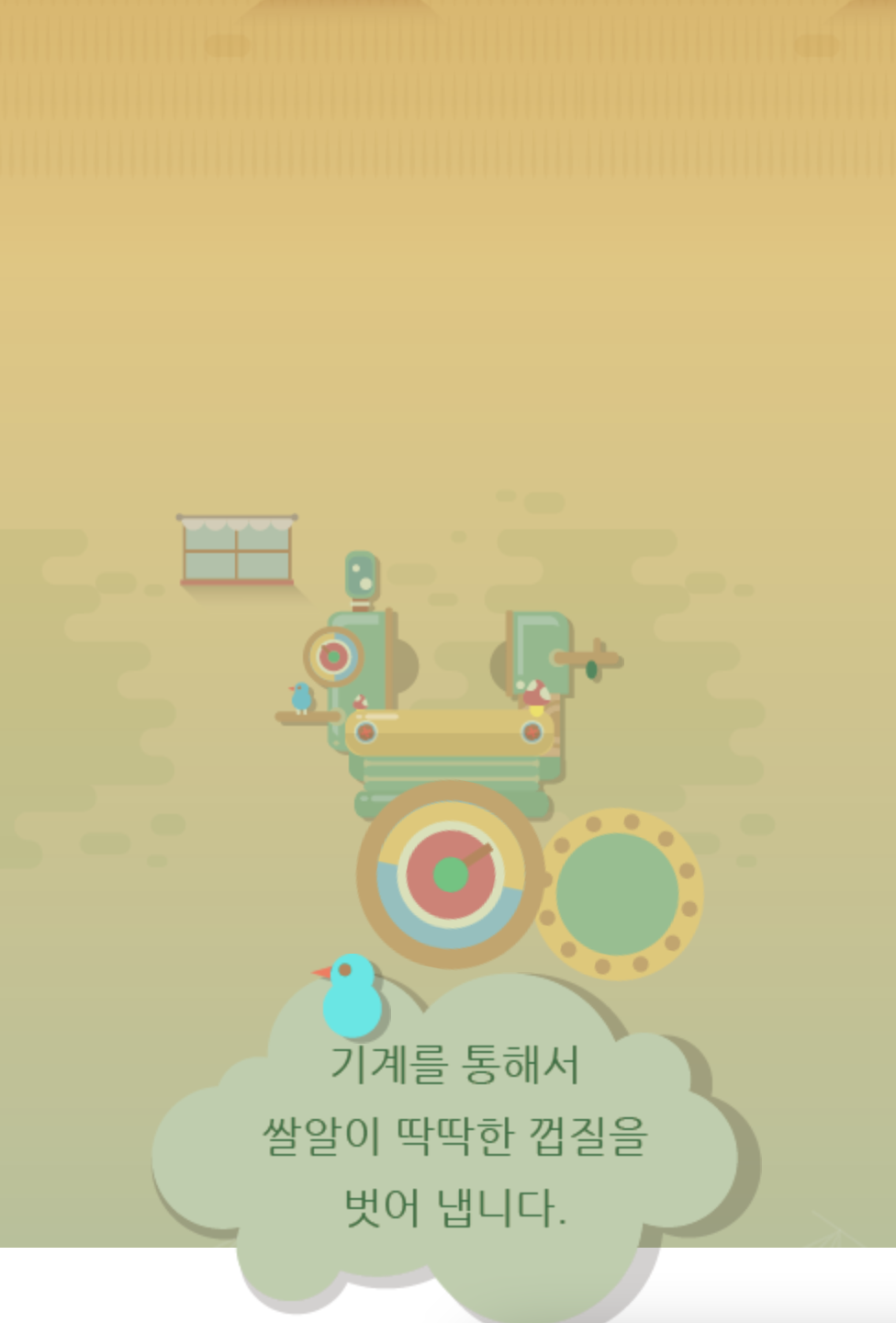
	<div id="farm3">

		<div class="farm3Window"></div>
		<div class="machineWrap">
			<div class="machine1"></div>
			<div class="sawShadow"></div>
			<div class="saw1"></div>
			<div class="saw2"></div>
			<div class="machineBird"></div>
			<div class="timer"></div>
		</div>

		<img class="farm3Bubble" src="img/farm/farm3/farm3bubble.png" alt="기계를 통해서 쌀알이 딱딱한 껍질을 벗어 냅니다.">
	</div>
style.css
#farm3 {
	position: relative;

	width: 100%;
	height: 850px;
	background-image: url(../img/farm/farm3/farm3_bg.png);
}

#farm3 .farm3Window {
	position: absolute;

	width: 247px;
	height: 169px;
	background-image: url(../img/farm/farm3/window.png);

	margin: 100px 0 0 100px;
}

#farm3 .machineWrap {
	position: relative;

	width: 600px;
	height: 455px;
	background-color: yellow;

	left: 50%;
	margin-left: -285px;
	top: 150px;
}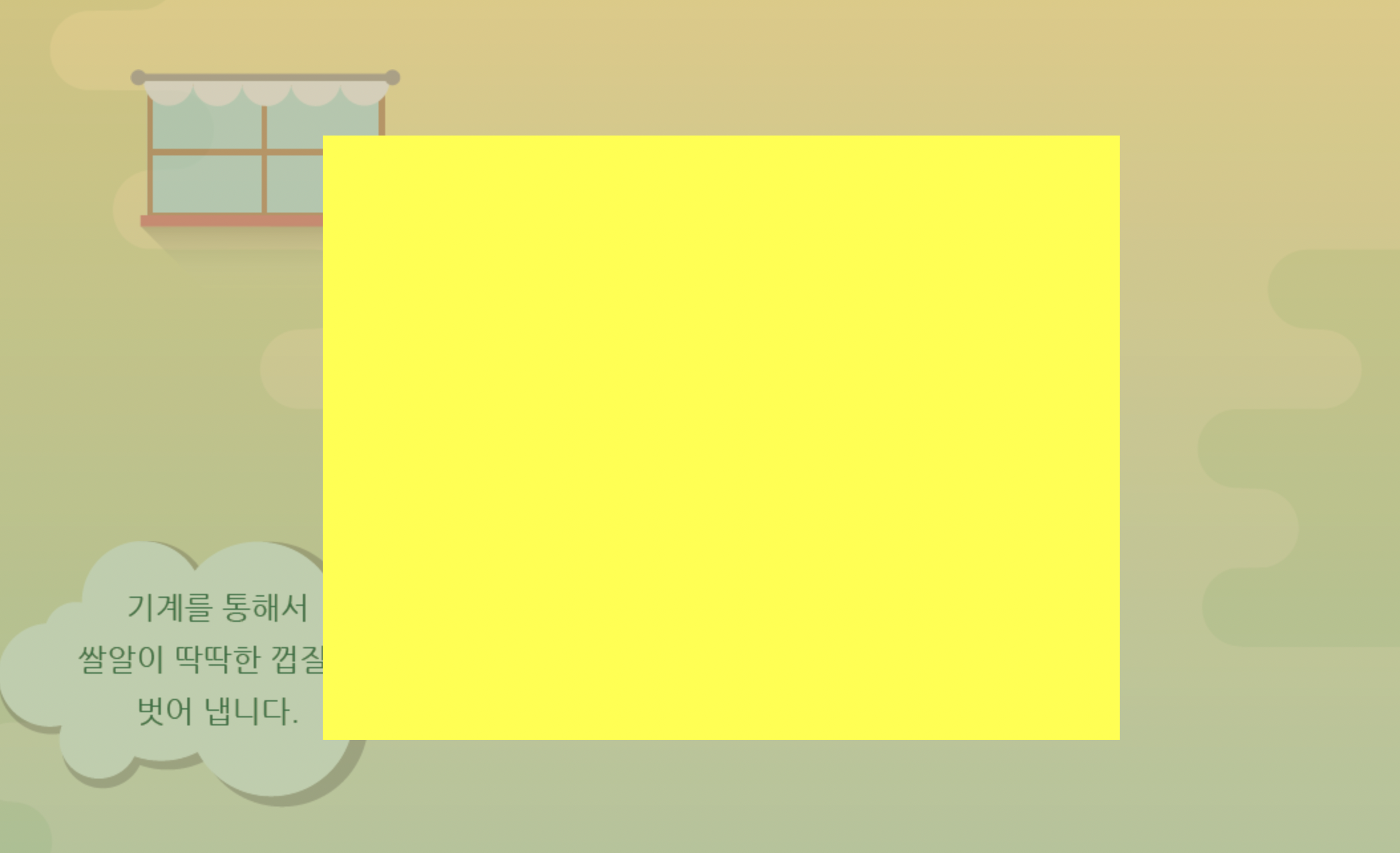
노란박스 안의 영역에 기계 이미지를 넣을 것이다.
background color는 주석 처리
style.css
#farm3 .machineWrap .machine1 {
	position: absolute;

	width: 586px;
	height: 455px;
	background-image: url(../img/farm/farm3/machine1.png);

	z-index: 900;
}

#farm3 .machineWrap .sawShadow {
	position: absolute;

	width: 95px;
	height: 95px;
	background-image: url(../img/farm/farm3/sawshadow.png);

	margin: 145px 0 0 145px;
}

#farm3 .machineWrap .saw1,
#farm3 .machineWrap .saw2 {
	position: absolute;
	width: 95px;
	height: 95px;
	background-image: url(../img/farm/farm3/saw.png);
}

#farm3 .machineWrap .saw1 {
	margin: 140px 0 0 140px;
}

#farm3 .machineWrap .saw2 {
	margin: 140px 0 0 350px;
}

#farm3 .machineWrap .timer {
	position: absolute;

	width: 103px;
	height: 104px;
	background-image: url(../img/farm/farm3/second.png);

	margin: 125px 0 0 45px;

	z-index: 999;
}

#farm3 .machineWrap .machineBird {
	position: absolute;

	width: 44px;
	height: 49px;
	background-image: url(../img/farm/farm3/machinebird.png);

	margin: 220px 0 0 20px;

	z-index: 999;
}

#farm3 .farm3Bubble {
	position: absolute;

	top: 350px;
	right: 80px;
}
animation
#farm3 .machineWrap .timer {
	animation: rotateTimer 10000ms linear infinite;
}

@keyframes rotateTimer {
	from { transform: rotate(0deg); }
	to { transform: rotate(360deg); }
}

#farm3 .machineWrap .saw1 {
	animation: rotateLeftSaw 10000ms linear infinite;
}

@keyframes rotateLeftSaw {
	from { transform: rotate(0deg); }
	to { transform: rotate(360deg); }
}

#farm3 .machineWrap .saw2 {
	animation: rotateRightSaw 10000ms linear infinite;
}

@keyframes rotateRightSaw {
	from { transform: rotate(360deg); }
	to { transform: rotate(0deg); }
mobile
	#farm3 {
		height: 500px;
		background-image: url(../img/mobile/farm/farm3/mobile_farm3_bg.png);
	}

	#farm3 .farm3Window {
		width: 82px;
		height: 56px;
		background-image: url(../img/mobile/farm/farm3/mobile_window.png);

		margin-left: 10px 0 0 10px;
	}

	#farm3 .machineWrap {
		width: 200px;
		height: 150px;

		top: 120px;
		margin-left: -96px;
	}

	#farm3 .machineWrap .machine1 {
		width: 191px;
		height: 149px;
		background-image: url(../img/mobile/farm/farm3/mobile_machine1.png);
	}

	#farm3 .machineWrap .sawShadow,
	#farm3 .machineWrap .timer,
	#farm3 .machineWrap .machineBird {
		display: none;
	}
톱니바퀴, 버블 크기와 위치 지정
	#farm3 .machineWrap .saw1,
	#farm3 .machineWrap .saw2 {
		width: 31px;
		height: 31px;
		background-image: url(../img/mobile/farm/farm3/mobile_saw.png);
	}

	#farm3 .machineWrap .saw1 {
		margin: 50px 0 0 50px;
	}

	#farm3 .machineWrap .saw2 {
		margin: 50px 0 0 115px;
	}

    	#farm3 .farm3Bubble {
		padding: ab;

		width: 152px;

		left: 50%;
		margin: 0 0 0 -70px;
	}
학습소감
오늘은 강의 내용이 조금 많아서 설정할 부분들이 많았지만 어려운 것 보다는 주의할 점 들이 많았던 것 같다. 그래도 이미 존재하는 사이트를 똑같이 비슷하게 만들어볼 수 있어서 뿌듯하다.
0개의 댓글
관련 채용 정보


