10강 네이버메인
학습 내용
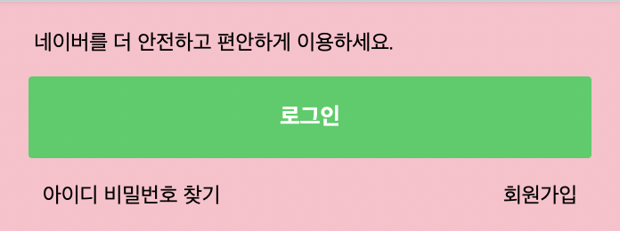
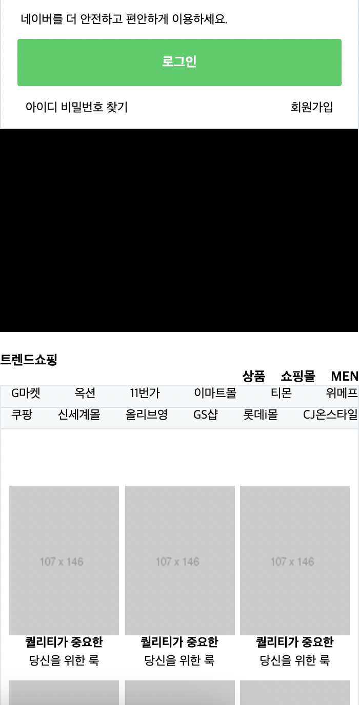
네이버 페이지
로그인 부분
html
		<div id="main_right">

			<div id="account">
				<p>네이버를 더 안전하고 편안하게 이용하세요.</p>
				<a href="#">로그인</a>
				<div class="account_sub">
					<div class="left">
						<span>아이디</span>
						<span>비밀번호 찾기</span>
					</div>
					<span>회원가입</span>
				</div>
			</div>
css
#main_right #account {
	width: 100%;
	border: solid 1px #dae1e6;
	padding: 16px 16px 12px 16px;
}

#main_right #account p {
	font-size: 12px;
	padding-left: 3px;
	margin-bottom: 11px;
}

#main_right #account a {
	display: block;
	width: 100%;
	background-color: #19ce60;
	border-radius: 2px;

	padding: 15px 0;
	margin-bottom: 14px;

	text-align: center;
	font-size: 13px;
	color: #fff;
	font-weight: 700;
}

#main_right #account .account_sub{
	display: flex;
	flex-wrap: wrap;
	justify-content: space-between;
	align-items: center;

	padding: 0 8px;
}

#main_right #account .account_sub {
	font-size: 12px;
}
증시 부분 skip
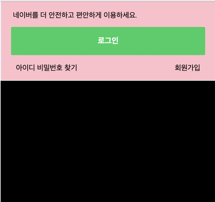
광고 배너
html
<div id="banner"></div>css
#main_right #banner {
	width: 349px;
	height: 198px;
	background-color: #000000;
}
쇼핑
html
<div id="shop_wrap">
<div class="shop_title">
<h3><a href="#">트렌드쇼핑</a></h3>
<div class="right">
<h4><a href="#">상품</a></h4>
<h4><a href="#">쇼핑몰</a></h4>
<h4><a href="#">MEN</a></h4>
</div>
</div>
<div class="shop_content">
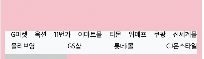
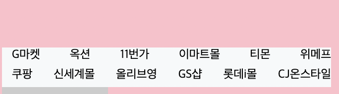
<ul class="commerce-lists">
<li><a href="#">G마켓</a></li>
<li><a href="#">옥션</a></li>
<li><a href="#">11번가</a></li>
<li><a href="#">이마트몰</a></li>
<li><a href="#">티몬</a></li>
<li><a href="#">위메프</a></li>
<li><a href="#">쿠팡</a></li>
<li><a href="#">신세계몰</a></li>
<li><a href="#">올리브영</a></li>
<li><a href="#">GS샵</a></li>
<li><a href="#">롯데i몰</a></li>
<li><a href="#">CJ온스타일</a></li>
</ul>
<ul class="product-lists">
<li>
<a href="#">
<img src="https://via.placeholder.com/107x146">
<div class="product-info">
<h3>퀄리티가 중요한</h3>
<span>당신을 위한 룩</span>
</div>
</a>
</li>마지막 li 태그 6개정도 만들어줌
css
#main_right #shop_wrap .shot_title {
	display: flex;
	flex-wrap: wrap;
	justify-content: space-between;
	align-items: center;

	padding: 12px 0;
}

#main_right #shop_wrap .shop_title h3, h4 {
	font-size: 13px;
}

#main_right #shop_wrap .shop_title h4 {
	margin-left: 15px;
}

#main_right #shop_wrap .shop_title .right {
	display: flex;
	flex-wrap: wrap;
	justify-content: flex-end;
	align-items: center;
}


#main_right #shop_wrap .shop_content {
	border: solid 1px #e4e8eb;
	padding: 55px 8px 22px;
}

#main_right #shop_wrap .shop_content .commerce-lists {
	display: flex;
	flex-wrap: wrap;
	justify-content: space-between;
	align-items: center;

	background-color: #f7f9fa;
	border-bottom: solid 1px #dae1e6;
}

#main_right #shop_wrap .shop_content .commerce-lists li {
	font-size: 12px;
	margin-left: 10px;
	margin-bottom: 5px;
}
어려웠던 점
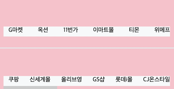
쇼핑몰 리스트는 12개로 한 줄에 6개씩이 숫자가 맞아 떨어지는데 space-between 하면 윗줄에는 8개 나오고 아랫줄에 4개가 나왔다. 왜 이렇게 되는지 잘 모르겠다. 쇼핑몰 리스트를 4개 더 늘려서 16개로 space-between 하면 한 줄에 8개씩 2줄로 정렬이 되면서 공간이 맞아떨어진다. 이런 경우가 아니라면 원래의 목록 갯수를 그대로 두고 float left를 사용하면 된다고 하셨는데 직접 해보았지만 원래 갯수대로 했을 때 해결되는 것은 없었다. 네이버 페이지에는 쇼핑몰 리스트가 12개인데 그 갯수대로 해결을 하지 않으시고 리스트를 늘린 상태로 강의를 이어가셨다. 원래의 네이버 목록대로 하려면 어떻게 해야하는지 모르겠다 ...
해결 방법
네이버 사이트에 접속해서 직접 확인을 했다. 네이버에서는 div를 쇼핑몰 6씩 따로 두고 각 쇼핑몰을 a태그로 주었다. 나도 div로 나누어주었는데 갯수는 맞아떨어졌지만 강의를 들으면서 ul 태그로 설정을 해주었기 때문에이 방법은 안될 것 같았다.
그래서 ul태그를 나누어주었더니 해결은 된 것 같다.
강의 내용과 내가 한 부분이 조금 달라서 나는 commerce-lists 부분에 padding값을 아직 설정해주지 않았다.
css
#main_right #shop_wrap .shop_content .commerce-lists li:nthchild(1),
#main_right #shop_wrap .shop_content .commerce-lists li:nthchild(9) {
	margin-left: 0;
}


#main_right #shop_wrap .product-lists {
	display: flex;
	flex-wrap: wrap;
	justify-content: space-between;
	align-items: center;
}

#main_right #shop_wrap .product-lists li {
	margin-bottom: 10px;
}

#main_right #shop_wrap .product-lists .product-info {
	text-align: center;
}

#main_right #shop_wrap .product-lists h3,
#main_right #shop_wrap .product-lists span {
	font-size: 12px;
}
main 부분 끝!
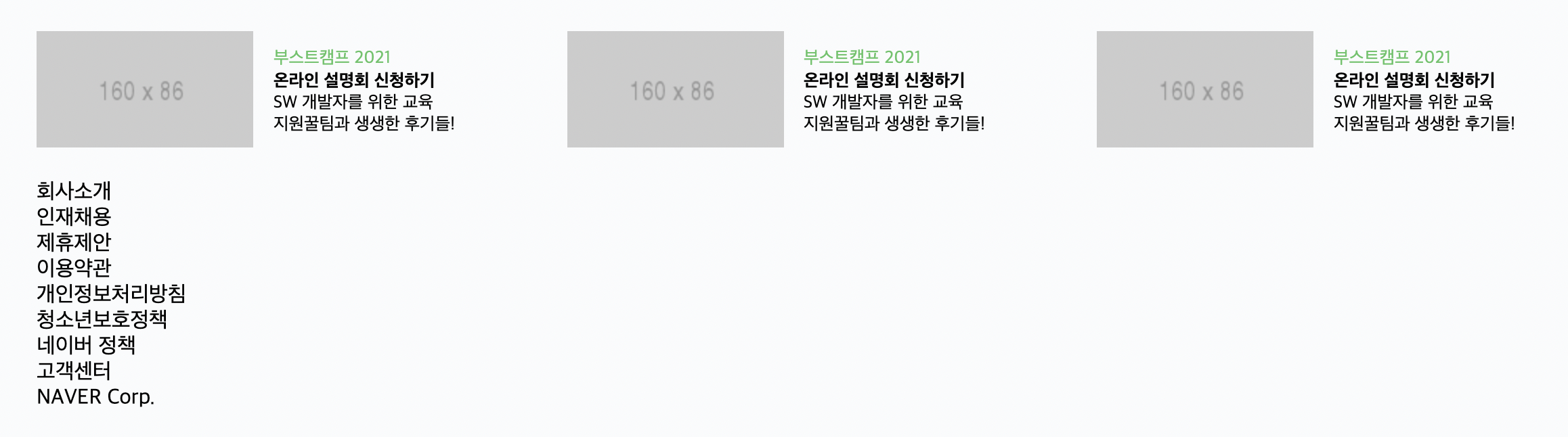
footer
html
	<footer id="main_footer">
		<div class="container">

			<ul class="news_lists">
				<li>
					<img src="https://via.placeholder.com/160x86">
					<div class="news_info">
						<span>부스트캠프 2021</span>
						<h3>온라인 설명회 신청하기</h3>
						<p>
						SW 개발자를 위한 교육<br>
						지원꿀팀과 생생한 후기들!
					</p>
					</div>
				</li>
             </ul>
li 2개 추가
			<ul class="corp_lists">
				<li><a href="#">회사소개</a></li>
				<li><a href="#">인재채용</a></li>
				<li><a href="#">제휴제안</a></li>
				<li><a href="#">이용약관</a></li>
				<li><a href="#">개인정보처리방침</a></li>
				<li><a href="#">청소년보호정책</a></li>
				<li><a href="#">네이버 정책</a></li>
				<li><a href="#">고객센터</a></li>
				<li><a href="#">NAVER Corp.</a></li>
			</ul>
		</div>
	</footer>
css
#main-footer {
	background-color: #fafbfc;
	border-top: solid 1px #e4e8eb;
	padding-bottom: 92px;
}

#main-footer .news_lists {
	display: flex;
	flex-wrap: wrap;
	justify-content: space-between;
	align-items: center;

	padding: 24px 0;

}

#main-footer .news_lists li {
	display: flex;
	flex-wrap: wrap;
	justify-content: flex-start;
	align-items: center;
}

#main-footer .news_lists li img {
	margin-right: 15px;
}

#main-footer .news_lists li .news_info {
	width: 172px;
}

#main-footer .news_lists li .news_info span,
#main-footer .news_lists li .news_info h3,
#main-footer .news_lists li .news_info p {
	font-size: 13px;
}

#main-footer .news_lists li .news_info span {
	color: #58c464;
}
css
#main-footer .corp_lists {
	padding-top: 25px;
	border-top: solid 1px #e4e8eb;
}

#main-footer .corp_lists li {
	display: inline-block;
	vertical-align: middle;
}

#main-footer .corp_lists li:first-child:before {
	content: initial;
}

#main-footer .corp_lists li:before {
	content: "";
	display: inline-block;
	width: 1px;
	height: 11px;
	background-color: #e4e8eb;
	margin: 0 8px;

	vertical-align: -1px;
}

#main-footer .corp_lists li a {
	font-size: 12px;
}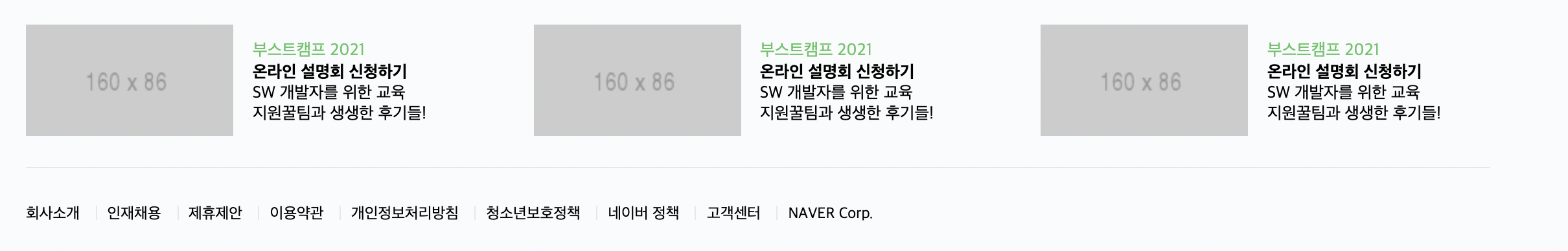
#main-footer .corp_lists li:first-child:before {
	content: initial;
}
이 부분에서 회사소개의 왼쪽에 있는 작대기 없애준다
학습 소감
네이버 페이지를 완성했다. 그럴싸해서 신기하기도 하고 배운 내용을 토대로 적용하는 부분이었지만 복잡하다고 느껴졌다. 약간의 우여곡절이 있었지만 괜찮았던 것 같다. 저녁에는 처음부터 다시 해보아야겠다.