22강 네이버 뉴스 3
학습 내용
ent.html
<!DOCTYPE html>
<html>
<head>
	<meta charset="utf-8">
	<title>네이버</title>

	<link rel="stylesheet" type="text/css" href="css/style.css">
</head>
<body>


	<header id="ent-header">
		<div class="ent-flex-between">

			<div class="ent-header-left">
				<ul class="ent-flex-start">
					<li><a href="#">TV연예</a></li>
					<li><a href="news.html">뉴스</a></li>
				</ul>
			</div>
			<div class="ent-header-center">
				<ul class="ent-flex-center">
					<li class="on"><a href="#">TV연예홈</a></li>
					<li><a href="#">TV</a></li>
					<li><a href="#">포토</a></li>
					<li><a href="#">랭킹</a></li>
					<li><a href="#">영화</a></li>
					<li><a href="#">최신뉴스</a></li>
				</ul>
			</div>
			<div class="ent-header-right ent-flex-end">
				<a href="#" class="btn-login">로그인</a>
				<button type="button" class="btn-menu"></button>
				<button type="button" class="btn-search"></button>
			</div>
		</div>
	</header>


	<main role="main" id="ent-main">

		<div class="ent-container">

			<div class="ent-left">

				<div id="ent-media-headline">

					<ul class="ent-flex-between">
						<li>
							<a href="#">
								<div class="media-top">
									<img src="https://via.placeholder.com/148x145">
									<span class="time">03:02</span>
									<i class="icon-play"></i>
								</div>
								<div class="media-bottom">
									<p>[신곡 MV] BTS (방탄소년단)...</p>
								</div>
							</a>
						</li>
					</ul>
				</div>
			</div>

			<div class="ent-right"></div>
		</div>
	</main>
</body>
</html>
css
.ent-container {
	width: 980px;
	margin: 0 auto;
}

.ent-flex-start {
	display: flex;
	flex-wrap: wrap;
	align-items: center;
}

.ent-flex-center {
	display: flex;
	flex-wrap: wrap;
	justify-content: center;
	align-items: center;
}

.ent-flex-end {
	display: flex;
	flex-wrap: wrap;
	justify-content: flex-end;
	align-items: center;
}

.ent-flex-between {
	display: flex;
	flex-wrap: wrap;
	justify-content: space-between;
	align-items: center;
}

.ent-border {
	border: solid 1px #000000;
}

#ent-header {
	width: 100%;
	height: 62px;
	background-color: #ffffff;
	border-bottom: solid 2px #f1f1f1;

	padding:  20px 25px 0;
}

#ent-header .ent-header-left ul

#ent-header .ent-header-left ul li {
	font-weight: 700;
}

#ent-header .ent-header-left ul li a {

}

#ent-header .ent-header-left ul li:last-child a {
	color: #9f9f9f;
}

#ent-header .ent-header-left ul li a:before {
	content: '';
	display: inline-block;
	width: 1px;
	height: 12px;
	background-color: #dddddd;

	margin: 0 8px;

	vertical-align: -1px;
}

#ent-header .ent-header-left ul li:first-child a:before {
	content: none;
}

#ent-header .ent-header-center li {
	font-weight: 700;
	font-size: 16px;
	padding: 0 15px;
}

#ent-header .ent-header-center li a {
	display: inline-block;
	border-bottom: solid 2px #ffffff;

	padding-bottom: 2px;
}

#ent-header .ent-header-center li.on {

}

#ent-header .ent-header-center li.on a {
	color: #e24587;
	border-bottom: solid 2px #e24587;
}

#ent-header .ent-header-right .btn-login {
	width: 45px;
	height: 20px;
	border: solid 1px #000000;

	font-size: 12px;
	line-height: 20px;
	text-align: center;
	margin: 0 9px;
}

#ent-header .ent-header-right .btn-menu {
	width: 16px;
	height: 16px;
	background-color: grey;
	margin: 0 9px;
}

#ent-header .ent-header-right .btn-search {
	width: 25px;
	height: 25px;
	background-color: #000000;
	margin-left: 9px;
}

#ent-main

#ent-main .ent-container {
	overflow: hidden;
}

#ent-main .ent-left {
	float: left;
	width: 654px;
	height: 2000px;
	background-color: yellow;
}

#ent-main .ent-left #ent-media-headline {
	padding-bottom: 20px;
	border-bottom: solid 1px #f1f1f1;
}

#ent-main .ent-left #ent-media-headline li {
	width: 148px;
	height: 204px;
	border-radius: 10px;
}

#ent-main .ent-left #ent-media-headline a {
	display: block;
	width: 100%;
	height: 100%;
}

#ent-main .ent-left #ent-media-headline .media-top {
	position: relative;
	height: 144px;
}

#ent-main .ent-left #ent-media-headline .media-top img {
	position: absolute;
	width: 100%;
	height: 100%;
}

#ent-main .ent-left #ent-media-headline .media-top .time {
	position: absolute;
	display: block;
	height: 16px;
	border-radius: 2px;
	background-color: rgba(0, 0, 0, .56);

	padding: 0 4px;
	right: 8px;
	top: ;

	color: #ffffff;
	font-size: 11px;
	line-height: 16px;
}

#ent-main .ent-left #ent-media-headline .media-top .icon-play {
	position: absolute;
	display: block;

	width: 28px;
	height: 28px;
	background-color: grey;
	border-radius: 50%;

	left: 8px;
	bottom: 7px;
}

#ent-main .ent-left #ent-media-headline .media-bottom {
	height: 60px;
	background-color: #444a60;
}

#ent-main .ent-left #ent-media-headline .media-bottom p {
	font-size: 14px;
	font-weight: 700;
	letter-spacing: -1px;

	padding: 11px 12px 0;

	color: #ffffff;
}
css
#ent-main .ent-left #ent-section-1 {

}

#ent-main .ent-left #ent-section-1 li {
	border-bottom: solid 1px #f1f1f1;
	padding: 20px 0;
}

#ent-main .ent-left #ent-section-1 li a{

}

#ent-main .ent-left #ent-section-1 li img{
	width: 148px;
	height: 90px;
	border: solid 1px #000000;
}

#ent-main .ent-left #ent-section-1 li .ent-news-wrap {
	width: 462px;
}

#ent-main .ent-left #ent-section-1 li .ent-news-wrap h3 {
	margin-bottom: 8px;

	font-size: 14px;
	font-weight: 700;
}

#ent-main .ent-left #ent-section-1 li .ent-news-wrap p {
	margin-bottom: 8px;

	font-size: 12px;
	color: #898989;
	font-weight: 400;
	line-height: 20px;
}

#ent-main .ent-left #ent-sction-1 li .ent-news-wrap .bottom-wrap

#ent-main .ent-left #ent-section-1 li .ent-news-wrap .bottom-wrap .source {
	font-size: 11px;
	font-weight: 400;
	color: #a7a7a7;
}

#ent-main .ent-left #ent-section-1 li .ent-news-wrap .bottom-wrap .count {
	display: inline-block;

	width: 20px;
	height: 20px;
	border: solid 1px #000000;
	border-radius: 5px;

	text-align: center;
	line-height: 20px;

	font-size: 10px;
}
html
<div id="ent-section-2">
					<ul class="ent-flex-between">
						<li>
							<a href="#">
								<img src="https://via.placeholder.com/200x122">
								<h3>Title 1 Title 1 Title 1 Title 1</h3>
								<div class="ent-bottom ent-flex-between">
									<span class="source">TV리포트</span>
									<span class="count">1</span>
								</div>
							</a>
						</li>
					</ul>
				</div>
css
#ent-main .ent-left #ent-section-2  {
	border-bottom: solid 1px #f1f1f1;
	padding: 20px 0;
}

#ent-main .ent-left #ent-section-2 li {
	width: 200px;
}

#ent-main .ent-left #ent-section-2 a

#ent-main .ent-left #ent-section-2 img {
	width: 200px;
	height: 122px;
	border: solid 1px #000000;

	margin-bottom: 15px;
}

#ent-main .ent-left #ent-section-2 h3 {
	font-size: 13px;
	line-height: 20px;

	margin-bottom: 9px;
}
#ent-main .ent-left #ent-section-2 .ent-bottom .source
#ent-main .ent-left #ent-section-2 .ent-bottom .count위의 두 코드는 이전에 작성했던 곳에 넣어준다
html
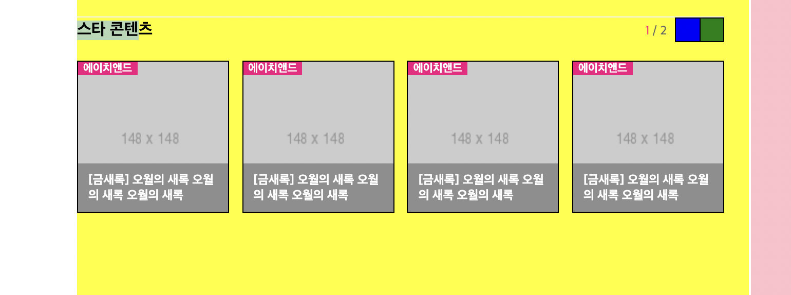
<div id="ent-section-3">
					<div class="title-wrap ent-flex-between">
						<h3>스타 콘텐츠</h3>
						<div class="right-wrap ent-flex-end">
							<div class="count-wrap">
								<span><em>1</em> / 2</span>
							</div>
							<div class="btn-wrap ent-flex-end">
								<button class="btn btn-prev"></button>
								<button class="btn btn-next"></button>
							</div>
						</div>
					</div>

					<ul class="ent-flex-between">
						<li>
							<a href="#">
								<img src="https://via.placeholder.com/148x148">
								<span>에이치앤드</span>
								<h3>[금새록] 오월의 새록 오월의 새록 오월의 새록</h3>
							</a>
						</li>
					</ul>
				</div>
css
white-space: nowrap;
어려웠던 점 & 해결 방법
스타 콘텐츠 부분의 오른쪽 두 버튼을 설정하고 확인할 때 나타나지 않았다. 다음 부분의 btn-wrap에서 마진을 설정해주니 버튼이 나타났다.
학습 소감
미리 설정해놓은 클래스를 다른 곳에 적용해서 배열을 맞추는 것을 공부해보아야겠다.