23강 네이버 뉴스 4
학습 내용
html
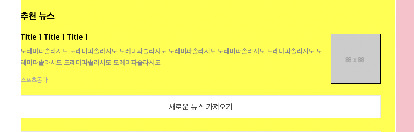
				<div id="ent-section-4">
					<div class="title-wrap">
						<h3>추천 뉴스</h3>
					</div>

					<ul>
						<li>
							<a href="#" class="ent-flex-between">
								<div class="ent-info">
									<h3>Title 1 Title 1 Title 1</h3>
									<p>도레미파솔라시도 도레미파솔라시도 도레미파솔라시도 도레미파솔라시도 도레미파솔라시도 도레미파솔라시도 도레미파솔라시도 도레미파솔라시도 도레미파솔라시도</p>
									<span class="source">스포츠동아</span>
								</div>

								<img src="https://via.placeholder.com/88x88">
							</a>
						</li>
					</ul>

					<button class="btn-more">새로운 뉴스 가져오기</button>
				</div>
css
#ent-main .ent-left #ent-section-4 {
	padding: 23px 0;
	border-bottom: solid 1px #e4e4e4;
}

#ent-main .ent-left #ent-section-4 .title-wrap {
	/*margin-bottom: 18px;*/
}

#ent-main .ent-left #ent-section-4 .title-wrap h3 {
	font-size: 16px;
}

#ent-main .ent-left #ent-section-4 li {
	padding: 18px 0;
	border-bottom: solid 1px #f1f1f1;
}

#ent-main .ent-left #ent-section-4 li:last-child {
	border-bottom: none;
}

#ent-main .ent-left #ent-section-4 .ent-info {
	width: 528px;
}

#ent-main .ent-left #ent-section-4 .ent-info h3 {
	font-size: 14px;
	font-weight: 700;
	margin-bottom: 7px;
}

#ent-main .ent-left #ent-section-4 .ent-info p {
	font-size: 12px;
	font-weight: 400;
	line-height: 20px;
	color: #898989;

	margin-bottom: 9px;
}

#ent-main .ent-left #ent-section-4 .ent-info .source{
	font-size: 11px;
	font-weight: 400;
	color: #a7a7a7;
}

#ent-main .ent-left #ent-section-4 li img {
	width: 88px;
	height: 88px;
	border: solid 1px #000000;
}

#ent-main .ent-left #ent-section-4 .btn-more {
	display: block;
	width: 100%;
	height: 40px;
	background-color: #ffffff;
	border: solid 1px #e8e8e8;

	line-height: 40px;

	text-align: center;

	color: #444;

}
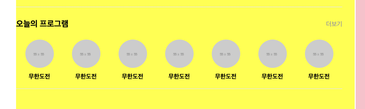
html
				<div id="ent-section-5">
					<div class="title-wrap ent-flex-between">
						<h3>오늘의 프로그램</h3>
						<a href="#">더보기</a>
					</div>

					<ul>
						<li>
							<a href="#">
								<img src="https://via.placeholder.com/55x55">
								<h4>무한도전</h4>
							</a>
						</li>
					</ul>
				</div>
css
#ent-main .ent-left #ent-section-5 {
	padding: 24px 0 14px;
	border-bottom: solid 1px #e4e4e4;
}

#ent-main .ent-left #ent-section-5 .title-wrap {
	margin-bottom: 20px;
}

#ent-main .ent-left #ent-section-5 .title-wrap h3 {
	font-size: 16px;
}

#ent-main .ent-left #ent-section-5 .title-wrap a {
	font-size: 12px;
	color: #999;
}

#ent-main .ent-left #ent-section-5 ul {
	display: flex;
	flex-wrap: wrap;
	justify-content: space-around;
	align-items: center;
}

#ent-main .ent-left #ent-section-5 li a {
	display: block;

	width: 100%;
	height: 100%;
	text-align: center;
}

#ent-main .ent-left #ent-section-5 li img {
	width: 55px;
	height: 55px;
	border-radius: 50%;

	margin-bottom: 10px;
}

#ent-main .ent-left #ent-section-5 li h4 {
	font-size: 12px;
	font-weight: 700;
	line-height: 16px;
}
어려웠던 점
강사님과 다른 부분이 있어서 강의를 여러번 돌려보고 다시 확인을 해보아도 다 똑같은데 적용이 안되는 부분이 있었다.
해결 방법
css 코드를 작성할 때 아무것도 적용하지 않는 부분에 강사님은 {}를 넣어주었지만 난 넣지 않아서 그 부분의 바로 다음 코드가 적용이 안되었다. 그래서 적용하지 않는 부분을 지워주었다.
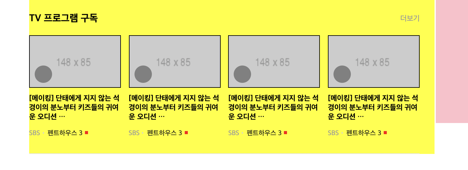
html
				<div id="ent-section-6">
					<div class="title-wrap ent-flex-between">
						<h3>TV 프로그램 구독</h3>
						<a href="#">더보기</a>
					</div>

					<ul class="ent-flex-between">
						<li>
							<a href="#">
								<div class="img-wrap">
									<img src="https://via.placeholder.com/148x85">
									<i class="icon-play"></i>
								</div>
								<h4>[메이킹] 단태에게 지지 않는 석경이의 분노부터 키즈들의 귀여운 오디션 …</h4>
							</a>


							<a href="#">
								<span class="source">SBS</span>
								<span class="program">펜트하우스 3</span>
							</a>
						</li>
					</ul>
				</div>
css
#ent-main .ent-left #ent-section-6 {
	padding: 24px 0;
	border-bottom: solid 1px #e4e4e4;
}

#ent-main .ent-left #ent-section-6 .title-wrap {
	margin-bottom: 17px;
}

#ent-main .ent-left #ent-section-6 .title-wrap h3 {
	font-size: 16px;
}

#ent-main .ent-left #ent-section-6 .title-wrap a {
	font-size: 12px;
	color: #999;
}

#ent-main .ent-left #ent-section-6 li {
	width: 148px;
}

#ent-main .ent-left #ent-section-6 ul .img-wrap {
	position: relative;
	width: 148px;
	height: 85px;
	border: solid 1px #000000;

	margin-bottom: 10px;
}

#ent-main .ent-left #ent-section-6 ul .img-wrap img {
	position: absolute;
	width: 100%;
	height: 100%;
}

#ent-main .ent-left #ent-section-6 ul .img-wrap .icon-play {
	position: absolute;
	display: block;

	width: 28px;
	height: 28px;
	background-color: grey;
	border-radius: 50%;

	left: 8px;
	bottom: 7px;
}

#ent-main .ent-left #ent-section-6 ul h4 {
	font-size: 12px;
	margin-bottom: 8px;
}

#ent-main .ent-left #ent-section-6 ul span {
	font-size: 11px;
	color: #141414;
}

#ent-main .ent-left #ent-section-6 ul .source {
	color: #999;
}

#ent-main .ent-left #ent-section-6 ul .source:after {
	content: '';
	display: inline-block;
	width: 2px;
	height: 2px;
	background-color: #d3d3d3;

	vertical-align: top;

	margin: 9px 2px 0 4px;
}

#ent-main .ent-left #ent-section-6 ul .program:after {
	content: '';
	display: inline-block;
	width: 5px;
	height: 5px;
	background-color: red;

	vertical-align: top;

	margin: 7px 2px 0 4px;
}
html
<div id="ent-section-7">
					<div class="title-wrap ent-flex-between">
						<h3>영화계는 지금</h3>
						<a href="#">더보기</a>
					</div>

					<div class="movie-wrap ent-flex-start">
						<div class="left">
							<a href="#">
								<img src="https://via.placeholder.com/200x122">
								<h4>Title 1</h4>
							</a>
						</div>
						<div class="right">
							<ul>
								<li>
									<a href="#">Title 1</a>
									<span>스타뉴스</span>
								</li>
							</ul>
						</div>
					</div>
				</div>
css
#ent-main .ent-left #ent-section-7 {
	padding: 24px 0 20px;
	border-bottom: solid 1px #e4e4e4;
}

#ent-main .ent-left #ent-section-7 .title-wrap {
	margin-bottom: 17px;
}

#ent-main .ent-left #ent-section-7 .title-wrap h3 {
	font-size: 16px;
}

#ent-main .ent-left #ent-section-7 .title-wrap a {
	font-size: 12px;
	color: #999;
}

#ent-main .ent-left #ent-section-7 .movie-wrap {
	align-items: stretch;
}

#ent-main .ent-left #ent-section-7 .movie-wrap .left img {
	width: 200px;
	height: 122px;
	margin-bottom: 11px;
}

#ent-main .ent-left #ent-section-7 .movie-wrap .left h4 {
	font-size: 12px;
	font-weight: 700;
}

#ent-main .ent-left #ent-section-7 .movie-wrap .right {
	width: 412px;
	margin-left: 18px;
}

#ent-main .ent-left #ent-section-7 .movie-wrap .right li {
	margin-bottom: 10px;
}

#ent-main .ent-left #ent-section-7 .movie-wrap .right li:last-child {
	margin-bottom: 0;
}

#ent-main .ent-left #ent-section-7 .movie-wrap .right a {
	display: inline-block;
	max-width: 363px;
	margin-right: 5px;
	vertical-align: top;

	font-size: 14px;
	font-weight: 700;

	overflow: hidden;
	text-overflow: ellipsis;
	white-space: nowrap;
}

#ent-main .ent-left #ent-section-7 .movie-wrap .right span {
	vertical-align: top;

	font-size: 11px;
	color: #898989;
}
이렇게 해두고 사이트에 들어가서 오늘의 뉴스를 그대로 옮기려고 했지만
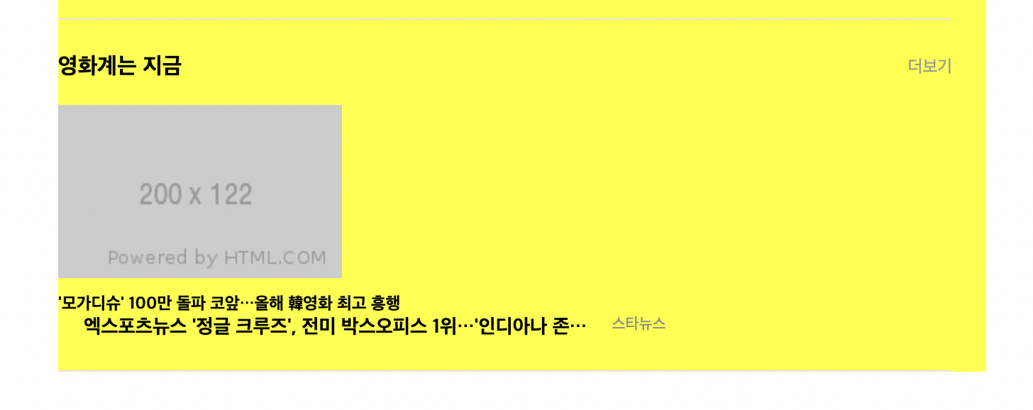
글자를 넣으니 레이어가 다 깨져서 강사님이 하신대로 되돌려놓았다..ㅎ
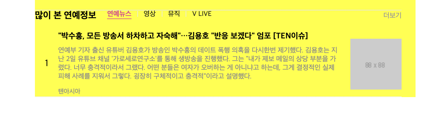
html
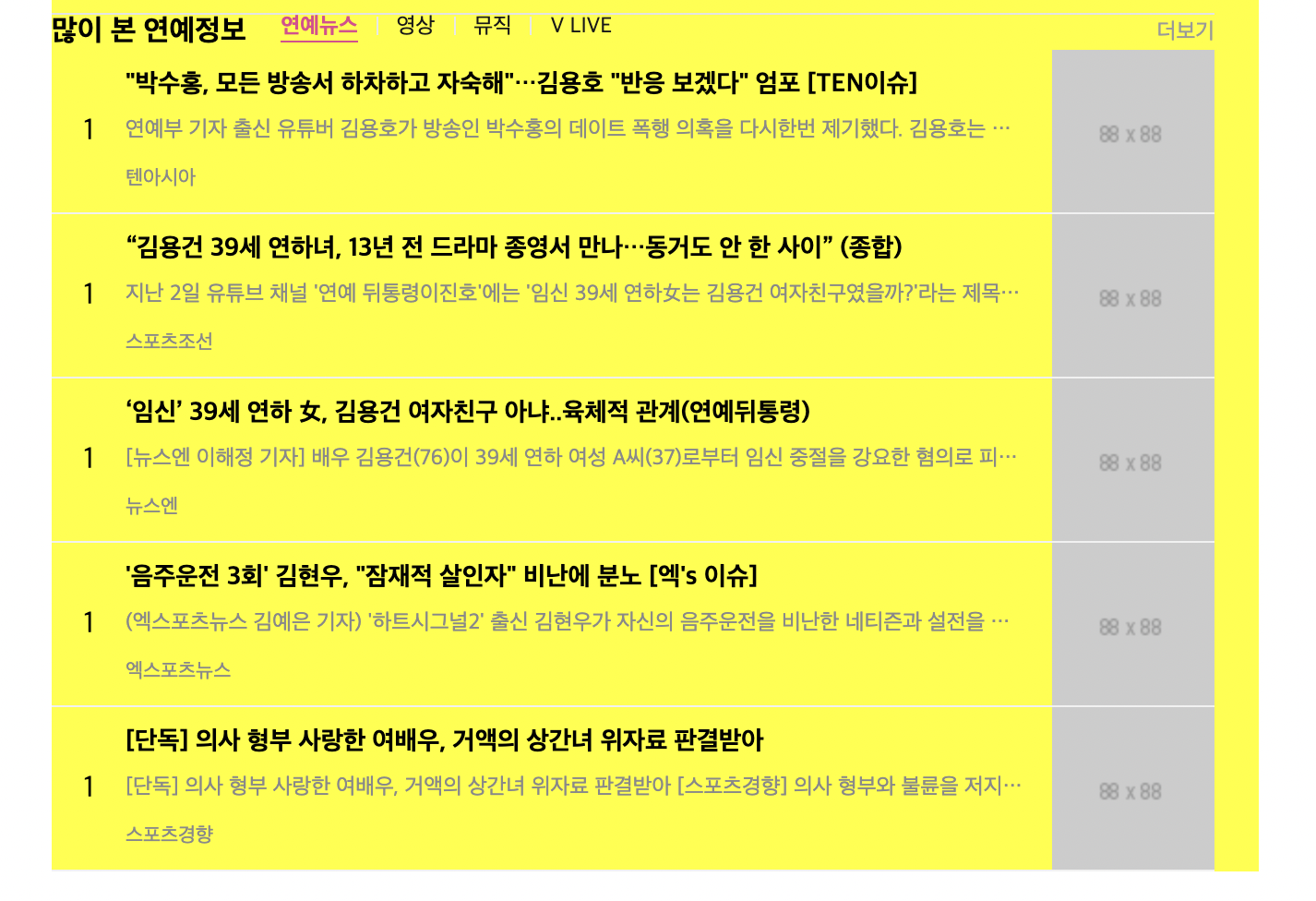
<div id="ent-section-8">
					<div class="title-wrap ent-flex-between">
						<div class="ent-flex-start">
							<h3>많이 본 연예정보</h3>

							<ul class="ent-flex-start">
								<li><a href="#" class="on">연예뉴스</a></li>
								<li><a href="#">영상</a></li>
								<li><a href="#">뮤직</a></li>
								<li><a href="#">V LIVE</a></li>
							</ul>
						</div>

						<a href="#" class="more">더보기</a>
					</div>

					<ol class="news-lists">
						<li>
							<a href="#" class="ent-flex-start">
								<span class="rank">1</span>
								<div class="news-info-wrap ent-flex-between">
									<div class="news-info-txt">
										<h4>"박수홍, 모든 방송서 하차하고 자숙해"…김용호 "반응 보겠다" 엄포 [TEN이슈]</h4>
										<p>연예부 기자 출신 유튜버 김용호가 방송인 박수홍의 데이트 폭행 의혹을 다시한번 제기했다. 김용호는 지난 2일 유튜브 채널 '가로세로연구소'를 통해 생방송을 진행했다. 그는 "내가 제보 메일의 상당 부분을 가렸다. 너무 충격적이라서 그랬다. 어떤 분들은 여자가 오버하는 게 아니냐고 하는데, 그게 결정적인 실제 피해 사례를 지워서 그렇다. 굉장히 구체적이고 충격적"이라고 설명했다. </p>
										<span>텐아시아</span>
									</div>

									<img src="https://via.placeholder.com/88x88">
								</div>
							</a>
						</li>
					</ol>
				</div>
css
#ent-main .ent-left #ent-section-8 .title-wrap div {
	align-items: flex-start;
}

#ent-main .ent-left #ent-section-8 .title-wrap h3 {
	font-size: 16px;
}

#ent-main .ent-left #ent-section-8 .title-wrap ul {
	position: relative;
	top: -4px;
	margin-left: 19px;
}

#ent-main .ent-left #ent-section-8 .title-wrap li a {
	font-size: 12px;
	color: #181818;
}

#ent-main .ent-left #ent-section-8 .title-wrap li a:before {
	content: '';
	display: inline-block;
	width: 1px;
	height: 10px;
	background-color: #e8e8e8;

	margin: 0 10px;

	vertical-align: -1px;
}

#ent-main .ent-left #ent-section-8 .title-wrap li:first-child a:before {
	content: none;
}

#ent-main .ent-left #ent-section-8 .title-wrap li a.on {
	font-weight: 700;
	color: #e2458f;
	border-bottom: solid 1px #e2458f;
}

#ent-main .ent-left #ent-section-8 .title-wrap .more {
	font-size: 12px;
	color: #999;
}

#ent-main .ent-left #ent-section-8 .news-lists li {
	padding: 18px 9;
	border-bottom: solid 1px #f1f1f1;
}

#ent-main .ent-left #ent-section-8 .news-lists a {
	/*display: block;*/
}

#ent-main .ent-left #ent-section-8 .news-lists .rank {
	display: block;
	width: 40px;
	text-align: center;
}

#ent-main .ent-left #ent-section-8 .news-lists .news-info-wrap {
	width: calc(100% - 40px);
}

#ent-main .ent-left #ent-section-8 .news-lists .news-info-txt {
	width: 486px;
}

#ent-main .ent-left #ent-section-8 .news-lists .news-info-txt h4 {
	font-size: 14px;
	font-weight: 700;
	margin-bottom: 9px;
}

#ent-main .ent-left #ent-section-8 .news-lists .news-info-txt p {
	font-size: 12px;
	font-weight: 400;
	color: #898989;
	margin-bottom: 8px;

	overflow: hidden;
	text-overflow: ellipsis;
	white-space: nowrap;
}

#ent-main .ent-left #ent-section-8 .news-lists .news-info-txt span {
	font-size: 11px;
	color: #898989;
}

#ent-main .ent-left #ent-section-8 .news-lists .news-info-txt img {
	width: 88px;
	height: 88px;
}
뉴스 상세 부분이 쭉 이어져서 css에
overflow: hidden;
text-overflow: ellipsis;
white-space: nowrap;
이렇게 추가해주었는데 한줄로만 표시가 되고 끝부분에 ...이 붙었다. 두 줄로 하고 싶은데 방법을 잘 모르겠다.
html
<div id="ent-section-9">
					<div class="title-wrap ent-flex-between">
						<h3>기자추천 연재코너</h3>
						<a href="#" class="more">더보기</a>
					</div>

					<ul class="ent-flex-between">
						<li>
							<a href="#">
								<img src="https://via.placeholder.com/200x122">
								<div class="txt-wrap">
									<span class="program">SW시선</span>
									<span class="sourece">스포츠월드</span>
									<h4>Title 1 Title 1 Title 1 Title 1</h4>
								</div>
							</a>
						</li>
					</ul>
				</div>
css
#ent-main .ent-left #ent-section-0 {
	padding: 24px 0 20px;
	border-bottom: solid 1px #e4e4e4;
}

#ent-main .ent-left #ent-section-9 .title-wrap {
	margin-bottom: 17px;
}

#ent-main .ent-left #ent-section-9 .title-wrap h3 {
	font-size: 16px;
}

#ent-main .ent-left #ent-section-9 .title-wrap a {
	font-size: 12px;
	color: #999;
}

#ent-main .ent-left #ent-section-9 li {
	width: 200px;
	border: solid 1px #000000;
}

#ent-main .ent-left #ent-section-9 a {
	display: block;
}

#ent-main .ent-left #ent-section-9 li img {
	width: 100%;
	height: 122px;
}

#ent-main .ent-left #ent-section-9 li .txt-wrap  {
	padding: 13px 14px 18px;
}

#ent-main .ent-left #ent-section-9 li span {
	font-size: 11px;
}

#ent-main .ent-left #ent-section-9 li .program {
	color: #ff0080;
}

#ent-main .ent-left #ent-section-9 li .program:after {
	content: '';
	display: inline-block;
	width: 2px;
	height: 2px;
	background-color: #d3d3d3;
	vertical-align: top;
	margin-bottom: 9px 2px 0 4px;
}

#ent-main .ent-left #ent-section-9 li .source {
	color: #999;
}

#ent-main .ent-left #ent-section-9 li h4 {
	padding-top: 8px;

	font-size: 12px;
	font-weight: 700;
	line-height: 20px;
	min-height: 36px;
}
뉴스 TV연예 부분 왼쪽 Part 완성
학습 소감
한 페이지의 반쪽을 만드는데도 엄청 오랜 시간이 걸리는데 평소 쓰는 웹사이트에 대해 큰 의미를 부여하지 않았지만 정말 대단한 것 같다는 생각이 든다.