32강 네이버 오디오 2
학습 내용
audio.html
	<main id="audio-main" role="main">

		<div class="audio-container audio-flex-between">

			<div class="audio-main-left">

				<div id="audio-today" class="audio-section">

					<div class="audio-header">
						<h2>오늘의 오디오클립</h2>
					</div>

					<div class="audio-body">

						<div class="audio-slide-wrap">

							<div class="audio-slide audio-flex-between">
								<img src="https://via.placeholder.com/415x198">
								<div class="txt-wrap">
									<h3>'신은 죽었다'며 말한 니체의 대표작</h3>
									<p><차라투스트라는 이렇게 말했다> 90% 할인</p>
								</div>
							</div>

							<button type="button" class="btn btn-left"></button>
							<button type="button" class="btn btn-right"></button>
						</div>
					</div>

				</div>
			</div>

			<div class="audio-main-right">

			</div>
		</div>
	</main>
css
#audio-main {
	width: 100%;
	height: 2000px;
	background-color: #f6f8fa;

	padding-top: 61px;
}

#audio-main .audio-container {
	/*overflow: hidden;*/
}

#audio-main .audio-main-left {
	/*float: left;*/
	width: 660px;
}

#audio-main .audio-main-right {
	/*float: right;*/
	width: 330px;
}

/* 각 섹션별 공통 디자인 */
.audio-section {
	padding: 32px 0;
}

.audio-section .audio-header {
}

.audio-section .audio-header h2 {
	font-size: 22px;
	font-weight: 500;
	letter-spacing: -0.8px;
}


.audio-section .audio-body {
	padding-top: 19px;
}

.audio-main-left #audio-today {

}

/* 오늘의 오디오클립 */
#audio-today .audio-slide {
	align-items: flex-start;
}

#audio-today .audio-slide img {
	width: 380px;
	height: 198px;
}

#audio-today .audio-slide .txt-wrap h3 {
	font-size: 18px;
	padding-top: 2px;
}

#audio-today .audio-slide .txt-wrap p {
	margin-top: 12px;
}

#audio-today .audio-slide-wrap {
	position: relative;
}

#audio-today .audio-slide-wrap .btn {
	position: absolute;

	width: 35px;
	height: 35px;
	background-color: yellow;
	border-radius: 50%;

	top: 80px;
}


#audio-today .audio-slide-wrap .btn-left {
	left: -17px;
}

#audio-today .audio-slide-wrap .btn-right {
	right: -17px;
}
html
<div id="audio-original" class="audio-section">

					<div class="audio-header">
						<h2>오디오클립 추천 오리지널</h2>
					</div>
					<div class="audio-body">

						<ul class="audio-flex-between">
							<li>
								<a href="#">
									<img src="https://via.placeholder.com/120">
									<div class="txt-wrap">
										<h3>Title 1</h3>
										<span class="author">아티스츠카드</span>
									</div>
								</a>
							</li>
						</ul>

					</div>
css
#audio-original {

}

#audio-original .audio-body {}

#audio-original .audio-body ul {
	align-items: flex-start;
}

#audio-original .audio-body ul li {
	width: 120px;
}

#audio-original .audio-body li a {}

#audio-original .audio-body li img {
	border-radius: 20px;
}

#audio-original .audio-body h3 {
	font-size: 13px;
	margin-top: 10px;
}

#audio-original .audio-body .author {
	font-size: 12px;
	margin-top: 6px;

	color: #959595;
}

#audio-original .audio-body .btn-right {
	top: 60px;
}

.audio-section .audio-body .btn-right {
	position: absolute;
	width: 35px;
	height: 35px;
	background-color: yellow;
	border-radius: 50%;
	right: -17px;
}
html
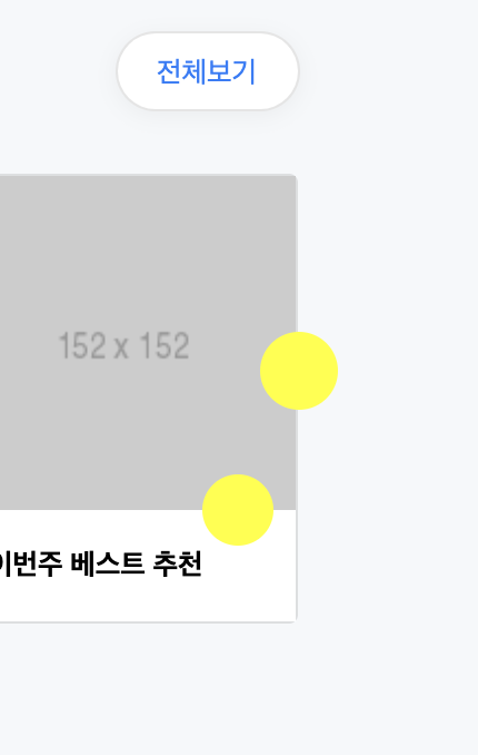
<div id="audio-playlist" class="audio-section">

					<div class="audio-header">
						<h2>나를 위한 플레이리스트</h2>
						<p>당신을 위해 매일 새롭게 업데이트 됩니다.</p>

						<a href="#" class="link-total">전체보기</a>
					</div>

					<div class="audio-body">

						<ul class="audio-flex-between">
							<li>
								<a href="#">
									<div class="image-wrap">
										<img src="https://via.placeholder.com/152">
										<i class="icon-play"></i>
									</div>

									<h3>이번주 베스트 추천</h3>
								</a>
							</li>
						</ul>
					</div>
				</div>
css
#audio-original .audio-body {
}

#audio-original .audio-body ul {
	align-items: flex-start;
}

#audio-original .audio-body ul li {
	width: 120px;
}

#audio-original .audio-body li a {}

#audio-original .audio-body li img {
	border-radius: 20px;
}

#audio-original .audio-body h3 {
	font-size: 13px;
	margin-top: 10px;
}

#audio-original .audio-body .author {
	font-size: 12px;
	margin-top: 6px;

	color: #959595;
}

#audio-original .audio-body .btn-right {
	top: 60px;
}


#audio-playlist {}

#audio-playlist .audio-header {
	position: relative;
}

#audio-playlist .audio-header h2 {}

#audio-playlist .audio-header p {
	font-size: 13px;
	margin-top: 8px;
	color: #888888;
	font-weight: 400;
}

#audio-playlist .audio-header .link-total {
	display: block;
	position: absolute;

	padding: 10px 18px 8px;
	background-color: #ffffff;
	font-size: 13px;
	border: solid 1px rgba(0, 0, 0, 0.1);
	border-radius: 20px;
	box-shadow: 0 2px 10px 0 rgb(80 85 91 / 7%);

	color: #157efb;

	right: 0;
	top: 6px;
}


#audio-playlist .audio-body {}

#audio-playlist .audio-body ul {
	align-items: flex-start;
}

#audio-playlist .audio-body li {
	width: 152px;
	border: solid 1px rgba(0, 0, 0, 0.1);
	border-radius: 4px;
}

#audio-playlist .audio-body li .image-wrap {
	position: relative;
	width: 150px;
	height: 150px;
}

#audio-playlist .audio-body li .image-wrap img {
	position: absolute;
	width: 100%;
	height: 100%;
}

#audio-playlist .audio-body li .image-wrap .icon-play {
	position: absolute;
	width: 32px;
	height: 32px;
	background-color: yellow;
	border-radius: 50%;

	bottom: -16px;
	right: 10px;
}

#audio-playlist .audio-body li h3 {
	background-color: #ffffff;
	padding: 17px 11px;
	font-size: 13px;
}
html
<button type="button" class="btn-right"></button>css
#audio-playlist .audio-body .btn-right {
	top: 90px;
}
html
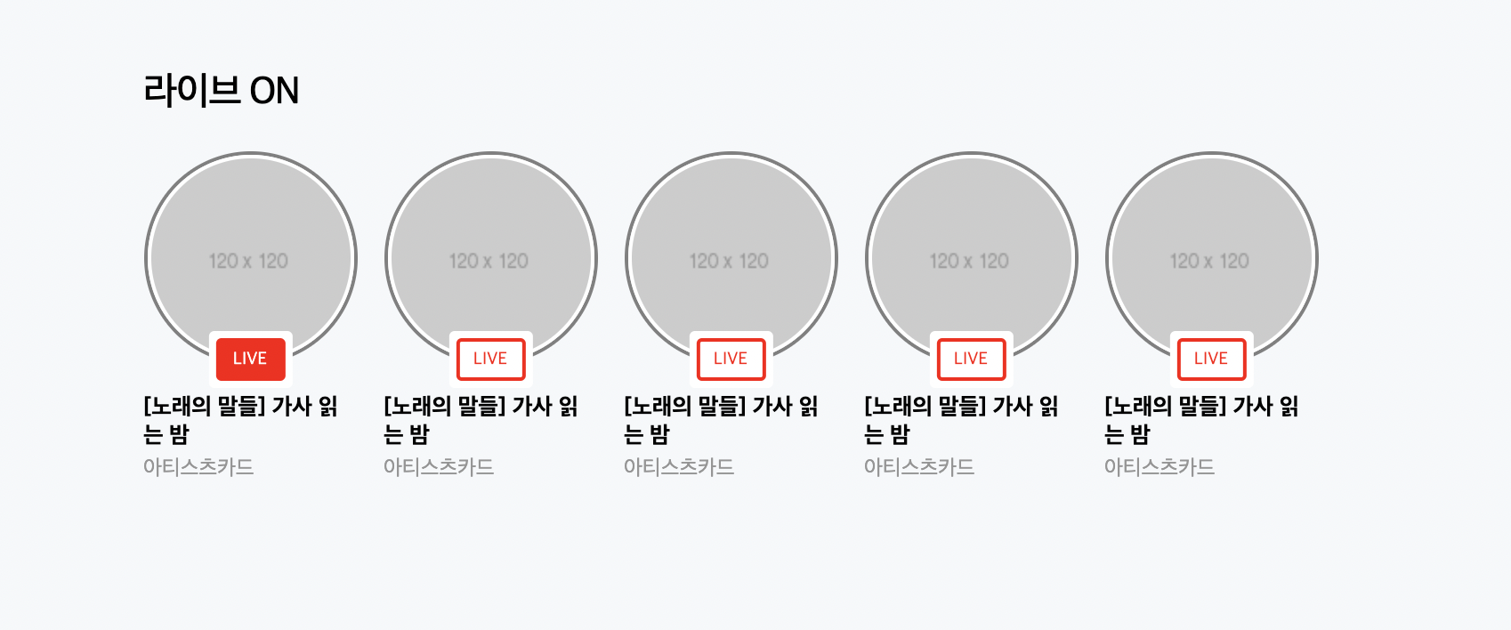
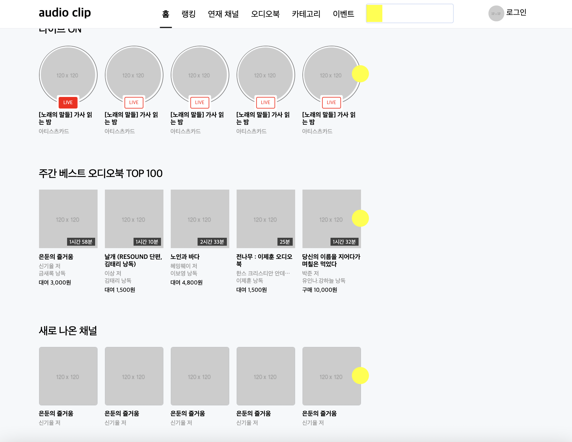
<div id="audio-live" class="audio-section">

					<div class="audio-header">
						<h2>라이브 ON</h2>
					</div>
					<div class="audio-body">

						<ul class="audio-flex-between">
							<li class="active">
								<a href="#">
									<div class="image-wrap">
										<img src="https://via.placeholder.com/120">
										<div class="live-state">
											<span class="live">LIVE</span>
										</div>
									</div>

									<h3>[노래의 말들] 가사 읽는 밤</h3>
									<span class="author">아티스츠카드</span>
								</a>
							</li>
							<li>
								<a href="#">
									<div class="image-wrap">
										<img src="https://via.placeholder.com/120">
										<div class="live-state">
											<span class="live">LIVE</span>
										</div>
									</div>

									<h3>[노래의 말들] 가사 읽는 밤</h3>
									<span class="author">아티스츠카드</span>
								</a>
							</li>
						</ul>


					</div>

				</div>
css
#audio-live .audio-body {
	align-items: flex-start;
}

#audio-live .audio-body li {
	width: 120px;
}

#audio-live .audio-body li .image-wrap {
	position: relative;
	width: 120px;
	height: 120px;
	border: solid 2px grey;
	border-radius: 50%;
}

#audio-live .audio-body li .image-wrap img {
	position: absolute;
	width: 100%;
	height: 100%;
	border: solid 2px #ffffff;
	border-radius: 50%;
}

#audio-live .audio-body li .image-wrap .live-state {
	position: absolute;

	padding: 2px;
	border: solid 2px #ffffff;
	border-radius: 3px;
	background-color: #ffffff;

	bottom: -15px;
	left: 50%;
	transform: translateX(-50%);
}

#audio-live .audio-body li .image-wrap .live-state .live {
	display: block;
	padding: 4px 8px;
	color: red;
	border: solid 2px red;
	border-radius: 3px;
	background-color: #ffffff;

	font-size: 10px;
}

#audio-live .audio-body li.active .image-wrap .live-state .live {
	border: solid 2px red;
	background-color: red;

	color: #ffffff;
}


#audio-live .audio-body li h3 {
	margin-top: 16px;
	font-size: 13px;
}

#audio-live .audio-body li .author {
	margin-top: 6px;
	font-size: 12px;
	color: #959595;
}
html
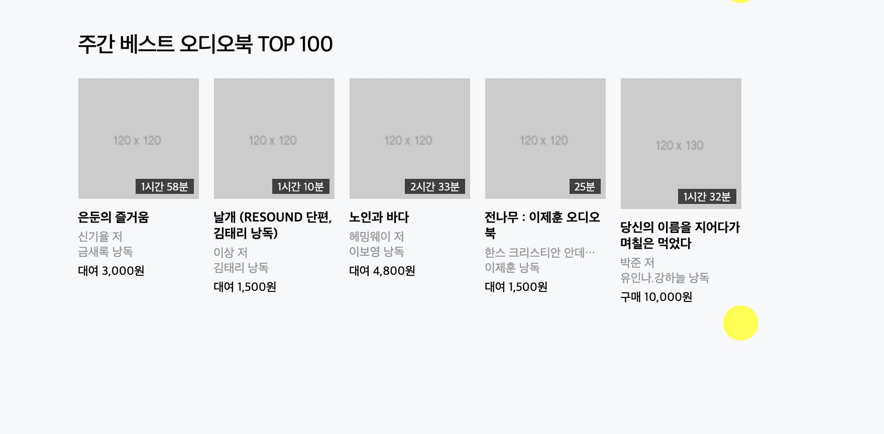
<div id="audio-book" class="audio-section">

					<div class="audio-header">
						<h2>주간 베스트 오디오북 TOP 100</h2>
					</div>
					<div class="audio-body">

						<ul class="audio-flex-between">
							<li>
								<a href="#">
									<div class="image-wrap">
										<img src="https://via.placeholder.com/120">
										<span class="time">2시간</span>
									</div>

									<h3>[노래의 말들] 가사 읽는 밤</h3>
									<span class="author-1">아티스츠카드</span>
									<span class="author-2">아티스츠카드</span>
									<span class="price">아티스츠카드</span>
								</a>
							</li>
						</ul>

						<button type="button" class="btn-right"></button>

					</div>

				</div>
css
#audio-book .audio-body {}

#audio-book .audio-body ul {
	align-items: flex-start;
}

#audio-book .audio-body li {
	position: relative;
	width: 120px;
}

#audio-book .audio-body .image-wrap {
	position: relative;
	width: 100%;
}

#audio-book .audio-body .image-wrap img {
	/*position: absolute;*/
	width: 100%;
}

#audio-book .audio-body .image-wrap .time {
	position: absolute;

	padding: 2px 5px 0;
	background-color: rgba(17, 17, 17, .75);

	font-size: 11px;
	color: #ffffff;

	right: 5px;
	bottom: 5px;
}

#audio-book .audio-body li h3 {
	font-size: 13px;
	margin-top: 11px;
}

#audio-book .audio-body li .author-1 {
	display: block;
	font-size: 12px;
	margin-top: 4px;

	color: #959595;
}

#audio-book .audio-body li .author-2 {
	display: block;
	font-size: 12px;
	color: #959595;
}

#audio-book .audio-body li .price {
	display: block;
	font-size: 12px;
	margin-top: 4px;
	font-weight: 500;
}
이렇게 작성을 하고 네이버 페이지에서 문구를 똑같이 넣어주었는데 저자 부분에 글이 많이 들어가는 경우를 확인하고 css에 span 태그에 관한 것을 더 설정해주었다.
#audio-book .audio-body li span {
	overflow: hidden;
	text-overflow: ellipsis;
	white-space: nowrap;
}
html
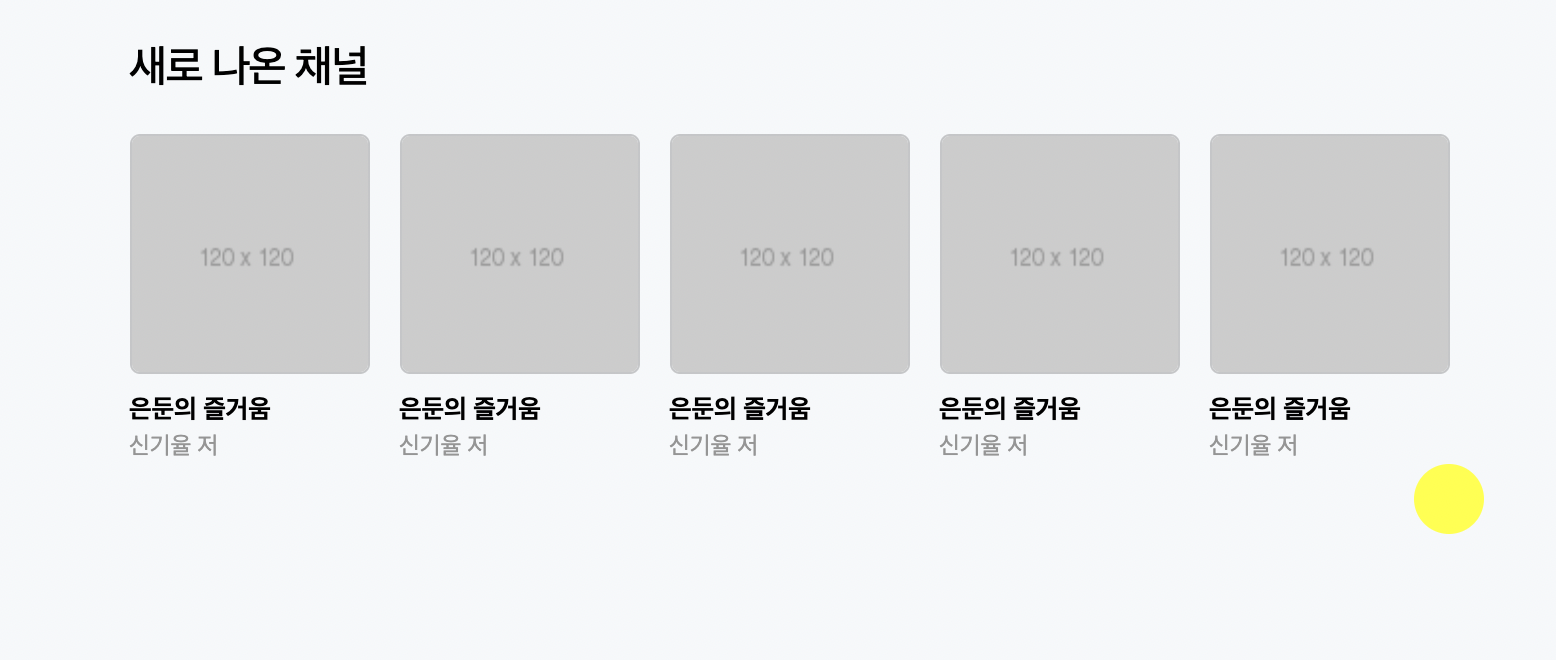
<div id="audio-channel" class="audio-section">

					<div class="audio-header">
						<h2>새로 나온 채널</h2>
					</div>
					<div class="audio-body">

						<ul class="audio-flex-between">
							<li>
								<a href="#">
										<img src="https://via.placeholder.com/120">

									<h3>은둔의 즐거움</h3>
									<span class="author">신기율 저</span>
								</a>
							</li>

						</ul>

						<button type="button" class="btn-right"></button>

					</div>

				</div>
css
#audio-channel .audio-body {}

#audio-channel .audio-body ul {
	align-items: flex-start;
}

#audio-channel .audio-body li {
	width: 120px;
}

#audio-channel .audio-body li img {
	width: 120px;
	height: 120px;
	border: solid 1px rgba(0, 0, 0, 0.2);
	border-radius: 5px;
}

#audio-channel .audio-body li h3 {
	font-size: 13px;
	margin-top: 10px;
}

#audio-channel .audio-body li .author {
	font-size: 12px;
	margin-top: 6px;
	color: #959595;
}
버튼의 위치는 쉬워서 skip 하신다고 하셨다.
css
.audio-section .audio-body .btn-right {
	position: absolute;
	width: 35px;
	height: 35px;
	background-color: yellow;
	border-radius: 50%;
	right: -17px;
}
이 부분에
top: 60px;이렇게만 넣어주었더니 버튼이 제자리를 찾은듯했다.
어려웠던 점 & 해결 방법
강의 시점이 현재가 아니라서 지금의 사이트와 다른 점 때문에 혼란스러울 때도 있지만 사이트를 확인하면서 해결해나가고 있다.
- 강의를 다 듣고 페이지를 비교해봤는데 오늘의 오디오 클립 부분에 이미지 옆 글씨가 붙여져있어서 확인을 다시 해보았다. <차라투스트라는 이렇게 말했다> 에 들어가는 <> 괄호 때문인지 설정이 안 먹히는 것 같은데 이유를 잘 모르겠다. 아마 코드 작성할 때 쓰는 괄호라서 그런거라는 생각이 들어서 괄호만 빼주었다...
학습 소감
버튼 태그의 위치 설정 부분을 skip 하셔서 혼자 공부할 부분이 많을거라 생각했지만 생각보다 간단해서 좋았다.