35강 트위치 2 ( 처음 - 0:57:39)
학습 내용
twitch.html
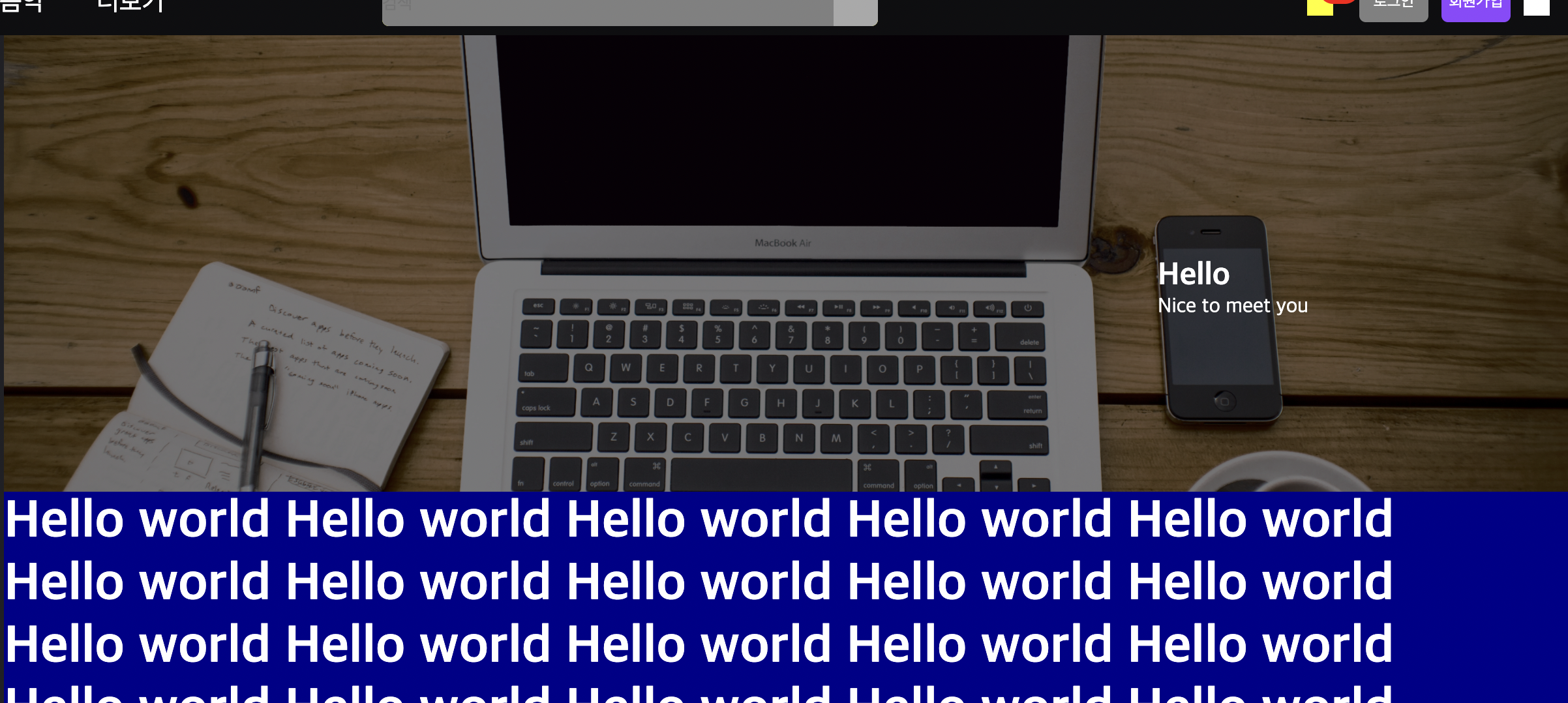
<div class="content">
			<div id="content-banner">
				<div class="layer">
					<div class="txt-wrap">
						<h2>Hello</h2>
						<p>Nice to meet you</p>
					</div>
				</div>
			</div>
			<h1>Hello world Hello world Hello world Hello world Hello world</h1>
			<h1>Hello world Hello world Hello world Hello world Hello world</h1>
			<h1>Hello world Hello world Hello world Hello world Hello world</h1>
			<h1>Hello world Hello world Hello world Hello world Hello world</h1>
			<h1>Hello world Hello world Hello world Hello world Hello world</h1>
		</div>
overflow-y: auto;
컨텐츠 내부 영역에 대해서만
background-size: cover;
특정 영역에서 큰 이미지를 넣었을 때,
원본 비율은 유지한 채로 크기 맞춰 줌
css
.content {
	overflow-y: auto;
	position: absolute;
	background-color: darkblue;
	top: 50px;
	left: 240px;

	bottom: 0;
	right: 0;
}

.content h1 {
	font-size: 40px;
}

.content #content-banner {
	position: relative;
	width: 100%;
	height: 350px;
	background: url('../img/notebook.jpg') no-repeat center;
	background-size: cover;
}

.content #content-banner .layer {
	position: absolute;
	width: 100%;
	height: 100%;
	background-color: rgba(0, 0, 0, 0.5);

	top: 0;
	left: 0;
}

.content #content-banner .layer .txt-wrap {
	position: absolute;
	top: 170px;
	right: 200px;
}
css
.main-container {
	position: relative;
	height: 100%;
}
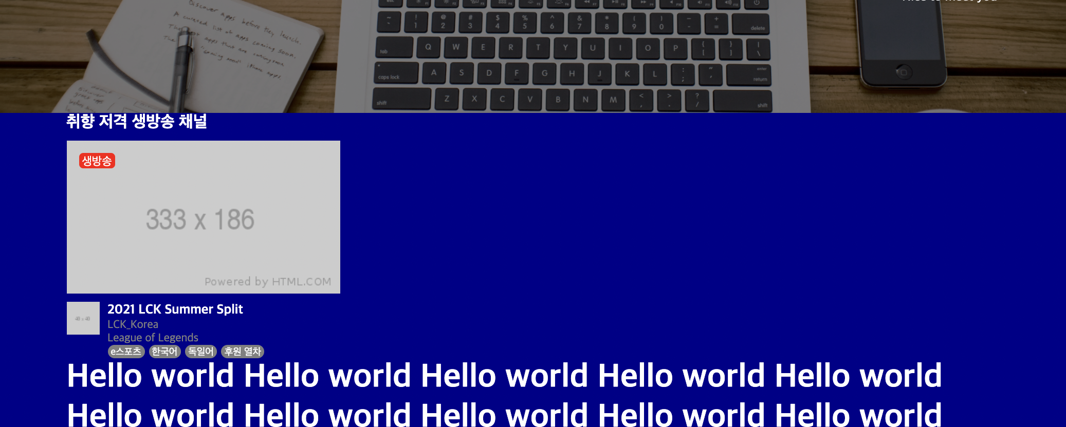
html
<div class="content-container">

				<div class="video-section">
					<div class="title-wrap">
						<h2>취향 저격 생방송 채널</h2>
					</div>

					<div class="video-wrap">
						<ul>
							<li>
								<a href="#">
									<div class="image-wrap">
										<img src="https://via.placeholder.com/333x186">
										<span class="mark">생방송</span>
									</div>

									<div class="video-bottom">
										<img class="thumbnail" src="https://via.placeholder.com/40">
										<div class="txt-wrap">
											<h3>2021 LCK Summer Split</h3>
											<p class="source">LCK_Korea</p>
											<p class="game">League of Legends</p>

											<div class="tag-wrap">
												<span class="tag">e스포츠</span>
												<span class="tag">한국어</span>
												<span class="tag">독일어</span>
												<span class="tag">후원 열차</span>
											</div>
										</div>
									</div>
								</a>
							</li>
						</ul>
					</div>
				</div>

				<h1>Hello world Hello world Hello world Hello world Hello world</h1>
				<h1>Hello world Hello world Hello world Hello world Hello world</h1>
				<h1>Hello world Hello world Hello world Hello world Hello world</h1>
				<h1>Hello world Hello world Hello world Hello world Hello world</h1>
				<h1>Hello world Hello world Hello world Hello world Hello world</h1>
				<h1>Hello world Hello world Hello world Hello world Hello world</h1>
				<h1>Hello world Hello world Hello world Hello world Hello world</h1>
				<h1>Hello world Hello world Hello world Hello world Hello world</h1>
				<h1>Hello world Hello world Hello world Hello world Hello world</h1>
				<h1>Hello world Hello world Hello world Hello world Hello world</h1>
			</div>
css
.content .content-container {
	width: 1240px;
	margin: 0 auto;
}

/* 태그 디폴트 */
.content-container .tag-wrap {
	display: flex;
	flex-wrap: wrap;
	align-items: center;
}

.content-container .tag-wrap .tag {
	font-size: 12px;
	color: #ffffff;
	background-color: grey;
	border-radius: 8px;

	padding: 2px 4px 0;

	margin-right: 5px;
}

.content-container .tag-wrap .tag:last-child {
	margin-right: 0;
}

.content-container .txt-wrap {

}
.content-container .txt-wrap h3 {
	font-size: 16px;
}


/* 비디오 섹션 */
.video-section {}

.video-section .title-wrap {
	padding-bottom: 10px;
}

.video-section .title-wrap h2 {
	font-size: 20px;
}

.video-section .video-wrap {}

.video-section .video-wrap ul {}

.video-section .video-wrap li {
	width: 333px;
}

.video-section .video-wrap a {}

.video-section .video-wrap .image-wrap {
	position: relative;
	width: 333px;
	height: 186px;
}

.video-section .video-wrap .image-wrap img {
	width: 100%;
	height: 100%;
}

.video-section .video-wrap .image-wrap .mark {
	position: absolute;

	top: 15px;
	left: 15px;

	border-radius: 5px;
	background-color: red;

	padding: 2px 4px 0;

	font-size: 14px;
}

.video-section .video-wrap .video-bottom {
	display: flex;
	flex-wrap: wrap;
	justify-content: space-between;
	align-items: flex-start;

	margin-top: 10px;
}

.video-section .video-wrap .video-bottom .thumbnail {
	width: 40px;
	height: 40px;
}

.video-section .video-wrap .video-bottom .txt-wrap {
	width: calc(100% - 50px);
}

.video-section .video-wrap .video-bottom .txt-wrap .source,
.video-section .video-wrap .video-bottom .txt-wrap .game {
	font-size: 14px;
	color: grey;
}
어려웠던 점 & 해결 방법
overflow-y 부분이 이해가 잘 안되서 인터넷을 통해 따로 찾아보고 적용하는 경우를 알게 되었다.
학습 소감
이때까지 배운 내용을 계속 반복하면서 아는 부분이 대부분일거라 생각했지만 새로운 부분을 하나씩 배우면서 아직 갈 길이 멀다는 생각이 들었다. 부족한 부분은 반복하면서 익혀야겠다.