5강 애니메이션 (처음 - 02:25:41)
학습 내용
rotate (2차원 회전)
html
<!DOCTYPE html>
<html>
<head>
	<meta charset="utf-8">
	<link rel="stylesheet" type="text/css" href="css/style.css">
</head>
<body>


	<div class="transform"></div>


</body>
</html>
css
.transform {
	width: 300px;
	height: 300px;
	background-color: yellow;

	transform:  rotate(45deg);
}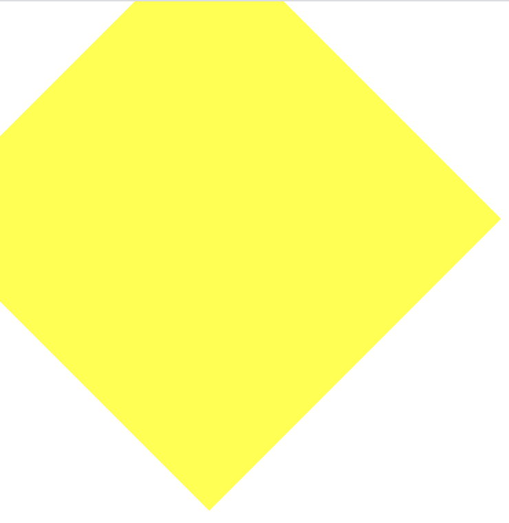
양수 시계방향 회전
음수 반시계방향 회전
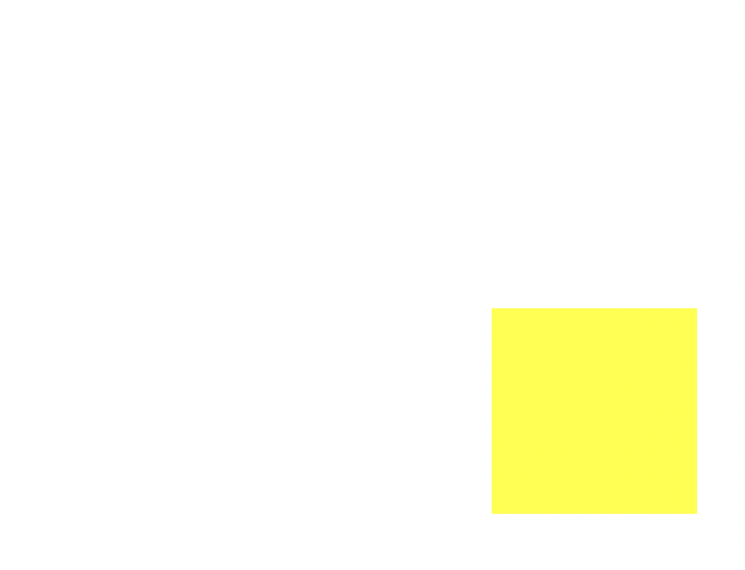
scale
css
	/*transform:  rotate(45deg);*/
	transform:  scale(0.5, 0.5);

	margin-left: 300px;
	margin-top: 500px;
scale(2, 3) : x 축으로 2배, y 축으로 3배 값을 키운다.
0.5 는 반으로 줄인다.
scale : 영역을 비율로 확대, 축소하는 것
skew (3차원 회전)
css
transform: skew(10deg, 20deg);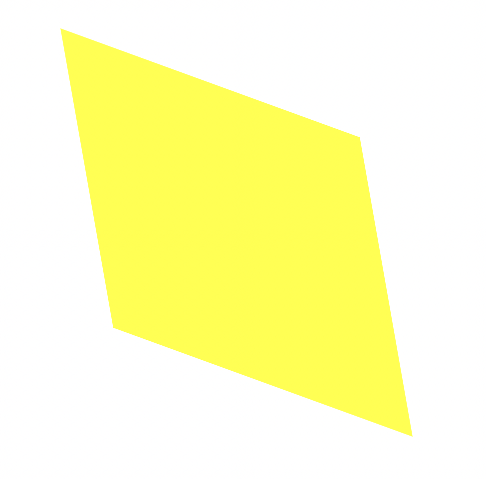
translate
css
transform: translate(100px, 300px);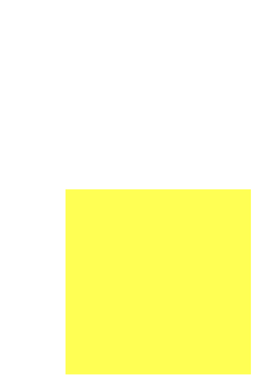
선택한 영역의 object 위치를 변경할 때 사용
프리픽스
css
	-webkit-transform:  rotate(10deg);
	-moz-transform:  rotate(10deg);
	-ms-transform:  rotate(10deg);
	-o-transform:  rotate(10deg);
	transform: rotate(10deg);
-webkit- : Chrome, Safari
-moz- : Firefox
-ms- : Explorer
-o- : Opera
transition
html
<div class="transition"></div>css
.transition {
	width: 300px;
	height: 300px;
	background-color: yellow;

	transition-property:  width;
	transition-duration: 2s;
	transition-timing-function: linear;
	transition-delay: 1s;
}

.transition:hover {
	width: 600px;
}
커서를 올리면 1초의 지연시간 후에 크기가 늘어남
linear: 시작부터 끝까지 일정한 속도 유지
css
	/*
	transition-property:  width;
	transition-duration: 2s;
	transition-timing-function: linear;
	transition-delay: 1s;
	*/

	transition: width 2s linear 1s;
4줄 짜리를 1줄로 줄임
css
	transition: width 2s linear, height 2s linear;
}

.transition:hover {
	width: 600px;
	height: 600px;
}
animation
html
<div class="animation"></div>css
.animation {
	width: 300px;
	height: 300px;
	background-color: yellow;

	animation-name: changeWidth;
	animation-duration: 3s;
	animation-timing-function: linear;
	animation-delay: 1s;

	animation-literation-count:  6;
	animation-direction: normal;
}

@keyframes changeWidth {
	from {
		width: 300px;
	}

	to {
		width: 600px;
	}
}
커서를 올리지 않아도 자동으로 애니메이션 재생
from 에서 to 로 진행하고 다시 돌아오는 것을 원할 때 alternate
css
animation-direction: alternate;횟수 제한 없이 무한으로 infinite
css
animation-iteration-count: infinite;노란색 정 300에서 빨간색 정600
css
@keyframes changeWidth {
	from {
		width: 300px;
		height: 300px;
		background-color: yellow;
	}

	to {
		width: 600px;
		height: 600px;
		background-color: red;
	}
여기서 신기했던 점! 노란색에서 시작해서 빨간색으로 변하는 과정에서 다른 설정없이 주황색이 등장했다.
어려웠던 점 (이라기보다 궁금했던 점)
Q) 그렇다면 다른 색깔을 적용했을 때도 이런 원리가 적용이 되는건가?
해결 방법
A) yellow 대신 blue를 넣어보았는데 변화하는 과정에서 보라색도 나오고 자주색도 나오는 것을 확인했다. 색의 원리가 자동으로 적용이 되는 것 같다.
from 대신 0%, to 대신 100% 로 설정을 하고 중간에 다른 숫자를 넣어서 상세하게 편집 가능
spin-lion
10도씩 왔다갔다 움직이는 애니메이션 구현
html
<div class="spin-lion"></div>css
.animation {
	width: 300px;
	height: 300px;
	background-color: yellow;

	animation-name: changeWidth;
	animation-duration: 3s;
	animation-timing-function: linear;
	animation-delay: 1s;

	animation-iteration-count:  infinite;
	animation-direction: alternate;
}

@keyframes changeWidth {
	0% {
		width: 300px;
		height: 300px;
		background-color: blue;
	}
	50% {
		background-color:  blue;
	}

	100% {
		width: 600px;
		height: 600px;
		background-color: red;
	}
}


.spin-lion {
	width: 150px;
	height: 150px;
	background-color: blue;

	animation-name: spinLion;
	animation-duration: 1.5s;
	animation-timing-function: linear;
	animation-iteration-count: infinite;
	animation-direction: alternate;
}

@keyframes spinLion {
	from {
		transform:  rotate(-10deg);
	}

	to {
		transform: rotate(10deg);
	}
}
animation-name부터 animation-direction을 한 줄로
animation: spinLion 1.5s linear infinite alternate;참고 사이트 https://jeremyckahn.github.io/stylie/
mouse animation
html
<!DOCTYPE html>
<html>
<head>
<meta charset="utf-8">
<link rel="stylesheet" type="text/css" href="css/style.css">
</head>
<body>
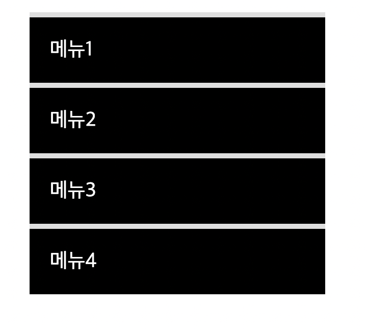
<nav class="mouse-animation">
<ul>
<li><a href="#">메뉴1</a></li>
<li><a href="#">메뉴2</a></li>
<li><a href="#">메뉴3</a></li>
<li><a href="#">메뉴4</a></li>
</ul>
</nav>
</body>
</html>css
html, body {
	margin: 0;
	padding: 0;
}

ul {
	list-style:  none;
}

a {
	text-decoration: none;
	color: #000000;
}

.mouse-animation li {
	width:  250px;
	background-color: #000000;
	padding: 20px;

	border-top: solid 5px #dfdfdf;
	transition: opacity 0.5s, margin-left 0.5s;
}

.mouse-animation li:hover {
	opacity:  0.5;
	margin-left: 10px;
}

.mouse-animation li a {
	color: #ffffff;
	font-size: 20px;
}
커서 올렸을 때
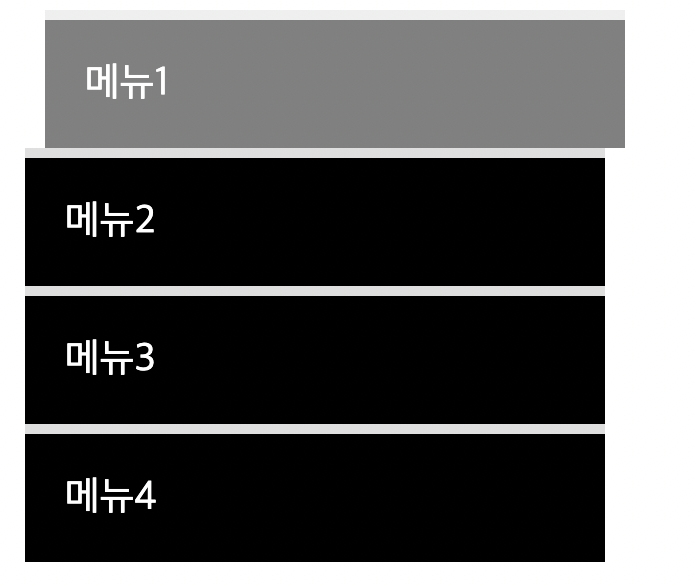
opacity 투명도
글자도 투명도 영향을 받는다
글자는 그대로 배경만 투명도를 바꾸어주고 싶을 때
css
background-color: rgba(0, 0, 0, 1);앞 숫자 세 개는 색상, 마지막 숫자는 투명도
move-box
html
<div class="move-box"></div>css
.move-box {
	position: relative;
	width: 200px;
	height: 200px;
	background-color: red;

	animation-name: moveBox;
	animation-duration: 4s;
	animation-timing-function: linear;
	animation-delay: 1s;
	animation-iteration-count: infinite;
	animation-direction: alternate;
	animation-play-state: running;
	animation-fill-mode: backwards;
}

@keyframes moveBox {
	0% {
		background-color: green;
		left: 0;
		top: 0;
	}

	25% {
		background-color: yellow;
		left: 500px;
		top: 0;
	}

	50% {
		background-color: gray;
		left: 500px;
		top: 500px;
		border-radius: 50%;
	}

	75% {
		background-color: blue;
		left: 0px;
		top: 500px;
	}

	100% {
		background-color:  red;
		left: 0;
		top: 0;
	}
}
left와 top을 지정할 수 있는 이유는 position이 relative이기 때문
- animation-play-state : 동작을 원할 때 running 멈추고 싶을 때 paused
- animation-fill-mode : backwards는 0%에 입력된 상태를 기준으로 최초화면을 사용자에게 보여줌
outer-border
html
	 <div class="outer-border">
 	 	<div class="inner-border"></div>
 	 </div>
css
.outer-border {
	display: felx;
	justify-content: center;
	align-items: center;

	width: 200px;
	height: 200px;
	border: solid 15px red;
	border-radius: 50%;

	margin: 0 auto;
	margin-top: 200px;

	animation: outerBorder 2s infinite;
}

@keyframes outerBorder {
	0% { border-color: red; transform: scale(1);}
	25% { border-color: yellow; transform: scale(1.2);}
	50% { border-color: blue; transform: scale(1.3);}
	75% { border-color: green; transform: scale(1.2);}
	100% { border-color: pink; transform: scale(1);}
}

.inner-border {
	box-sizing: border-box;
	width: 75px;
	height: 75px;
	border: 5px solid purple;

	animation: innerBorder 2s infinite;
}

@keyframes innerBorder {
	0% { transform: rotate(0deg); }
	25% { border-color: blue; border-width: 10px;}
	50% { border-color: yellow; border-width: 20px;}
	75% { border-color: green; border-width: 40px;}
	100% { border-color:  gray; border-width:  5px; transform: rotate(360deg); }
}
mario-container
html
 	<div class="mario-container">
 		<div class="mario-coin"></div>
 		<div class="mario-box"></div>
 	</div>
css
.mario-container {
	position:  relative;
	width: 500px;
	height: 500px;
	border: solid 10px black;

	margin: 0 auto;
	margin-top: 200px;
}


.mario-container .mario-coin {
	position: relative;
	width: 70px;
	height: 70px;
	background-color: yellow;
	border-radius: 50%;

	margin: 0 auto;
	margin-top: 100px;

	animation: jumpCoin 0.5s linear infinite;
}

@keyframes jumpCoin {
	0% {
		transform: translateY(0);
		opacity: 1;
	}

	50% {
		transform: translateY(-100px) rotateY(180deg);
		opacity: 0;
	}

	100% {
		transform: translateY(-100px) rotateY(360deg);
		opacity: 0;
	}
}

.mario-container .mario-box {
	width: 100px;
	height: 100px;
	background-color: blue;
	margin: 0 auto;

	animation: jumpBox 0.5s linear infinite alternate;
}

@keyframes jumpBox {
	0% { transform: translateY(0px); }
	50% { transform: translateY(-10px); }
	100% { transform: translateY(0px); }
}
hover-image
html
 	<div class="hover-image">
 		<img src="https://i.pinimg.com/originals/5b/0e/52/5b0e52bcd854360b1843f8e44ec3aec8.jpg">

 		<div class="image-info">
 			<h2>Title</h2>
 			<p>Paragraph</p>
 		</div>
css
.hover-image {
	width: 400px;
	border: solid 10px #000000;
}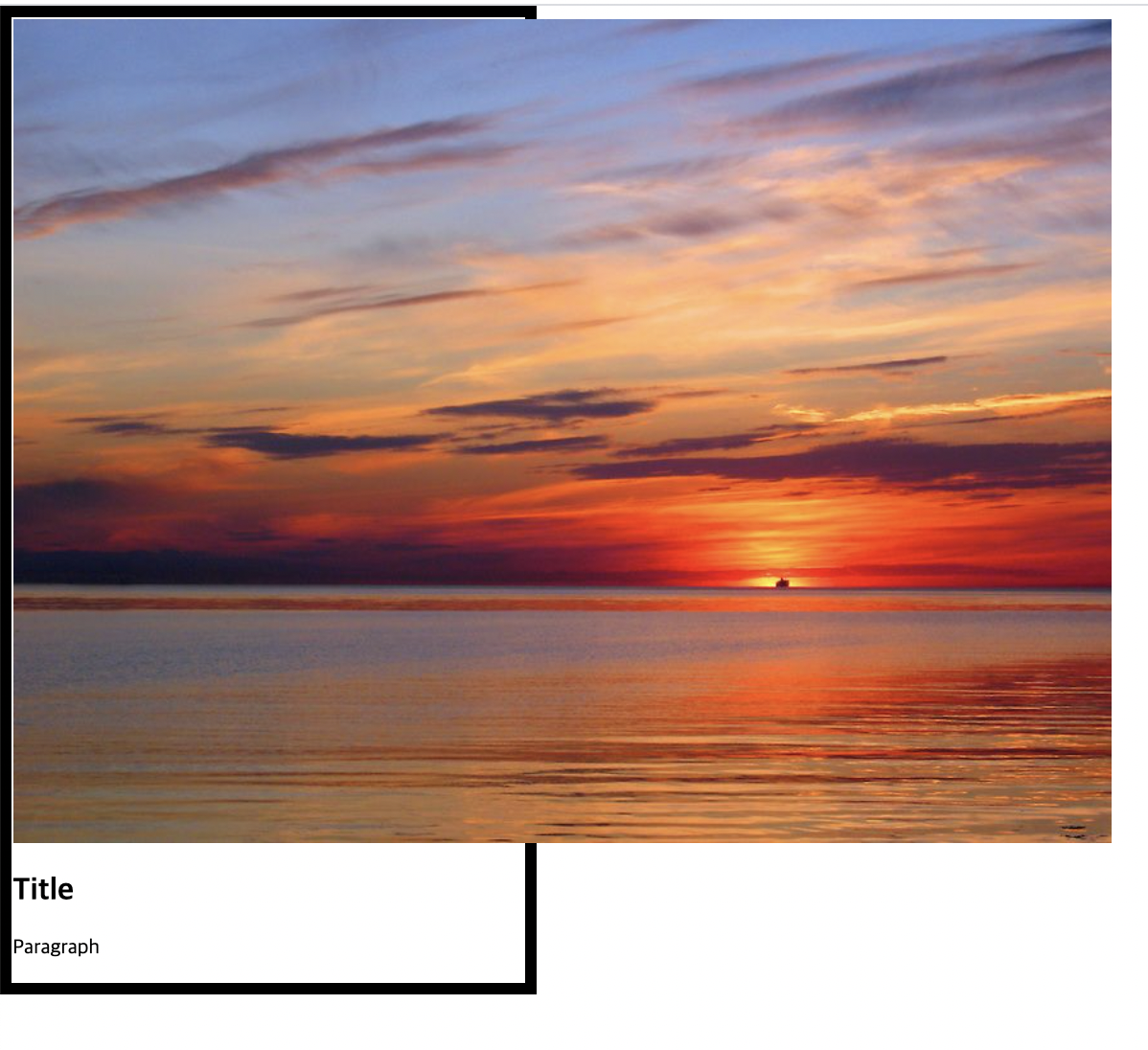
image가 image를 감싼 공간보다 더 크게 나올 때는 공간 안에 들어갈 수 있도록 따로 설정을 해준다
css
.hover-image img {
	width: 100%;
}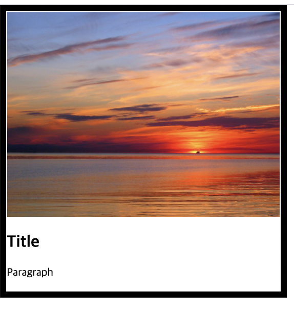
image-info 값 넣어주기
css
.hover-image .image-info {
	background-color: rgba(0, 0, 0, 0.5);
	padding: 20px;
}

.hover-image .image-info h2,
.hover-image .image-info p {
	margin: 0;
	padding: 0;
	color: #ffffff;
}

.hover-image .image-info h2{
	font-size: 20px;
}

.hover-image .image-info p {
	font-size: 15px;
}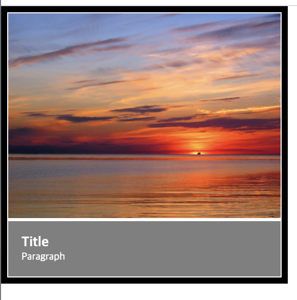
공백이 들어간 것을 확인할 수 있다. img 태그 때문
img 태그 안에
css
vertical-align: middle;넣어주면 공백이 없어진다.
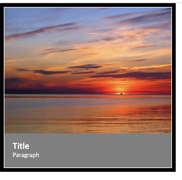
image 영역 안으로 image info 들어가도록
css
.hover-image .image-info {
	box-sizing:  border-box;
	position: absolute;
	width: 100%;

	background-color: rgba(0, 0, 0, 0.5);
	padding: 20px;

	left: 0;
	bottom: 0;
}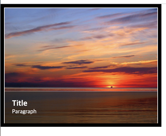
image info 안 보이는 상태에서 커서 올리면 나타나게 설정하기
css 전체
.hover-image {
	cursor: pointer;
	overflow: hidden;
	position: relative;
	width: 400px;
	border: solid 10px #000000;
}

.hover-image img {
	width: 100%;
	vertical-align: middle;
	transition: transform 0.3s linear;
}

.hover-image:hover img {
	transform: scale(1.3);
}

.hover-image .image-info {
	box-sizing:  border-box;
	position: absolute;
	width: 100%;

	background-color: rgba(0, 0, 0, 0.5);
	padding: 20px;

	left: 0;
	bottom: -85px;

	transition: bottom 0.3s linear;
}

.hover-image:hover .image-info {
	bottom: 0;

}

.hover-image .image-info h2,
.hover-image .image-info p {
	margin: 0;
	padding: 0;
	color: #ffffff;
}

.hover-image .image-info h2{
	font-size: 20px;
}

.hover-image .image-info p {
	font-size: 15px;
}
학습소감
마우스 커서를 가져다 댔을 때 화면이 변하는 현상이나 애니메이션을 이용해 도형이 움직이고 슈퍼마리오 동전을 만들어 본 것이 재미있었다. 마지막 hover image에서 여러가지 설정을 많이 했는데 각각의 설정을 할 때 해당되는 class를 찾아서 넣는 게 많이 헷갈렸다.