4강 레이아웃(02:46:04 - 끝)
학습내용
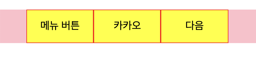
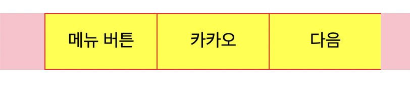
메뉴버튼
html
<!DOCTYPE html>
<html>
<head>
	<meta charset="utf-8">
	<link rel="stylesheet" type="text/css" href="css/style.css">
</head>
<body>


	<nav class="menu">
		<ul>
			<li>

				<a href="#">메뉴 버튼</a>

			</li>
			<li>
				<a href="#">카카오</a>
			</li>
			<li>
				<a href="#">다음</a>
			</li>
		</ul>
	</nav>


</body>
</html>
css
html, body {
	margin: 0;
	padding: 0;

}

ul {
	list-style: none;
}

a {
	color: #000000;
	text-decoration: none;
}


.menu ul {
	overflow: hidden;
	background-color: pink;
}
.menu li {
	/*display: inline-block;*/
	float: left;


	width: 100px;
	height: 50px;
	background-color: yellow;
	border: solid 1px red;

	text-align: center;
	line-height: 50px;

	padding-top: 15px;
	padding-bottom: 15px;
}
아래의 코드 중 첫 줄을 추가하면
여백에 커서를 올렸을 때 마우스가 손가락 모양으로 바뀌게 된다.
css
.menu li a {
	display: block;
    text-align: center;

	padding-top: 15px;
	padding-bottom: 15px;
}
글자를 가운데 정렬
높이도 가운데 정렬
마우스 올렸을 때 색깔 변경
css
.menu li a:hover {
	color: blue;
}
border-top 박스의 윗쪽 영역에 대해서만 border 값 설정 가능
	border-top: solid 1px red;
	border-bottom: solid 1px red;
	border-left: solid 1px red;
이렇게 각각 설정해주고
오른쪽 부분은 가상선택자를 사용한다
.menu li:last-child {
	border-right: solid 1px red;
}
짜잔 네이버와 동일한 디자인, 구조 완성~
카카오 친구 목록
kakao html을 만들고 복사 붙여넣기
html 코드에서 수정되는 부분
			<li>
				<a href="index.html">메뉴 버튼</a>
			</li>
			<li>
				<a href="kakao.html">카카오</a>
			</li>
글자를 눌렀을 때 각각 해당되는 페이지로 이동되는 것을 확인할 수 있다.
html
<!DOCTYPE html>
<html>
<head>
<meta charset="utf-8">
<link rel="stylesheet" type="text/css" href="css/style.css">
</head>
<body>
<nav class="menu">
<ul>
<li>
<a href="index.html">메뉴 버튼</a>
</li>
<li>
<a href="kakao.html">카카오</a>
</li>
<li>
<a href="#">다음</a>
</li>
</ul>
</nav>
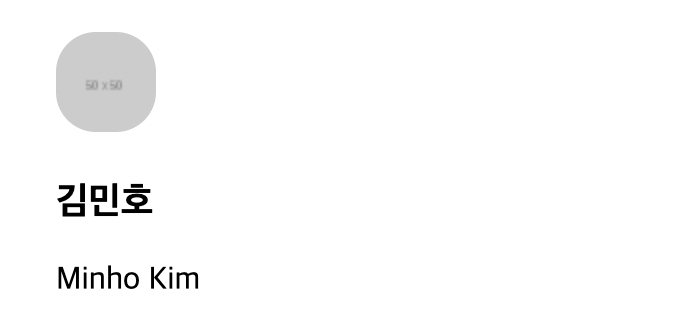
<ul class="kakao-lists">
<li>
<a href="">
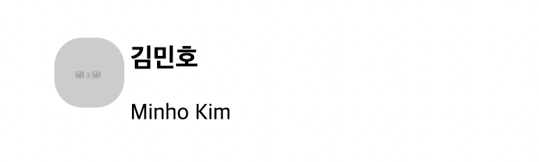
<img src="https://via.placeholder.com/50">
<div class="kakao-info">
<h3>김민호</h3>
<span>Minho Kim</span>
</div>
</a>
</li>
</ul>
</body>
</html>css
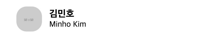
.kakao-lists li img {
	border-radius: 20px;

}

.kakao-lists li .kakao-info {

}
y축 정렬된 결과 나온다.
이미지 오른쪽에 글자가 나오게 할 것이다.
css
.kakao-lists li .kakao-info {
	display: inline-block;
}
글자가 오른쪽으로 가긴 했는데
x축 중앙 정렬이 되지 않은 것 같아 보인다.
마진값이 기본적으로 설정되어 있어서
css
.kakao-lists li .kakao-info h3 {
	margin: 0;
}
이렇게 마진값을 0으로 바꾸어주어야한다.
그리고 프로필명을 이미지에서 살짝 띄워주려면
이미지 기준으로 마진을 넣어주면 된다.
css
.kakao-lists li img {
	border-radius: 20px;
	margin-right: 10px;
}
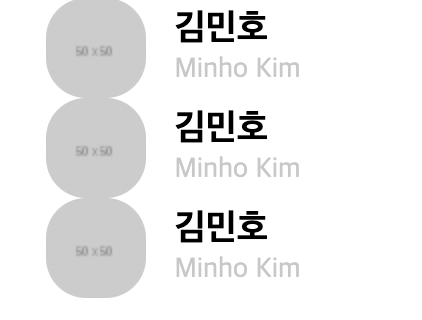
여러 명의 목록을 만들 때
코드를 붙여 넣으면 목록이 붙어있다.
css
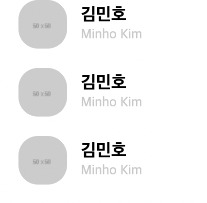
.kakao-lists li {
	margin-bottom: 20px;
}
아래쪽에 마진값을 넣어주면 해결!
네이버 리빙
naver html을 만들기
html
<!DOCTYPE html>
<html>
<head>
<meta charset="utf-8">
<link rel="stylesheet" type="text/css" href="css/style.css">
</head>
<body>
<nav class="menu">
<ul>
<li>
<a href="index.html">메뉴 버튼</a>
</li>
<li>
<a href="kakao.html">카카오</a>
</li>
<li>
<a href="naver.html">네이버</a>
</li>
</ul>
</nav>
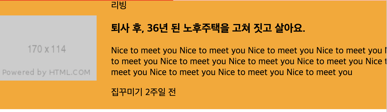
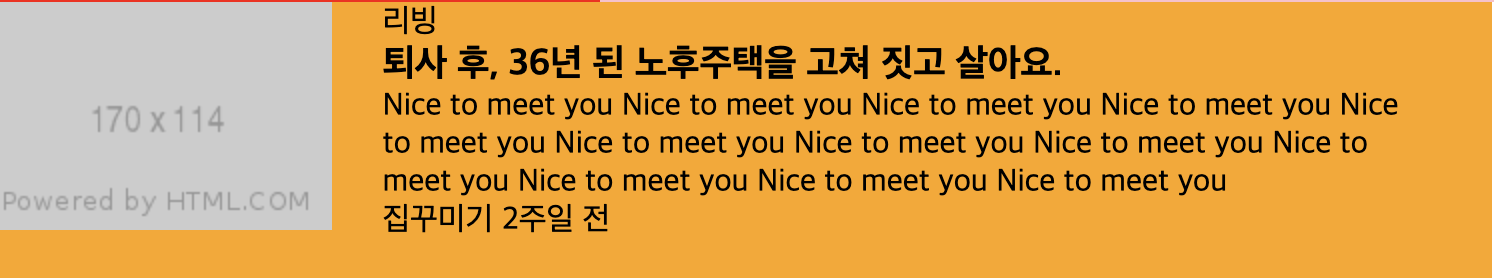
<ul class="living-lists">
<li>
<a href="#" class="image-link">
<img src="https://via.placeholder.com/170x114">
</a>
<a href="#" class="info-link">
<div class="living-info">
<span>리빙</span>
<h3>퇴사 후, 36년 된 노후주택을 고쳐 짓고 살아요.</h3>
<p>Nice to meet you Nice to meet you Nice to meet you Nice to meet you Nice to meet you Nice to meet you Nice to meet you Nice to meet you Nice to meet you Nice to meet you Nice to meet you Nice to meet you </p>
<div class="date-wrap">
<span class="source">집꾸미기</span>
<span class="date">2주일 전</span>
</li>
</div>
</div>
</a>
</li>
</ul>
</body>
</html>css
.living-lists {
	width: 750px;
	background-color: orange;

}


.living-lists .image-link,
.living-lists .info-link {
	display: inline-block;
	vertical-align: middle;
}

.living-lists .image-link {
	margin-right: 21px;
}

.living-lists .info-link {
	width: 512px;
}
어려웠던 점
Q) 강사님이 보여주시는 결과 화면이랑 내 화면이 달랐다. 왜죠..?
강의를 다시 돌려봐도 놓친 부분이 없었고 맨 처음부터 카카오 할 때 까지 마진값을 0으로 둬서 설정을 더 해야하는 것을 못 찾고 헤맸다.
해결방법
A) 처음 나온 p 태그와 h3 태그의 마진을 0으로 설정해주었다. 그림이 얼추 비슷하게 나왔는데 아래 부분에 약간의 공백이 차이가 있었다. 이미지랑 스팬 태그에 마진을 0으로 설정해도 달라지지 않았고 결국엔 비슷하게만 만들고 똑같이는 못 만든 것 같다...
css
p, h3 {
	margin: 0;
}
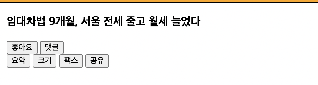
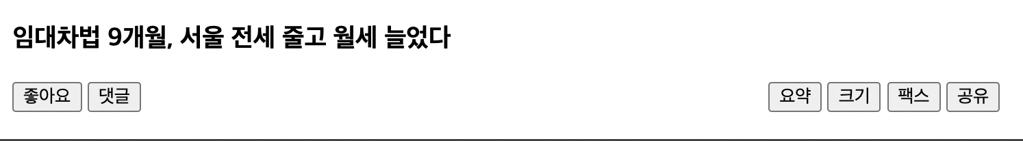
네이버 뉴스
html
	<div class="title-wrap">
		<h3>임대차법 9개월, 서울 전세 줄고 월세 늘었다</h3>

		<div class="btn-wrap">
			<div class="btn-left-wrap">
				<button type="button">좋아요</button>
				<button type="button">댓글</button>
			</div>

			<div class="btn-right-wrap">
				<button type="button">요약</button>
				<button type="button">크기</button>
				<button type="button">팩스</button>
				<button type="button">공유</button>
			</div>

		</div>
	</div>
css
.title-wrap {
	border-top: solid 2px #000000;
	border-bottom: solid 1px #000000;

	padding-top: 20px;
	padding-bottom: 20px;
	padding-left: 15px;
	padding-right: 20px;
}

.title-wrap h3 {
	margin-bottom: 20px;
}
버튼 정렬
https://flexbox.help/ 에 접속하여
btn-left-wrap
btn-right-wrap
두 가지를 정렬할 것이기 때문에
그림과 같이 체크하고 코드 복사
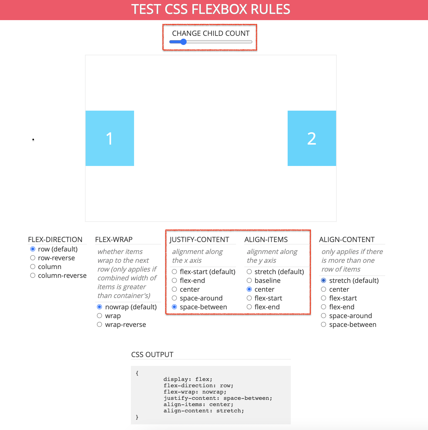
css
.title-wrap .btn-wrap {
	display: flex;
	flex-direction: row;
	flex-wrap: nowrap;
	justify-content: space-between;
	align-items: center;
	align-content: stretch;

}
참고 사이트 https://ko.learnlayout.com/box-model.html
학습소감
새로운 내용 보다는 이때까지 배웠던 것들을 활용해서 한번에 만들어 나갔다. flexbox 참고 사이트는 정말 유용한 것 같다. 막히는 부분이 있을 때 오탈자만 찾던 파이썬 때와는 달리 여러가지 시도를 해보면서 결과를 보고 다시 수정하는 과정을 해보니까 해결했을 때 뿌듯함이 있었다.
0개의 댓글
관련 채용 정보