Style - 동적 Theme
레퍼런스
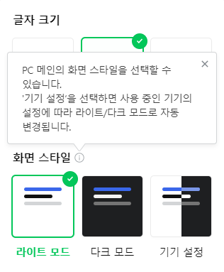
🔍 Naver
<html data-dark="false" /> // 라이트
<html data-dark="true" />  // 다크
:root {
--color_title: #080808;
--color_title_rgb: 8,8,8;
--color_body: #101010;
--color_body_rgb: 16,16,16;
...}
:root[data-dark=true] {
--color_title: #fff;
--color_title_rgb: 255,255,255;
--color_body: #f3f3f3;
--color_body_rgb: 243,243,243;
...}
/* var 변수로 속성값 설정 */
.Layout-module__content_area {
background-color: #fff;
background-color: var(--color_block_bg);
}
html[data-dark=true] .Layout-module__content_area {
box-shadow: none;
}🔗 How to implement switchable themes in scss? | stack overflow
:root {
  --background-color: white;
  --text-color: black;
}

.theme-dark {
  --background-color: black;
  --text-color: white;
}

.target {
  background-color: var(--background-color);
  color: var(--text-color);
}
If the body element has the theme-dark class, it will use the variables defined for that class.
body 요소에 theme-dark 클래스가 있으면 해당 클래스에 대해 정의된 변수를 사용하고
Otherwise, it will use the default root variables.
그렇지 않으면 기본 루트 변수를 사용합니다.
🔍 Tailwind
<html /> // Light
<html class="dark" /> // Dark
.dark {
color-scheme: dark /* normal light dark */
}
- 요소가 편안하게 렌더링될 수 있는 색상 구성표를 나타낼 수 있습니다.
- 운영 체제 색상 체계에 대한 일반적인 선택은 "light"/"dark", 또는 "day"/"night"입니다.
- 사용자가 색상 체계를 선택하면 운영 체제는 사용자 인터페이스를 조정합니다. 여기에는 폼 컨트롤, 스크롤 바 및 CSS 시스템 색상의 사용 값이 포함됩니다.
<nav class="text-slate-700 dark:text-slate-200" />.text-slate-700 {color: rgb(51 65 85);}
:is(.dark .dark\:text-slate-200) {color: rgb(226 232 240);}
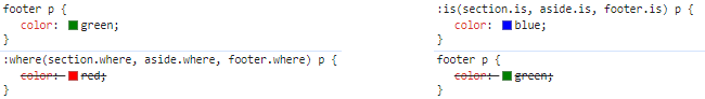
- 선택자 목록을 인수로 삼고, 그 목록에 있는 선택자 중 한 명이 선택할 수 있는 모든 요소를 선택합니다. 이것은 큰 선택자를 더 콤팩트한 형태로 작성할 때 유용합니다.
:where()은 매개변수로 전달된 선택자 목록의 모든 명시도를 무시한다.:is()는 가장 구체적인 선택자의 명시도를 따라간다.
:where(section.where, aside.where, footer.where) p {
  color: red;
}
footer p {
  color: green;
}
:is(section.is, aside.is, footer.is) p {
  color: blue;
}
🔗 [SOCAR FRAME 만들기 #2] 다크 모드 받고 디자인 시스템 더블로 가!
ThemeProvider
const lightPalette = {
  primary: '#000000',
}

const darkPalette = {
  primary: '#ffffff',
}

// App
<ThemeProvider theme={theme === 'Dark' ? darkPalette : lightPalette} />

const Component = styled.div`
  color: ${({ theme }) => theme.primary};
`;
prefers-color-scheme
color-scheme 속성값을 통한 미디어 쿼리 방식
prefers-color-scheme | MDN
ThemeProvider를 사용하지 않고 SCSS로 다크모드를 구현해보자
:root {
  --AppTheme: #fff;
}

@media (prefers-color-scheme: dark) {
  :root {
    --AppTheme: rgb(12, 12, 48);
  }
}

.background {
  background-color: var(--AppTheme);
}
css var() + SCSS
$themes: (
  default: (
    primary: #000,
    secondary: #111,
  ),
  dark: (
    primary: #fff,
    secondary: #eee,
  ),
);

@each $theme in default, dark, light {
  html.theme-#{$theme} {
    @include setTheme($theme);
  }
}
@mixin setTheme($theme) {
  --primary-color: #{setColor($themes, $theme, primary)};
  --secondary-color: #{setColor($themes, $theme, secondary)};
}
@function setColor($themes, $theme, $variant) {
  @if map-has-key($themes, $theme) {
    @return map-get(map-get($themes, $theme), $variant);
  }
  @warn "The theme ´#{$theme} is not available in the themes.";
  @return null;
}

/* Converted */
html.theme-default {
  --primary-color: #000;
  --secondary-color: #111;
}
html.theme-dark {
  --primary-color: #fff;
  --secondary-color: #eee;
}

/* 적용 */
.target {
  color: var(--primary-color);
}
💥🧐
@mixin에서 variant 마다 각각 선언해줘야함
👉 리팩토링 버전 (믹스인 단계 생략)
@each $theme, $map in $themes {
  html.theme-#{$theme} {
    @each $variant, $color in $map {
      --#{$variant}-color: #{setColor($themes, $theme, $variant)};
    }
  }
}
@function setColor($themes, $theme, $variant) {
  @if map-has-key($themes, $theme) {
    @return map-get(map-get($themes, $theme), $variant);
  }
  @warn "The theme ´#{$theme} is not available in the themes.";
  @return null;
}
🔗 How to implement switchable themes in scss? | stack overflow
$themes: (
  light: (
    primary: #000,
    secondary: #111,
  ),
  dark: (
    primary: #fff,
    secondary: #eee,
  ),
);

@mixin themify( $themes: $themes ) {
  @each $theme, $map in $themes {
    .theme-#{$theme} & {
      $theme-map: () !global;
      @each $key, $submap in $map {
        $value: map-get(map-get($themes, $theme), '#{$key}');
        $theme-map: map-merge($theme-map, ($key: $value)) !global;
      }
      @content;
      $theme-map: null !global;
    }
  }
}
@function themed( $key ) {
  @return map-get( $theme-map, $key );
}

/* 적용 */
.target {
  color: black; // default
  @include themify {
    color: themed('primary');
  }
}

/* Converted */
.theme-dark .target {
  color: #fff;
}
💥🧐 적용에 함수를 쓰므로 scss파일 내에서만 할수있음
hsla()
hue, saturation, lightness, alpha: 색조, 채도, 밝기, 불투명도
:root{
	--base-blue: 222, 89%;
	--main-blue: hsla(var(--base-blue), 55%, 100%);
	--main-blue-transparent: hsla(var(--base-blue), 55%, 10%);

	--primary: hsla(var(--palette-blue-50), 100%);
	--emphasis: hsla(var(--palette-blue-50), 8%);
}