Flex ?
flex는 웹페이지의 레이아웃이 필요할 때 사용하는 CSS속성입니다.
보통 display, float, position과 같은 속성을 사용하지만,
사용이 복잡하고 어려울 때를 극복하기 위해 flex가 생겼습니다.
flex는 flexible box,flexbox라고도 불립니다.
flex 시작 !
우선 body에 container(부모역할)과 flexitem(자식역할)을 생성합니다.
<div class="flex_container">
 <div class="flexitem">box1</div>
 <div class="flexitem">box2</div>
 <div class="flexitem">box3</div>
 <div class="flexitem">box4</div>
 </div>
거기에 style를 적용합니다.
<style>
.flex_container {border: 1px solid red;}
.flexitem { margin: 5px; width: 50px; height: 50px;
      background-color: yellow; }
</style>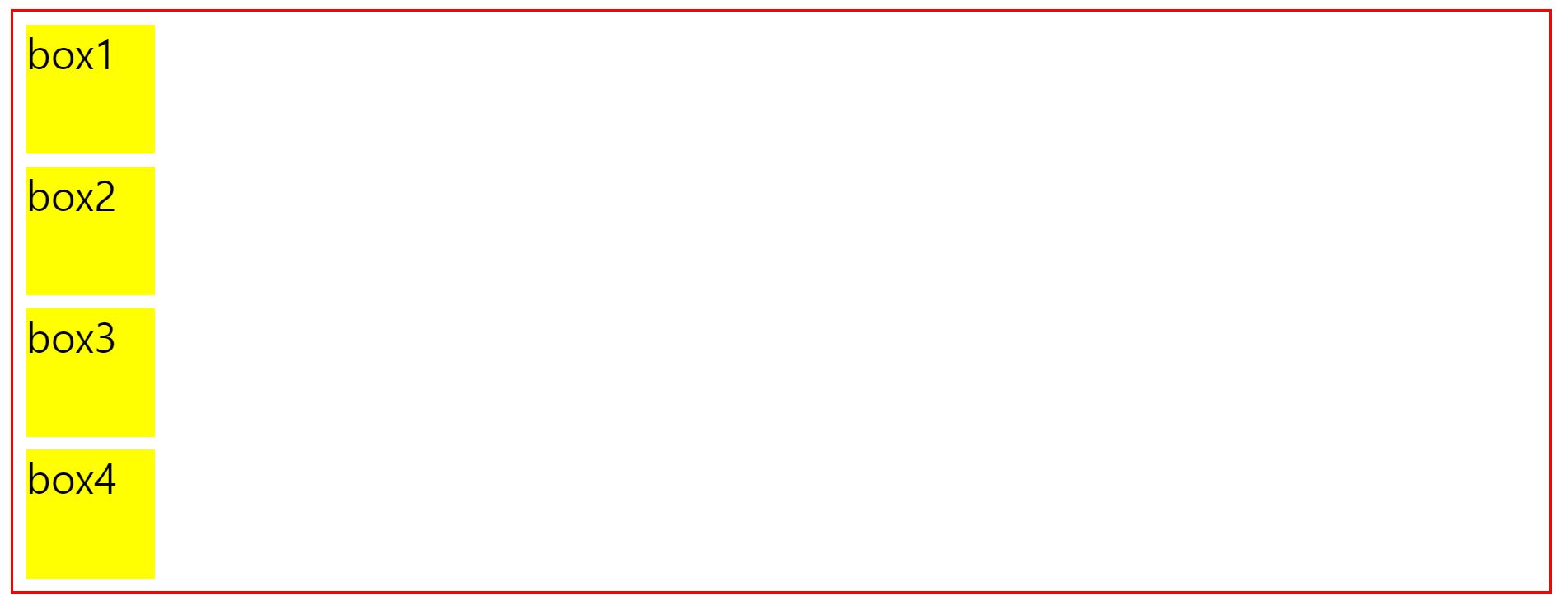
기본적으로 div는 block속성을 가지고 있기 때문에 box(div)들이 차곡차곡 쌓이게 됩니다.
flex를 적용하는 방법은 매우 간단합니다.
자식역할을 하는 div(flexitem)을 감싸는 부모역할을 하는 div(flex_container)에
display: flex;를 적용하면 끝입니다.
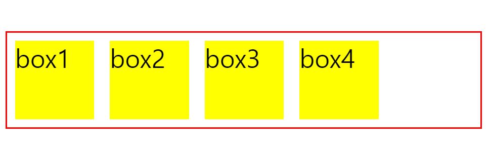
flex속성을 적용하는 것만으로 수직정렬이였던 flexitem이 수평정렬로 변했습니다.
즉! 부모(flex_container)에 적용하여 자식(flexitem)들이 수평정렬한 것이라도 이해하면 됩니다.
주의할점 !
flex container와 flex item에 적용할 수 있는 속성은 다릅니다.
flex container: display,flex-flow,flex-direction,flex-wrap,justify-content,align-content,align-items
flex item: order, flex-grow, flex-shrink, flex-basis,flex,align-self
참고자료!
:https://developer.mozilla.org/ko/docs/Web/CSS/CSS_Flexible_Box_Layout/Basic_Concepts_of_Flexbox