해당 글은 제로베이스데이터스쿨 학습자료를 참고하여 작성되었습니다
PCA
- Principal Component Analysis
- 데이터 집합 내에 존재하는 각 데이터의 차이를 가장 잘 나타내주는 요소를 찾아내는 방법
- 통계데이터 분석(주성분 찾기), 데이터 압축(차원감소), 노이즈 제거 등 다양한 분야에서 사용
- 차원축소와 변수추출 기법으로 사용
- 데이터의 분산을 최대한 보존하면서 서로 직교하는 새 기저(축)을 찾아, 고차원 공간의 표본들을 선형 연관성이 없는 저차원 공간으로 변환하는 기법
- 변수추출은 기존 변수를 조합해 새로운 변수를 만드는 기법(변수 선택과 구분됨)
- 기존의 칼럼을 참고하여 주성분을 생성
간단한 PCA 예시
데이터 준비
import seaborn as sns
import matplotlib.pyplot as plt
from matplotlib import rc
import numpy as np

rng = np.random.RandomState(13)
X = np.dot(rng.rand(2,2), rng.randn(2, 200)).T
X.shape
---------------
(200, 2)
scatterplot
plt.scatter(X[:,0], X[:,1])
plt.axis('equal')   # x,y축 스케일 통일
-------------------------------------
(-2.346839332894307, 2.4400046646752487, -3.8591181666878738, 4.08448257499405)
주성분 2개
from sklearn.decomposition import PCA

pca = PCA(n_components=2, random_state=13)
pca.fit(X)
pca의 성분 행렬
print('주성분 행렬')
print(pca.components_)
print('------------------------')
print('주성분을 설명하는 분산 행렬')
print(pca.explained_variance_)
print('------------------------')
print('전체 데이터의 설명 비율')
print(pca.explained_variance_ratio_)
-----------------------------------------
주성분 행렬
[[ 0.47802511  0.87834617]
 [-0.87834617  0.47802511]]
------------------------
주성분을 설명하는 분산 행렬
[1.82531406 0.13209947]
------------------------
전체 데이터의 설명 비율
[0.93251326 0.06748674]
주성분 벡터 그리기
def draw_vector(v0, v1, ax=None):
    ax = ax or plt.gca()
    arrowprops = dict(
        arrowstyle='->',
        linewidth=2,
        color='black',
        shrinkA=0,
        shrinkB=0,
    )
    ax.annotate('', v1, v0, arrowprops=arrowprops)

plt.scatter(X[:, 0], X[:, 1], alpha=0.4)
for length, vector in zip(pca.explained_variance_, pca.components_):
    v = vector * 3 * np.sqrt(length)
    draw_vector(pca.mean_, pca.mean_ + v)
plt.axis('equal')
plt.show()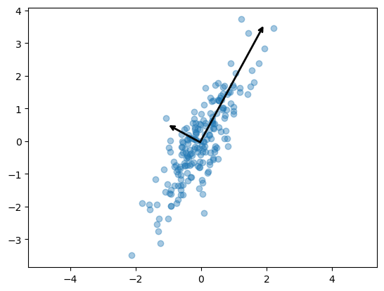
주성분 1개
from sklearn.decomposition import PCA

pca = PCA(n_components=1, random_state=13)
pca.fit(X)
X_pca = pca.transform(X)
pca의 성분 행렬
def pca_print_matrix(user_pca):
    print('주성분 행렬')
    print(user_pca.components_)
    print('------------------------')
    print('주성분을 설명하는 분산 행렬')
    print(user_pca.explained_variance_)
    print('------------------------')
    print('전체 데이터의 설명 비율')
    print(user_pca.explained_variance_ratio_)
pca_print_matrix(pca)
--------------------------------------------
주성분 행렬
[[0.47802511 0.87834617]]
------------------------
주성분을 설명하는 분산 행렬
[1.82531406]
------------------------
전체 데이터의 설명 비율
[0.93251326]
주성분이 하나인 벡터 그리기
X_new = pca.inverse_transform(X_pca)
plt.scatter(X[:, 0], X[:, 1], alpha=0.3)
plt.scatter(X_new[:, 0], X_new[:, 1], alpha=0.9)
plt.axis('equal')
plt.show()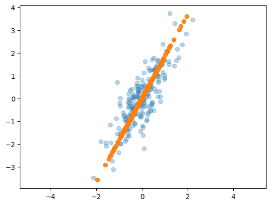
예제1) iris
4개의 칼럼 상관관계
import pandas as pd
from sklearn.datasets import load_iris

iris = load_iris()

iris_pd = pd.DataFrame(iris.data, columns=iris.feature_names)
iris_pd['species'] = iris.target

sns.pairplot(iris_pd, hue='species', height=3,
             x_vars=['sepal length (cm)' ,'petal length (cm)'],
             y_vars=['sepal width (cm)', 'petal width (cm)'])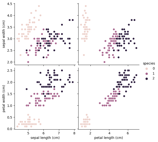
PCA 학습
from sklearn.preprocessing import StandardScaler
from sklearn.decomposition import PCA

def get_pca_data(ss_data, n_components=2):
    pca = PCA(n_components=n_components)
    pca.fit(ss_data)

    return pca.transform(ss_data), pca

def get_pd_from_pca(pca_data, cols=['pca_component_1', 'pca_component_2']):
    return pd.DataFrame(pca_data, columns=cols)

iris_ss = StandardScaler().fit_transform(iris.data)
iris_pca, pca = get_pca_data(iris_ss, 2)

iris_pd_pca = get_pd_from_pca(iris_pca)
iris_pd_pca['species'] = iris.target
iris_pd_pca.head(3)
----------------------------------------------
   pca_component_1  pca_component_2  species
0        -2.264703         0.480027        0
1        -2.080961        -0.674134        0
2        -2.364229        -0.341908        0
pca의 성분 행렬
pca_print_matrix(pca)
-------------------------------------------------
주성분 행렬
[[ 0.52106591 -0.26934744  0.5804131   0.56485654]
 [ 0.37741762  0.92329566  0.02449161  0.06694199]]
------------------------
주성분을 설명하는 분산 행렬
[2.93808505 0.9201649 ]
------------------------
전체 데이터의 설명 비율
[0.72962445 0.22850762]
주성분 시각화
sns.pairplot(iris_pd_pca, hue='species', height=5,
             x_vars=['pca_component_1'], y_vars=['pca_component_2'])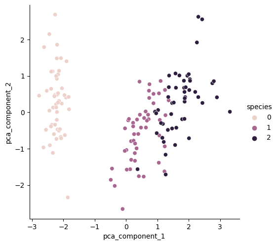
랜덤포레스트 평가
from sklearn.ensemble import RandomForestClassifier
from sklearn.model_selection import cross_val_score

def rf_scores(X, y, cv=5):
    rf = RandomForestClassifier(random_state=13, n_estimators=100)
    scores_rf = cross_val_score(rf, X, y, scoring='accuracy', cv=cv)

    print('Score : ', np.mean(scores_rf))

rf_scores(iris_ss, iris.target)
-------------------------------------
Score :  0.96
pca_X = iris_pd_pca[['pca_component_1', 'pca_component_2']]
rf_scores(pca_X, iris.target)
-------------------------------
Score : 0.9066666666666666예제2) 와인
주성분 2개
wine_url = 'https://raw.githubusercontent.com/PinkWink/ML_tutorial/master/dataset/wine.csv'
wine = pd.read_csv(wine_url, sep=',', index_col=0)

wine_X = wine.drop(['color'], axis=1)
wine_y = wine['color']

wine_ss = StandardScaler().fit_transform(wine_X)
pca_wine, pca = get_pca_data(wine_ss, n_components=2)

def print_vaiance_ratio(pca):
    print('variance_ratio : ', pca.explained_variance_ratio_)
    print('sum of variance_ratio : ', np.sum(pca.explained_variance_ratio_))

print_vaiance_ratio(pca)
----------------------------------------
variance_ratio :  [0.25346226 0.22082117]
sum of variance_ratio :  0.47428342743236185
pca_columns = ['PC1', 'PC2']
pca_wine_pd = pd.DataFrame(pca_wine, columns=pca_columns)
pca_wine_pd['color'] = wine_y.values
sns.pairplot(pca_wine_pd, hue='color', height=5, x_vars=['PC1'], y_vars=['PC2'])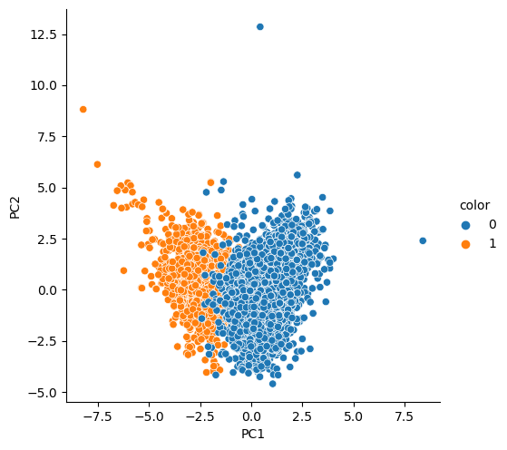
rf_scores
rf_scores(wine_ss, wine_y)

pca_X = pca_wine_pd[['PC1', 'PC2']]
rf_scores(pca_X, wine_y)
-------------------------------------
Score :  0.9935352638124
Score :  0.981067803635933
주성분 3개
pca_wine, pca = get_pca_data(wine_ss, n_components=3)
print_vaiance_ratio(pca)

cols = ['PC1', 'PC2', 'PC3']
pca_wine_pd = get_pd_from_pca(pca_wine, cols=cols)

pca_X = pca_wine_pd[cols]
rf_scores(pca_X, wine_y)
----------------------------------------
variance_ratio :  [0.25346226 0.22082117 0.13679223]
sum of variance_ratio :  0.6110756621838704
Score :  0.9832236631728548
주성분 3개 시각화
pca_wine_plot = pca_X
pca_wine_plot['color'] = wine_y.values
pca_wine_plot.head()
---------------------------------------
        PC1       PC2       PC3  color
0 -3.348438  0.568926 -2.727386      1
1 -3.228595  1.197335 -1.998904      1
2 -3.237468  0.952580 -1.746578      1
3 -1.672561  1.600583  2.856552      1
4 -3.348438  0.568926 -2.727386      1
주성분 3개 3D 시각화
import plotly.express as px

fig = px.scatter_3d(pca_wine_plot, x='PC1', y='PC2', z='PC3',
                    color='color', symbol='color', opacity=0.4)
fig.update_layout(margin=dict(l=0, r=0, b=0, t=0))
fig.show()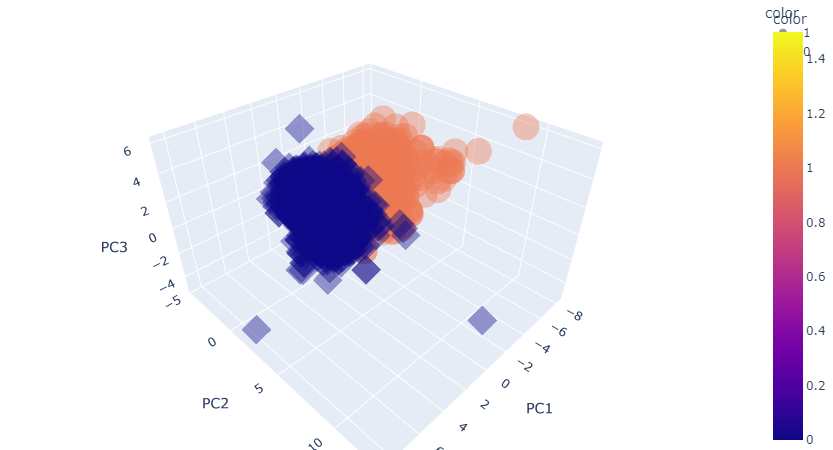
PCA eigenface
PCA 얼굴인식
from sklearn.datasets import fetch_olivetti_faces

faces_all = fetch_olivetti_faces()
print(faces_all.DESCR)
---------------------------------------------------------------------------------------
The Olivetti faces dataset
--------------------------

`This dataset contains a set of face images`_ taken between April 1992 and
April 1994 at AT&T Laboratories Cambridge. The
:func:`sklearn.datasets.fetch_olivetti_faces` function is the data
fetching / caching function that downloads the data
archive from AT&T.

.. _This dataset contains a set of face images: https://cam-orl.co.uk/facedatabase.html

As described on the original website:

    There are ten different images of each of 40 distinct subjects. For some
    subjects, the images were taken at different times, varying the lighting,
    facial expressions (open / closed eyes, smiling / not smiling) and facial
    details (glasses / no glasses). All the images were taken against a dark
    homogeneous background with the subjects in an upright, frontal position
    (with tolerance for some side movement).

**Data Set Characteristics:**

    =================   =====================
...
consists of 64x64 images.

When using these images, please give credit to AT&T Laboratories Cambridge.
20번 인물(Olivetti) 이미지 사용
- 배열의 단위는 픽셀
K = 20
faces = faces_all.images[faces_all.target == K]

import matplotlib.pyplot as plt

N = 2
M = 5
fig = plt.figure(figsize=(10, 5))
plt.subplots_adjust(top=1, bottom=0, hspace=0, wspace=0.05)
for n in range(N*M):
    ax = fig.add_subplot(N, M, n+1)
    ax.imshow(faces[n], cmap=plt.cm.bone)
    ax.grid(False)
    ax.xaxis.set_ticks([])
    ax.yaxis.set_ticks([])

plt.suptitle('Olivetti')
plt.tight_layout()
plt.show()
PCA 분석
from sklearn.decomposition import PCA

pca = PCA(n_components=2)

X = faces_all.data[faces_all.target == K]   # 'Olivetti'의 사진을 학습데이터로 활용
W = pca.fit_transform(X)    # 각 이미지를 벡터화

X_inv = pca.inverse_transform(W)    # PCA의 주성분을 바탕으로 X 데이터 역변환
사진 모양 확인
- 10장의 사진이 64^2 픽셀로 이루어져 있음
X.shape
-------------
(10, 4096)
X_inv 시각화
fig = plt.figure(figsize=(10, 5))
plt.subplots_adjust(top=1, bottom=0, hspace=0, wspace=0.05)
for n in range(N*M):
    ax = fig.add_subplot(N, M, n+1)
    ax.imshow(X_inv[n].reshape(64, 64), cmap=plt.cm.bone)
    ax.grid(False)
    ax.xaxis.set_ticks([])
    ax.yaxis.set_ticks([])

plt.suptitle('Olivetti')
plt.tight_layout()
plt.show()
주성분 시각화
- 10장의 사진은 mean, face_p1, face_p2의 조합
face_mean = pca.mean_.reshape(64,64)
face_p1 = pca.components_[0].reshape(64,64)
face_p2 = pca.components_[1].reshape(64,64)

plt.figure(figsize=(12, 7))
plt.subplot(131)
plt.imshow(face_mean, cmap=plt.cm.bone)
plt.grid(False); plt.xticks([]); plt.yticks([]); plt.title('mean')
plt.subplot(132)
plt.imshow(face_p1, cmap=plt.cm.bone)
plt.grid(False); plt.xticks([]); plt.yticks([]); plt.title('face_p1')
plt.subplot(133)
plt.imshow(face_p2, cmap=plt.cm.bone)
plt.grid(False); plt.xticks([]); plt.yticks([]); plt.title('face_p2')
plt.show()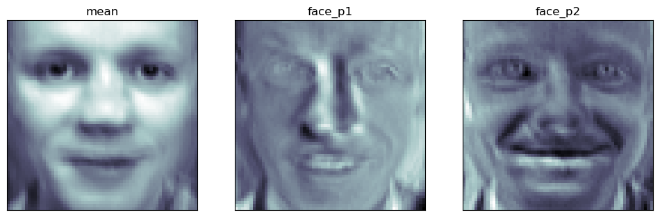
가중치 부여
face_p1
import numpy as np

N = 2
M = 5
w = np.linspace(-5, 10, N*M)

fig = plt.figure(figsize=(10, 5))
plt.subplots_adjust(top=1, bottom=0, hspace=0, wspace=0.05)

for n in range(N*M):
    ax = fig.add_subplot(N, M, n+1)
    ax.imshow(face_mean + w[n] * face_p1, cmap=plt.cm.bone)
    ax.grid(False); plt.xticks([]); plt.yticks([]);
    plt.title('Weight : ' + str(round(w[n])))

plt.tight_layout()
plt.show()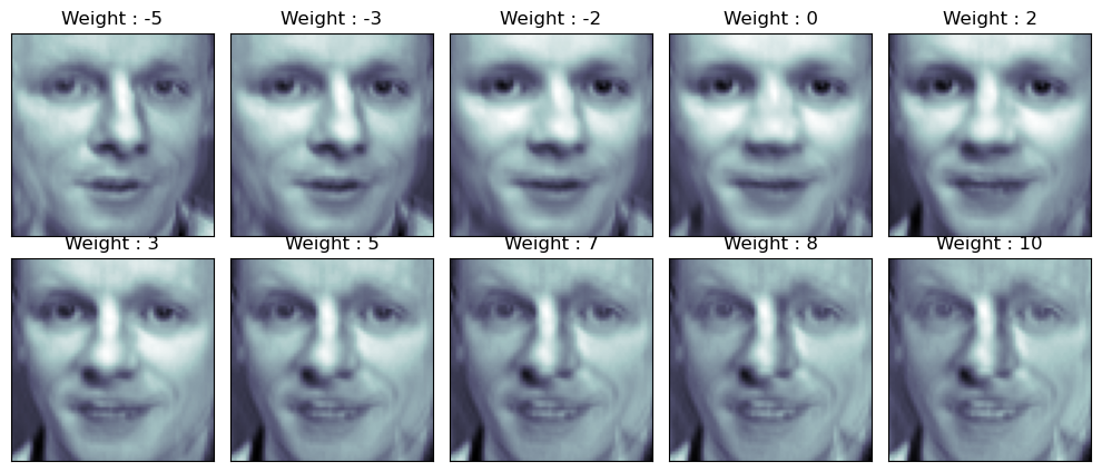
face_p2
fig = plt.figure(figsize=(10, 5))
plt.subplots_adjust(top=1, bottom=0, hspace=0, wspace=0.05)

for n in range(N*M):
    ax = fig.add_subplot(N, M, n+1)
    ax.imshow(face_mean + w[n] * face_p2, cmap=plt.cm.bone)
    ax.grid(False); plt.xticks([]); plt.yticks([]);
    plt.title('Weight : ' + str(round(w[n])))

plt.tight_layout()
plt.show()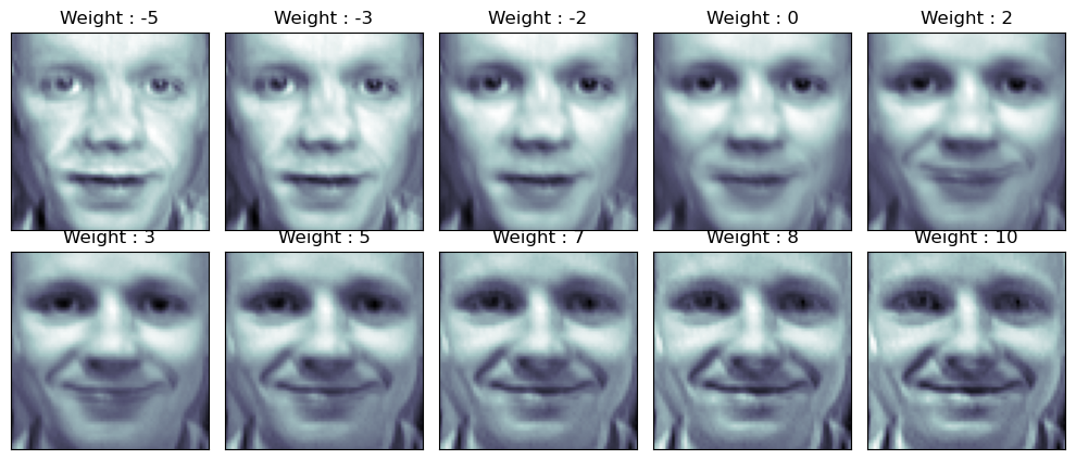
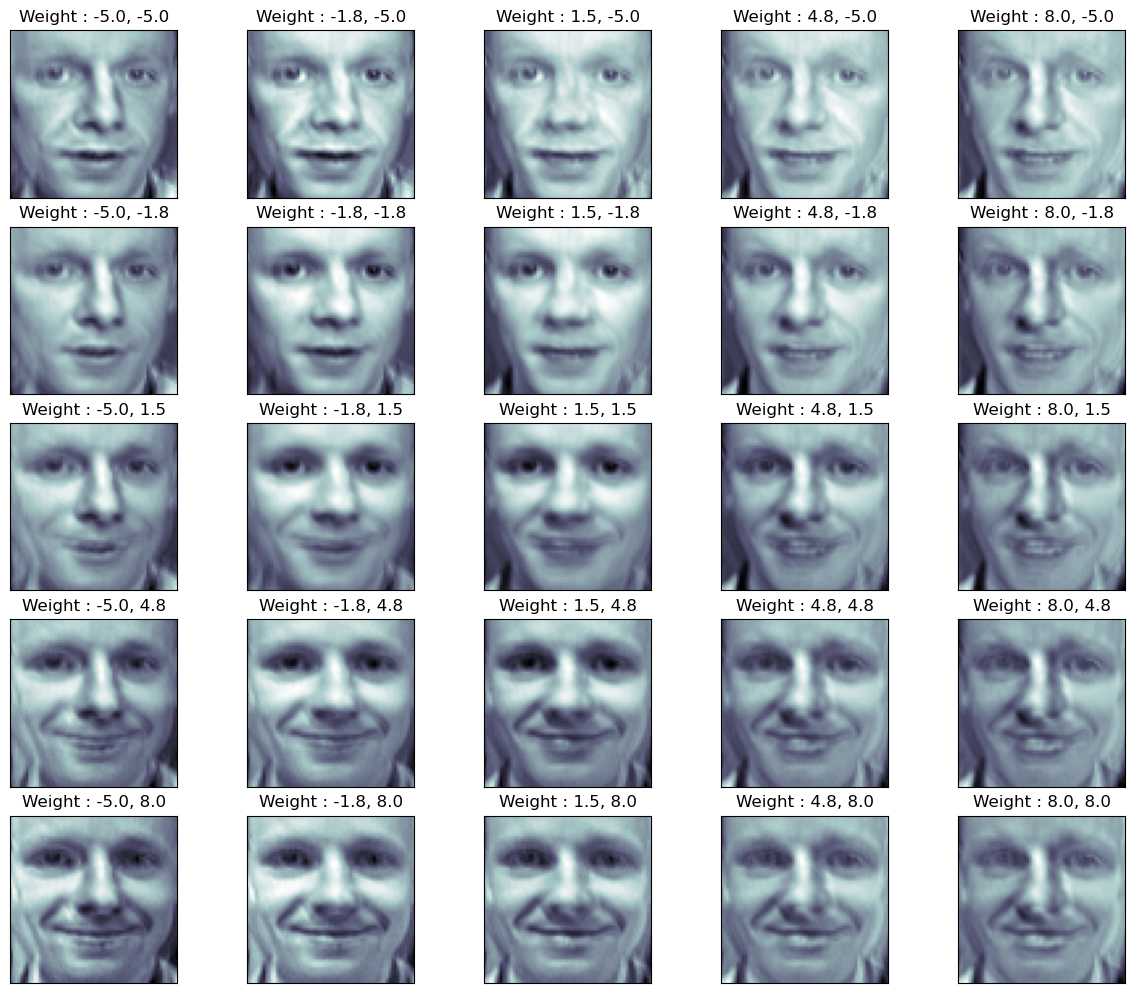
두 개의 성분 모두 추가
nx, ny = (5, 5)
x = np.linspace(-5, 8, nx)
y = np.linspace(-5, 8, ny)
w1, w2 = np.meshgrid(x, y)
w1 = w1.reshape(-1, )
w2 = w2.reshape(-1, )

N = 5
M = 5
fig = plt.figure(figsize=(12, 10))
plt.subplots_adjust(top=1, bottom=0, hspace=0.1, wspace=0.05)

for n in range(N*M):
    ax = fig.add_subplot(N, M, n+1)
    ax.imshow(face_mean + w1[n] * face_p1 + w2[n] * face_p2, cmap=plt.cm.bone)
    ax.grid(False); plt.xticks([]); plt.yticks([]);
    plt.title('Weight : ' + str(round(w1[n], 1)) + ', ' + str(round(w2[n], 1)))

plt.tight_layout()
plt.show()