📖 최성일, ⌈Do it! 인터랙티브 웹 페이지 만들기⌋, 이지스퍼블리싱, 2021
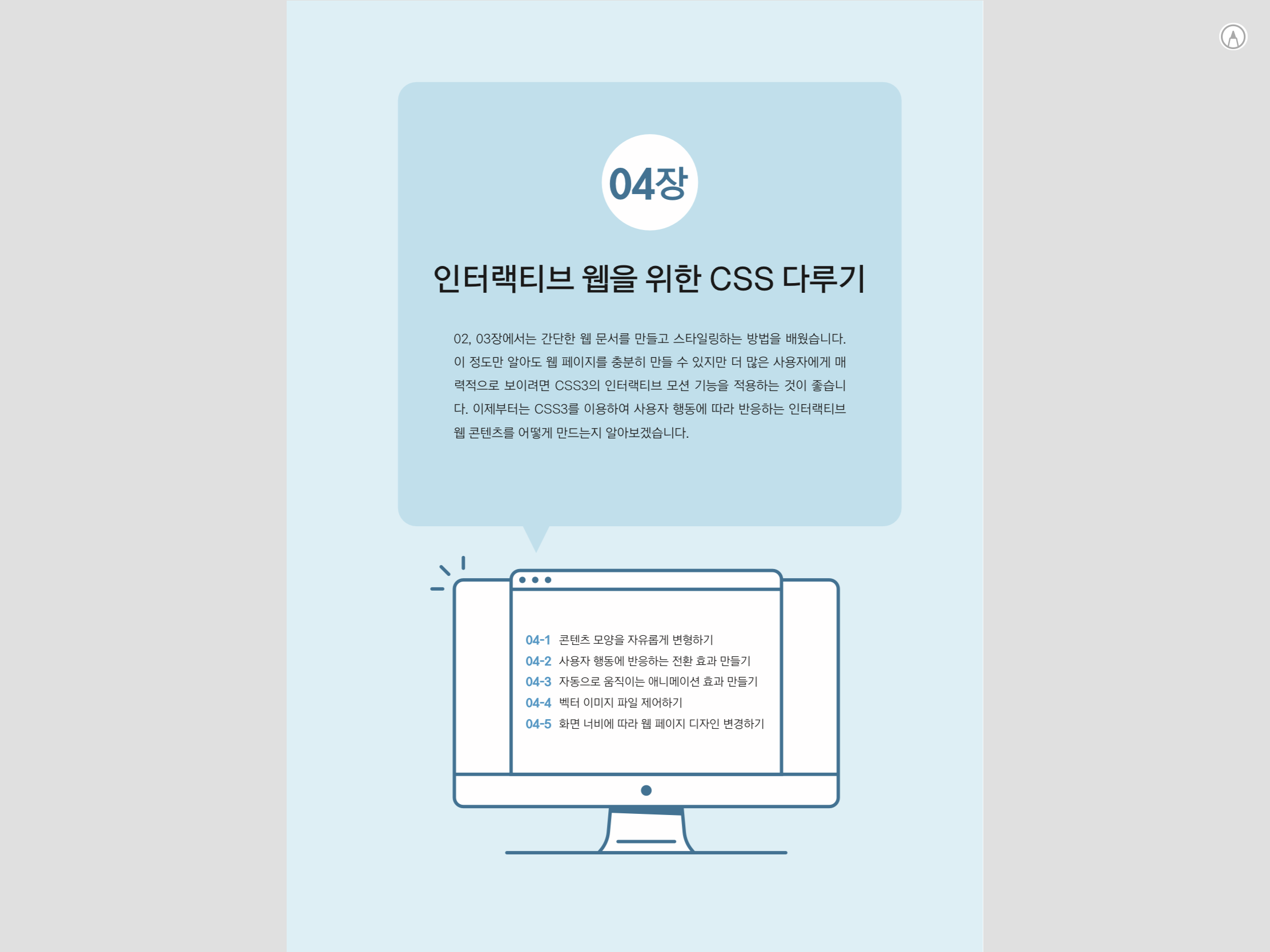
04장 인터랙티브 웹을 위한 CSS 다루기
04-4 벡터 이미지 파일 제어하기
마우스 포인터를 올리면 선이 그려지는 모션 만들기
article svg {
  width: 100%
}

article svg path {
  fill: transparent;
  stroke: red;
  stroke-width: 2;
  /* 1420 : 가시 영역의 path 전체 길이 */
  stroke-dasharray: 1420;
  stroke-dashoffset: -1420;
  transition: all 3s;
}

article:hover svg path {
  stroke-dashoffset: 0;
}
04-5 화면 너비에 따라 웹 페이지 디자인 변경하기
미디어 쿼리 적용하기
article {
  width: 200px;
  height: 200px;
  background: pink;
  margin: 100px auto;
}

@media screen and (max-width: 900px) {
  article {
    background: orange;
  }
}

@media screen and (max-width: 400px) {
  article {
    background: aqua;
  }
}
파비콘 이미지 등록하고 마무리하기: Favicon & App Icon Generator
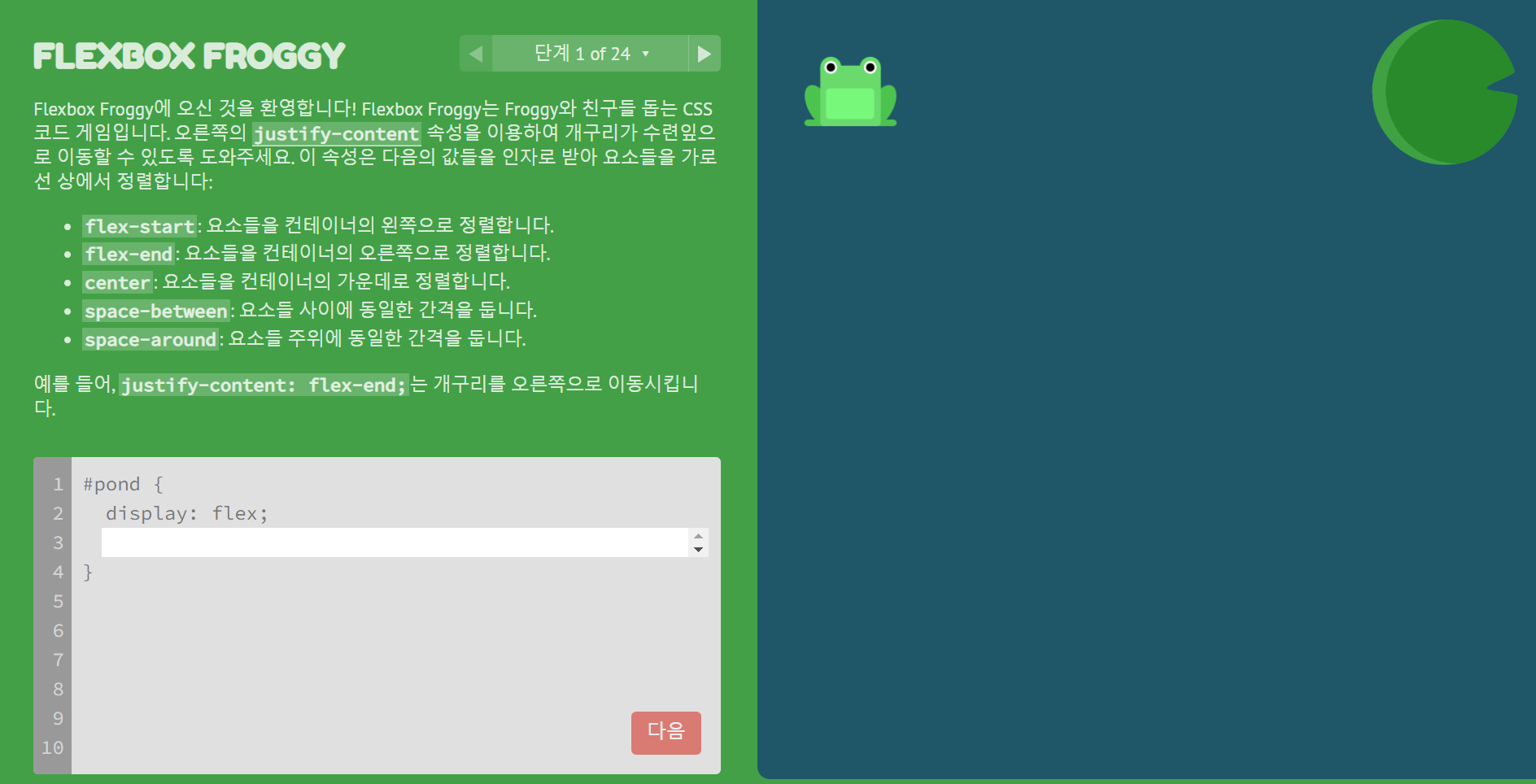
05장 flex 방식으로 레이아웃 만들기
게임으로 플렉스박스 배우기: Flexbox Froggy
이번 스터디에서 특별히 좋았던 점이나 어려웠던 점, 새로 알게 된 부분
CSS에서 미디어 쿼리를 이용해 화면 너비에 따른 반응형 웹 페이지를 구현해 보았다. 플렉스박스가 항상 헷갈리기 쉬운 부분이었는데, 전부터 알고 있던 플렉스박스 학습 게임으로 한 번 더 복습하며 기본기를 다지는 시간을 가졌다.
👩🏻💻 Web Front-end Developer