시각화도구(이어서)
화면분할
# 한글 폰트 설정
plt.rc("font", family = "NanumGothic")
#스타일 서식
plt.style.use("ggplot")
# 그래프 객체 생성
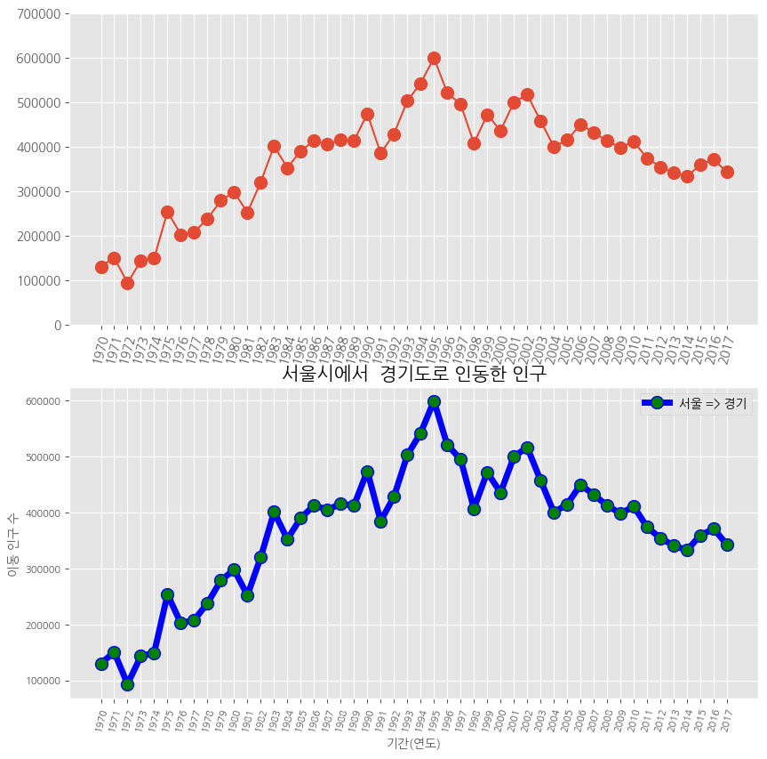
fig = plt.figure(figsize = (10,10))
ax1 = fig.add_subplot(2,1,1) # 행의 개수, 열의 개수, 위치
ax2 = fig.add_subplot(2,1,2)
# axe 객체에 그래프 출력
ax1.plot(df_ggd, marker = 'o', markersize =10)
ax2.plot(df_ggd, marker = 'o', markersize =10, markerfacecolor = 'green',
color = 'blue', linewidth = 5, label = '서울 => 경기')
# ax2 객체에 범례 추가
ax2.legend(loc = 'best')
# y 축 범위 조정
ax1.set_ylim(0,700000)
ax1.set_ylim(0,700000)
# x 축 눈금 라벨 회전
ax1.set_xticklabels(df_ggd.index, rotation = 75)
ax2.set_xticklabels(df_ggd.index, rotation = 75)
# 차트 제목 추가
ax2.set_title("서울시에서 경기도로 인동한 인구", size = 15)
# 축 이름 추가
ax2.set_xlabel("기간(연도)", size = 10)
ax2.set_ylabel("이동 인구 수 ", size = 10)
#x 축 눈금 라벨 크기 수정
ax2.tick_params(axis = 'x', labelsize = 8)
ax2.tick_params(axis = 'y', labelsize = 8)
plt.show()
색상& 헥스 코드
# 색상과 헥사 코드 확인
import matplotlib
colors ={}
for i, j in matplotlib.colors.cnames.items():
  colors[i] = j
print(colors)
면적 그래프
# 4개 지역 추출
df_4 = df_seoul.loc[['충청남도','경상북도','강원도','전라남도']]
df_4.head()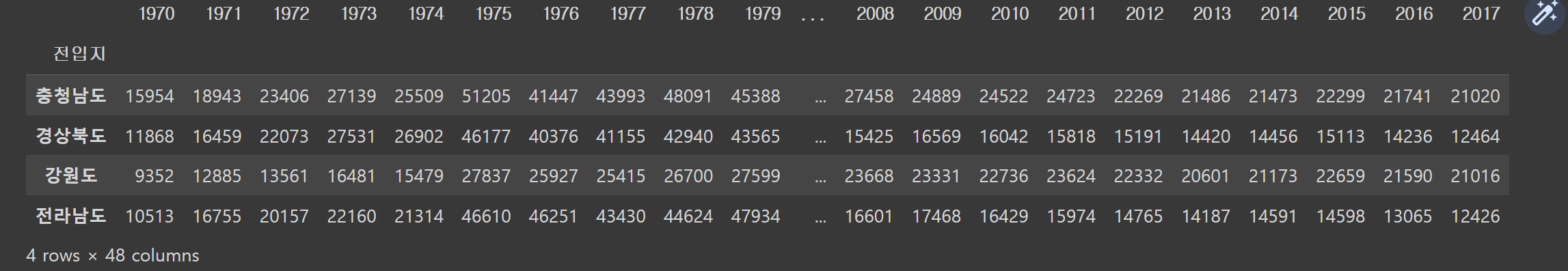
# 행과 열을 바꾸기
df_4_t = df_4.T
# kind 매개변수 기본값은 선
df_4_t.plot(kind = 'area',
stacked = False, # 누적
alpha = 0.2, # 투명도
figsize = (7, 5))
# 차트 제목
plt.title("서울시에서 다른 4개 지역으로 이동한 인구")
# 축 제목(이름)
plt.xlabel("기간 (연도)", size = 10)
plt.ylabel("이동 인구 수", size =10)
plt.show()# kind 매개변수 기본값은 선
df_4_t.plot(kind = 'area',
stacked = False, # 누적<<
alpha = 0.2, # 투명도
figsize = (7, 5))
# 차트 제목
plt.title("서울시에서 다른 4개 지역으로 이동한 인구")
# 축 제목(이름)
plt.xlabel("기간 (연도)", size = 10)
plt.ylabel("이동 인구 수", size =10)
plt.show()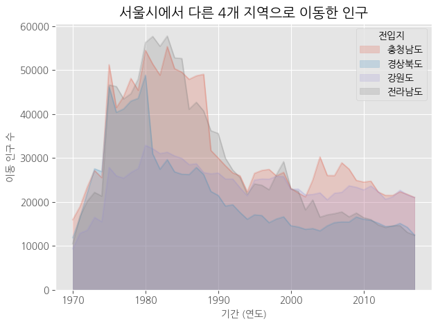
# 누적 면적 그래프
stacked = True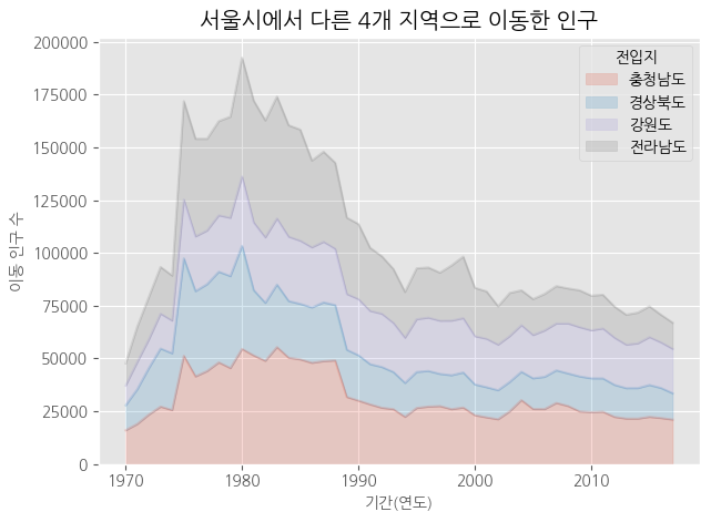
# axe 객체로 그리기
# 스타일 서식 적용
plt.style.use('ggplot')<<<
# 누적 면적 그래프
ax1 = df_4_t.plot(kind = 'area',
                  stacked = True, # 누적 여부
                  alpha = 0.2, # 투명도
                  figsize = (7, 5))
print(type(ax1))<<<
# 차트 제목
ax1.set_title("서울시에서 다른 4개 지역으로 이동한 인구", size = 20,
              color = 'red', weight = 'bold')<<<
# 축 제목
ax1.set_xlabel("기간(연도)", size = 10, color = 'blue')
ax1.set_ylabel("이동 인구 수", size = 10, color = 'blue')
#
plt.show()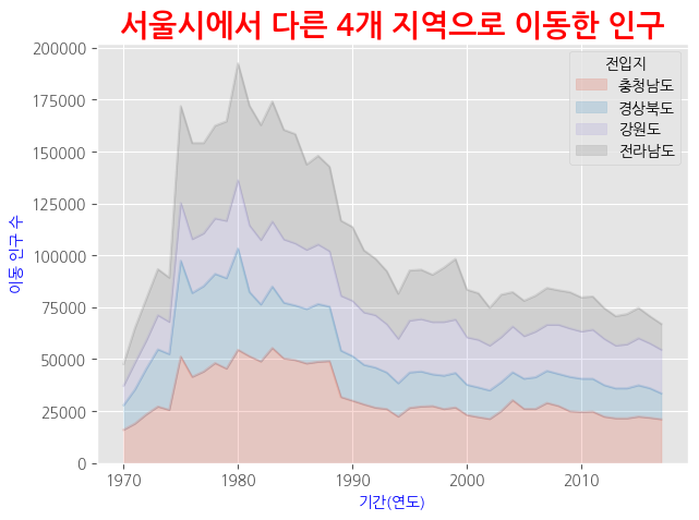
# 스타일 서식 적용
plt.style.use('ggplot')
# 수직 막대 그래프
df_4_t.plot(kind = 'bar',<<<
          figsize = (12,5),
          width = 0.5,
          color = ['green','red','yellow','blue'])
# 차트 제목
plt.title("서울시에서 다른 4개 지역으로 이동한 인구")
# 축 제목(이름)
plt.xlabel("기간(연도)", size = 10)
plt.ylabel("이동 인구 수", size = 10)
#
plt.show()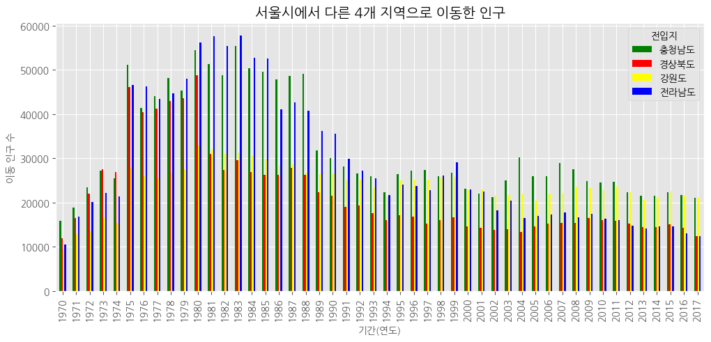
# 2000년 이후 데이터 추출
df_4_new = df_4.loc[:, '2000':].T #행, 렬 바꿔줌
# 스타일 서식 적용, 위에식 그대로
plt.style.use('ggplot')
# 수직 막대 그래프
df_4_new.plot(kind = 'bar',
figsize = (12,5),
width = 0.5,
color = ['green','red','yellow','blue'])
# 차트 제목
plt.title("서울시에서 다른 4개 지역으로 이동한 인구")
# 축 제목(이름)
plt.xlabel("기간(연도)", size = 10)
plt.ylabel("이동 인구 수", size = 10)
#
plt.show()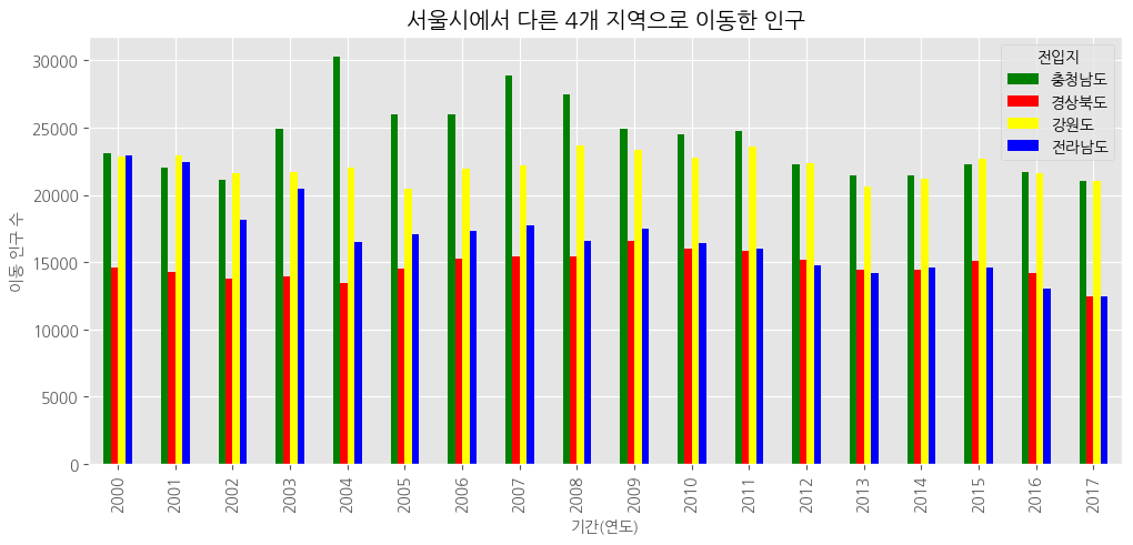
# 스타일 서식 적용
plt.style.use('ggplot')
# 수평 막대 그래프, bar=> barh로 바꿔주기만 하면 됨!
df_4_new.plot(kind = 'barh',
          figsize = (12,5),
          width = 0.5,
          color = ['green','red','yellow','blue'])
# 차트 제목
plt.title("서울시에서 다른 4개 지역으로 이동한 인구")
# 축 제목(이름)
plt.xlabel("기간(연도)", size = 10)
plt.ylabel("이동 인구 수", size = 10)
#
plt.show()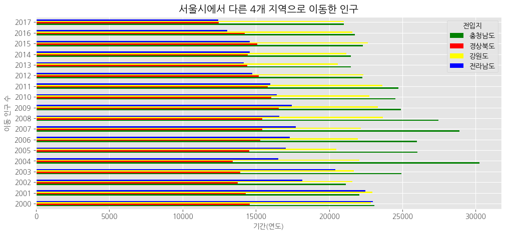
###barh - 수평(역순)
# 인구의 총합 데이터
df_total = df_4_new.T
df_total["합계"] = df_4_new.sum()
df_total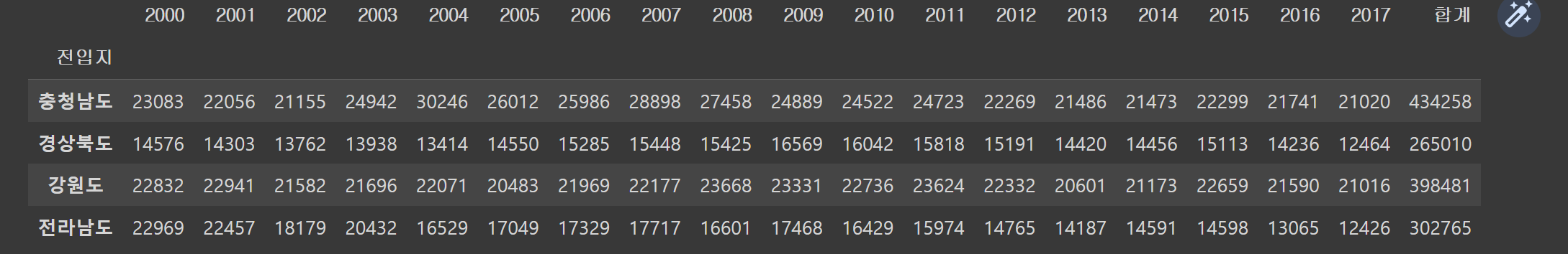
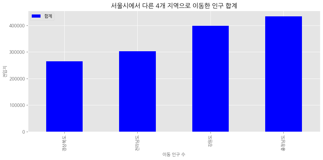
# 인구 합계 내림차순 정렬
df_total[["합계"]].sort_values(by = '합계', ascending = True)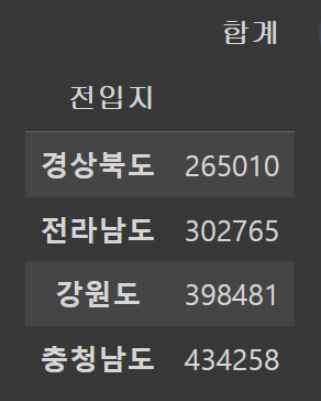
# 인구 합계가 적은 지역부터 많은 지역으로 막대 그래프 시각화
# 인구 합계 내림차순 정렬
df_total_dsc = df_total[["합계"]].sort_values(by = '합계', ascending = False)
# 수평 막대 그래프
df_total_dsc.plot(kind = 'barh',
                  figsize = (12,5),
                  width = 0.5,
          color = ['blue'])
# 차트 제목
plt.title("서울시에서 다른 4개 지역으로 이동한 인구")
# 축 제목(이름)
plt.xlabel("이동 인구 수", size = 10)
plt.ylabel("전입지", size = 10)
#
plt.show()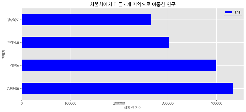
오름차순으로 정렬> ascending = False만 빼면 돼!
bar - 수직(역순x)
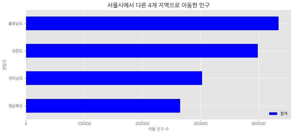
# 인구 합계가 많은 지역부터 적은 지역으로 막대 그래프 시각화
# 인구 합계 내림차순 정렬
df_total_dsc = df_total[["합계"]].sort_values(by = '합계', ascending = False)
# 수직 막대 그래프
df_total_dsc.plot(kind = 'bar',
                  figsize = (12,5),
                  width = 0.5,
                  color = 'blue')
# 차트 제목
plt.title("서울시에서 다른 4개 지역으로 이동한 인구 합계")
# 축 제목(이름)
plt.xlabel("이동 인구 수", size = 10)
plt.ylabel("전입지", size = 10)
#
plt.show()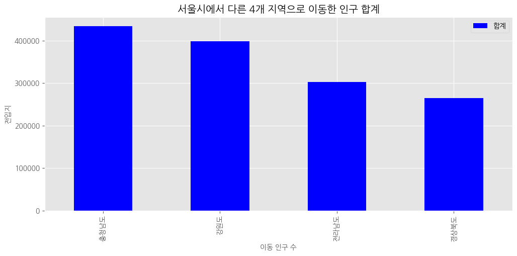
오름차순
보조축(2축 그래프)
# 라이브러리 불러오기
import pandas as pd
import matplotlib.pyplot as plt

#데이터 불러오기
df = pd.read_excel ('/content/drive/MyDrive/hana1/Data/남북한발전전력량.xlsx',
                    engine = 'openpyxl')

# 북한 데이터 추출
df_north = df.iloc[5:]

df_north = df_north.drop('전력량 (억㎾h)', axis = 1)

df_north = df_north.set_index('발전 전력별')

df_north = df_north.T

# 전력 증감율 계산
df_north = df_north.rename(columns = {'합계':'총발전량'})

df_north['전년총발전량'] = df_north['총발전량'].shift(1) # 한칸씩 밀리게!

df_north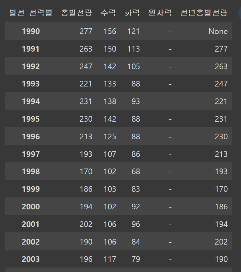
# 증감율 = ((금년총발전량 - 전년총발전량)/ 전년총발전량)*100
# 총발전량 = 금년총발전량
df_north['증감율'] = ((df_north['총발전량'] - df_north['전년총발전량'])
                   /df_north['전년총발전량'])*100
df_north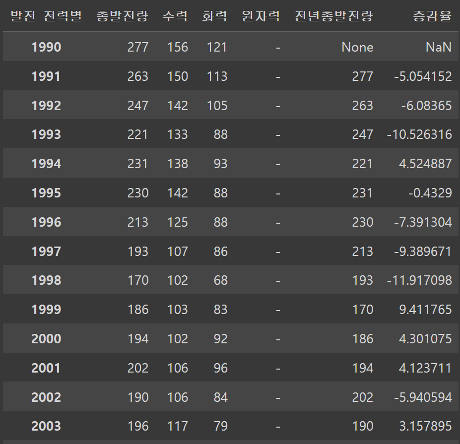
# 한글 폰트 설정
plt.rc("font", family = "NanumGothic")
# 스타일 서식
plt.style.use("ggplot")
# 마이너스 기호 출력
plt.rcParams['axes.unicode_minus'] = False
# axe 객체
# 수력, 화력 발전에 대한 누적 막대 그래프
ax1 = df_north[['수력', '화력']].plot(kind = 'bar', stacked = True, figsize = (12, 6))
ax2 = ax1.twinx() # x축 공유
# 증감율에 대한 선 그래프
ax2.plot(df_north.index, df_north['증감율'], color = 'green', marker = 'o', label = '증감율')
# y 축 범위 조정
ax1.set_ylim(0, 500)
ax2.set_ylim(-60, 40)
#차트 제목
plt.title("북한 전력 발전량")
#축 이름
ax1.set_xlabel('기간(연도)')
ax1.set_ylabel('발전량')
ax2.set_ylabel('증감율')
#범례
ax1.legend(loc = 'upper left')
ax2.legend(loc = 'best')
#
plt.show()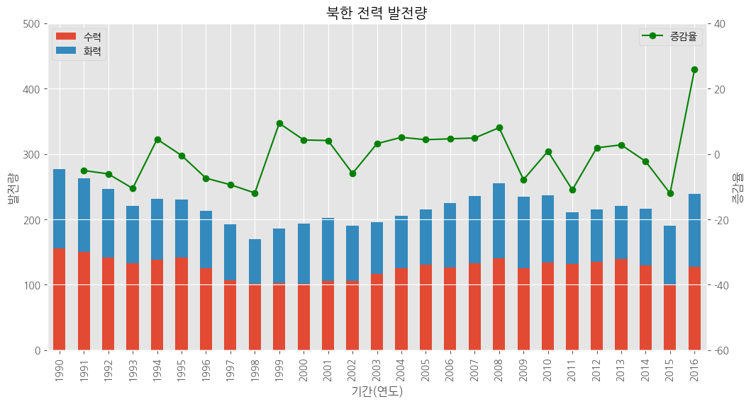
히스토그램
#라이브러리 불러오기
import pandas as pd
import matplotlib.pyplot as plt

# 데이터 불러오기
# csv 파일 불러오기 + 열 이름이 없음(header = None)
df = pd.read_csv('/content/drive/MyDrive/hana1/Data/auto-mpg.csv', header = None)

# 열 이름 지정
df.columns = ['mpg', 'cylinders', 'displacement', 'horsepower', 'weight',
              'acceleration', 'model_year', 'origin', 'car_name']

# 한글 폰트 설정
plt.rc("font", family = "NanumGothic")
# 스타일 서식
plt.style.use("ggplot")
# 히스토그램, kind = hist
df['mpg'].plot(kind = 'hist',
               bins = 15, # 구간 개수
                color = 'aquamarine',
               figsize = (5,3))
# 축 제목
plt.title("자동차 연비 히스토그램")
# x축 이름
plt.xlabel("연비")
#
plt.show()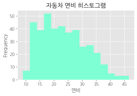
산점도
# 스타일 서식
plt.style.use("ggplot")
# 산점도
df.plot(kind = 'scatter',
        x = 'mpg',
        y = 'weight',
        c = 'tomato',
        s = 20,
        figsize = (5,3))
#차트 제목
plt.title("차중과 연비의 산점도")
#
plt.show()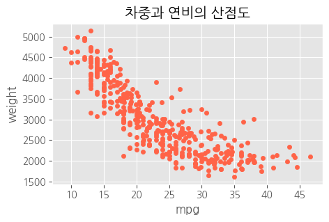
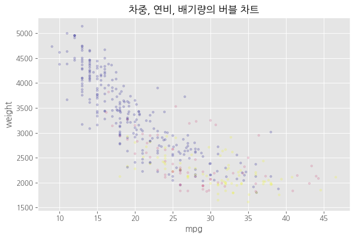
# 버블 차트 = 원의 크기로 그리기
# 스타일 서식
plt.style.use("ggplot")
# 산점도
df.plot(kind = 'scatter',
        x = 'mpg',
        y = 'weight',
        c = 'tomato', # 색상
        s = 'displacement', # 크기<<<
        alpha = 0.2, #<<<
        figsize = (8,5))
# 차트 제목
plt.title("차중, 연비, 배기량의 버블 차트")
#
plt.show()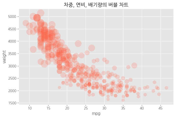
# 버블 차트 = 원의 크기로 그리기
# 스타일 서식
plt.style.use("ggplot")
# cylinders 전처리 > 값이 모여있어서 덩치를 키워야 잘 보여, 그래서 전처리가 필요해<<<
cy = df.cylinders * 100
# 산점도
df.plot(kind = 'scatter',
        x = 'mpg',
        y = 'weight',
        c = 'tomato', # 색상
        s = cy, # 크기<<<
        alpha = 0.2,
        figsize = (8,5))
# 차트 제목
plt.title("차중, 연비, 실린더의 버블 차트")
#
plt.show()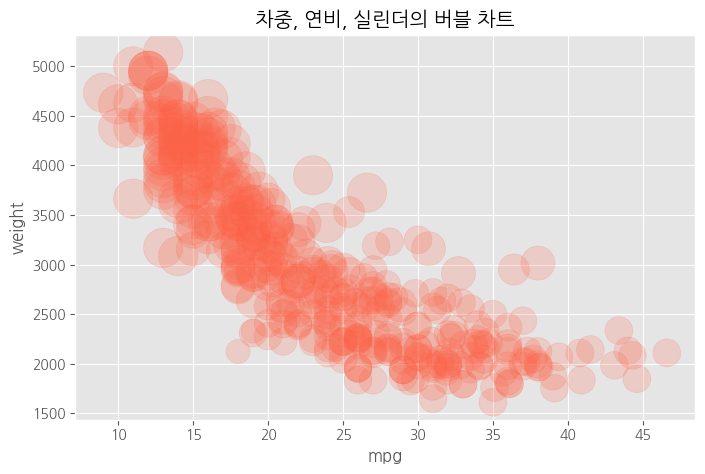
# 원의 색상으로 그리기 - 숫자형 변수
# 스타일 서식
plt.style.use("ggplot")
# 산점도
df.plot(kind = 'scatter',
        x = 'mpg',
        y = 'weight',
        c = 'displacement', # 색상<<<
        s = 10, # 크기
        alpha = 0.2,
        figsize = (8,5))
# 차트 제목
plt.title("차중, 연비, 배기량의 버블 차트")
#
plt.show()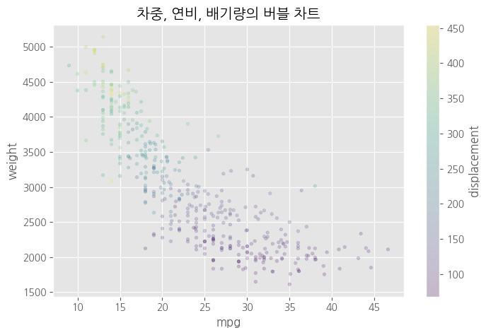
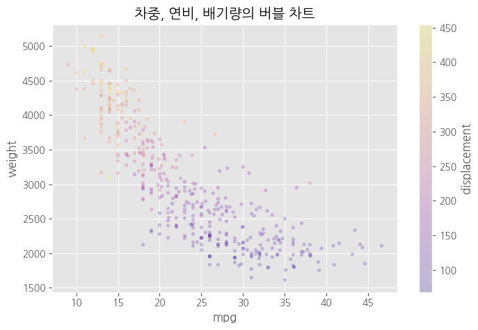
# 원의 색상으로 그리기
# 스타일 서식
plt.style.use("ggplot")
# 산점도
df.plot(kind = 'scatter',
        x = 'mpg',
        y = 'weight',
        c = 'displacement', # 색상
        cmap = 'plasma', # 컬러맵<<<<
        s = 10, # 크기
        alpha = 0.2,
        figsize = (8,5))
# 차트 제목
plt.title("차중, 연비, 배기량의 버블 차트")
# 
# 원의 색상으로 그리기 - 범주형 변수
# 스타일 서식
plt.style.use("ggplot")
# 산점도
df.plot(kind = 'scatter',
        x = 'mpg',
        y = 'weight',
        c = 'origin', # 색상 <<<<
        cmap = 'plasma', # 컬러맵
        s = 10, # 크기
        alpha = 0.2,
        figsize = (8,5))
# 차트 제목
plt.title("차중, 연비, 배기량의 버블 차트")
#
plt.show()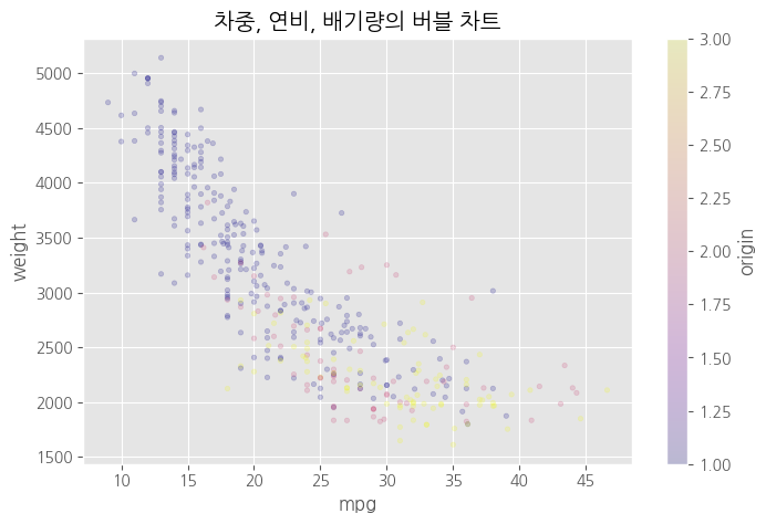
# 원의 색상으로 그리기 - 범주형 변수
# 스타일 서식
plt.style.use("ggplot")
# origin 전처리 # 범주형이라 category로 처리 <<<
origin_cat = df.origin.astype('category')
# 산점도
df.plot(kind = 'scatter',
        x = 'mpg',
        y = 'weight',
        c = origin_cat, # 색상
        cmap = 'plasma', # 컬러맵
        s = 10, # 크기
        alpha = 0.2,
        figsize = (8,5))
# 차트 제목
plt.title("차중, 연비, 배기량의 버블 차트")
# 
파이차트(원그래프)
# origin 별로 데이터 만들기
df['count'] = 1
df_origin = df.groupby('origin').sum()
df_origin.index = ["USA", "EU", "JAP"]

df['count'] = 1

df_origin = df.groupby('origin').sum()

df_origin.index = ["USA","EU", "JAP"]
# 1번끼리 모아서 sum, 모든 열에 대해서 sum! 1번 그룹의 mpg의 sum, cylinders의 sum

df_origin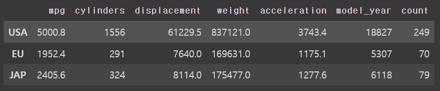
# 스타일 서식
plt.style.use("ggplot")
# 파이 차트
df_origin['count'].plot(kind = 'pie',
                        figsize = (10, 5),
                        autopct = '%.1f', # 소수점 첫째자리 숫자만 표시
                        # autopct = '%.2f%%', # 소수점 첫째자리로 % 와 함께 표시
                        colors = ['red','blue','yellow'], # 각 조각의 색상
                        startangle = 0) # 시작 위치 # 첫 번째 조각이 3시부터 시작, 시계 반대 방향, 0==360
# 차트 제목
plt.title("origin에 대한 원 그래프")
#범례
plt.legend(loc = 'best')
#
plt.show()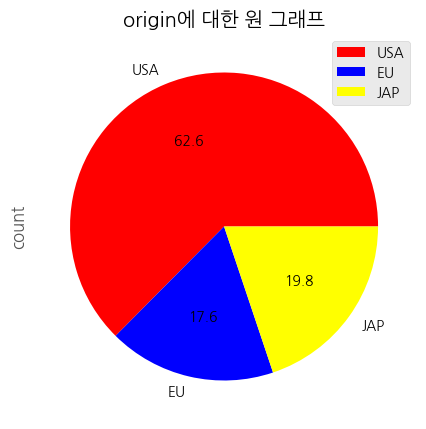
상자 수염 그림
# origin 별로 연비 데이터 마늘기
mpg_1 = df[df['origin'] == 1 ]['mpg']
mpg_2 = df[df['origin'] == 2 ]['mpg']
mpg_3 = df[df['origin'] == 3 ]['mpg']

# 그림 객체
fig = plt.figure(figsize=(10,5))
ax = fig.add_subplot(1,1,1)
# 수직 상자 그림
ax.boxplot(x = [mpg_1, mpg_2, mpg_3],
           labels = ['USA', 'EU', "JAP"])
plt.show()
#미국 차는 연비가 낮아요 일본 차는 연비가 좋아용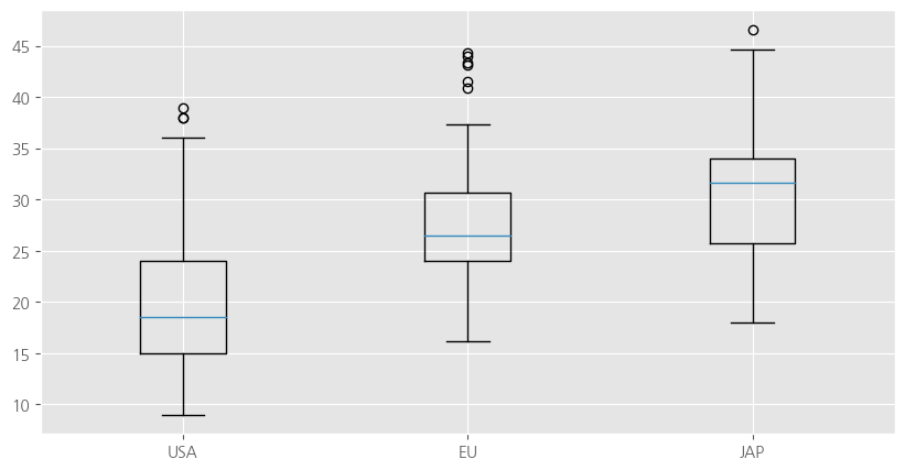
# 그림 객체
fig = plt.figure(figsize=(10,5))
ax = fig.add_subplot(1,1,1)
# 수평 상자 그림
ax.boxplot(x = [mpg_1, mpg_2, mpg_3],
           labels = ['USA', 'EU', "JAP"],
           vert = False )
plt.show()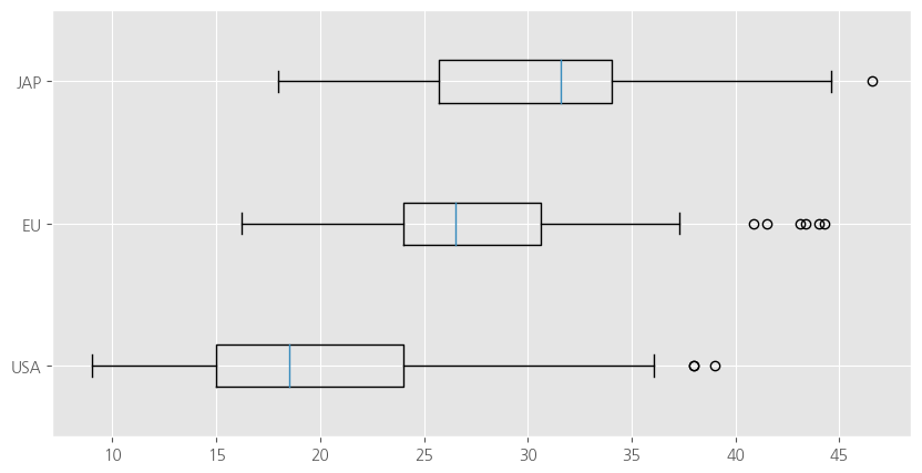
파이썬 그래프 갤러리
https://www.python-graph-gallery.com/
컬러맵
plt.colormaps()
Seaborn
# seaborn: matplotlib에서 기능, 스타일 확장, sns
import seaborn as sns
# 내장 데이터 불러오기
titanic = sns.load_dataset("titanic")
print(titanic.head())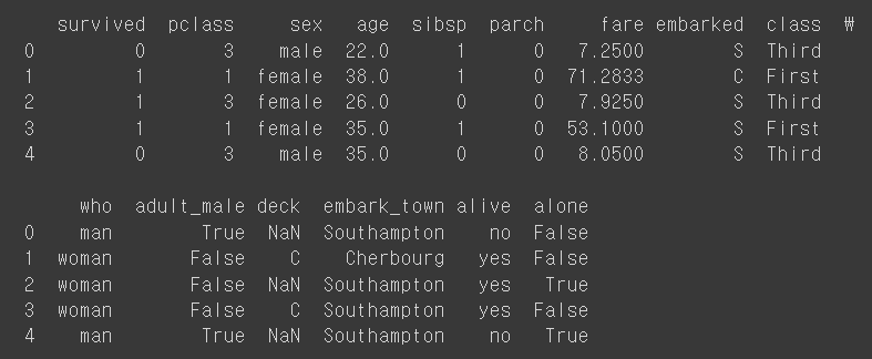
# 데이터 정보
print(titanic.info())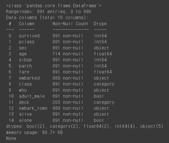
산점도
import matplotlib.pyplot as plt

# 그래프 객체
fig = plt.figure(figsize = (10, 5))
ax1 = fig.add_subplot(1, 2, 1)
ax2 = fig.add_subplot(1, 2, 2)
#산점도
#회귀선이 없는 산점도
sns.regplot(x = 'age', y ='fare', # 변수설정
            data = titanic, # 데이터 결정
            ax = ax1, #axe 객체 설정 = 위치 설정
            fit_reg = False)
#회귀선이 있는 산점도
sns.regplot(x = 'age', y ='fare', # 변수설정
            data = titanic, # 데이터 결정
            ax = ax2, #axe 객체 설정 = 위치 설정
            fit_reg = True) # 선이 있어요
plt.show()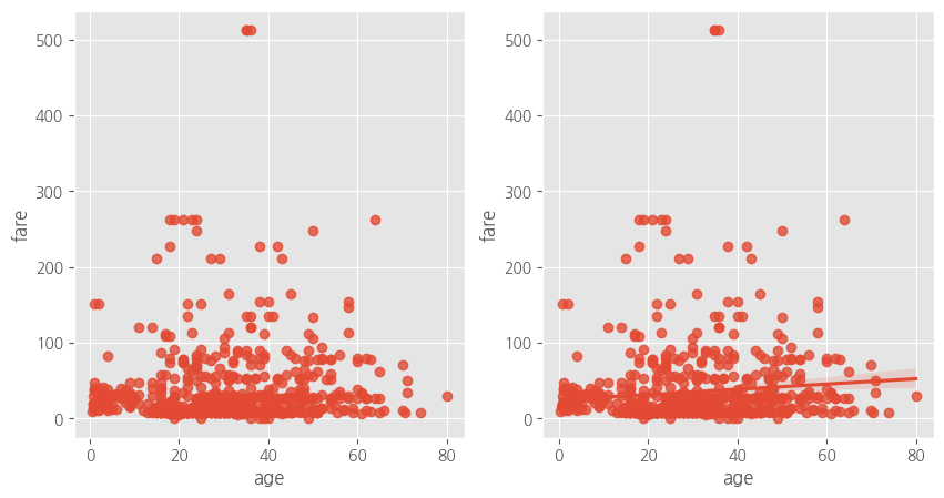
히스토그램, 밀도 함수 그래프
from re import A
#그래프 객체
fig = plt.figure(figsize = (18, 5))
ax1 = fig.add_subplot(1, 3, 1)
ax2 = fig.add_subplot(1, 3, 2)
ax3 = fig.add_subplot(1, 3, 3)
# 히스토그램 + 밀도함수 그래프
sns.distplot(titanic['fare'], ax = ax1)
# 밀도 함수 그래프
sns.kdeplot(titanic['fare'], ax = ax2)
# 히스토그램
sns.histplot(titanic['fare'], ax = ax3)
# 제목 추가
ax1.set_title("fare에 대한 히스토그램 & 밀도함수")
ax2.set_title("fare에 대한 밀도함수")
ax3.set_title("fare에 대한 히스토그램")
plt.show()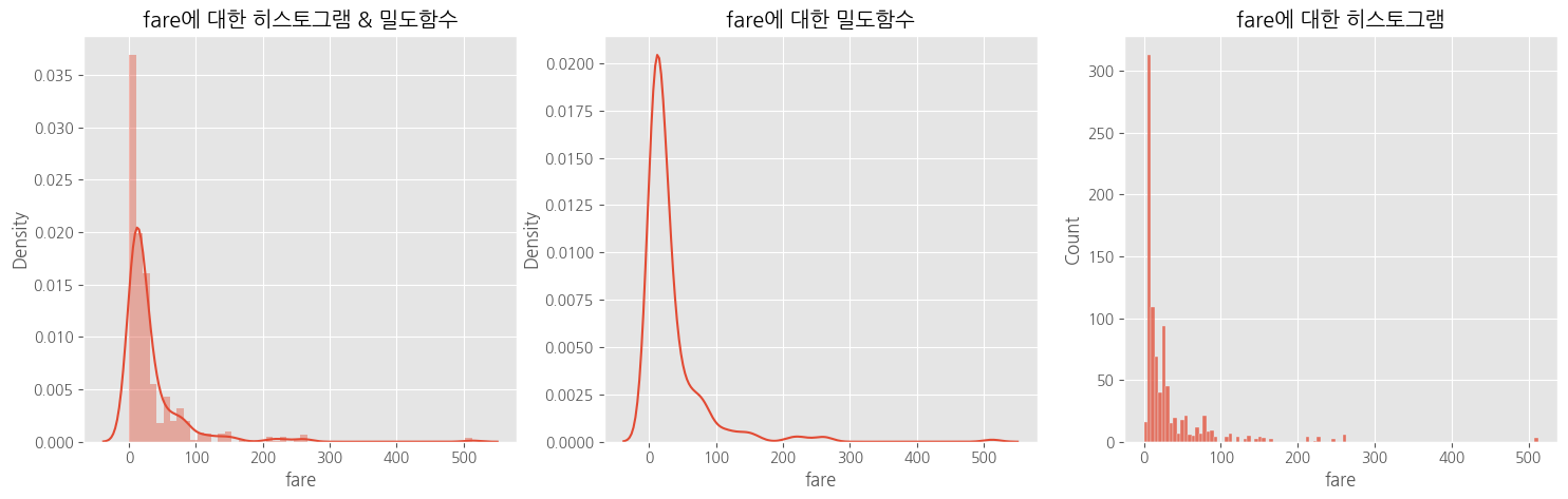
스타일 적용
# 스타일 적용
#darkgrid, whitegrid, dark, white, ticks
sns.set_style('darkgrid')
히트맵
# 피봇 테이블
table = titanic.pivot_table(index = 'sex', columns = 'class', aggfunc = 'size')

# 히트맵
sns.heatmap(table,
            annot = True, # 데이터 값 표시 여부
            fmt = 'd', #숫자 표현 방식 지정, d = 정수
            cmap = 'plasma', # 컬러맵
            linewidth = 1,# 구분선
            cbar = True) # 컬러바 표시 여부
plt.show()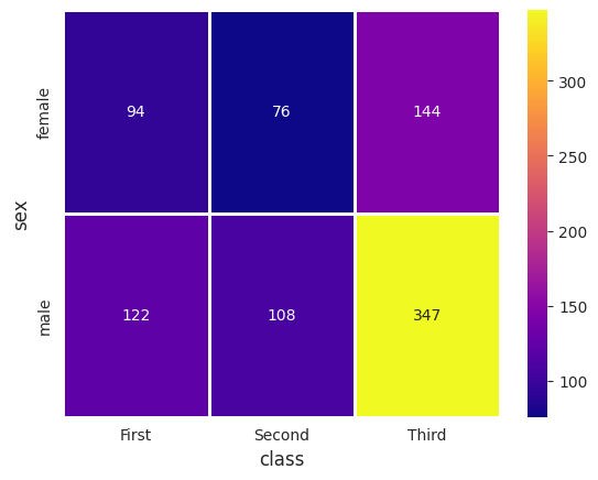
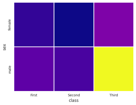
다 False로 바꾸면
범주형 변수 산점도
# 그래프 객체
fig = plt.figure(figsize = (12, 5))
ax1 = fig.add_subplot(1, 2, 1)
ax2 = fig.add_subplot(1, 2, 2)
# 범주형 변수 산점도
# 1) 분산 고려하지 않은 경우
sns.stripplot(x = 'class', y = 'age', data = titanic, ax = ax1)
# 2) 분산 고려한 경우
sns.swarmplot(x = 'class', y = 'age', data = titanic, ax = ax2)
# 제목 추가
ax1.set_title('클래스에 따른 연령의 분포 - 분산 고려하지 않음')
ax2.set_title('클래스에 따른 연령의 분포 - 분산 고려')
plt.show()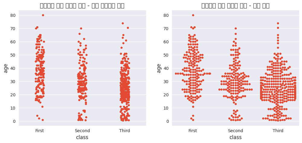
이미지가 왜,,깨지지,,!!

!굉장나 엄청해!