SwiftUI 3.0 Animation Challenge - App Store Hero Animation - Xcode 13 - SwiftUI Tutorials
AppStore Hero Animation
구현 목표
- 앱 스토어 모달 이동 전환 애니메이션 구현
구현 태스크
- 홈 뷰 UI 구현
- 홈 뷰 카드 뷰 UI 구현
- 카드 디테일 뷰 UI 구현
- 클릭 이벤트 시 스케일 효과 적용
MatchedGeometryEffect적용
핵심 코드
// MARK: Animation Properties
@State private var currentItem: TodayModel?
@State private var showDetailPage: Bool = false
// Matched Geometry Effect
@Namespace private var animation
// MARK: Detail Animation Properties
@State private var animateView: Bool = false
@State private var animateContent: Bool = false
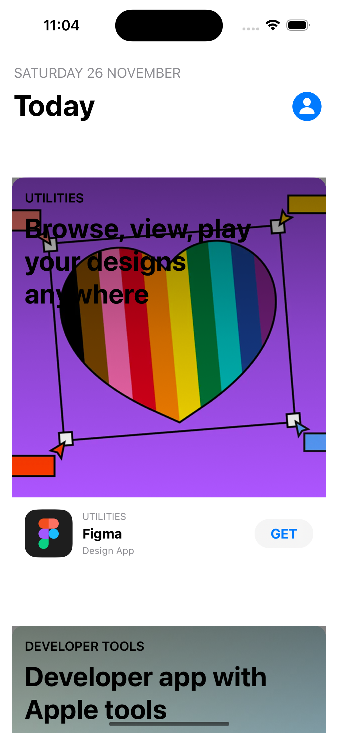
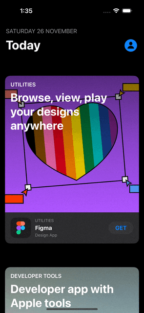
@State private var scrollOffset: CGFloat = 0- 홈 뷰에 표시되는 카드 중 어떤 카드를 선택한지 보여주는
currentItem프로퍼티를 통해 선택 여부와 선택 카드 종류를 캐치
headerView
                .padding(.horizontal)
                .padding(.bottom)
.opacity(showDetailPage ? 0 : 1)- 홈 뷰의 헤더 뷰(날짜 및 프로필 정보 등)는 디테일 뷰가 뜬다면 보이지 않도록 구현
.overlay {
            if
                let currentItem = currentItem,
                showDetailPage {
                DetailView(item: currentItem)
                    .ignoresSafeArea(.container, edges: .top)
            }
}- 홈 뷰 전체를
overlay하는 해당 코드는 선택한 카드 뷰가 존재하고 디테일 뷰를 표시하라는 프로퍼티가 참일 때 상단에 디테일 뷰를 오버레이
private var cardListView: some View {
        ForEach(todayItems) { item in
            Button {
                withAnimation(.interactiveSpring(response: 0.6, dampingFraction: 0.7)) {
                    currentItem = item
                    showDetailPage = true
                }
            } label: {
                CardView(item: item)
                    .scaleEffect(currentItem?.id == item.id && showDetailPage ? 1 : 0.93)
            }
            .buttonStyle(ScaledButtonStyle())
            .opacity(showDetailPage ? (currentItem?.id == item.id ? 1 : 0) : 1)
        }
}- 카드를 띄우는 과정, 즉
currentItem과showDetaulPage에 값을 변경하는 버튼 이벤트 - 카드 자체를 라벨로 삼아 해당 액션으로 작성
@ViewBuilder
    private func CardView(item: TodayModel) -> some View {
        VStack(alignment: .leading, spacing: 15) {
            ZStack(alignment: .topLeading) {
                // Banner Image
                GeometryReader { proxy in
                    let size = proxy.size
                    Image(item.artwork)
                        .resizable()
                        .aspectRatio(contentMode: .fill)
                        .frame(width: size.width, height: size.height)
                        .clipShape(CustomCorner(corners: [.topLeft, .topRight], radius: 15))
                }
                .frame(height: 400)

                // linear gradient
                ...

                // banner title and description
                ...

                // app logo
                ...

                // button
                ...
        }
        .background {
            RoundedRectangle(cornerRadius: 15, style: .continuous)
                .fill(Color(.tertiarySystemBackground))
        }
         .matchedGeometryEffect(id: item.id, in: animation)

...- 전체적인 카드 뷰의 구조
GeometryReader를 통해 현재 뷰가 존재하는 프레임 값을 읽어온 뒤 카드에 적용- 현재 홈 뷰에 존재하는 카드는 네 각이 모두 90도인 직사각형이 아니라 상단 좌측, 우측부만 둥근 형태의 커스텀 형태이므로
clipShape를 통해 해당 위치에만radius를 주기 - 카드 이미지 뷰를 띄운 뒤
linear gradient와 배너 타이틀 및 앱 로고, 버튼 등을 띄우는 UI 구현 과정 - 트랜지션 애니메이션 과정의 핵심 코드인
.matchedGeometryEffect(id: item.id, in: animation)를 통해 현재 카드 뷰와 이후 카드 뷰를 클릭할 때 등장하는 디테일 뷰가 동일한 컴포넌트로서 인식되어야 함을 알려주기
.offset(y: currentItem?.id == item.id && animateView ? safeArea().top : 0)- 카드 뷰가 선택되었다면 현재 카드 뷰의 위치는 최상단 부로 자연스럽게 오프셋 이동 가능
ScrollView(.vertical, showsIndicators: false) {
            VStack {
                CardView(item: item)
                    .scaleEffect(animateView ? 1 : 0.93)

                VStack(spacing: 15) {
                // Detail Content for CardView
                ...
                        }
                    }
}- 전체적인 카드 디테일 뷰의 구조
- 카드 뷰를 선택하면 해당 카드 뷰를 스크롤 뷰 상단에 두고, 나머지 디테일한 컨텐츠를 표시한 뷰를 하단에 둔 VStack이 담긴 스크롤 뷰를 띄우기
.onAppear {
            withAnimation(.interactiveSpring(response: 0.6, dampingFraction: 0.7)) {
                animateView = true
            }
            withAnimation(.interactiveSpring(response: 0.6, dampingFraction: 0.7)) {
                animateContent = true
            }
}- 해당 디테일 뷰가 클릭되면 발생하는 이벤트
animateView와aniamteContent가 참으로 값 변경
CardView(item: item)
                    .scaleEffect(animateView ? 1 : 0.93)
                    ...
// Detail Content View's VStack
.opacity(animateContent ? 1 : 0)- 카드 뷰의 크기를 띄우고 디테일 뷰가 보일지 여부를 결정
.offset(y: scrollOffset > 0 ? -scrollOffset : 0)
.overlay {
                GeometryReader { proxy in
                    let minY = proxy.frame(in: .named("SCROLL")).minY
                    Color.clear
                        .preference(key: OffsetKey.self, value: minY)
                }
                .onPreferenceChange(OffsetKey.self) { value in
                    scrollOffset = value
                }
}- 디테일 뷰 자체에 오프셋을 주는 부분
- 디테일 뷰 자체의
y값은 스크롤 오프셋이 0보다 크다면 그 역을, 그렇지 않다면 0을 취함.y값이 0이라는 뜻은 곧 가장 top일 때 GeometryReader를 통해 현재 프레임의minY값을 읽어올 수 있음 (이는 스크롤 뷰 자체에.coordinateSpace(name: "SCROLL")을 주었기 때문에 해당 이름으로 읽어오기 가능) → 해당 값이 변경될 때마다scrollOffset@State프로퍼티 값을 변경 가능
소스 코드
import SwiftUI

struct HomeView: View {
    // MARK: Animation Properties
    @State private var currentItem: TodayModel?
    @State private var showDetailPage: Bool = false
    // Matched Geometry Effect
    @Namespace private var animation
    // MARK: Detail Animation Properties
    @State private var animateView: Bool = false
    @State private var animateContent: Bool = false
    @State private var scrollOffset: CGFloat = 0

    var body: some View {
        ScrollView(.vertical, showsIndicators: false) {
            VStack(spacing: 30) {
                headerView
                .padding(.horizontal)
                .padding(.bottom)
                .opacity(showDetailPage ? 0 : 1)
                cardListView
            }
            .padding(.vertical)
        }
        .overlay {
            if
                let currentItem = currentItem,
                showDetailPage {
                DetailView(item: currentItem)
                    .ignoresSafeArea(.container, edges: .top)
            }
        }
        .background(alignment: .top) {
            RoundedRectangle(cornerRadius: 15, style: .continuous)
                .fill(Color(.tertiarySystemBackground))
                .frame(height: animateView ? nil : 350, alignment: .top)
                .opacity(animateView ? 1 : 0)
                .ignoresSafeArea()
        }
    }
}- 전체적인 뷰 구조
- 카드 뷰를 리스트로 띄우는 부분이 핵심
extension HomeView {
    private var headerView: some View {
        HStack(alignment: .bottom) {
            VStack(alignment: .leading, spacing: 8) {
                Text("SATURDAY 26 NOVEMBER")
                    .font(.callout)
                    .foregroundColor(.gray)
                Text("Today")
                    .font(.largeTitle.bold())
            }
            .frame(maxWidth: .infinity, alignment: .leading)

            Button {

            } label: {
                Image(systemName: "person.circle.fill")
                    .font(.largeTitle)
            }
        }
    }

    private var cardListView: some View {
        ForEach(todayItems) { item in
            Button {
                withAnimation(.interactiveSpring(response: 0.6, dampingFraction: 0.7)) {
                    currentItem = item
                    showDetailPage = true
                }
            } label: {
                CardView(item: item)
                    .scaleEffect(currentItem?.id == item.id && showDetailPage ? 1 : 0.93)
            }
            .buttonStyle(ScaledButtonStyle())
            .opacity(showDetailPage ? (currentItem?.id == item.id ? 1 : 0) : 1)
        }
    }

    // MARK: CardView
    @ViewBuilder
    private func CardView(item: TodayModel) -> some View {
        VStack(alignment: .leading, spacing: 15) {
            ZStack(alignment: .topLeading) {
                // Banner Image
                GeometryReader { proxy in
                    let size = proxy.size
                    Image(item.artwork)
                        .resizable()
                        .aspectRatio(contentMode: .fill)
                        .frame(width: size.width, height: size.height)
                        .clipShape(CustomCorner(corners: [.topLeft, .topRight], radius: 15))
                }
                .frame(height: 400)

                LinearGradient(colors: [
                    .black.opacity(0.5),
                    .black.opacity(0.2),
                    .clear
                ], startPoint: .top, endPoint: .bottom)

                VStack(alignment: .leading, spacing: 8) {
                    Text(item.platformTitle.uppercased())
                        .font(.callout)
                        .fontWeight(.semibold)
                    Text(item.bannerTitle)
                        .font(.largeTitle.bold())
                        .multilineTextAlignment(.leading)
                }
                .foregroundColor(.primary)
                .padding()
                .offset(y: currentItem?.id == item.id && animateView ? safeArea().top : 0)
            }
            HStack(spacing: 12) {
                Image(item.appLogo)
                    .resizable()
                    .aspectRatio(contentMode: .fill)
                    .frame(width: 60, height: 60)
                    .clipShape(RoundedRectangle(cornerRadius: 15, style: .continuous))
                VStack(alignment: .leading, spacing: 4) {
                    Text(item.platformTitle.uppercased())
                        .font(.caption)
                        .foregroundColor(.gray)
                    Text(item.appName)
                        .fontWeight(.bold)
                    Text(item.appDescription)
                        .font(.caption)
                        .foregroundColor(.gray)
                }
                .frame(maxWidth: .infinity, alignment: .leading)

                Button {

                } label: {
                    Text("GET")
                        .fontWeight(.bold)
                        .foregroundColor(.blue)
                        .padding(.vertical, 8)
                        .padding(.horizontal, 20)
                        .background(Capsule().fill(.ultraThinMaterial))
                }

            }
            .padding([.horizontal, .bottom])
        }
        .background {
            RoundedRectangle(cornerRadius: 15, style: .continuous)
                .fill(Color(.tertiarySystemBackground))
        }
        .matchedGeometryEffect(id: item.id, in: animation)
    }

    func DetailView(item: TodayModel) -> some View {
        ScrollView(.vertical, showsIndicators: false) {
            VStack {
                CardView(item: item)
                    .scaleEffect(animateView ? 1 : 0.93)

                VStack(spacing: 15) {
                    Text(item.appDetailDescription)
                        .multilineTextAlignment(.leading)
                        .lineSpacing(10)
                        .padding(.bottom, 20)
                    Divider()

                    Button {

                    } label: {
                        Label {
                            Text("Share Story")
                        } icon: {
                            Image(systemName: "square.and.arrow.up.fill")
                        }
                        .foregroundColor(.primary)
                        .padding(.vertical, 5)
                        .padding(.horizontal, 25)
                        .background {
                            RoundedRectangle(cornerRadius: 5, style: .continuous)
                                .fill(.ultraThinMaterial)
                        }
                    }
                }
                .padding()
                .offset(y: scrollOffset > 0 ? scrollOffset : 0)
                .opacity(animateContent ? 1 : 0)
                .scaleEffect(animateView ? 1 : 0, anchor: .top)
            }
            .offset(y: scrollOffset > 0 ? -scrollOffset : 0)
            .overlay {
                GeometryReader { proxy in
                    let minY = proxy.frame(in: .named("SCROLL")).minY
                    Color.clear
                        .preference(key: OffsetKey.self, value: minY)
                }
                .onPreferenceChange(OffsetKey.self) { value in
                    scrollOffset = value
                }
            }
        }
        .coordinateSpace(name: "SCROLL")
        .overlay(alignment: .topTrailing) {
            Button {
                // Closing Views
                withAnimation(.interactiveSpring(response: 0.6, dampingFraction: 0.7, blendDuration: 0.7)) {
                    animateView = false
                    animateContent = false
                }

                withAnimation(.interactiveSpring(response: 0.6, dampingFraction: 0.7).delay(0.05)) {
                    currentItem = nil
                    showDetailPage = false
                }
            } label: {
                Image(systemName: "xmark.circle.fill")
                    .font(.title)
                    .foregroundColor(.primary)
            }
            .padding()
            .padding(.top, safeArea().top)
            .offset(y: -10)
            .opacity(animateView ? 1 : 0)
        }
        .onAppear {
            withAnimation(.interactiveSpring(response: 0.6, dampingFraction: 0.7)) {
                animateView = true
            }
            withAnimation(.interactiveSpring(response: 0.6, dampingFraction: 0.7)) {
                animateContent = true
            }
        }
        .transition(.identity)
    }

}- 카드 뷰와 디테일 뷰 간의 트랜지션 애니메이션을 위한
matchedGeometryEffect가 핵심 로직 - 디테일 카드 뷰를 띄울 때 스케일 이펙트를 주기 위한 효과를 카드 UI 자체뿐만 아니라 디테일 뷰 내 스크롤 뷰에 들어가는 컴포넌트 사이에도 적용
import Foundation

struct TodayModel: Identifiable {
    let id = UUID().uuidString
    let appName: String
    let appDescription: String
    let appLogo: String
    let bannerTitle: String
    let platformTitle: String
    let artwork: String
    let appDetailDescription: String
}- 간단한 커스텀 모델
let todayItems: [TodayModel] = [
    TodayModel(appName: "Figma", appDescription: "Design App", appLogo: "logo_1", bannerTitle: "Browse, view, play your designs anywhere", platformTitle: "Utilities", artwork: "post_1", appDetailDescription: """
               Keep your designs mobile with the Figma app.

               Bring your creations to life, wherever you are, for convenient and immersive viewing. Share, browse, and view your designs with just a few taps.

               With Figma’s mobile app, you can:

               - View, browse, and share files and prototypes
               - Navigate team and project folders
               - Favorite files for even faster access
               - Playback prototypes without being tethered to your desktop
               - Turn on hot spots in prototypes for easier navigation
               - Mirror selected frames from desktop onto your mobile device

               On iPad, you can also use the Figma app to:

               - Sketch with the Apple Pencil to explore and iterate on ideas more fluidly
               - Share and riff on early thinking with your team
               - Annotate designs to share feedback
               - Jot down ideas whenever inspiration strikes

               We’re excited to release more features soon!

               If you have any feedback you can report issues in-app from your account settings.
               """),
    TodayModel(appName: "Apple Developer", appDescription: "Developer App", appLogo: "logo_2", bannerTitle: "Developer app with Apple tools", platformTitle: "Developer Tools", artwork: "post_2", appDetailDescription: """
Welcome to Apple Developer, your source for developer stories, news, and educational information — and the best place to experience WWDC.
• Stay up to date on the latest technical and community information.
• Browse news, features, developer stories, and informative videos.
• Catch up on videos from past events and download them to watch offline.
Thank you for your feedback. New in this release:

• A new UI designed for macOS.
• Discover, which helps you catch up on the latest stories, news, videos, and more.
• WWDC, where you can find everything you’ll need for the conference.
• A new browse interface, where you can search for existing sessions, videos, articles, and news.
• The option to download and favorite content to read or watch later.
""")
]
- 실제로는 API를 통해 받아올 더미 데이터
import SwiftUI

struct ScaledButtonStyle: ButtonStyle {
    func makeBody(configuration: Configuration) -> some View {
        configuration.label.scaleEffect(configuration.isPressed ? 0.95 : 1)
            .animation(.easeInOut, value: configuration.isPressed)
    }
}- 커스텀 버튼 스타일
- 버튼이 클릭될 때 스케일 이펙트를 적용
import SwiftUI

struct CustomCorner: Shape {
    var corners: UIRectCorner
    var radius: CGFloat

    func path(in rect: CGRect) -> Path {
        let path = UIBezierPath(roundedRect: rect, byRoundingCorners: corners, cornerRadii: CGSize(width: radius, height: radius))
        return Path(path.cgPath)
    }
}
- 홈 뷰에 표시되는 카드 뷰에 적용할 커스텀 모서리 정도
import SwiftUI

struct OffsetKey: PreferenceKey {
    static var defaultValue: CGFloat = 0

    static func reduce(value: inout CGFloat, nextValue: () -> CGFloat) {
        value = nextValue()
    }
}- 커스텀
PreferenceKey를 통해 현 시점의 하위 뷰인 디테일 뷰 내 스크롤 뷰의GeometrReader를 통해 읽어온 값을 상위 뷰인 홈 뷰에 전달하기 위한 커스텀Preference
import SwiftUI

extension View {
    func safeArea() -> UIEdgeInsets {
        guard
            let screen = UIApplication.shared.connectedScenes.first as? UIWindowScene,
            let safeArea = screen.windows.first?.safeAreaInsets else { return .zero }
        return safeArea
    }
}- 현재 주어진 윈도우의
safeArea자체를 읽어오는 코드 - 카드 뷰 위치를 최상단에 놓을 때 사용
구현 화면
코드를 그대로 읽고 작성하는 것밖에 하지 않았지만 근래 들어 본 강의 내용 중에 가장 어려웠다. 선언형 언어인 SwitUI 사용 방법에 보다 익숙해져야겠다. 한 번 개념적으로나마 익혀볼까, 하고 생각했던
PreferenceKey,MatchedGeometryEffect,GeometryReader등 UI 컴포넌트를 다룰 때 익혔던 고급 개념들을 함께 사용해야 하니 말이다.

JUST DO IT