2022-08-03
오늘 진행 사항
1) 오전 10시 모임
2) 개별 작업 진행
3) 오후 4:40 모임 후 해산
2) 개별 작업
슬릭슬라이더 버튼 연결 후 미디어 쿼리 진행중
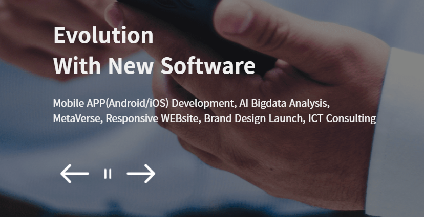
<||> 버튼에 슬릭 슬라이더 버튼 기능을 연결하는 것은 바로 해결
누르면 왼쪽 오른쪽 잘 간다
 $('.slick-header-wrap').slick({
        slidesToShow: 1,
        slidesToScroll: 1,
        autoplay: true,
        autoplaySpeed: 3000,
        pauseOnHover:true,
        arrows: true,
        infinite:true,
        speed: 500,
        prevArrow: $('#prev-arrow'), // 이 부분이
        nextArrow: $('#next-arrow') // 버튼 연결 부분
});- 어제 헤더 이미지를 가로 화면 전체로 차지하게 변경하면서 텍스트가 헤더를 따라 왼쪽에 쏠리는 현상이 있었다.
화면이 좁아짐에 따라 중앙정렬을 항상 해주게 변경해야 된다.
포지션으론 위치가 안잡혀서 어떻게 할까 싶었는데 html에 컴포넌트화를 한번 더 하면서 해결했다.
텍스트와 버튼을 한꺼번에 묶고 헤더이미지와 분리. 그리고 헤더 전체를 감싸는 부모 div를 하나 더 만들어서 포지션으로 자식 위치 조정 후, 감싸는 부분 부모에 마진 0 auto를 주어 해결했다.
/* 헤더 */
.main-header {
    /* width: 100%; */
    /* height: 900px; */
   position: relative;
}
.main-header .header-wrap{
    /* position: absolute; */
    margin: 0 auto;
    /* border: 2px solid red; */
    max-width: 1440px;
    /* z-index: 1; */
    /* height: 900px;  */
    /* position: relative; */
    /* position: absolute; */
    /* z-index: 1; */
}
.main-header .head-box img{
    width: 100%;
    height: 900px;
    object-fit: cover;
    filter: brightness(55%);
    z-index: -1;
}
.main-header .slick-header-wrap{
    position: static;
    z-index: 1;
    width: 100%;
    height: 900px;
}
.main-header .header-wrap h1, .main-header .header-wrap p{
    color: rgb(240, 240, 240);

}
.main-header .header-text-wrap {
    position: absolute;
    top:460px;
}
.main-header h1 {
    max-width: 450px;
    font-weight: 700;
    font-size: 2.8rem;
    line-height: 4rem;
}
.main-header p {
    max-width: 680px;
    font-weight: 400;
    font-size: 1.3rem;
    line-height: 2rem;
    bottom: 250px;
    margin-top: 2rem;
}
/* <-> 버튼 */
.main-header .slick-button-wrap {
    position: absolute;
    z-index: 1;
    top: 750px;
    display: flex;
	flex-direction: row;
	flex-wrap: nowrap;
	justify-content: center;
	align-items: center;
	align-content: center;
}
.main-header .slick-button-wrap img{
    padding: 1rem;
    /* border: 1px solid red; */
    cursor: pointer;
}- 미디어 쿼리는 사이즈별로 계속 작업중이다
미디어 쿼리 작업을 너무 들쭉날쭉 하는 것 같은 느낌...
1280 사이즈부터 차례대로 건드려봐야겠다.
필요없는 중복코드도 잘 줄여나가야 한다.
/* 미디어 쿼리 1440 */
@media (max-width: 1440px) {
/* 메인 섹션 전체 */
/* 헤더 */
.main-header .header-wrap {
/* width: 1024px; */
}
.main-news-container, .project, .service, .reference {
max-width: 1440px;
/* border: solid 1px red; */
margin-left: 3rem;
margin-right: 3rem;
}
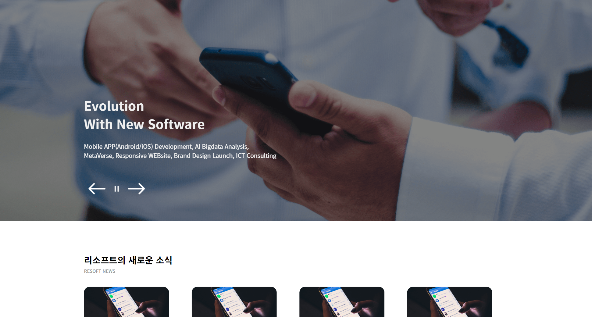
/* 뉴스 (새소식) */
.main-news-container {
}
.main-header .header-text-wrap, .main-header .slick-button-wrap {
margin-left: 3rem;
}
.main-news-container .news-wrap {
/* margin: 0 auto; */
max-width: 1440px;
display: flex;
flex-wrap: wrap;
justify-content: flex-start;
align-items: center;
align-content: center;
}
.main-news-container .news-contents {
width: 300px;
margin-right: 5rem;
}
.main-news-container .news-contents:last-child {
display: none;
}
.main-news-container .news-img-wrap {
width: 300px;
height: 200px;
border-radius: 20px;
position:relative;
overflow: hidden;
}
.main-news-container .news-img {
width: 300px;
height: 200px;
border-radius: 20px;
position:relative;
background: url('./img/toco-common/sample-img.png') no-repeat center / cover;
transition: transform 0.25s ease-in-out;
opacity:1;
}
.main-news-container .news-contents:last-child {
/* display: none; */
}
/* 서비스 */
.main-service-container .service-left-wrap lottie-player {
max-width: 600px;
margin-top: 130px;
}
/* 푸터 */
.footer-logo, .footer-text{
margin-left: 3rem;
}
}
/* 미디어 쿼리 1280 */
@media (max-width: 1280px) {
/* 메인 전체 */
section {
margin: 0 auto;
padding-top: 120px;
padding-bottom: 120px;
}
.main-title, .sub-title{
text-align: center;
}
/* 헤더 */
.main-header .header-wrap {
width: 768px;
}
.main-news-container, .project, .service, .reference {
max-width: 768px;
}
.main-news-container {
}
.main-news-container .news-wrap {
margin: 0 auto;
width: 768px;
display: flex;
flex-wrap: wrap;
justify-content: space-around;
align-items: center;
align-content: center;
}
.main-news-container .news-contents {
width: 300px;
}
.main-news-container .news-img-wrap {
width: 300px;
height: 200px;
border-radius: 20px;
position:relative;
overflow: hidden;
}
.main-news-container .news-img {
width: 300px;
height: 200px;
border-radius: 20px;
position:relative;
background: url('./img/toco-common/sample-img.png') no-repeat center / cover;
transition: transform 0.25s ease-in-out;
opacity:1;
}
}
/* 미디어 쿼리 768 */
@media (max-width: 768px) {
.main-header .header-wrap {
max-width: 600px;
margin-left: 3rem;
margin-right: 3rem;
}
.main-news-container, .project, .service, .reference {
max-width: 600px;
margin-left: 3rem;
margin-right: 3rem;
}
/* 헤더 */
/* 헤더 텍스트 */
.main-header .head-box img{
height: 700px;
}
.main-header .slick-header-wrap{
height: 700px;
}
.main-header .header-text-wrap {
top:300px;
}
.main-header h1 {
max-width: 400px;
font-weight: 600;
font-size: 2.2em;
line-height: 3.2rem;
}
.main-header p {
max-width: 530px;
font-weight: 300;
font-size: 1.1rem;
line-height: 2rem;
bottom: 250px;
}
/* 헤더 슬릭 버튼 */
.main-header .slick-button-wrap {
top: 580px;
}
}
/* 미디어 쿼리 430 */
@media (max-width: 430px) {
}어려운 점
아직은 없음 세부조정이 번거로운 정도. 많이 손대지 않고 미디어 쿼리가 잘 되게 신경쓰는 중이다
해결 방법
역시 구조화를 잘해야 해결된다
소감
기존에 해놓은 컴포넌트화 작업이 있어서 미디어쿼리 작성이 생각보다 복잡하진 않으나, 작업 방식이 들쭉날쭉이어서 과정을 임의로 정해놓으면 속도가 빨라질 것 같다.
제로부터 시작하는 프로그래밍&코딩