
2022-08-08
오늘 진행 사항
1) 오전 10시 스크럼 회의 진행
2) 개별 진행
3) 체크아웃 회의
폰트 정보 통일, nav바 통일은 이번주 내로 진행
공통 환경 모여서 설정하는거 한시간쯤 더 진행
1440px : 제목 - 폰트크기 40px, 행간 58px / 부제목 폰트크기 26px, 행간 45px
1280px : 제목 - 폰트크기 35px, 행간 58px / 부제목 폰트크기 26px, 행간 45px
430x : 제목 - 폰트크기 28px / 부제목 폰트크기 14px
컨테이너 패딩 : 120px
나머지 line-height나 font-weigth는 시안과 동일
2) 개별 진행
미디어 쿼리 진행중... 1024는 안해도 된다셔서 뺄 예정
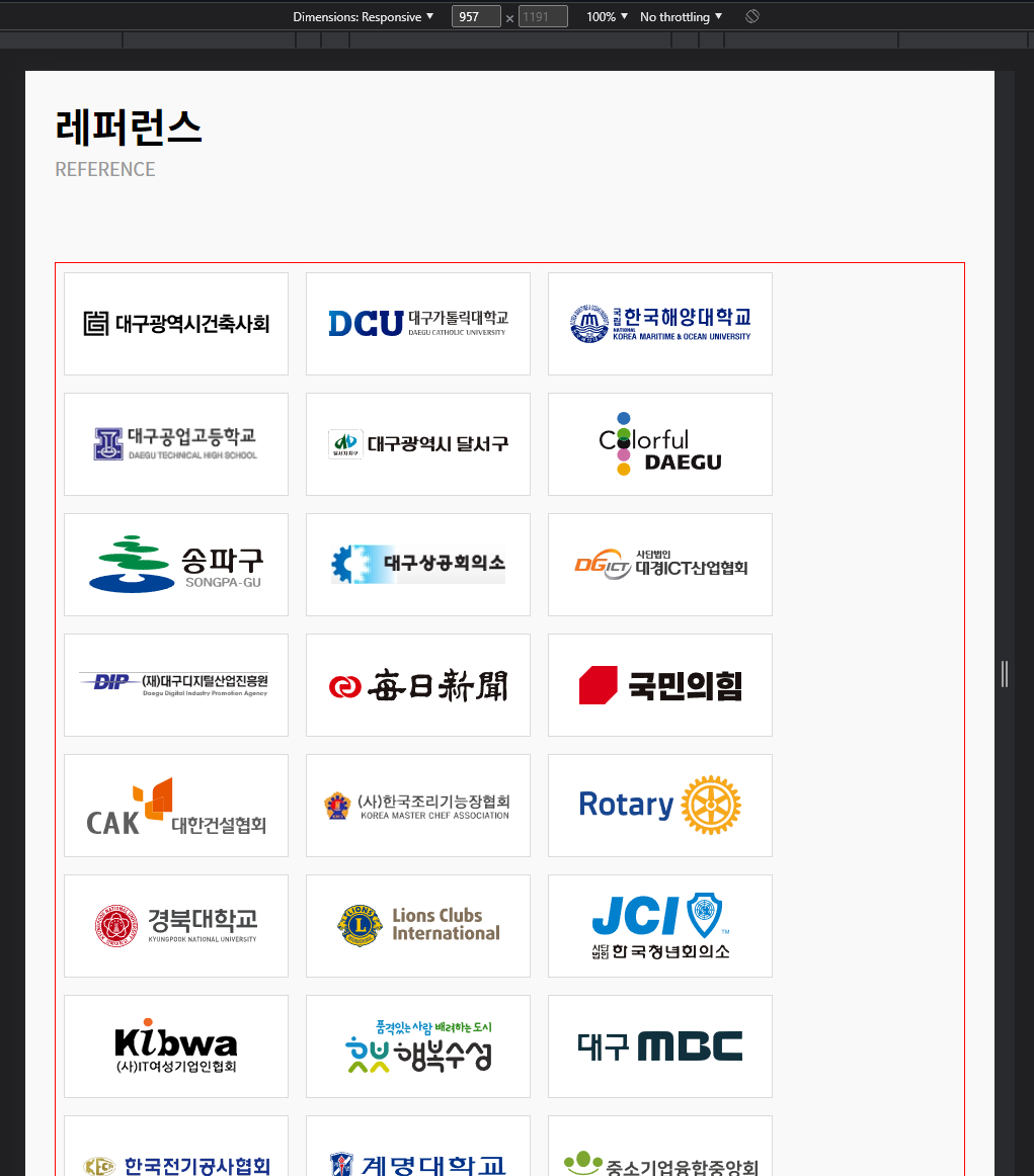
레퍼런스 부분은 이것을
/* .main-reference-container .ref-logo-wrap {
    height: 100%;
    display: flex;
    flex-direction: row;
    flex-wrap: wrap;
    justify-content: space-between;
}
.main-reference-container #hidden {
    visibility: hidden;
}
.main-reference-container .ref-logo{
    border: solid 1px #DBDBDB;
    background-color: #fff;
    width: 220px;
    height: 100px;
    margin-top: 1rem;
    display: flex;
    justify-content: center;
    align-items: center;
    align-content: center;
}
.main-reference-container .ref-logo-wrap:last-child {
    margin: 0;
    border: 1px solid red;
} */
이것으로 변경
.main-reference-container .ref-logo-wrap {
    height: 100%;
    display: flex;
    flex-direction: row;
    flex-wrap: wrap;
}
.main-reference-container .ref-logo {

    border: solid 1px #DBDBDB;
    background-color: #fff;
    width: 220px;
    height: 100px;
    margin: 8.5px;
    display: flex;
    justify-content: center;
    align-items: center;
    align-content: center;;
}
/* 미디어 쿼리 1440 - PC */
@media (max-width: 1440px) {
/* 메인 섹션 전체 */
.all-margin {
margin-left: 3vw;
margin-right: 3vw;
}
/* 헤더 */
.main-header .header-wrap {
/* width: 1024px; */
}
.main-news-container, .project, .service, .reference {
max-width: 1440px;
/* border: solid 1px red; */
}
.all-margin {
margin-left: 3vw;
margin-right: 3vw;
}
.main-header .header-text-wrap, .main-header .slick-button-wrap {
margin-left: 3vw;
}
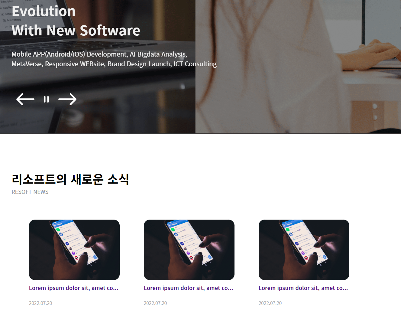
/* 뉴스 (새소식) */
.main-news-container .news-wrap {
max-width: 1440px;
display: flex;
flex-wrap: wrap;
justify-content: center;
align-items: center;
align-content: center;
/* border: 1px solid red; */
}
.main-news-container .news-contents {
width: 300px;
margin-right: 5rem;
}
.main-news-container .news-contents:last-child {
display: none;
}
.main-news-container .news-img-wrap {
width: 300px;
height: 200px;
border-radius: 20px;
position:relative;
overflow: hidden;
}
/* 프로젝트 */
.main-project-container lottie-player {
max-width: 600px;
}
/* 서비스 */
.main-service-container .service {
/* max-width: 1000px; */
display: flex;
flex-direction:row;
flex-wrap: wrap;
justify-content: space-between;
/* border: solid 1px red; */
}
/* 서비스 섹션 - 왼쪽 */
.main-service-container .service-left-wrap {
/* width: 50%; */
/* height: 100%; */
/* width: 1000px; */
/* border: solid 1px orange; */
}
.main-service-container .service-img1 {
/* width: 400px; */
/* height: 680px; */
}
.main-service-container .service-left-wrap lottie-player {
/* margin-left: -1rem; */
max-width: 490px;
/* border: solid 1px red; */
}
/* 서비스 섹션 - 오른쪽 */
.main-service-container .service-right-wrap{
/* width: 50%; */
height: 100%;
display: flex;
flex-direction: row;
/* flex-wrap: wrap; */
justify-content: center;
align-items: flex-start;
align-content: flex-start;
/* border: solid 1px orange; */
}
.main-service-container .service-left-wrap lottie-player {
margin-top: 20px;
}
.main-service-container .service-img-wrap2 {
margin-left: 2.5rem;
}
/* 레퍼런스 섹션 */
.main-reference-container .ref-logo-wrap {
justify-content:flex-start;
}
.main-reference-container #hidden {
display: none;
}
/* 푸터 */
.footer-logo, .footer-text{
margin-left: 3rem;
}
}
/* 미디어 쿼리 1280 - PC */
@media (max-width: 1280px) {
/* 메인 전체 */
/* 헤더 */
.main-header .header-wrap {
max-width: 1000px;
}
.main-header .header-text-wrap, .main-header .slick-button-wrap {
margin-left: 0rem;
}
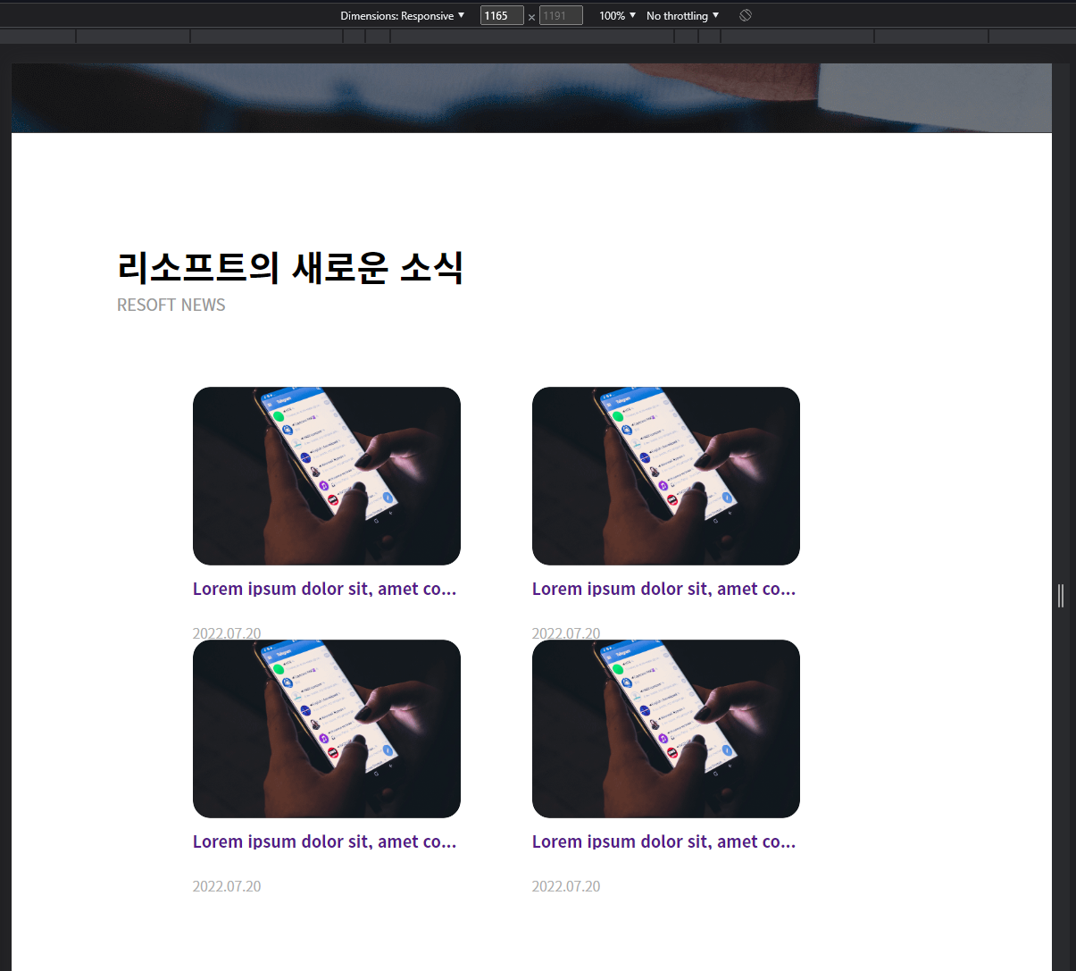
.main-news-container, .project, .service, .reference {
max-width: 1000px;
margin: 0 auto;
}
/* 뉴스 (새소식) */
.main-news-container .news-wrap {
max-width: 1000px;
justify-content:center;
}
.main-news-container .news-contents:last-child {
display: block;
}
/* 프로젝트 섹션 */
.main-project-container {
background-color: #F9F8FF;
}
.main-project-container .project-wrap {
position: static;
}
/* 프로젝트 섹션 - 오른쪽 */
.main-project-container .project-right-wrap {
max-width: 1000px;
/* border: 1px solid red; */
}
.main-project-container .project-title-wrap {
position: static;
/* border: 1px solid blue; */
}
.main-project-container .project-wrap {
display: flex;
flex-direction: column-reverse;
}
.main-project-container .project-img2 {
/* border: 1px solid blue; */
}
.main-project-container .media1440 {
display: none;
}
.main-project-container .media1280 {
display: block;
}
/* 프로젝트 섹션 - 왼쪽 */
.main-project-container .project-left-wrap {
/* border: 1px solid red; */
}
.main-project-container .project-img1:first-child{
margin-bottom: 50px;
}
/* 서비스 섹션 */
.main-service-container {
background-color: #F2F6FC;
}
.main-service-container .service {
max-width: 1000px;
justify-content:center;
/* border: 1px solid red; */
}
.main-service-container .service-title-wrap {
/* border: 1px solid blue; */
}
.main-service-container .service-img1 {
/* border: 1px solid blue; */
}
.main-service-container .service-left-wrap lottie-player {
margin: 0 auto;
/* border: 1px solid blue; */
}
.main-service-container .media1440 {
display: none;
}
.main-service-container .media1280 {
display: block;
}
/* 레퍼런스 섹션 */
.main-reference-container {
width: 100%;
height: 100%;
}
.main-reference-container .ref-logo-wrap {
/* border: 1px solid orange; */
}
/* 푸터 */
.footer-logo, .footer-text{
margin-left: 3rem;
}
}
/* 미디어 쿼리 1024 - 태블릿 */
/* @media (max-width: 1024px) {
.main-title {
font-size: 35px;
}
.news-contents .news-wrap {
}
} */
/* 미디어 쿼리 768 - 태블릿 */
@media (max-width: 768px) {
.main-header .header-wrap {
max-width: 600px;
margin-left: 3rem;
margin-right: 3rem;
}
.main-news-container, .project, .service, .reference {
max-width: 600px;
margin-left: 3rem;
margin-right: 3rem;
}
/* 헤더 */
/* 헤더 텍스트 */
.main-header .head-box img{
height: 700px;
}
.main-header .slick-header-wrap{
height: 700px;
}
.main-header .header-text-wrap {
top:300px;
}
.main-header h1 {
max-width: 400px;
font-weight: 600;
font-size: 2.2em;
line-height: 3.2rem;
}
.main-header p {
max-width: 530px;
font-weight: 300;
font-size: 1.1rem;
line-height: 2rem;
bottom: 250px;
}
/* 헤더 슬릭 버튼 */
.main-header .slick-button-wrap {
top: 580px;
}
}
/* 미디어 쿼리 430 - 모바일*/
@media (max-width: 430px) {
.main-title {
font-size: 28px;
padding-bottom: 1rem;
}
.sub-title {
font-size: 14px;
}
}어려운 점
- 분명
position:static으로 옵션을 기본으로 만들어 줬는데도 효과를 받고있는 것 마냥 컨텐츠가 겹쳐서 보여진다.
아예 포지션을 해제하는 속성키는 position : inherit; 인 것 같은데 이것도 적용이 안됨.
해결 방법
- 그래.. 이것이 안 될리가 없다.. 구조가 한번 reverse된 구조라 글과 이미지 정렬을 위해선 다른 곳에도 reverse를 줘야하고.. position:static을 줬는데도 안됐던 건 이 flex 구조를 건드리지 않아서 그렇게 보였던 것 같다. 그리고 flex와 positon 설정해야하는 곳을 제대로 집어보지 않아서 그랬던 듯. 아래 코드를 통해서 완전히 해결됐다.
/* 프로젝트 섹션 - 오른쪽 */
.main-project-container .project-wrap {
flex-direction: column-reverse;
}
.main-project-container .project-right-wrap {
width: 100%;
flex-direction: row-reverse;
justify-content: center;
}
.main-project-container .project-right-wrap .project-title-wrap {
width: 100%;
text-align: right;
position: static;
left: 0;
}
.main-project-container .media1440 {
display: none;
}
.main-project-container .media1280 {
display: block;
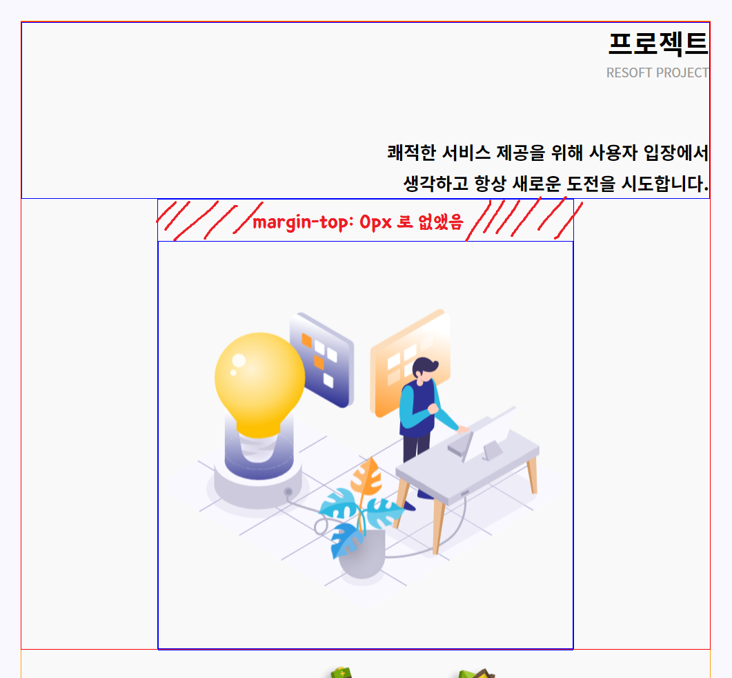
margin-top: 0px;
}소감
이틀 안으로 내 파트는 마무리를 할 수 있을 것 같다
- 끼워 맞추기식 코드를 작성하지 않아도 코드의 기능을 그대로 살려서 문제를 해결하는 것이 목표다

제로부터 시작하는 프로그래밍&코딩