
2022-08-09
오늘 진행 사항
1) 오전10시 멘토링
2) 멘토링 후 스크럼 회의
3) 3시간 가량 팀원 코드 수정 시도
4) 개별 작업
5) 체크아웃 회의
1) 멘토링
멘토님: 안쪽 내용물은 거의 다 되어서 네비바 화면 줄였을 때 텍스트를 햄버거 메뉴아이콘 안에 넣는것, 푸터 간격이나 내용 조정 등을 하면 될것 같다
다음 시간에는 자바스크립트 코드 리뷰를 하겠다
2) 스크럼 회의
나 : 미디어 쿼리 구조적인 수정과 추가는 다 완료했고 더 세부적인 것 조정하겠다
3) 팀원 코드 수정 시도
조직도 부분 담당하는 팀원의 코드 수정을 시도
3명이 붙잡았지만 결과물은 조금 애매.. 해당 팀원의 미디어쿼리를 기다려볼듯
4) 개별 작업
px, 혹은 rem으로 고정되었던 것들을 용도에 맞게 표기 단위를 바꿨다.
특히 px로 줬던 이미지들은 768px 모바일 화면 시점부터 모두 vw (뷰포트) 단위로 변경하여 화면이 줄어들어도 해당 비율을 유지하도록 변경.
이후 미디어 쿼리 작업이 엄청 수월해졌다.
조정한 것도 대부분 플렉스나 마진0오토, width:100% 로 오토를 최대한 활용했고 화면 비율마다 조금씩 조정하는 정도의 미디어 쿼리다
물론, 이렇게 편하게 수정하기 위해 처음부터 구조화를 잘 하려고 많이 신경썼다
/* 미디어 쿼리 1440 - PC ---------------------------------------------------*/
@media screen and (max-width: 1440px) {
    /* 메인 섹션 전체 */
    .all-margin {
        margin-left: 3vw;
        margin-right: 3vw;
    }
    /* 헤더 */
    .main-news-container, .project, .service, .reference  {
        max-width: 1440px;
    }
    .all-margin {
        margin-left: 3vw;
        margin-right: 3vw;
    }
    /* 뉴스 (새소식) */
    .main-news-container .news-wrap {
        max-width: 1440px;
        display: flex;
        flex-wrap: wrap;
        justify-content: center;
    }
    .main-news-container .news-contents {
        margin-right: 5vw;
    }
    .main-news-container .news-contents:last-child {
        display: none;
    }
    /* 프로젝트 */
    .main-project-container lottie-player {
        max-width: 600px;
    }
    /* 서비스 */
    .main-service-container .service {
        display: flex;
        flex-direction:row;
        flex-wrap: wrap;
        justify-content: space-between;
    }
    /* 서비스 섹션 - 왼쪽 */
    .main-service-container .service-left-wrap .media1440 {
        max-width: 490px;
    }
    /* 서비스 섹션 - 오른쪽 */
    .main-service-container .service-right-wrap{
        height: 100%;
        display: flex;
        flex-direction: row;
        justify-content: center;
        align-items: flex-start;
        align-content: flex-start;
    }
    .main-service-container .service-left-wrap .media1440 {
        margin-top: 20px;
    }
    .main-service-container .service-img-wrap2 {
        margin-left: 2.5rem;
    }
    /* 레퍼런스 섹션 */
    .main-reference-container .ref-logo-wrap {
        justify-content:flex-start;
    }
    .main-reference-container #hidden {
        display: none;
    }
    /* 푸터 */
    .footer-logo, .footer-text{
        margin-left: 3rem;
    }
}


/* 미디어 쿼리 1280 - PC --------------------------------------------------------*/
@media screen and (max-width: 1280px) {
    /* 메인 전체 */
    .all-margin {
        margin-left: 3vw;
        margin-right: 3vw;
    }
    .main-news-container, .project, .service, .reference  {
        max-width: 1000px;
    }
    .main-title {
        font-size: 35px;
        line-height: 58px;
    }
    /* 헤더 */
    .main-header .header-wrap {
        max-width: 1000px;
    }
    .main-header .header-text-wrap, .main-header .slick-button-wrap {
        margin-left: 0rem;
    }
    .main-news-container, .project, .service, .reference  {
        max-width: 1000px;
        margin: 0 auto;
    }
    /* 뉴스 (새소식) */
    .main-news-container .news-wrap {
        justify-content:center;
    }
    .main-news-container .news-contents:last-child {
        display: block;
    }
    .main-news-container .news-contents:nth-child(2n) {
        margin-right: 0;
    }
    .main-news-container .news-contents {
        margin-bottom: 3vw;
    }
    /* 프로젝트 섹션 */
    .main-project-container {
        background-color: #F9F8FF;
    }
    .main-project-container .project-wrap {
        position: static;
        background-color: #F9F8FF;
    }
    .main-project-container .project-img2 {
        margin-top: 0;
    }
    /* 프로젝트 섹션 - 오른쪽 */
    .main-project-container .project-wrap {
        flex-direction: column-reverse;
    }
    .main-project-container .project-right-wrap {
        max-width: 1000px;
        width: 100%;
        flex-direction: row-reverse;
        justify-content: center;
    }
    .main-project-container .project-right-wrap .project-title-wrap {
        width: 100%;
        text-align: right;
        position: static;
        left: 0;
    }
    .main-project-container .media1440 {
        display: none;
    }
    .main-project-container .media1280 {
        display: block;
        margin-top: 0px;
    }

    /* 프로젝트 섹션 - 왼쪽 */
    .main-project-container .project-img1:first-child{
     margin-bottom: 50px;
    }

    /* 서비스 섹션 */
    .main-service-container {
        background-color: #F2F6FC;
    }
    .main-service-container .service {
        justify-content:center;
    }
    .main-service-container .service-left-wrap {
        max-width: 1000px;
        width: 100%;
    }
    .main-service-container .service-left-wrap .media1280 {
        margin: 0 auto;
    }
    .main-service-container .media1440 {
        display: none;
    }
    .main-service-container .media1280 {
        display: block;
    }
      /* 레퍼런스 섹션 */
    .main-reference-container .ref-logo-wrap {
        justify-content:center;
    }
    .main-reference-container .ref-logo-wrap:last-child {
        justify-content:flex-start;
    }

    /* 푸터 */
    .footer-logo, .footer-text{
        margin-left: 3rem;
    }
}

/* 미디어 쿼리 768 - 태블릿 -----------------------------------------------------*/
@media screen and (max-width: 768px) {
    /* 메인 전체 */

    section {
        margin: 0 auto;
        padding-top: 80px;
        padding-bottom: 80px;
    }
    .all-margin {
        margin-left: 4vw;
        margin-right: 4vw;
    }
    .main-header .header-wrap {
        max-width: 700px;
    }
    .main-news-container, .project, .service, .reference  {
        max-width: 700px;
    }
    .main-title {
        font-size: 28px;
        line-height: 42px;
    }
    .sub-title {
        font-size: 14px;
        margin-bottom: 50px;
        line-height: 26px;
    }
    .sub-text {
        font-size: 20px;
        font-weight: 600;
        line-height: 35px;
    }

    /* 헤더 텍스트 */
    .main-header .head-box img{
        height: 700px;
    }
    .main-header .slick-header-wrap{
        height: 700px;
    }
    .main-header .header-text-wrap {
        top:300px;
    }
    .main-header h1 {
        max-width: 400px;
        font-weight: 600;
        font-size: 2.2em;
        line-height: 3.2rem;
    }
    .main-header p {
        max-width: 530px;
        font-weight: 300;
        font-size: 1.1rem;
        line-height: 2rem;
        bottom: 250px;
    }
    /* 헤더 슬릭 버튼 */
    .main-header .slick-button-wrap {
        top: 580px;
    }
    /* 뉴스 (새소식) 섹션 */
    .main-news-container .news-contents {
        width: 40vw;
    }
    .main-news-container .news-img-wrap {
        width: 40vw;
        height: 26.8vw;
        border-radius: 12px;
    }
    .main-news-container .news-img {
        width: 40vw;
        height: 26.8vw;
        border-radius: 12px;
    }
    .main-news-container .news-text {
        font-size: 15px;
        font-weight: 500;
        margin-top: 1.5vw;
        margin-bottom: 2.4vw;
    }
    .main-news-container .news-date {
        font-size: 13px;
        color : #AAAAAA;
    }
    /* 프로젝트 섹션 */
    .main-project-container .media1280 {
        max-width: 85vw;
        max-height: 85vw;
    }
    .main-project-container .project-left-wrap {
        max-width: 80vw;
        flex-direction: row;
        flex-wrap: wrap;
    }

    .main-project-container .project-img1{
        width: 80vw;
        height: 57vw;
        border-radius: 12px;
    }
    /* 프로젝트 마우스 오버 */
    .main-project-container .moado, .ecoce {
        width: 80vw;
        height: 57vw;
        border-radius: 12px;
    }
    .main-project-container .text-show h3{
        font-size: 1.3em;
    }
    .main-project-container .text-show p{
        font-size: 1em;
    }
    /* 서비스 섹션 */
    .main-service-container .media1280 {
        max-width: 85vw;
        max-height: 85vw;
    }
    /* 서비스 섹션 - 오른쪽 */
    .main-service-container .service-img-wrap2 {
        margin-top: 10rem;
        margin-left: 4vw;
    }
    .main-service-container .service-card {
        width: 39vw;
        height: 49vw;
        margin-bottom:4vw;
        border-radius: 12px;
    }
    .main-service-container .service-card:last-child{
        margin-bottom: 0;

    }
    .main-service-container .service-card h3 {
        font-size: 24px;
        font-weight: 500;
        line-height: 43px;
    }
    .main-service-container .service-card p {
        font-size: 14px;
        font-weight: 300;
    }
    .main-service-container .service-card .card-hide p {
        color: #fff;
        font-size: 18px;
        font-weight: 400;
        line-height: 30px;
    }
      /* 레퍼런스 섹션 */
    .main-reference-container .ref-logo {
        width: 27.5vw;
        height: 13vw;
        margin: 1vw;
    }
    .main-reference-container img {
        width: 22vw;
    }
    .main-reference-container .resize {
        height: 9vw;
    }
    .main-reference-container .w18 {
        width: 18vw;
    }
    .main-reference-container .h8 {
        height: 8vw;
    }
    .main-reference-container .wh18-8 {
        width: 18vw;
        height: 8vw;
    }
    .main-reference-container .w14 {
        width: 14vw;
    }
}

/* 미디어 쿼리 430 - 모바일-------------------------------------------------------*/
@media screen and (max-width: 430px) {
    /* 메인 전체 */
    section {
        padding-top: 50px;
        padding-bottom: 50px;
    }
    .all-margin {
        margin-left: 5vw;
        margin-right: 5vw;
    }
    .main-news-container, .project, .service, .reference  {
        max-width: 420px;
    }
    .sub-text {
        font-size: 16px;
        line-height: 27px;
        line-height: 31px;
    }
    /* 네비바 */
        header #gon {padding: 5px; }
    /* 헤더 텍스트 */
    .main-header .head-box img{
        height: 600px;
    }
    .main-header .slick-header-wrap{
        height: 600px;
    }
    .main-header .header-text-wrap {
        top:270px;
    }
    .main-header h1 {
        max-width: 390px;
        font-weight: 600;
        font-size: 30px;
        line-height: 45px;
    }
    .main-header p {
        max-width: 370px;
        font-weight: 300;
        font-size: 13px;
        line-height: 24px;
    }
    /* 헤더 슬릭 버튼 */
    .main-header .slick-button-wrap {
        top: 500px;
    }
    .main-header .slick-button-wrap #prev-arrow, #next-arrow{
        width: 32px;
    }
    .main-header .slick-button-wrap #stop-btn{
        width: 12px;
    }
    /* 뉴스 */
    .main-news-container .news-img-wrap {
        border-radius: 10px;
    }
    .main-news-container .news-img {
        border-radius: 10px;
    }
    /* 프로젝트 섹션 */
    .main-project-container .project-img1 {
        border-radius: 10px;
    }
    .main-project-container .moado, .ecoce {
        border-radius: 10x;
    }
    .main-project-container .project-img1:first-child{
        margin-bottom: 30px;
       }
    .main-project-container .text-show h3{
        font-size: 14.5px;
    }
    .main-project-container .text-show p{
        font-size: 12px;
        line-height: 17px;
    }

    /* 서비스 섹션 */
    .main-service-container .service-card {
        border-radius: 10px;
    }
    .main-service-container .service-card h3 {
        font-size: 18px;
        line-height: 43px;
    }
    .main-service-container .service-card p {
        font-size: 13px;
    }
    .main-service-container .service-card .card-hide p {
        font-size: 14px;
        line-height: 28px;
    }
    /* 레퍼런스 섹션 */
    .main-reference-container .ref-logo {
        width: 27.5vw;
        height: 13vw;
        margin: 1vw;
    }
    .main-reference-container img {
        width: 22vw;
    }
}
어려운 점
- 개별 작업 진행 당시 하나의 난제가 있었다. 지금에서야 이렇게 간단한 걸 생각못했나 싶지만, 아무래도 초보 개발자 입장에선 그랬다.
아래 이미지에서 콘텐츠 영역에 전부 margin-right와 margin-bottom을 준 상태다.
근데 justify-content: center을 주었을 때 컨텐츠가 마진을 포함해서 중앙에 오겠지?
여기서 문제. 이 콘텐츠는 div 부모태그에 아래 같은 자식들이고 저 주황영역만 지우고 싶은데, 동시 적용은 되어야한다.
하지만 그 당시 이걸 어떻게 해결해야되지, 하면서 html 구조 자체를 변경하는 등 시도해봄
부모를 두개 만들었더니 flex로 잡아놓은 레이아웃이 다 엇갈려서 어떻게 해야되나 싶었음.
해결 하려고 프로그래밍 모르는 친구들에게 '퀴즈 하나 낼게' 말하고 그림을 그려서 이럴 때 어떻게 해결하면 좋을까? 하고 물으려했던 참이었다. 그제서야 강의에서 짧게 스쳐지나가듯 썼던 코드가 딱 떠오름
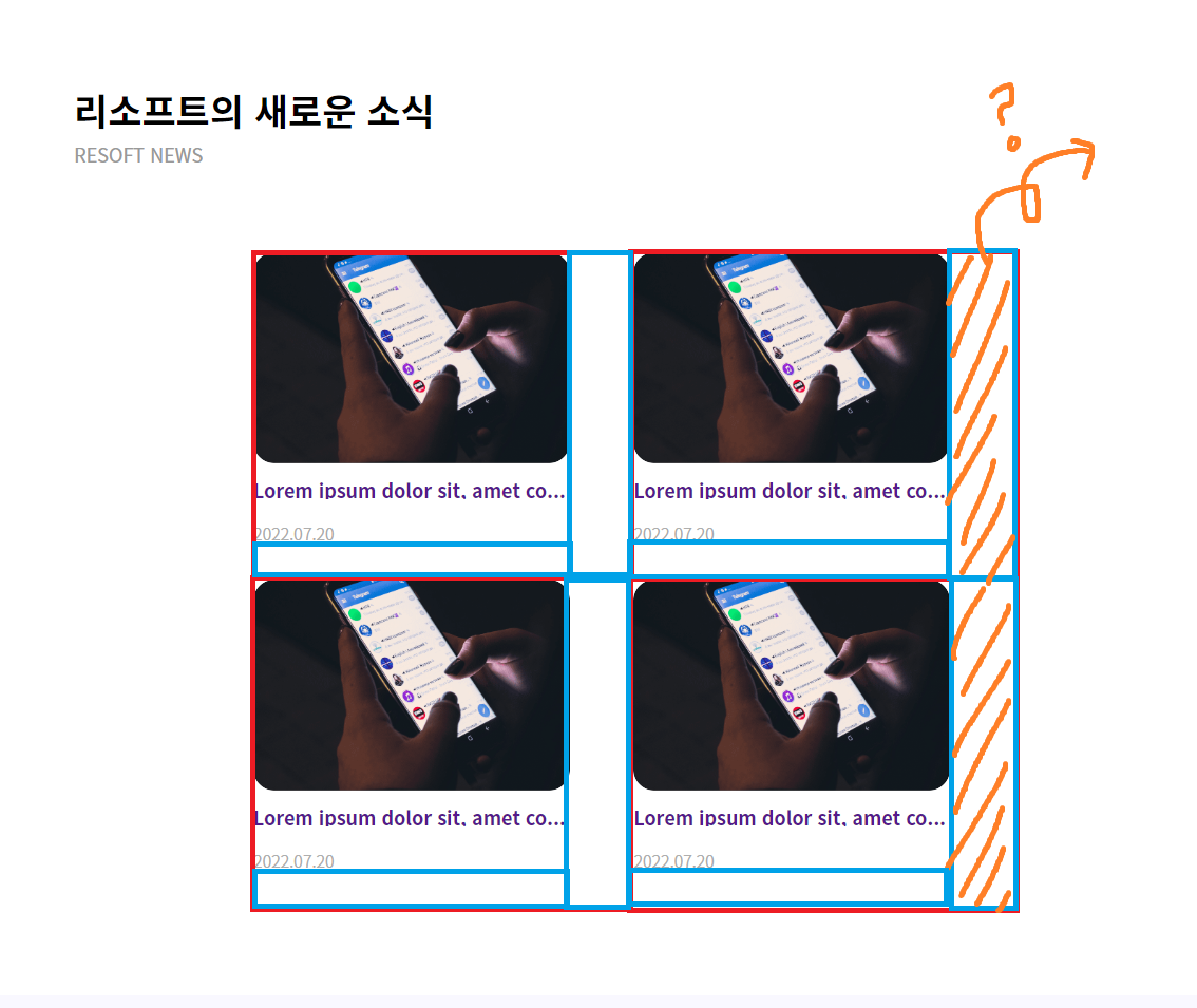
해결 방법
- 바로 짝수 지정 선택자였다
 .main-news-container .news-contents:nth-child(2n) {
        margin-right: 0;
    }
즉 news-contents의 nth-child(2n) 짝수번째 자식들에게만 오른쪽-마진을 0을 주겠다는 것.
이렇게 해서 모든 문제 해결! 앞으로는 선택자를 더 친근하게 써먹을 수 있을 것 같다.
소감
미디어 쿼리는 거의 다해가서 한시름 놓은 듯
남은 건 네비바와 푸터 정도