디자인 코드
<Window x:Class="HelloWPF1.MainWindow"
        xmlns="http://schemas.microsoft.com/winfx/2006/xaml/presentation"
        xmlns:x="http://schemas.microsoft.com/winfx/2006/xaml"
        xmlns:d="http://schemas.microsoft.com/expression/blend/2008"
        xmlns:mc="http://schemas.openxmlformats.org/markup-compatibility/2006"
        xmlns:local="clr-namespace:HelloWPF1"
        mc:Ignorable="d"
        Title="헬로우 WPF" Height="450" Width="450">
    <Grid>
        <Label x:Name="lbl" Content="레이블" Margin="184,83,167,314"/>
        <Button x:Name="btn" Content="버튼" HorizontalAlignment="Center" Margin="0,229,0,0" VerticalAlignment="Top" RenderTransformOrigin="5.229,2.246"/>

    </Grid>
</Window>
Label과 Button에 별칭을 지정해주고 아래에서 불러올 수 있다.
비하인드 코드
using System.Text;
using System.Windows;
using System.Windows.Controls;
using System.Windows.Data;
using System.Windows.Documents;
using System.Windows.Input;
using System.Windows.Media;
using System.Windows.Media.Imaging;
using System.Windows.Navigation;
using System.Windows.Shapes;

namespace HelloWPF1
{
    /// <summary>
    /// Interaction logic for MainWindow.xaml
    /// </summary>
    public partial class MainWindow : Window
    {
        public MainWindow()
        {
            InitializeComponent();
            btn.Content = "버튼입니다.";
            lbl.Content = "레이블입니다.";
        }
    }
}
btn.Content를 비하인드 코드에서 수정하고 적용할 수 있다.
Label
<Window x:Class="WpfApp2.MainWindow"
xmlns="http://schemas.microsoft.com/winfx/2006/xaml/presentation"
xmlns:x="http://schemas.microsoft.com/winfx/2006/xaml"
xmlns:d="http://schemas.microsoft.com/expression/blend/2008"
xmlns:mc="http://schemas.openxmlformats.org/markup-compatibility/2006"
xmlns:local="clr-namespace:WpfApp2"
mc:Ignorable="d"
Title="MainWindow" Height="450" Width="800">
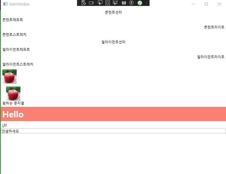
<Grid>
<StackPanel Orientation="Vertical">
<Label HorizontalContentAlignment="Center">콘텐트센터</Label>
<Label HorizontalContentAlignment="Left">콘텐트레프트</Label>
<Label HorizontalContentAlignment="Right">콘텐트라이트</Label>
<Label HorizontalContentAlignment="Stretch">콘텐트스트레치</Label>
<Label HorizontalAlignment="Center">얼라이먼트센터</Label>
<Label HorizontalAlignment="Left">얼라이먼트레프트</Label>
<Label HorizontalAlignment="Right">얼라이먼트라이트</Label>
<Label HorizontalAlignment="Stretch">얼라이먼트스트레치</Label>
<Label>
<Image Width="50" Source="https://www.cyso.co.kr/data/item/1625295618/thumb-64yA7ZGc1_500x500.jpg"></Image>
</Label>
<Label>
<StackPanel Orientation="Vertical">
<Image Width="50" Source="https://www.cyso.co.kr/data/item/1625295618/thumb-64yA7ZGc1_500x500.jpg"></Image>
<AccessText Text="원하는 문자열"/>
</StackPanel>
</Label>
<Label Content="Hello"
FontSize="30"
FontWeight="Bold"
Background="Salmon"
Foreground="White"
></Label>
<Label Content="_Lbl" Target="{Binding ElementName=tb}"></Label>
<TextBox x:Name="tb"/>
</StackPanel>
</Grid>
</Window>
StackPanel
- 원래 같은 내용의 라벨을 2개 넣으면 겹치게 되지만 이 태그를 감싸면 겹치지 않게된다.
- Vertical, Horization 등 옵션으로 정렬할 수 있다.
HorizontalContentAlignment
- 블록형식에 태그이다.
- 맵 끝까지 차지한다.
- 여기서 Stretch와 left는 거의 비슷하게 동작한다.
HorizontalAlignment
- 인라인 형식이라 콘텐트 크기만큼 크기를 차지한다.
- 여기서 Stretch는 HorizontalContetnAlignment처럼 블록 형식으로 작동한다.
Image
- 이미지를 불러올 수 있다.
- Content로 이미지에 내용을 추가 할 수 있다.
AccessText
- Content보다는 이미지와 AccessText를 StackPanel로 감싸고 하는 것이 더 좋다.
Style
            <Label Content="Hello"
                   FontSize="30"
                   FontWeight="Bold"
                   Background="Salmon"
                   Foreground="White"
                  ></Label>
위처럼 스타일을 지정할 수 있다.
Target, Binding
            <Label Content="_Lbl" Target="{Binding ElementName=tb}"></Label>
<TextBox x:Name="tb"/>- 위처럼 TextBox와 Label을 Binding으로 연결하면 단축키 같은 걸로 연결이 된다.
- 이에 사용성은 나중에 알아보자
TextBlock
<Window x:Class="WpfTextBlock.MainWindow"
xmlns="http://schemas.microsoft.com/winfx/2006/xaml/presentation"
xmlns:x="http://schemas.microsoft.com/winfx/2006/xaml"
xmlns:d="http://schemas.microsoft.com/expression/blend/2008"
xmlns:mc="http://schemas.openxmlformats.org/markup-compatibility/2006"
xmlns:local="clr-namespace:WpfTextBlock"
mc:Ignorable="d"
Title="MainWindow" Height="450" Width="300">
<Grid>
<StackPanel>
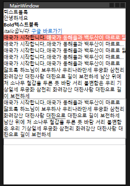
<TextBlock>텍스트블록</TextBlock>
<TextBlock Text="안녕하세요"/>
<TextBlock> <Bold>Bold텍스트블록</Bold>
<LineBreak/>
<Italic>Italic입니다.</Italic>
<Hyperlink RequestNavigate="Hyperlink_RequestNavigate" NavigateUri="https://google.com" Cursor="Hand">구글 바로가기</Hyperlink>
</TextBlock>
<TextBlock
Background="Salmon"
Foreground="White"
>
<Span Foreground="Black">애국가 시작합니다,.</Span>애국가 동해물과 백두산이 마르로 닳도록 하느님이 보우하사 우리나라만세 무궁화 삼천리 화려강산 대한사람 대한으로 길이 보전하세 남산 위에 저 소나무 철갑을 두른 듯 바람 서리 불변함은 우리 기상일세 무궁화 삼천리 화려강산 대한사람 대한으로 길이 보전하세
</TextBlock>
<TextBlock
TextTrimming="CharacterEllipsis"
>
<Span Foreground="Black">애국가 시작합니다,.</Span>애국가 동해물과 백두산이 마르로 닳도록 하느님이 보우하사 우리나라만세 무궁화 삼천리 화려강산 대한사람 대한으로 길이 보전하세 남산 위에 저 소나무 철갑을 두른 듯 바람 서리 불변함은 우리 기상일세 무궁화 삼천리 화려강산 대한사람 대한으로 길이 보전하세
</TextBlock>
<TextBlock
TextTrimming="None"
>
<Span Foreground="Black">애국가 시작합니다,.</Span>애국가 동해물과 백두산이 마르로 닳도록 하느님이 보우하사 우리나라만세 무궁화 삼천리 화려강산 대한사람 대한으로 길이 보전하세 남산 위에 저 소나무 철갑을 두른 듯 바람 서리 불변함은 우리 기상일세 무궁화 삼천리 화려강산 대한사람 대한으로 길이 보전하세
</TextBlock>
<TextBlock
TextTrimming="WordEllipsis"
>
<Span Foreground="Black">애국가 시작합니다,.</Span>애국가 동해물과 백두산이 마르로 닳도록 하느님이 보우하사 우리나라만세 무궁화 삼천리 화려강산 대한사람 대한으로 길이 보전하세 남산 위에 저 소나무 철갑을 두른 듯 바람 서리 불변함은 우리 기상일세 무궁화 삼천리 화려강산 대한사람 대한으로 길이 보전하세
</TextBlock>
<TextBlock
TextWrapping="Wrap"
>
<Span Foreground="Black">애국가 시작합니다,.</Span>애국가 동해물과 백두산이 마르로 닳도록 하느님이 보우하사 우리나라만세 무궁화 삼천리 화려강산 대한사람 대한으로 길이 보전하세 남산 위에 저 소나무 철갑을 두른 듯 바람 서리 불변함은 우리 기상일세 무궁화 삼천리 화려강산 대한사람 대한으로 길이 보전하세
</TextBlock>
<TextBlock
TextWrapping="WrapWithOverflow"
>
<Span Foreground="Black">애국가 시작합니다,.</Span>애국가 동해물과 백두산이 마르로 닳도록 하느님이 보우하사 우리나라만세 무궁화 삼천리 화려강산 대한사람 <Underline>대한으로</Underline> 대한으로 길이 보전하세 남산 위에 저 소나무 철갑을 두른 듯 바람 서리 불변함은 우리 기상일세 무궁화 삼천리 화려강산 대한사람 대한으로 길이 보전하세
</TextBlock>
<TextBox x:Name="logTextBox" VerticalScrollBarVisibility="Auto" IsReadOnly="True"/>
</StackPanel>
</Grid>
</Window>
- <LineBreak//>: 줄바꿈
- Hyperlink
- Hyperlink는 NavigateUri로 타겟 Uri를 설정하고 RequestNavigate="Hyperlink_RequestNavigate로 비하인드 코드와 연결해서 나머지 설정들을 해준다.
- CharacterEllipsis: TextTrimming의 옵션으로 문장이 잘리면 ...으로 표시해준다.
- WordEllipsis: 단어기준으로 ... 해준다
- Wrap: TextWrapping의 옵션으로 줄바꿈이 일어난다.
- WrapWithOverflow: 단어단위로 줄바꿈이 일어난다.
using System.Diagnostics;
using System.Text;
using System.Windows;
using System.Windows.Controls;
using System.Windows.Data;
using System.Windows.Documents;
using System.Windows.Input;
using System.Windows.Media;
using System.Windows.Media.Imaging;
using System.Windows.Navigation;
using System.Windows.Shapes;

namespace WpfTextBlock
{
    /// <summary>
    /// Interaction logic for MainWindow.xaml
    /// </summary>
    public partial class MainWindow : Window
    {
        public MainWindow()
        {
            InitializeComponent();
        }

        private void Hyperlink_RequestNavigate(object sender, RequestNavigateEventArgs e)
        {
            logTextBox.AppendText(e.Uri.AbsoluteUri + "\n");
            logTextBox.ScrollToEnd();
            Process.Start(new ProcessStartInfo(e.Uri.AbsoluteUri) {UseShellExecute = true });
        }
}- Hyperlink_RequestNavigate로 아까 요청한 내용들을 받는다.
- logTextBox.AppendText(e.Uri.AbsoluteUri + "\n");
- logTextBox.ScrollToEnd();
위는 내가 RequestNavigateEventArgs로 받은 e를 까보기 위해서 만들어놓은 디버깅 텍스트박스이다.
Process.Start(new ProcessStartInfo(e.Uri.AbsoluteUri) {UseShellExecute = true });위 코드로 하이퍼링크로 이동하는 것을 허용해준다.
- UseShellExecute: 운영체제사용을 허용하는 것이라고 생각하자.
- ProcessStartInfo를 생성할 때 uri를 넣어주고 property로 UseShellExecute를 true로 설정한다.
Button
<Window x:Class="WpfButton.MainWindow"
        xmlns="http://schemas.microsoft.com/winfx/2006/xaml/presentation"
        xmlns:x="http://schemas.microsoft.com/winfx/2006/xaml"
        xmlns:d="http://schemas.microsoft.com/expression/blend/2008"
        xmlns:mc="http://schemas.openxmlformats.org/markup-compatibility/2006"
        xmlns:local="clr-namespace:WpfButton"
        mc:Ignorable="d"
        Title="MainWindow" Height="450" Width="800">
    <Grid>
        <StackPanel>
            <Button>버튼</Button>
            <Button Content="버튼"/>
            <Button
                x:Name="btn"
                ToolTip="클릭해보세요"
                Click="btn_Click"
                MouseDoubleClick="btn_MouseDoubleClick"
                MouseLeave="btn_MouseLeave"
                MouseEnter="btn_MouseEnter"
                Content="버튼" Width="100">
                <Button.Resources>
                    <Style TargetType="Border">
                        <Setter Property="CornerRadius" Value="20"></Setter>
                    </Style>
                </Button.Resources>
            </Button>
            <TextBlock Text="텍스트블럭" x:Name="txtb"/>
        </StackPanel>
    </Grid>
</Window>
- Button.Resources안에 Style태그로 버튼을 조금 더 스타일링 했다.
- ToolTip, MouseDoubleClik 같은 이벤트성 옵션을 추가했다.
using System.Text;
using System.Windows;
using System.Windows.Controls;
using System.Windows.Data;
using System.Windows.Documents;
using System.Windows.Input;
using System.Windows.Media;
using System.Windows.Media.Imaging;
using System.Windows.Navigation;
using System.Windows.Shapes;

namespace WpfButton
{
    /// <summary>
    /// Interaction logic for MainWindow.xaml
    /// </summary>
    public partial class MainWindow : Window
    {
        public MainWindow()
        {
            InitializeComponent();
        }

        private void btn_Click(object sender, RoutedEventArgs e)
        {
            txtb.Text = "버튼을 클릭했습니다.";
        }

        private void btn_MouseDoubleClick(object sender, MouseButtonEventArgs e)
        {
            txtb.Background = Brushes.Salmon;
            txtb.Foreground = Brushes.White;
        }

        private void btn_MouseLeave(object sender, MouseEventArgs e)
        {
            btn.Foreground = Brushes.Black;
        }

        private void btn_MouseEnter(object sender, MouseEventArgs e)
        {
            btn.Foreground = Brushes.Red;
        }
    }
}
각 이벤트가 실행될 때마다 디자인코드에서 받은 Name을 참조해 이벤트에 해당하는 동작을 수행하는 코드를 작성했다.
TextBox
<Window x:Class="WpfTextBox.MainWindow"
        xmlns="http://schemas.microsoft.com/winfx/2006/xaml/presentation"
        xmlns:x="http://schemas.microsoft.com/winfx/2006/xaml"
        xmlns:d="http://schemas.microsoft.com/expression/blend/2008"
        xmlns:mc="http://schemas.openxmlformats.org/markup-compatibility/2006"
        xmlns:local="clr-namespace:WpfTextBox"
        mc:Ignorable="d"
        Title="MainWindow" Height="450" Width="800">
    <Grid>
        <StackPanel>
            <TextBox
                x:Name ="txt"
                IsReadOnly="true">텍스트박스</TextBox>
            <TextBox
                FontSize="20"
                Background="Salmon"
                Foreground="White"
                Margin="10"
                TextWrapping="Wrap"
                AcceptsReturn="True"
                Text="텍스트박스"
                SelectionChanged="TextBox_SelectionChanged"
                />
            <TextBlock>텍스트블럭</TextBlock>
        </StackPanel>
    </Grid>
</Window>
- 첫번째 TextBoxt에는 IsReadOnly = true설정으로 읽을 수만 있다.
- 두번째 텍스트블럭에 이벤트핸들러를 넣었다.
- TextWrapping으로 끝까지 갔을 때 자동줄바꿈
- AcceptsReturn = True 설정으로 Enter로 줄바꿈 가능하게함
using System.Text;
using System.Windows;
using System.Windows.Controls;
using System.Windows.Data;
using System.Windows.Documents;
using System.Windows.Input;
using System.Windows.Media;
using System.Windows.Media.Imaging;
using System.Windows.Navigation;
using System.Windows.Shapes;

namespace WpfTextBox
{
    /// <summary>
    /// Interaction logic for MainWindow.xaml
    /// </summary>
    public partial class MainWindow : Window
    {
        public MainWindow()
        {
            InitializeComponent();
        }

        private void TextBox_SelectionChanged(object sender, RoutedEventArgs e)
        {
            TextBox textbox = sender as TextBox; //이벤트가 발생한 object에서 별칭을 사용하지 않았기 때문에 TextBox로 형변환
            if(textbox != null)
            {
                txt.Text = textbox.Text;
            }
        }
    }
}- 이벤트가 발생한 두번째 텍스트박스에는 별칭이 없기 때문에 받은 object를 TextBox로 형변환
- 만약 두번째 텍스트박스에 Text가 Null이 아니면
- ReadOnly textbox에 똑같은 글이 입력되게해서 ReadOnly인 박스에도 글을 넣을 수 있게됐다.
PasswordBox
<Window x:Class="WpfAppPassword.MainWindow"
        xmlns="http://schemas.microsoft.com/winfx/2006/xaml/presentation"
        xmlns:x="http://schemas.microsoft.com/winfx/2006/xaml"
        xmlns:d="http://schemas.microsoft.com/expression/blend/2008"
        xmlns:mc="http://schemas.openxmlformats.org/markup-compatibility/2006"
        xmlns:local="clr-namespace:WpfAppPassword"
        mc:Ignorable="d"
        Title="MainWindow" Height="450" Width="800">
    <Grid>
        <StackPanel>
            <PasswordBox BorderThickness="3"
                         PasswordChar="*"
                         MaxLength="3"
                         x:Name="pwd"
                         />
            <Button Click="Button_Click"></Button>
        </StackPanel>
    </Grid>
</Window>
- BorderThickness: 테두리 굵기
- PasswordChar: 패스워드를 숨겨줄 문자
- MaxLength: 길이 제한
pwd에 제대로 들어왔는지 보기 위해
Button Click 이벤트로 비하인드 코드에 내용을 보내어 확인해보자
using System.Text;
using System.Windows;
using System.Windows.Controls;
using System.Windows.Data;
using System.Windows.Documents;
using System.Windows.Input;
using System.Windows.Media;
using System.Windows.Media.Imaging;
using System.Windows.Navigation;
using System.Windows.Shapes;

namespace WpfAppPassword
{
    /// <summary>
    /// Interaction logic for MainWindow.xaml
    /// </summary>
    public partial class MainWindow : Window
    {
        public MainWindow()
        {
            InitializeComponent();
        }

        private void Button_Click(object sender, RoutedEventArgs e)
        {
            MessageBox.Show(pwd.Password);
        }
    }
}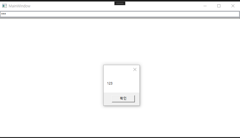
위처럼 메시지 박스가 클릭시 입력한 값으로 잘 뜨는 것을 볼 수 있다.
이미지
<Window x:Class="WpfApp1Image.MainWindow"
        xmlns="http://schemas.microsoft.com/winfx/2006/xaml/presentation"
        xmlns:x="http://schemas.microsoft.com/winfx/2006/xaml"
        xmlns:d="http://schemas.microsoft.com/expression/blend/2008"
        xmlns:mc="http://schemas.openxmlformats.org/markup-compatibility/2006"
        xmlns:local="clr-namespace:WpfApp1Image"
        mc:Ignorable="d"
        Title="MainWindow" Height="450" Width="800">
    <Grid>
        <StackPanel>
            <Image
                x:Name="img"
                MouseEnter="img_MouseEnter"
                Width="400"
                Source="https://velog.velcdn.com/images/jckim22/post/6ae6fd72-6905-4aa5-84af-91daaba4ae9d/image.png"></Image>
            <Button>
                <ContentControl>
                    <StackPanel>
                        <Image
                x:Name="img2"
                MouseEnter="img_MouseEnter"
                Width="400"
                Source="https://velog.velcdn.com/images/jckim22/post/12eca916-3d46-4c75-85bf-9169ef313963/image.png"></Image>
                        <TextBlock HorizontalAlignment="Center">버튼입니다.</TextBlock>
                    </StackPanel>
                </ContentControl>
            </Button>
        </StackPanel>
    </Grid>
</Window>- MouseEnter: 이벤트 트리거이다. (마우스 올렸을 시)
- Button안에도 이미지를 만들 수 있다.
- ContentControl: 자세한 공부필요
using System.Text;
using System.Windows;
using System.Windows.Controls;
using System.Windows.Data;
using System.Windows.Documents;
using System.Windows.Input;
using System.Windows.Media;
using System.Windows.Media.Imaging;
using System.Windows.Navigation;
using System.Windows.Shapes;

namespace WpfApp1Image
{
    /// <summary>
    /// Interaction logic for MainWindow.xaml
    /// </summary>
    public partial class MainWindow : Window
    {
        public MainWindow()
        {
            InitializeComponent();
        }

        private void img_MouseEnter(object sender, MouseEventArgs e)
        {
            img.Source = new BitmapImage(new Uri("https://velog.velcdn.com/images/jckim22/post/56253d13-73ca-472e-b8e3-0b93ebbcd164/image.png"));
        }
    }
}- img에 마우스를 올렸을 때 이벤트가 발생하고 BitmapImage로 새로운 이미지로 변경한다.
체크박스
<Window x:Class="체크박스.MainWindow"
xmlns="http://schemas.microsoft.com/winfx/2006/xaml/presentation"
xmlns:x="http://schemas.microsoft.com/winfx/2006/xaml"
xmlns:d="http://schemas.microsoft.com/expression/blend/2008"
xmlns:mc="http://schemas.openxmlformats.org/markup-compatibility/2006"
xmlns:local="clr-namespace:체크박스"
mc:Ignorable="d"
Title="MainWindow" Height="450" Width="800">
<Grid>
<StackPanel HorizontalAlignment="Center">
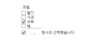
<Label>과일</Label>
<CheckBox>딸기</CheckBox>
<CheckBox>사과</CheckBox>
<CheckBox IsChecked="true">수박</CheckBox>
<CheckBox>배</CheckBox>
<CheckBox
x:Name="chkApple"
Checked="chkApple_Checked"
Unchecked="chkApple_Unchecked"
VerticalContentAlignment="Center"
>
<ContentControl>
<StackPanel Orientation="Horizontal">
<Image Width="50" Source="https://velog.velcdn.com/images/jckim22/post/6ae6fd72-6905-4aa5-84af-91daaba4ae9d/image.png"></Image>
<TextBlock VerticalAlignment="Center" x:Name="tb">청사과</TextBlock>
</StackPanel>
</ContentControl>
</CheckBox>
</StackPanel>
</Grid>
</Window>
- Checked, Unchecked 이벤트
- VerticalContentAlignment
- Orientation="Horizontal
using System.Text;
using System.Windows;
using System.Windows.Controls;
using System.Windows.Data;
using System.Windows.Documents;
using System.Windows.Input;
using System.Windows.Media;
using System.Windows.Media.Imaging;
using System.Windows.Navigation;
using System.Windows.Shapes;

namespace 체크박스
{
    /// <summary>
    /// Interaction logic for MainWindow.xaml
    /// </summary>
    public partial class MainWindow : Window
    {
        public MainWindow()
        {
            InitializeComponent();
        }

        private void chkApple_Checked(object sender, RoutedEventArgs e)
        {
            tb.Text = "청사과 선택했습니다.";
        }

        private void chkApple_Unchecked(object sender, RoutedEventArgs e)
        {
            tb.Text = "청사과 선택취소.";
        }
    }
}
라디오
<Window x:Class="라디오.MainWindow"
xmlns="http://schemas.microsoft.com/winfx/2006/xaml/presentation"
xmlns:x="http://schemas.microsoft.com/winfx/2006/xaml"
xmlns:d="http://schemas.microsoft.com/expression/blend/2008"
xmlns:mc="http://schemas.openxmlformats.org/markup-compatibility/2006"
xmlns:local="clr-namespace:라디오"
mc:Ignorable="d"
Title="MainWindow" Height="450" Width="800">
<Grid>
<StackPanel HorizontalAlignment="Center">
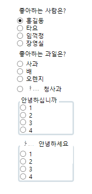
<Label>좋아하는 사람은?</Label>
<RadioButton x:Name ="rb" IsChecked="true" GroupName="first">홍길동</RadioButton>
<RadioButton GroupName="first">타요</RadioButton>
<RadioButton GroupName="first">임꺽정</RadioButton>
<RadioButton GroupName="first">장영실</RadioButton>
<Label>좋아하는 과일은?</Label>
<RadioButton GroupName="fruit">사과</RadioButton>
<RadioButton GroupName="fruit">배</RadioButton>
<RadioButton GroupName="fruit">오렌지</RadioButton>
<RadioButton
Checked="RadioButton_Checked"
Unchecked="RadioButton_Unchecked"
GroupName="fruit"
VerticalContentAlignment="Center">
<WrapPanel>
<Image Width="30" Source="https://velog.velcdn.com/images/jckim22/post/8b7bed83-5780-4d40-8614-701148a57b64/image.png"></Image>
<Label>청사과</Label>
</WrapPanel>
</RadioButton>
<GroupBox BorderThickness="3" Header="안녕하십니까">
<StackPanel>
<RadioButton>1</RadioButton>
<RadioButton>2</RadioButton>
<RadioButton>3</RadioButton>
<RadioButton>4</RadioButton>
</StackPanel>
</GroupBox>
<GroupBox BorderThickness="3">
<GroupBox.Header>
<WrapPanel>
<Image Width="30" Source="https://velog.velcdn.com/images/jckim22/post/8b7bed83-5780-4d40-8614-701148a57b64/image.png"></Image>
<Label>안녕하세요</Label>
</WrapPanel>
</GroupBox.Header>
<StackPanel>
<RadioButton>1</RadioButton>
<RadioButton>2</RadioButton>
<RadioButton>3</RadioButton>
<RadioButton>4</RadioButton>
</StackPanel>
</GroupBox>
</StackPanel>
</Grid>
</Window>
- StackPanel: 세로로 정렬 스택구조
- WrapPanel: 가로로 정렬 (끝까지 가면 자동 줄바꿈)
- GroupName으로 radio 그룹 지정
- GroupBox로도 가능
- VerticalContentAlignment: 세로 기준 위치선정
- HorizationContentAlignment: 가로 기준 위치선정
- GroupBox안에 Header 옵션을 사용해서 헤더를 설정할 수 있다.
- GroupBox안에 GroupBox.Header 태그를 따로 넣어서 더 커스터마이징 할 수 있다.
using System.Text;
using System.Windows;
using System.Windows.Controls;
using System.Windows.Data;
using System.Windows.Documents;
using System.Windows.Input;
using System.Windows.Media;
using System.Windows.Media.Imaging;
using System.Windows.Navigation;
using System.Windows.Shapes;

namespace 라디오
{
    /// <summary>
    /// Interaction logic for MainWindow.xaml
    /// </summary>
    public partial class MainWindow : Window
    {
        public MainWindow()
        {
            InitializeComponent();
        }

        private void RadioButton_Checked(object sender, RoutedEventArgs e)
        {
            rb.IsChecked = true;
        }

        private void RadioButton_Unchecked(object sender, RoutedEventArgs e)
        {
            rb.IsChecked = false;
        }
    }
}- 위처럼 이벤트를 컨트롤 한다.
Calender
<Window x:Class="캘린더.MainWindow"
        xmlns="http://schemas.microsoft.com/winfx/2006/xaml/presentation"
        xmlns:x="http://schemas.microsoft.com/winfx/2006/xaml"
        xmlns:d="http://schemas.microsoft.com/expression/blend/2008"
        xmlns:mc="http://schemas.openxmlformats.org/markup-compatibility/2006"
        xmlns:local="clr-namespace:캘린더"
        mc:Ignorable="d"
        Title="MainWindow" Height="450" Width="800">
    <Grid>
        <StackPanel>
            <StackPanel Orientation="Horizontal">
                <Calendar DisplayMode="Decade"></Calendar>
                <Calendar DisplayMode="Year"></Calendar>
                <Calendar DisplayMode="Month"
                      x:Name="cal"
                      SelectedDatesChanged="cal_SelectedDatesChanged"
                      >
                    <Calendar.BlackoutDates>
                        <CalendarDateRange Start="07.01.2024"
                                       End="07.05.2024"
                                       />
                    </Calendar.BlackoutDates>
                </Calendar>
            </StackPanel>
            <TextBlock x:Name="tb">텍스트블럭</TextBlock>
            <TextBlock
                Text="{Binding ElementName=cal, Path=SelectedDate
                ,StringFormat='yyyy-MM-dd tt hh:mm:ss', ConverterCulture='ko-KR'
                }"
                ></TextBlock>
        </StackPanel>
    </Grid>
</Window>
- Calender DisplayMode: Decade, Year, Month 3가지
- BlackoutDates로 선택불가 날짜를 지정할 수 있다.
- TextBlock에 Calender를 바인딩해서 정보를 불러올 수 잇다.
using System.Text;
using System.Windows;
using System.Windows.Controls;
using System.Windows.Data;
using System.Windows.Documents;
using System.Windows.Input;
using System.Windows.Media;
using System.Windows.Media.Imaging;
using System.Windows.Navigation;
using System.Windows.Shapes;

namespace 캘린더
{
    /// <summary>
    /// Interaction logic for MainWindow.xaml
    /// </summary>
    public partial class MainWindow : Window
    {
        public MainWindow()
        {
            InitializeComponent();
        }

        private void cal_SelectedDatesChanged(object sender, SelectionChangedEventArgs e)
        {
            tb.Text = cal.SelectedDate.ToString();
        }
    }
}- 바인딩 말고 비하인드코드에서 SelecrtedDate를 불러올 수 있다.
데이트피커
<Window x:Class="데이트피커.MainWindow"
        xmlns="http://schemas.microsoft.com/winfx/2006/xaml/presentation"
        xmlns:x="http://schemas.microsoft.com/winfx/2006/xaml"
        xmlns:d="http://schemas.microsoft.com/expression/blend/2008"
        xmlns:mc="http://schemas.openxmlformats.org/markup-compatibility/2006"
        xmlns:local="clr-namespace:데이트피커"
        mc:Ignorable="d"
        Title="MainWindow" Height="450" Width="800">
    <Grid>
        <StackPanel>
            <DatePicker/>
            <DatePicker
                SelectedDate="2024-06-30"
                SelectedDateFormat="Long"
                x:Name="dp"
                SelectedDateChanged="dp_SelectedDateChanged"
                />
            <TextBlock x:Name="tb">텍스트블럭</TextBlock>
            <TextBlock Text="{Binding ElementName=dp, Path=Text}"></TextBlock>
        </StackPanel>
    </Grid>
</Window>
- 비하인드 코드를 보자
using System.Text;
using System.Windows;
using System.Windows.Controls;
using System.Windows.Data;
using System.Windows.Documents;
using System.Windows.Input;
using System.Windows.Media;
using System.Windows.Media.Imaging;
using System.Windows.Navigation;
using System.Windows.Shapes;

namespace 데이트피커
{
    /// <summary>
    /// Interaction logic for MainWindow.xaml
    /// </summary>
    public partial class MainWindow : Window
    {
        public MainWindow()
        {
            InitializeComponent();
        }

        private void dp_SelectedDateChanged(object sender, SelectionChangedEventArgs e)
        {
            if(tb != null)
            {
                tb.Text = dp.Text;
            }
        }
    }
}- tb는 이벤트가 발생한 이후 초기화가 되기 때문에 첫 이벤트 발생 시 tb가 null이다.
- 따라서 tb에 대한 null 처리를 해준다.
슬라이더
<Window x:Class="슬라이더.MainWindow"
xmlns="http://schemas.microsoft.com/winfx/2006/xaml/presentation"
xmlns:x="http://schemas.microsoft.com/winfx/2006/xaml"
xmlns:d="http://schemas.microsoft.com/expression/blend/2008"
xmlns:mc="http://schemas.openxmlformats.org/markup-compatibility/2006"
xmlns:local="clr-namespace:슬라이더"
mc:Ignorable="d"
Title="MainWindow" Height="450" Width="800">
<Grid>
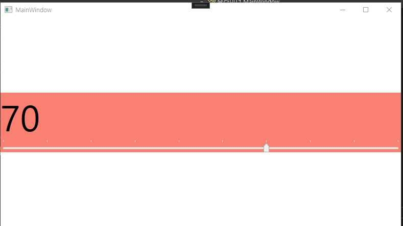
<StackPanel VerticalAlignment="Center" Background="Salmon">
<TextBlock
FontSize="{Binding ElementName=sld, Path=Value}"
x:Name="tb" Text="텍스트" />
<Slider
x:Name="sld"
ValueChanged="sld_ValueChanged"
TickPlacement="TopLeft"
IsSnapToTickEnabled="True"
Minimum="10"
Maximum="100"
TickFrequency="10"
/>
</StackPanel>
</Grid>
</Window>
- ValueChanged: 이벤트
- TickPlacement: 슬라이드 위치
- IsSnapToTickEnabled: 딱 정해진 만큼 슬라이드 되게 하는 옵션
- 미니넘과 맥시멈으로 그 양을 정한다.
- TickFrequency: 어느 정도의 간격인지 정한다.
- TextBlock의 FontSize 값을 Slide의 Value에 바인딩했다.
using System.Text;
using System.Windows;
using System.Windows.Controls;
using System.Windows.Data;
using System.Windows.Documents;
using System.Windows.Input;
using System.Windows.Media;
using System.Windows.Media.Imaging;
using System.Windows.Navigation;
using System.Windows.Shapes;

namespace 슬라이더
{
    /// <summary>
    /// Interaction logic for MainWindow.xaml
    /// </summary>
    public partial class MainWindow : Window
    {
        public MainWindow()
        {
            InitializeComponent();
        }

        private void sld_ValueChanged(object sender, RoutedPropertyChangedEventArgs<double> e)
        {
            tb.Text = sld.Value.ToString();
        }
    }
}- tb의 Text를 sld의 Value값으로

익스팬더
<Window x:Class="익스팬더.MainWindow"
        xmlns="http://schemas.microsoft.com/winfx/2006/xaml/presentation"
        xmlns:x="http://schemas.microsoft.com/winfx/2006/xaml"
        xmlns:d="http://schemas.microsoft.com/expression/blend/2008"
        xmlns:mc="http://schemas.openxmlformats.org/markup-compatibility/2006"
        xmlns:local="clr-namespace:익스팬더"
        mc:Ignorable="d"
        Title="MainWindow" Height="450" Width="800">
    <Grid>
        <StackPanel>
            <Expander Header="확장" Expanded="Expander_Expanded">
                <StackPanel>
                    <TextBlock>텍스트 블럭</TextBlock>
                    <Button>버튼</Button>
                </StackPanel>
            </Expander>
            <Expander>
                <Expander.Header>
                     <WrapPanel>
                            <TextBlock>확장</TextBlock>
                      </WrapPanel>
                    </Expander.Header>
                <WrapPanel>
                    <TextBlock>텍스트 블럭</TextBlock>
                    <Button>확장</Button>
                </WrapPanel>
            </Expander>
        </StackPanel>
    </Grid>
</Window>
- Expanded: 이벤트
namespace 익스팬더
{
    /// <summary>
    /// Interaction logic for MainWindow.xaml
    /// </summary>
    public partial class MainWindow : Window
    {
        public MainWindow()
        {
            InitializeComponent();
        }

        private void Expander_Expanded(object sender, RoutedEventArgs e)
        {
            MessageBox.Show("관리자 권한입니다.");
        }
    }
}
스택패널
<Window x:Class="스택패널.MainWindow"
        xmlns="http://schemas.microsoft.com/winfx/2006/xaml/presentation"
        xmlns:x="http://schemas.microsoft.com/winfx/2006/xaml"
        xmlns:d="http://schemas.microsoft.com/expression/blend/2008"
        xmlns:mc="http://schemas.openxmlformats.org/markup-compatibility/2006"
        xmlns:local="clr-namespace:스택패널"
        mc:Ignorable="d"
        Title="MainWindow" Height="450" Width="800">
    <Grid>
        <StackPanel>
            <Button>버튼</Button>
            <Button>버튼</Button>
            <Button>버튼</Button>
            <Button>버튼</Button>
            <StackPanel
                HorizontalAlignment="Center"
                Orientation="Horizontal">
                <Button>버튼</Button>
                <Button>버튼</Button>
                <Button>버튼</Button>
                <Button>버튼</Button>
                <Button>버튼</Button>
            </StackPanel>
            <Button>버튼</Button>
            <Button>버튼</Button>
        </StackPanel>
    </Grid>
</Window>
- 부모 StackPanel이 2개가 올 수는 없지만 Grid같은 다른 패널이 감싸고 있으면 상관 없다.
- 그 말은 즉슨 StackPanel안에 같은 세대 자식 StackPanel도 여러개 올 수 있다는 말이다.
WrapPanel
- StackPanel과 유사하지만 인라인으로 쌓이고 한 줄이 꽉차면 다음 줄로 내려간다.
DockPanel
- 기존 Grid 패널을 지우고 실습해보자
- 각 컨트롤들을 이어주는 역할을 한다.
- 가장 먼저 작성된 컨트롤이 그 밑 컨트롤과 겹쳤을 때 위로 와 덮는다.
<DockPanel LastChildFill="True">
	<Button DockPanel.Dock="Top">상단</Button> <--Top이 Left를 덮음-->
    <Button DockPanel.Dock="Left">왼쪽</Button>
Grid
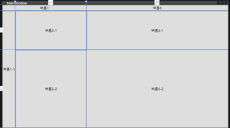
<Window x:Class="그리드.MainWindow"
        xmlns="http://schemas.microsoft.com/winfx/2006/xaml/presentation"
        xmlns:x="http://schemas.microsoft.com/winfx/2006/xaml"
        xmlns:d="http://schemas.microsoft.com/expression/blend/2008"
        xmlns:mc="http://schemas.openxmlformats.org/markup-compatibility/2006"
        xmlns:local="clr-namespace:그리드"
        mc:Ignorable="d"
        Title="MainWindow" Height="450" Width="800">
    <Grid>
        <Grid.ColumnDefinitions>
            <ColumnDefinition Width="Auto"/>
            <ColumnDefinition Width="1*"/>
            <ColumnDefinition Width="2*"/>
        </Grid.ColumnDefinitions>
        <Grid.RowDefinitions>
            <RowDefinition Height="Auto"/>
            <RowDefinition Height="1*"/>
            <RowDefinition Height="2*"/>
        </Grid.RowDefinitions>
        <Button Grid.Column="0" Grid.ColumnSpan="2">버튼1</Button>
        <Button Grid.Column="2">버튼3</Button>
        <Button Grid.Row="1" Grid.RowSpan="2" Grid.Column="0">버튼1-1</Button>
        <Button Grid.Row="1" Grid.Column="1">버튼2-1</Button>
        <Button Grid.Row="1" Grid.Column="2">버튼3-1</Button>

        <Button Grid.Row="2" Grid.Column="1">버튼2-2</Button>
        <Button Grid.Row="2" Grid.Column="2">버튼3-2</Button>
    </Grid>
</Window>
- StackPanel없이 정렬하려면 ColumDefinition, RowDefinition을 만들어주면 된다.
- Auto는 컨텐츠 크기 만큼이고 1, 2은 각 1배, 2배 사이즈라는 것이다.
- 컨트롤러에서 Row와 Column 인덱스를 지정해준다.
유니폼 그리드
- Button과 같은 컨트롤들이 자동으로 크기가 지정되어 정렬되는 Grid이다.
- 옵션에서 Columns과 Rows로 구조를 조정할 수 있다.
- 이 범위에서 넘어가면 표시가 안된다.
캔버스
- 좌표를 사용하는 직관적인 패널
- <Button Canvas.Left="50">버튼<Button>
- 좌표가 겹친다면 나중에 만들어진 컨트롤이 덮는다.
- Panel.ZIndex로 우선순위를 정할 수 있다.
프로그레스바
<Window x:Class="프로그레스바.MainWindow"
        xmlns="http://schemas.microsoft.com/winfx/2006/xaml/presentation"
        xmlns:x="http://schemas.microsoft.com/winfx/2006/xaml"
        xmlns:d="http://schemas.microsoft.com/expression/blend/2008"
        xmlns:mc="http://schemas.openxmlformats.org/markup-compatibility/2006"
        xmlns:local="clr-namespace:프로그레스바"
        mc:Ignorable="d"
        Title="MainWindow" Height="450" Width="800">
    <Grid>
        <StackPanel>
            <ProgressBar Height="20" Value="50"
                Minimum="0" Maximum="100"
                IsIndeterminate="True"
                ></ProgressBar>
            <Separator></Separator>
            <Button Click="Button_Click">버튼</Button>
            <ProgressBar Name="pb" Height="20" Maximum="100"/>
            <TextBlock
                Text="{Binding ElementName=pb, Path=Value, StringFormat={}{0:0}%}"
                HorizontalAlignment="Center"
                ></TextBlock>
        </StackPanel>
    </Grid>
</Window>
- IsIndterminate 옵션으로 게이지 방식을 바꿀 수 있다.
- pb에 바인딩해서 value값을 %로 표현
namespace 프로그레스바
{
    /// <summary>
    /// Interaction logic for MainWindow.xaml
    /// </summary>
    public partial class MainWindow : Window
    {
        public MainWindow()
        {
            InitializeComponent();
        }

        private void Button_Click(object sender, RoutedEventArgs e)
        {
            pb.Value += 10;
        }
    }
}- 클릭시 pb의 Value를 10씩 증가
StatusBar
<Window x:Class="스테이터스바.MainWindow"
      xmlns="http://schemas.microsoft.com/winfx/2006/xaml/presentation"
      xmlns:x="http://schemas.microsoft.com/winfx/2006/xaml"
      xmlns:d="http://schemas.microsoft.com/expression/blend/2008"
      xmlns:mc="http://schemas.openxmlformats.org/markup-compatibility/2006"
      xmlns:local="clr-namespace:스테이터스바"
      mc:Ignorable="d"
      Title="MainWindow" Height="450" Width="800">
  <DockPanel LastChildFill="False">
      <Slider
          DockPanel.Dock="Top" Name="sl" Maximum="100"
          ValueChanged="sl_ValueChanged"
          ></Slider>
      <StatusBar DockPanel.Dock="Bottom">
          <StatusBarItem>
              준비
          </StatusBarItem>
          <Separator></Separator>
          <StatusBarItem x:Name="sb">
              로딩중..
          </StatusBarItem>
          <StatusBarItem>
              <ProgressBar x:Name="pb" Height="10" Width="150" Value="0"></ProgressBar>
          </StatusBarItem>
      </StatusBar>
  </DockPanel>
</Window>
using System.Security.Cryptography;
using System.Text;
using System.Windows;
using System.Windows.Controls;
using System.Windows.Data;
using System.Windows.Documents;
using System.Windows.Input;
using System.Windows.Media;
using System.Windows.Media.Imaging;
using System.Windows.Navigation;
using System.Windows.Shapes;

namespace 스테이터스바
{
  /// <summary>
  /// Interaction logic for MainWindow.xaml
  /// </summary>
  public partial class MainWindow : Window
  {
      public MainWindow()
      {
          InitializeComponent();
      }

      private void sl_ValueChanged(object sender, RoutedPropertyChangedEventArgs<double> e)
      {
          if (sl.Value == 100)
          {
              sb.Content = "완료";
          }
          else
          {
              pb.Value = sl.Value;
              sb.Content = "로딩중";
          }
      }
  }
}- Slider의 밸류가 100이 되면 Statusbar의 콘텐츠를 완료로 바꾼다.
- 그게 아닐 경우에는 콘텐츠는 로딩중이고 pb의 Value는 항상 sl의 Value를 따른다.
ToolBar
<Window x:Class="툴바.MainWindow"
      xmlns="http://schemas.microsoft.com/winfx/2006/xaml/presentation"
      xmlns:x="http://schemas.microsoft.com/winfx/2006/xaml"
      xmlns:d="http://schemas.microsoft.com/expression/blend/2008"
      xmlns:mc="http://schemas.openxmlformats.org/markup-compatibility/2006"
      xmlns:local="clr-namespace:툴바"
      mc:Ignorable="d"
      Title="MainWindow" Height="450" Width="800">
  <DockPanel>
      <ToolBarTray DockPanel.Dock="Top">
          <ToolBar>
              <Button>
                  <Image Width="20" Source="https://cdn-icons-png.flaticon.com/128/16772/16772839.png"></Image>
              </Button>
              <TextBlock VerticalAlignment="Center">폰트사이즈</TextBlock>
              <ComboBox x:Name="cb" SelectionChanged="cb_SelectionChanged">
                  <ComboBoxItem IsSelected="True">10</ComboBoxItem>
                  <ComboBoxItem>10</ComboBoxItem>
                  <ComboBoxItem>12</ComboBoxItem>
                  <ComboBoxItem>14</ComboBoxItem>
                  <ComboBoxItem>16</ComboBoxItem>
                  <ComboBoxItem>18</ComboBoxItem>
                  <ComboBoxItem>20</ComboBoxItem>
                  <ComboBoxItem>22</ComboBoxItem>
                  <ComboBoxItem>24</ComboBoxItem>
              </ComboBox>
          </ToolBar>
      </ToolBarTray>
      <StackPanel>
          <TextBox x:Name="tb"></TextBox>
          <TextBox x:Name="tb2" FontSize="{Binding ElementName=cb, Path=Text}"></TextBox>
      </StackPanel>
  </DockPanel>
</Window>
-
ComboBox의 Text를 바인딩해서 아래 TextBox의 크기를 정한다.
using System.Text;
using System.Windows;
using System.Windows.Controls;
using System.Windows.Data;
using System.Windows.Documents;
using System.Windows.Input;
using System.Windows.Media;
using System.Windows.Media.Imaging;
using System.Windows.Navigation;
using System.Windows.Shapes;
namespace 툴바
{
///
/// Interaction logic for MainWindow.xaml
///
public partial class MainWindow : Window
{
public MainWindow()
{
InitializeComponent();
}
    private void cb_SelectionChanged(object sender, SelectionChangedEventArgs e)
    {
        if (tb != null)
        {
            MessageBox.Show(cb.Text);
            tb.FontSize = Convert.ToDouble(cb.Text);
        }
    }
}
}
- 이건 바인딩 대신 이벤트 발생 시 비하인드 코드에서 따로 처리한 것이다.
메뉴
<Window x:Class="메뉴.MainWindow"
        xmlns="http://schemas.microsoft.com/winfx/2006/xaml/presentation"
        xmlns:x="http://schemas.microsoft.com/winfx/2006/xaml"
        xmlns:d="http://schemas.microsoft.com/expression/blend/2008"
        xmlns:mc="http://schemas.openxmlformats.org/markup-compatibility/2006"
        xmlns:local="clr-namespace:메뉴"
        mc:Ignorable="d"
        Title="MainWindow" Height="450" Width="800">
    <DockPanel>
        <Menu DockPanel.Dock="Top">
            <MenuItem Header="파일">
                <MenuItem Header="파일">
                    <MenuItem Header="새로운 문서">
                        <MenuItem.Icon>
                            <Image Source="https://cdn-icons-png.flaticon.com/128/16772/16772855.png"></Image>
                        </MenuItem.Icon>
                    </MenuItem>
                </MenuItem>
                <MenuItem Header="열기"></MenuItem>
                <MenuItem Header="닫기"></MenuItem>
            </MenuItem>
            <MenuItem Header="_Move" Click="MenuItem_Click"></MenuItem>
        </Menu>
        <ContentControl x:Name="ContentArea"></ContentControl>
    </DockPanel>
</Window>
-
MenuItem으로 메뉴를 만든다.
-
ContentControl은 메뉴를 제외한 부분을 차지한다.
-
메뉴의 Move 메뉴 클릭시 이벤트를 발생시킨다.
namespace 메뉴
{
  /// <summary>
  /// Interaction logic for MainWindow.xaml
  /// </summary>
  public partial class MainWindow : Window
  {
      public MainWindow()
      {
          InitializeComponent();
      }

      private void MenuItem_Click(object sender, RoutedEventArgs e)
      {
          ContentArea.Content = new UserControl1();
      }
  }
}
-
- Move 클릭 시 ContentArea의 Content를 새로 정의한 new UserControl1 페이지로 전환한다.
컨텍스트메뉴
<Window x:Class="컨텍스트메뉴.MainWindow"
        xmlns="http://schemas.microsoft.com/winfx/2006/xaml/presentation"
        xmlns:x="http://schemas.microsoft.com/winfx/2006/xaml"
        xmlns:d="http://schemas.microsoft.com/expression/blend/2008"
        xmlns:mc="http://schemas.openxmlformats.org/markup-compatibility/2006"
        xmlns:local="clr-namespace:컨텍스트메뉴"
        mc:Ignorable="d"
        Title="MainWindow" Height="450" Width="800">
    <StackPanel>
        <TextBlock Text="마우스 우클릭" FontSize="20" Name="tb">
            <TextBlock.ContextMenu>
                <ContextMenu>
                    <MenuItem Header="진하게" Click="MenuItem_Click">
                        <MenuItem.Icon>
                            <Image Source="https://cdn-icons-png.flaticon.com/128/16772/16772855.png"></Image>
                        </MenuItem.Icon>
                    </MenuItem>
                    <MenuItem Header="기울기" IsCheckable="True"
                              Checked="MenuItem_Checked"
                              Unchecked="MenuItem_Unchecked">
                        <MenuItem.Icon>
                            <Image Source="https://cdn-icons-png.flaticon.com/128/16772/16772855.png"></Image>
                        </MenuItem.Icon>
                    </MenuItem>
                </ContextMenu>
            </TextBlock.ContextMenu>
        </TextBlock>
        <Button Content="버튼 우클릭">
            <Button.ContextMenu>
                <ContextMenu>
                    <MenuItem Header="진하게" Click="MenuItem_Click">
                        <MenuItem.Icon>
                            <Image Source="https://cdn-icons-png.flaticon.com/128/16772/16772855.png"></Image>
                        </MenuItem.Icon>
                    </MenuItem>
                    <MenuItem Header="기울기" IsCheckable="True"
                              Checked="MenuItem_Checked"
                              Unchecked="MenuItem_Unchecked">
                        <MenuItem.Icon>
                            <Image Source="https://cdn-icons-png.flaticon.com/128/16772/16772855.png"></Image>
                        </MenuItem.Icon>
                    </MenuItem>
                </ContextMenu>
            </Button.ContextMenu>
        </Button>
    </StackPanel>
</Window>
- 우클릭으로 컨텍스트메뉴를 꺼낼 수 있다.
- ContextMenu태그 안에는 똑같이 MenuItem을 넣을 수 있다.
- 일반 클릭일 수도 있고 check일수도 있다.
namespace 컨텍스트메뉴
{
    /// <summary>
    /// Interaction logic for MainWindow.xaml
    /// </summary>
    public partial class MainWindow : Window
    {
        public MainWindow()
        {
            InitializeComponent();
        }

        private void MenuItem_Click(object sender, RoutedEventArgs e)
        {
            tb.FontWeight = FontWeights.Bold;
        }

        private void MenuItem_Checked(object sender, RoutedEventArgs e)
        {
            tb.FontStyle = FontStyles.Italic;
        }

        private void MenuItem_Unchecked(object sender, RoutedEventArgs e)
        {
            tb.FontStyle = FontStyles.Normal;
        }
    }
}- 이벤트에 맞는 코드를 구현
데이터 바인딩
<Window x:Class="데이터바인딩.MainWindow"
      xmlns="http://schemas.microsoft.com/winfx/2006/xaml/presentation"
      xmlns:x="http://schemas.microsoft.com/winfx/2006/xaml"
      xmlns:d="http://schemas.microsoft.com/expression/blend/2008"
      xmlns:mc="http://schemas.openxmlformats.org/markup-compatibility/2006"
      xmlns:local="clr-namespace:데이터바인딩"
      mc:Ignorable="d"
      Title="MainWindow" Height="450" Width="800">
  <StackPanel>
      <TextBox x:Name="tbox"></TextBox>
      <TextBlock Text="{Binding ElementName=tbox, Path=Text}"></TextBlock>

      <Label>소스</Label>
      <TextBox Name="tbox1" Text="홍길동"></TextBox>
      <Label>타겟</Label>
      <TextBox Text="{Binding ElementName=tbox1, Path=Text, Mode=OneWayToSource, UpdateSourceTrigger=PropertyChanged}"></TextBox>

      <Button x:Name="btn1" Background="Salmon">버튼1</Button>
      <Button Background="{Binding ElementName=btn1, Path=Background}">버튼2</Button>
  </StackPanel>
</Window>
- 바인딩 할 때 Mode나 UpdateSourceTrigger 방식을 설정하면 그에 따른 바인딩 모드가 지정된다.
데이터 바인딩2
<Window x:Class="데이터바인딩2.MainWindow"
      xmlns="http://schemas.microsoft.com/winfx/2006/xaml/presentation"
      xmlns:x="http://schemas.microsoft.com/winfx/2006/xaml"
      xmlns:d="http://schemas.microsoft.com/expression/blend/2008"
      xmlns:mc="http://schemas.openxmlformats.org/markup-compatibility/2006"
      xmlns:local="clr-namespace:데이터바인딩2"
      mc:Ignorable="d"
      Title="MainWindow" Height="450" Width="800">

<StackPanel>
          <Label Content="{Binding 이름}"></Label>
          <Label Content="{Binding 나이}"></Label>
      <WrapPanel Name="wp">
          <Label Content="{Binding 이름}"></Label>
          <Label Content="{Binding 나이}"></Label>
      </WrapPanel>
      <StackPanel Name="stp">
          <Label Content="{Binding 이름}"></Label>
          <Label Content="{Binding 나이}"></Label>
      </StackPanel>
</StackPanel>

</Window>
namespace 데이터바인딩2
{
  /// <summary>
  /// Interaction logic for MainWindow.xaml
  /// </summary>
  public partial class MainWindow : Window
  {
      public string 이름 { get; set; }
      public int 나이 { get; set; }
      public MainWindow()
      {
          InitializeComponent();
          이름 = "타요";
          나이 = 10;
          DataContext = this;
          Person person = new Person() { 이름 = "홍길동", 나이 = 100 };
          wp.DataContext = person;
          Person person2 = new Person() { 이름 = "임꺽정", 나이 = 90 };
          stp.DataContext = person2;
      }
  }
} 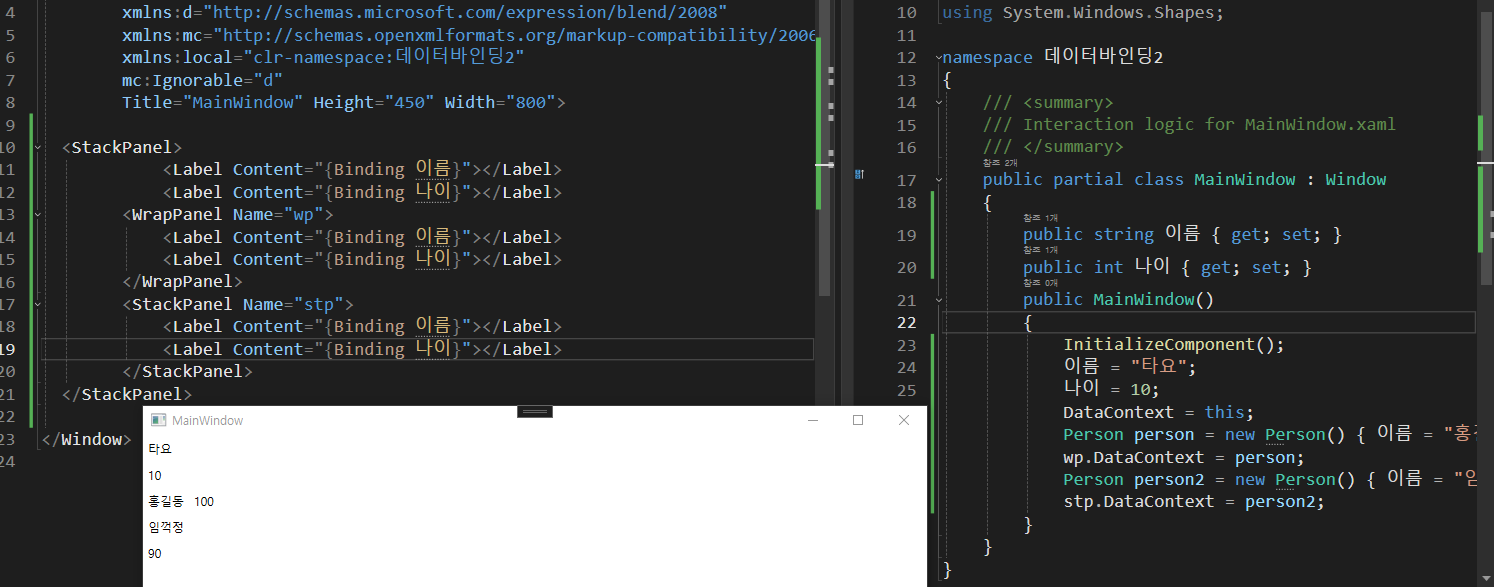
- 비하인드에서 디자인으로 데이터를 보내줄 수 있다.
- DataContext에 담아주면 된다.
- 위에서는 Panel별로 데이터를 담아줬다.
- 전체 DataContext에는 MainWindow 객체를 넘겨줬고
- wp,와 stp 이름을 붙여준 DataContext에는 person과 person2를 각각 보내줬다.
- 그리하여 결과가 다 다르게 나오게 된 것이다.
데이터바인딩3
<Window x:Class="데이터바인딩3.MainWindow"
      xmlns="http://schemas.microsoft.com/winfx/2006/xaml/presentation"
      xmlns:x="http://schemas.microsoft.com/winfx/2006/xaml"
      xmlns:d="http://schemas.microsoft.com/expression/blend/2008"
      xmlns:mc="http://schemas.openxmlformats.org/markup-compatibility/2006"
      xmlns:local="clr-namespace:데이터바인딩3"
      mc:Ignorable="d"
      Title="MainWindow" Height="450" Width="800">
  <Grid>
      <Grid.ColumnDefinitions>
          <ColumnDefinition Width="1*"/>
          <ColumnDefinition Width="1*"/>
      </Grid.ColumnDefinitions>
      <ListBox Grid.Column="0" Name="lb">
          <ListBox.ItemTemplate>
              <DataTemplate>
                  <Grid>
                      <Grid.ColumnDefinitions>
                          <ColumnDefinition/>
                          <ColumnDefinition/>
                          <ColumnDefinition/>
                      </Grid.ColumnDefinitions>
                  <TextBlock Grid.Column="0" Text="{Binding 이름}"/>
                  <Label Grid.Column="1" Content="{Binding 나이}"/>
                  <ProgressBar Width="100" Grid.Column="2" Value="{Binding 별점}"/>
                  </Grid>
              </DataTemplate>
          </ListBox.ItemTemplate>
      </ListBox>
      <ListView Grid.Column="1" Name="lv">
          <ListView.View>
              <GridView>
                  <GridViewColumn Header="이름" DisplayMemberBinding="{Binding 이름}"></GridViewColumn>
                  <GridViewColumn Header="나이" DisplayMemberBinding="{Binding 나이}"></GridViewColumn>
                  <GridViewColumn Header="별점">
                      <GridViewColumn.CellTemplate>
                          <DataTemplate>
                              <ProgressBar Width="50" Height="20" Value="{Binding 별점}"/>
                          </DataTemplate>
                      </GridViewColumn.CellTemplate>
                  </GridViewColumn>
              </GridView>
          </ListView.View>
      </ListView>
  </Grid>
</Window>
namespace 데이터바인딩3
{
  public class Person
  {
      public string 이름 { get; set; }
      public int 나이 { get; set; }
      public double 별점 { get; set; }

  }


  public partial class MainWindow : Window
  {

      List<Person> people = new List<Person>();

      public MainWindow()
      {
          InitializeComponent();
          people.Add(new Person() {이름 = "홍길동", 나이 = 45, 별점 = 74.2 });
          people.Add(new Person() {이름 = "임꺽정", 나이 = 22, 별점 = 99.2 });
          people.Add(new Person() {이름 = "장비", 나이 = 57, 별점 = 34.2 });
          people.Add(new Person() {이름 = "유비", 나이 = 12, 별점 = 67.2 });
          people.Add(new Person() {이름 = "관우", 나이 = 32, 별점 = 45.2 });
          lb.ItemsSource = people;
          lv.ItemsSource = people;
      }
  }
} 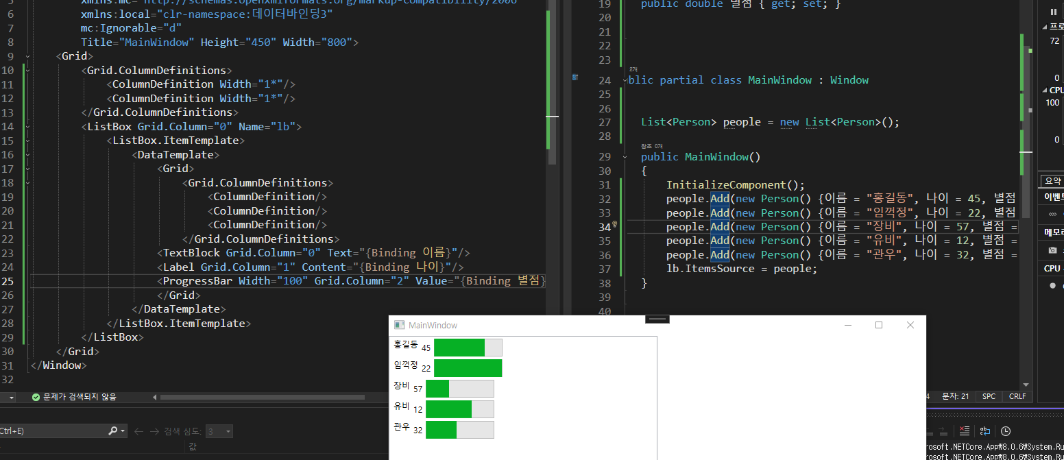
-
ListBox -> ItemTeplate -> DataTemplate -> Grid
-
위 경로에 바인딩한 리스트 데이터소스들을 넣으면 모든 요소가 반환이 된다.
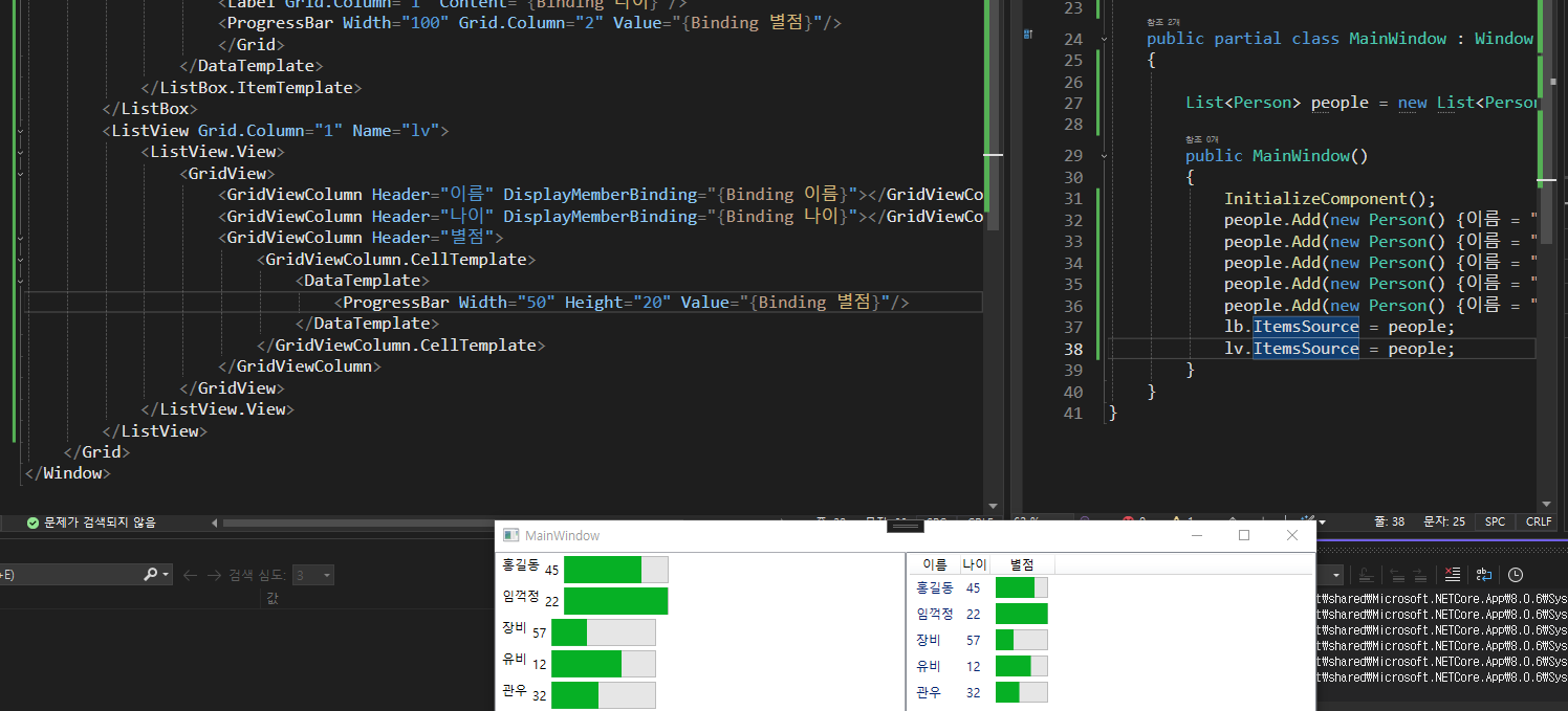
-
ListView는 ListBox에서 파생된 컨트롤러다.
-
ListView

개발/보안