오늘의 과제
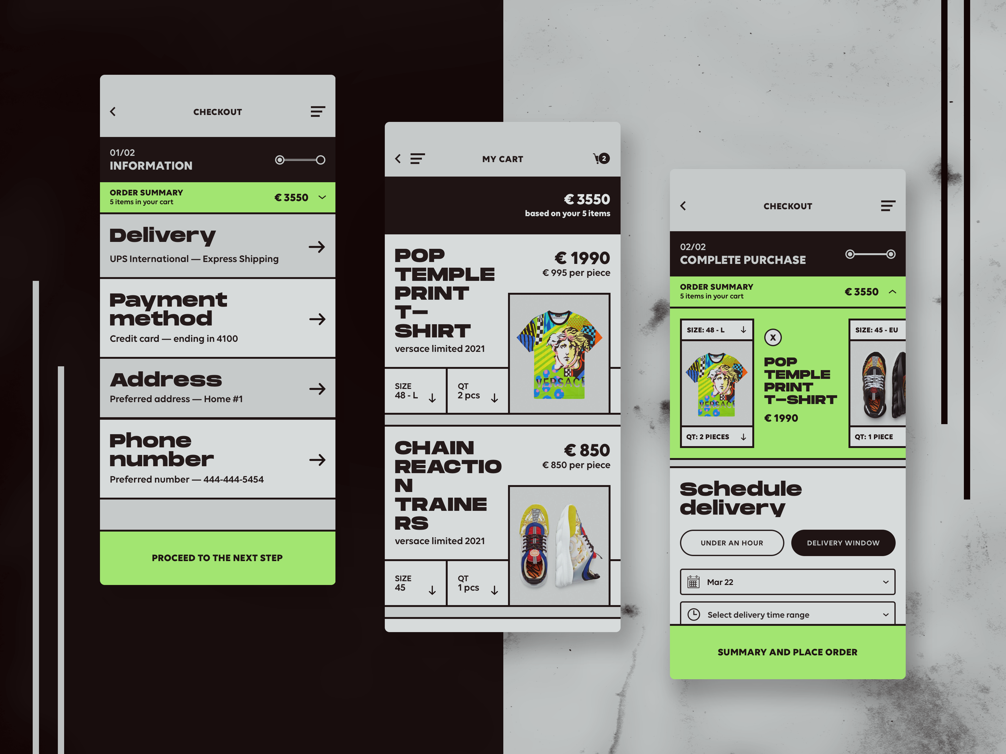
1. 요소 분석
우선 가운데 화면을 분석했다.
2. 비교분석
먼저 CSS 작성 -> 강의와 비교 방식으로 진행
- height의 작성 방식
- 나의 경우 : height를 미리 지정하고 box-sizing을 넣는다.
- 강의의 경우 : height를 지정하지 않고 padding으로 사이즈를 조정한다.
- 이미지 영역
- position : absolute를 활용해 지정했다. (정답~)
- item 간의 틈
- 나의 경우 : margin-bottom으로 처리
- 강의의 경우 : gap으로 처리
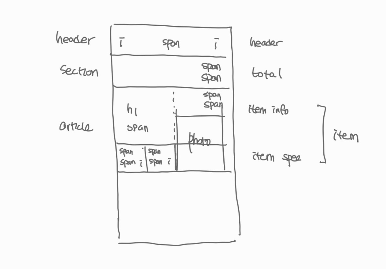
3. 결과
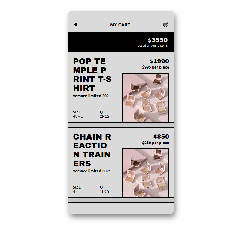
1) HTML
<!DOCTYPE html>
<html lang="en">

<head>
    <meta charset="UTF-8">
    <meta name="viewport" content="width=device-width, initial-scale=1.0">
    <title>Fashion Store</title>
    <link rel="stylesheet" href="css/style.css">
</head>

<body>
    <div class="phone">
        <header class="header">
            <span class="header__icon">◀</span>
            <span class="header__title">my cart</span>
            <span class="header__icon">🛒</span>
        </header>

        <section class="total">
            <span class="total__price">$3550</span>
            <span class="total__subtitle">based on your 5 items</span>
        </section>

        <article class="item">
            <div class="item__info">
                <div class="item__info-col">
                    <p class="info__title">pop temple print t-shirt</p>
                    <span class="info__subtitle">versace limited 2021</span>
                </div>
                <div class="item__info-col">
                    <span class="info__total">$1990</span>
                    <span class="info__price">$995 per piece</span>
                </div>
            </div>
            <div class="item__spec">
                <div class="spec">
                    <span class="spec__title">size</span>
                    <span class="spec__value">48 - l</span>
                </div>
                <div class="spec">
                    <span class="spec__title">qt</span>
                    <span class="spec__value">2pcs</span>
                </div>
            </div>
            <img src="https://source.unsplash.com/random" alt="" class="item__photo">
        </article>

        <article class="item">
            <div class="item__info">
                <div class="item__info-col">
                    <p class="info__title">chain reaction trainers</p>
                    <span class="info__subtitle">versace limited 2021</span>
                </div>
                <div class="item__info-col">
                    <span class="info__total">$850</span>
                    <span class="info__price">$850 per piece</span>
                </div>
            </div>
            <div class="item__spec">
                <div class="spec">
                    <span class="spec__title">size</span>
                    <span class="spec__value">45</span>
                </div>
                <div class="spec">
                    <span class="spec__title">qt</span>
                    <span class="spec__value">1pcs</span>
                </div>
            </div>
            <img src="https://source.unsplash.com/random" alt="" class="item__photo">
        </article>

        <article class="item"></article>
    </div>
</body>

</html>
2) CSS
@import url('https://fonts.googleapis.com/css2?family=Archivo+Black&display=swap');
@import url('https://fonts.googleapis.com/css2?family=Ubuntu:wght@300;400;500;700&display=swap');
@import "reset.css";

$title-font:'Archivo Black';
$mini-font: 'Ubuntu';
$grey: #dadada;
$deep-grey: #c7c7c7;


body {
    display: flex;
    justify-content: center;
    align-items: center;
    height: 100vh;
    width: 100vw;
    font-family: $mini-font;
}

.phone {
    overflow: hidden;
    width: 350px;
    height: 90%;
    background-color: $deep-grey;
    box-shadow: 5px 10px 20px rgba($color: black, $alpha: 0.5);
    border-radius: 10px;
}

.header {
    box-sizing: border-box;
    width: 100%;
    height: 10%;
    display: flex;
    align-items: flex-end;
    justify-content: space-between;
    padding: 15px;
    background-color: $grey;

    .header__title {
        text-transform: uppercase;
        font-weight: bold;
        font-size: 15px;
    }
}

.total {
    width: 100%;
    height: 10%;
    background-color: black;
    color: $grey;
    font-size: 10px;
    display: flex;
    flex-direction: column;
    align-items: flex-end;
    justify-content: center;
    padding-right: 20px;
    box-sizing: border-box;

    .total__price {
        font-size: 20px;
        font-weight: bold;
        font-family: $title-font;
    }

}

.item {
    position: relative;
    height: 35%;
    border-width: 2px 0px 2px 0px;
    border-color: black;
    border-style: solid;
    margin-bottom: 15px;
    background-color: $grey;
    box-sizing: border-box;
    display: grid;
    grid-template-rows: 75% 25%;

    .item__info {
        display: grid;
        grid-template-columns: 1fr 1fr;
        padding: 15px;
        font-weight: bold;
        gap: 10px;

        .info__title {
            font-family: $title-font;
            font-size: 27px;
            line-height: 110%;
            text-transform: uppercase;
            word-break: break-all;
            width: 85%;
        }
        .info__subtitle {
            font-size: 13px;
        }

        .item__info-col:nth-child(2) {
            display: flex;
            flex-direction: column;
            align-items: flex-end;

            .info__total {
                font-size: 20px;
                font-family: $title-font;
            }

            .info__price {
                font-size: 13px;
            }
        }
    }

    .item__spec {
        box-sizing: border-box;
        display: grid;
        grid-template-columns: 1fr 1fr 2fr;
        border-top: 2px solid black;

        .spec {
            padding: 15px;
            font-size: 13px;
            text-transform: uppercase;
            font-weight: 500;
            display: flex;
            flex-direction: column;
            justify-content: center;

            &:nth-child(2) {
                border-left: 2px solid black;
            }
        }
    }
}

img {
    width: 150px;
    height: 160px;
    object-fit: cover;
    position: absolute;
    bottom: 0px;
    // left: 50%;
    right: 15px;
    border-width: 3px 3px 0px 3px;
    border-color: black;
    border-style: solid;
}
3) 후기
- 집 모니터 크기가 애매해서 phone body 크기 설정이 좀 안이쁜거 같다
- header나 기타 section의 css를 분리해서, 여러 화면 만들어볼까 싶기도 (카톡 강의에서 했던 것처럼)
- 반응형은 아니라 아쉽다 ... 흠
까짓거 한 번 해보죠