오늘의 과제
1. 분석
- 네모 테두리는 고정 (fixed) - 가운데 사진 부분만 스크롤 되도록
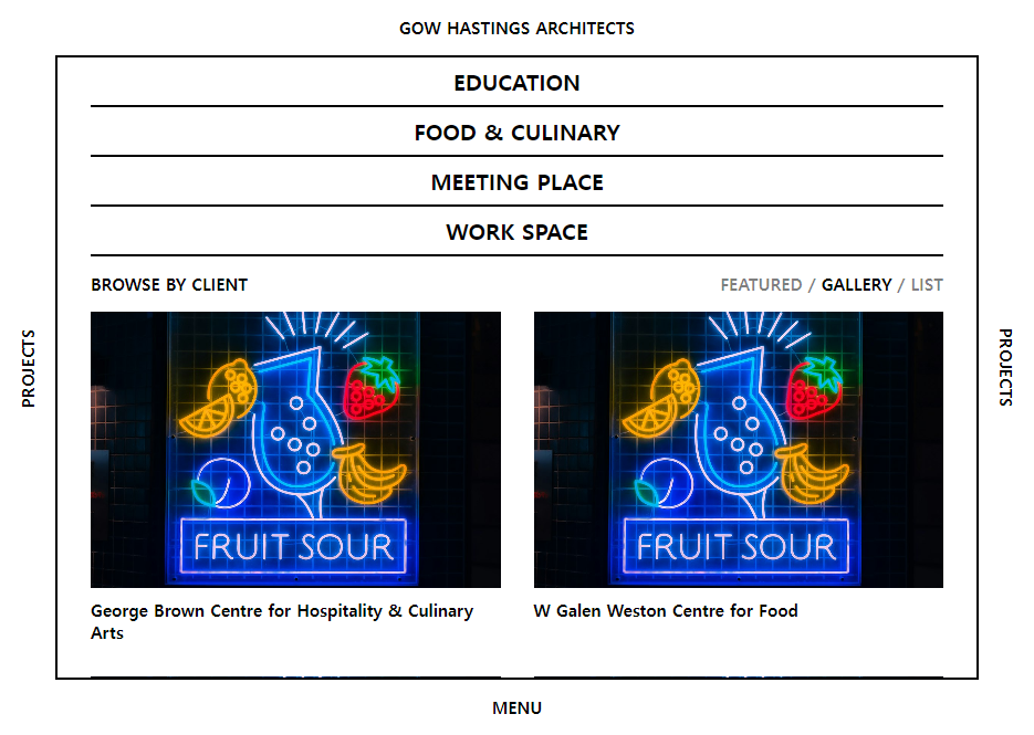
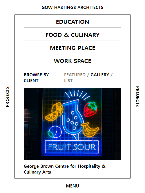
- 반응형 display -> 사이즈에 따라 사진 그리드 개수 변경, auto-fill/fit 사용
- header (menus)
- nav
- gallery
2. 비교
- menu 부분이 항상 보이게 하는 법 : overflow-y : scroll
- grid auto-fill을 하면 row는 지정하지 않아도 된다
- 이미지 max-height를 정해주면 길이 너무 길어지는 거 방지 가능
- auto-fill 이어서 bgimg로 이미지를 넣지 못했다.. img 크기가 지저되면 반응형이 안되기때문.. ㅠㅠ
3. 결과
예쁘게 잘 된다
1) html
<!DOCTYPE html>
<html lang="en">
<head>
<meta charset="UTF-8">
<meta name="viewport" content="width=device-width, initial-scale=1.0">
<title>title</title>
<link rel="stylesheet" href="css/style.css">
</head>
<body>
<div class="bar">
<span>gow hastings architects</span>
</div>
<div class="bar">
<span class="bar__leftside">projects</span>
</div>
<div class="main">
<div class="main__block">
<header class="header">
<ul>
<li class="header__menu">education</li>
<li class="header__menu">food & Culinary</li>
<li class="header__menu">meeting place</li>
<li class="header__menu">work space</li>
</ul>
</header>
<section class="nav">
<div class="nav__col"><span class="nav__txt">browse by client</span></div>
<div class="nav__col">
<span class="nav__txt light">featured / </span>
<span class="nav__txt">gallery</span>
<span class="nav__txt light"> / list</span>
</div>
</section>
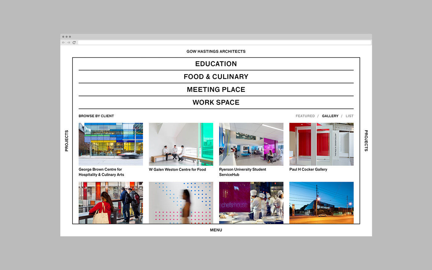
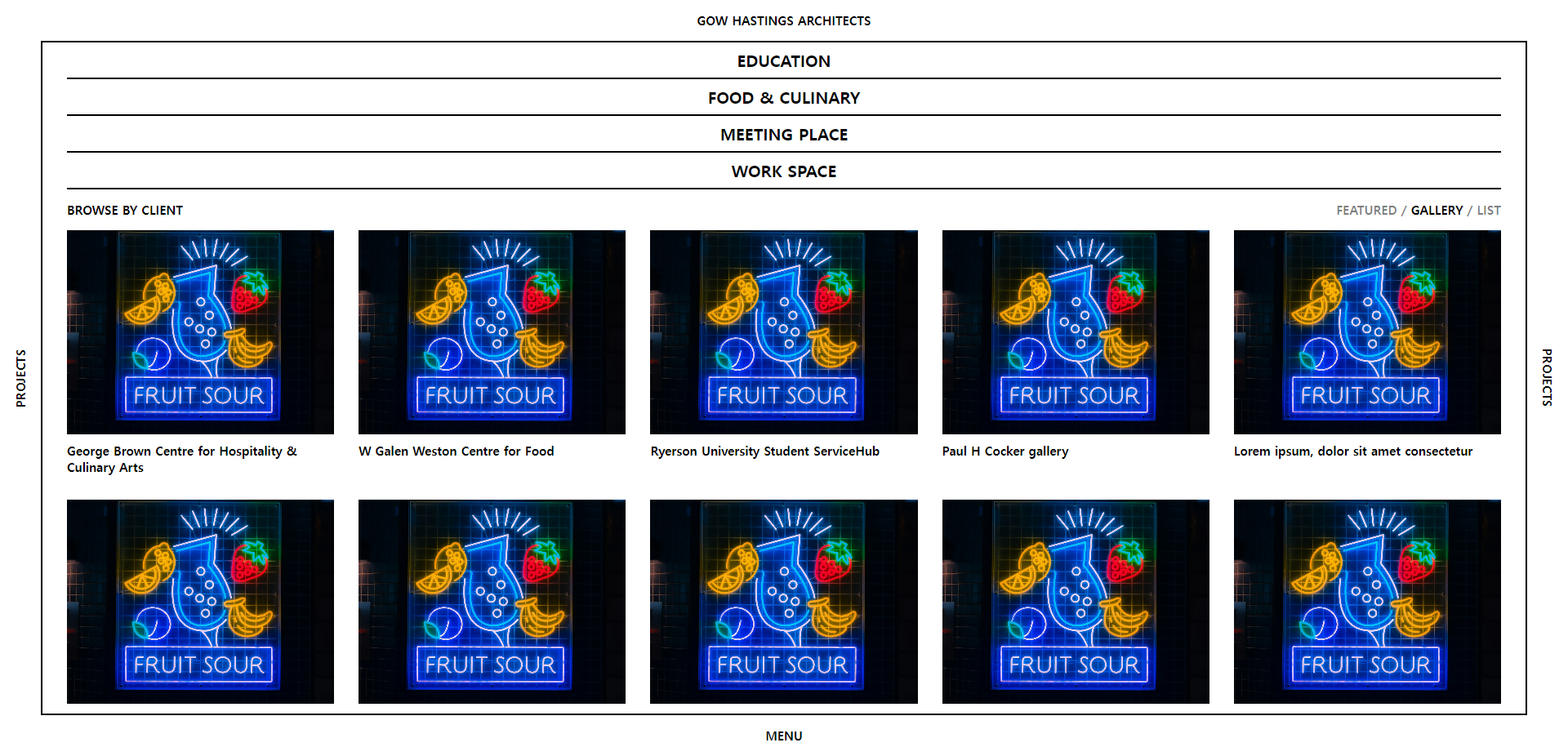
<section class="gallery">
<div class="gallery__cell">
<img class="gallery__img" src="https://source.unsplash.com/random" alt="">
<span class="gallery__txt">George Brown Centre for Hospitality & Culinary Arts</span>
</div>
<div class="gallery__cell">
<img class="gallery__img" src="https://source.unsplash.com/random" alt="">
<span class="gallery__txt">W Galen Weston Centre for Food</span>
</div>
<div class="gallery__cell">
<img class="gallery__img" src="https://source.unsplash.com/random" alt="">
<span class="gallery__txt">Ryerson University Student ServiceHub</span>
</div>
<div class="gallery__cell">
<img class="gallery__img" src="https://source.unsplash.com/random" alt="">
<span class="gallery__txt">Paul H Cocker gallery</span>
</div>
<div class="gallery__cell">
<img class="gallery__img" src="https://source.unsplash.com/random" alt="">
<span class="gallery__txt">Lorem ipsum, dolor sit amet consectetur</span>
</div>
<div class="gallery__cell">
<img class="gallery__img" src="https://source.unsplash.com/random" alt="">
<span class="gallery__txt">Lorem ipsum, dolor sit amet consectetur</span>
</div>
<div class="gallery__cell">
<img class="gallery__img" src="https://source.unsplash.com/random" alt="">
<span class="gallery__txt">Lorem ipsum, dolor sit amet consectetur</span>
</div>
<div class="gallery__cell">
<img class="gallery__img" src="https://source.unsplash.com/random" alt="">
<span class="gallery__txt">Lorem ipsum, dolor sit amet consectetur</span>
</div>
<div class="gallery__cell">
<img class="gallery__img" src="https://source.unsplash.com/random" alt="">
<span class="gallery__txt">Lorem ipsum, dolor sit amet consectetur</span>
</div>
<div class="gallery__cell">
<img class="gallery__img" src="https://source.unsplash.com/random" alt="">
<span class="gallery__txt">Lorem ipsum, dolor sit amet consectetur</span>
</div>
<div class="gallery__cell">
<img class="gallery__img" src="https://source.unsplash.com/random" alt="">
<span class="gallery__txt">Lorem ipsum, dolor sit amet consectetur</span>
</div>
<div class="gallery__cell">
<img class="gallery__img" src="https://source.unsplash.com/random" alt="">
<span class="gallery__txt">Lorem ipsum, dolor sit amet consectetur</span>
</div>
</section>
</div>
</div>
<div class="bar">
<span class="bar__rightside">projects</span>
</div>
<div class="bar">
<span>menu</span>
</div>
</body>
</html>2) CSS
@import "reset.css";
$upper : uppercase;
$smallfont : 15px;
$bigfont : 20px;
$border : 2px;
$txtpadding : 8px 0px 8px 0px;

body {
    display: grid;
    grid-template-columns: 50px 1fr 50px;
    grid-template-rows: 50px 1fr 50px;
    height: 100vh;
}

.bar {
    text-transform: $upper;
    font-size: $smallfont;
    font-weight: 600;
    display: flex;
    justify-content: center;
    align-items: center;

    &:first-child {
        grid-column: span 3;
    }
    &:nth-child(5) {
        grid-column: span 3;
    }

    .bar__leftside{
        transform: rotateZ(-90deg);
    }

    .bar__rightside{
        transform: rotateZ(90deg);
    }
}

.main {
    border: $border solid black;
    overflow-y: scroll;

    .main__block {
        padding: 0px 30px 0px 30px;

        .header {
            width: 100%;
        }

        .header ul{
            display: grid;
            grid-template-rows: repeat(4, 1fr);
            grid-template-columns: 1fr;
            justify-content: center;
            align-items: center;

            .header__menu {
                padding: $txtpadding;
                font-size: $bigfont;
                text-transform: $upper;
                font-weight: 600;
                display: flex;
                justify-content: center;
                align-items: center;
                border-bottom: $border solid black;
            }
        }

        .nav {
            display: flex;
            justify-content: space-between;
            padding: 15px 0px 15px 0px;
            text-transform: $upper;
            font-size: $smallfont;
            font-weight: bold;

            .light {
                opacity: 0.5;
            }
        }

        .gallery {
            display: grid;
            grid-template-columns: repeat(auto-fill, minmax(300px,1fr));
            gap: 30px;
            padding-bottom: 30px;

            .gallery__cell {
                display: flex;
                flex-direction: column;
                gap: 10px;
                font-size: $smallfont;
                font-weight: 600;
            }
            .gallery__img {
                width: 100%;
                max-height: 250px;
                object-fit:cover;
            }
        }
    }

}
3) 리뷰
- 지난 과제에서 방법을 몰랐던 이미지 길이조정을 해결했다. 간단하게... max-height를 넣으면 되는 거였음 ;;
까짓거 한 번 해보죠