1. 설치
- 만약 JS만 사용할 것이라면
npm i styled-components
추가로 TS를 사용하고 있다면npm i @types/styled-components를 추가적으로 설치해주자.
2. 사용법
- 통상 import 문과 FC(함수형 컴포넌트) 사이에 또는
export default 이름밑에 일괄적으로 선언해준다.
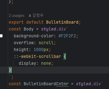
- 이름에서 알 수 있듯 styled를 임의로 지정할 수 있는 "컴포넌트"이다.
따라서 여기에 FC의 return문에 사용할 HTML 컴포넌트를 골라서 넣어주면 된다.
nested &
const ToggleSwitch = styled.label`
  position: absolute;
  display: inline-block;
  width: 50px;
  height: 18px;
  & input{
    &:checked + ${ToggleBtn}{
      background-color: #EBE51E;
    }
    &:focus + ${ToggleBtn}{
      box-shadow: 0 0 1px #EBE51E;
    }
    &:checked + ${ToggleBtn}:before{
      transform: translateX(30px);
    }
  }
`;- 위 처럼
&안에&를 사용할 수도 있고&를 동일한 "노드" 선상에 여러번 쓸 수 있다.
주의
반드시 대문자
- 또 주의할 점은 컴포넌트는 반드시 대문자로 선언해줘야한다.
그래야 FC의 return문에 넣을 수 있기 때문!
& 뒤에 컴포넌트가 올 때 반드시 한 칸 띌 것.
- 잘 못 된 코드
const MoveWrapper = styled.label`
  &input {
&:checked + ${MoveBtn}{- 맞게 띄어 쓴 코드
const MoveWrapper = styled.label`
  & input {
    &:checked + ${MoveBtn}{
config 추가
const nextConfig = {
  reactStrictMode: false,
  compiler:{
    styledComponents: true,
  },
}- 원래는 StrictMode만 적혀있을 텐데 추가로 compiler에 styledComponents를 명시해주어야 pre-rendering과 react가 랜더링하며 생기는 class깨지는 현상이 발생하지 않는다.
적용 전
적용 후

3. 추가
- 기본적으로 css selector를 제공한다. => css3의 기본기가 탄탄해야한다.
예제
- 프로젝트 중 적용했던 코드를 보면 훨씬 쉽다.
module.css
.toggleSwitch {
    position: absolute;
    top: 5px;
    display: inline-block;
    width: 50px;
    height: 18px;
}

.toggleSwitch input:checked + .toggleButton {
    background-color: #EBE51E;
}

.toggleSwitch input:focus + .toggleButton {
    box-shadow: 0 0 1px #EBE51E;
}

.toggleSwitch input:checked + .toggleButton:before {
    transform: translateX(30px);
}
styled components
const ToggleSwitch = styled.label`
  position: absolute;
  display: inline-block;
  width: 50px;
  height: 18px;
  & input{
    &:checked + ${ToggleBtn}{
      background-color: #EBE51E;
    }
    &:focus + ${ToggleBtn}{
      box-shadow: 0 0 1px #EBE51E;
    }
    &:checked + ${ToggleBtn}:before{
      transform: translateX(30px);
    }
  }
`;ToggleBtn은 위에 선언되어있음
props
- styled components 선언 => FC return문에서 사용 => 이때 props을 사용하면 => styled components에서 prop을 가져와 사용할 수 있음.
FC return 문
<Input
  type="password"
  ...
  maxLength={10}
  ...
  />
styled components
const Input = styled.input`
	...
    width: ${props => props.maxLength === 10 && '140px'};
`
reference

智(지)! 德(덕)! 體(체)!